
Many years ago, a major Swedish furniture-maker had the idea of creating a catalogue in which the products were shown in context to give potential buyers an idea of each item’s features and possible use. The catalogue was sold at newspaper kiosks and then, when the company’s network of stores expanded, it was given away for free and put through people’s letterboxes. The catalogue became an object of desire because it gave people advice on how best to furnish their homes and provided a vision of domestic bliss for entire families, built on low-cost furniture.
You all know which catalogue we’re talking about; you’re sure to have flicked through one at least once in your life. You know it’s a catalogue because it has product codes next to the names of the items. Basically, to be worthy of the name, a catalogue must contain for all products the features that are most useful both for sales staff and, for example, warehouse or delivery workers: the product code, pictures, dimensions, price and a brief description.
This is the essence of every catalogue: products and information.
A catalogue does not describe the company (or if it does, it keeps it brief), but instead shows what the company produces, and in the simplest and most clearly organised way possible, to encourage purchases (both by individual customers and by distributors or sales representatives).
WHAT MAKES A GOOD CATALOGUE?
In general, catalogues have lots of pages, because companies sell lots of products. Indeed, the word ‘catalogue’ is almost an exact replica of the ancient Greek word for ‘list’. And you need a list when there are lots of things.
In terms of their physical appearance, catalogues are usually similar to books or magazines. Depending on the number of pages, they can be either perfect-bound or staple-bound.
The size of the page varies depending on the sector involved, and above all on the impression the company wants to give of itself.
Catalogues for specific sectors (such as industrial or commercial equipment) often have simple graphics and come in standard formats, such as A4. Instead, companies that produce or sell luxury goods, for example, often opt for square, and, if possible, small-sized catalogues: a format particularly favoured by jewellers and watchmakers.
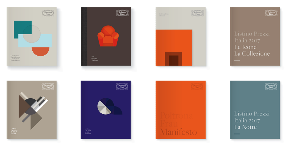
Sectors with a certain creative bent and that aim to convey a certain degree of sophistication sometimes risk unusual formats, hardback (and even cardboard) covers, special coatings and embossed effects. Unusual catalogues are common, for example, in the furniture and interior design sector and for companies that sell ceramics.
For businesses thinking of creating a catalogue, it is worth taking a look at the offerings of competitors and firms from the same sector in other countries, before deciding whether to follow the standard approach or to experiment with new solutions in an attempt to stand out.
After all, catalogues are multi-purpose tools: you can use them to show off products at a trade fair or in a shop (whether brick-and-mortar or virtual), and they can be used by the sales staff or perused time and again by the buyer. The design you end up with will depend on the uses they are to put to.
DESIGN AND LAYOUT: IS THERE ROOM FOR CREATIVITY IN A CATALOGUE?
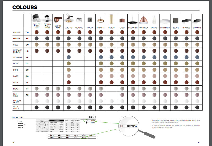
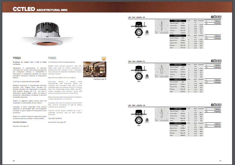
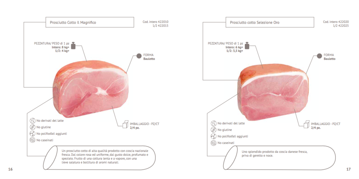
Catalogues must fulfil two main functions: they must be quick to consult (when looking for product information) and well ordered (given the large quantity of data they contain). For this reason, the majority of catalogues are laid out in tables, with a product on each row (sometimes including a small photo) followed by its codes, a description and its features.
When thinking about the layout to choose for any catalogue, it’s a good idea to consider:
- the number of products to display: the layout will change significantly depending on whether you need to include many products on each page or just one;
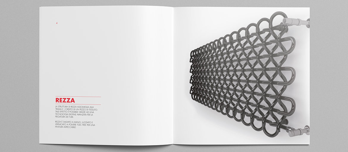
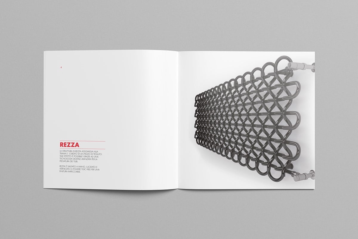
- the quality and size of the product photos: these can be large if they include the context in which the products are used, or small if they merely aim to convey the product’s appearance;
- the sector: looking at catalogues from other companies in the same sector helps you decide where to position yourself and what the most suitable layout might be.
It is difficult, but not impossible, to break the mould when a catalogue still has to be easy to read and consult.
If the catalogue includes tables, colours can be used to differentiate between the different product types, perhaps with symbols or small geometric shapes.
The layout grid can be dynamic and change within the catalogue without affecting readability, for example by frequently alternating the positions of large and small photos.
Another way to increase a catalogue’s appeal is to work on the pages that introduce each section, as it is highly likely that the publication will be divided into several parts. You can concentrate your design work on these pages, working with coloured backgrounds, fonts, titles, symbols and images, as if each of these pages were a sort of cover.
Another way to make catalogues more interesting is to use infographics to highlight the advantages of the products, or choose an infographic layout, where photos of the products are at the centre of a more free-form layout of codes and features.
PRODUCT PICTURES WITH OR WITHOUT CONTEXT?
The biggest dilemma faced by every designer producing a catalogue involves the photos provided by the client. And it is also an issue for the company commissioning the catalogue, which has to work out if it has all the photos it needs and, if not, how to go about taking them.
The photos must be consistent in the way the products are photographed: their position, lighting and any backdrops.
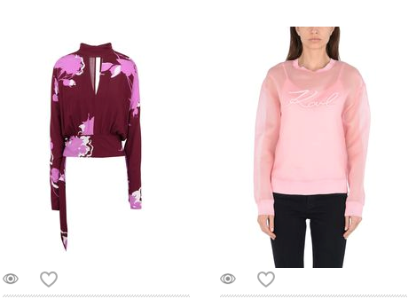
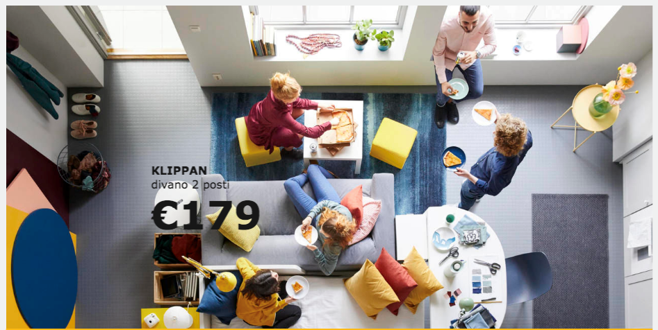
In the fashion sector you have to decide whether to photograph the item worn by a model or on its own. When it comes to furniture, you need to decide whether to use photos in context (as IKEA and Maisons du Monde do, for example) and whether to include people in them, and therefore build a realistic and credible story around the images (IKEA does, but Maisons du Monde doesn’t). And you have to decide whether to add pages at the end summarising each product shown in the catalogue (a photo plus the product’s characteristics), which Maisons du Monde does and IKEA doesn’t.
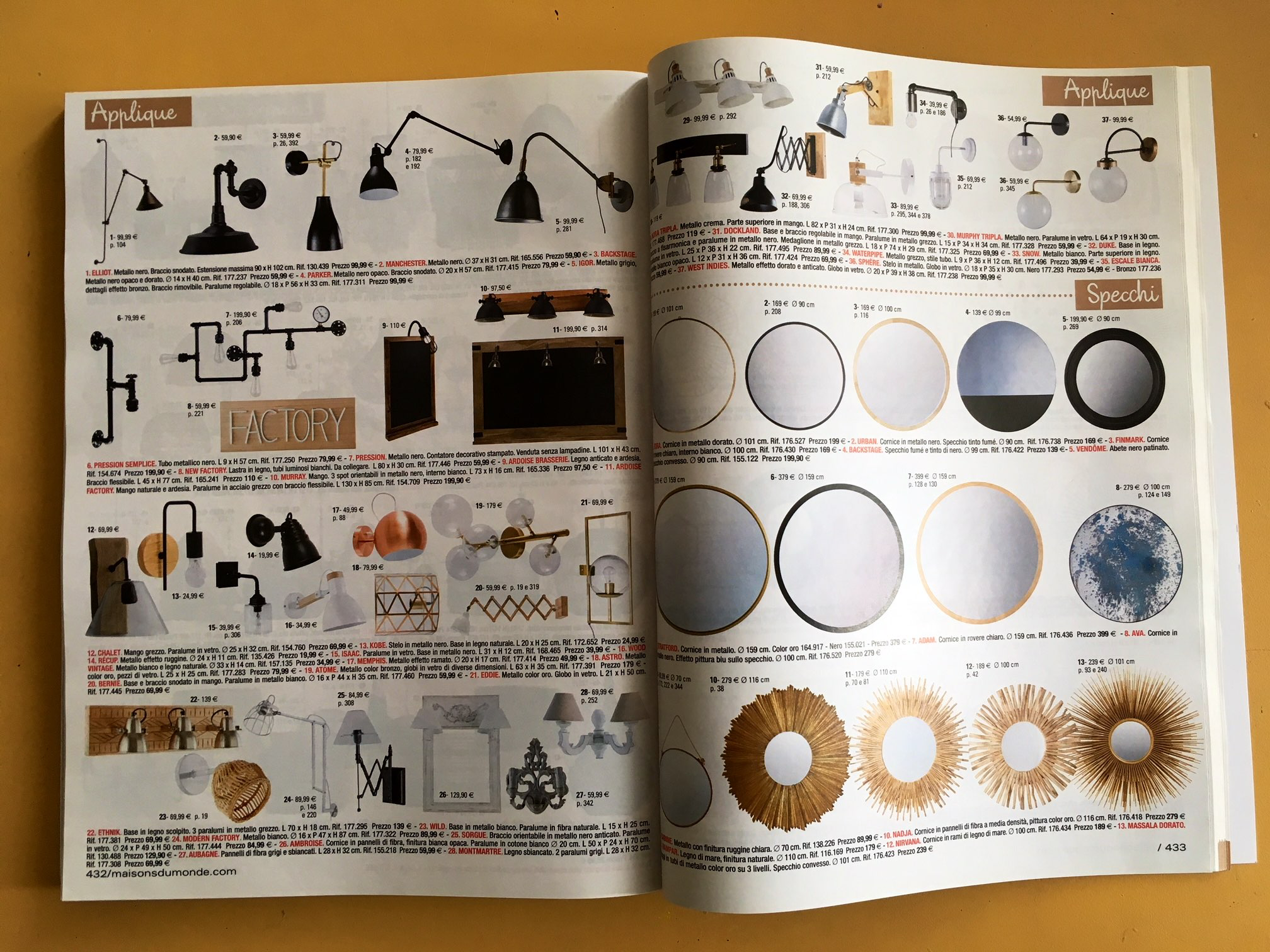
The most important thing, which shouldn’t be taken for granted, is the quality of the photos: they must of course be of a high standard and, above all, the images must all be of the same calibre. If some images are well-taken and others aren’t, the effectiveness of the catalogue will be compromised. Better to ask a photographer to take photos of all the products at the same time, so they have a uniform appearance.
TAKEAWAYS
Catalogues are essential for businesses that sell or manufacture products. They could be B2B or B2C tools, for internal or external use, designed for sales or for presenting the business, and used by those placing large orders or by customers looking to buy a single product
They therefore need to be versatile and designed to respond readily to these needs. The way they are produced can say a lot about the company, far more than brochures or other presentation and communication tools can: a catalogue represents the business, showing what it can actually do beyond the promotional texts, adverts and corporate storytelling.
A catalogue’s design can tell you an awful lot about how a company works and its organisation, perhaps as much as a visit around the offices, warehouses and production sites.
First-rate companies can have bad catalogues, but it’s rare for disorganised, inefficient and inattentive companies to produce good ones.