Table of Contents
In 2018, there was an explosion of nostalgia for the nineties, something that had been building for some time. The decade is a widely used tool to delineate and summarise the culture of a given period of the 20th century. But with the turn of the new millennium, decades seem to carry less weight: a clear image has (yet?) to coalesce around either the 2000s or the 2010s, one that can compete with those of the last century.
Perhaps this is why we feel compelled to look back at the last decade with a strong identity: the nineties.
For generation X, they are childhood years; for millennials and digital natives, they are a period full of fascination and idealization. It was the decade the technological revolution began: at the start of the 1990s, most people hadn’t heard of the Internet, but by the end, browsers, laptops, mobile phones and videogames were widely used. Technology was emerging and growing, but didn’t yet rule our lives.
The popular imagination of the 1990s, which includes music, fashion, film, TV and technology, is an enormous source of inspiration today. And graphic design from the decade is powerfully evocative, whether it be TV ads, posters, logos or adverts in glossy magazines. Graphics have always played a key role in encapsulating and representing the visual “feel” of a period. The return of graphic styles from the 1990s reflects our nostalgia for the era today.
Here we take a look back at some of the events, trends, fashions and objects that helped to define the decade and still loom large in our collective recollection of the period today.
The 1990s: the dawn of the Internet
One of the most epochal shifts of the 1990s was the spread of the Internet with the birth of websites. Web design then was simple, rudimentary and somewhat naive when seen today. Tables were the building blocks of almost every site; they limited creativity and made design rather boring, but allowed information to be displayed clearly. Long lines of text in Times New Roman, chaotic and ultra-colourful backgrounds and prehistoric gifs were all the rage.
There has been a revolution in web design over the last 20 years. Today, the focus is usability, hierarchies, templates and an attractive visual language for visitors. Many designers, however, are increasingly looking back to the 1990s in reaction to the frivolity and superstructures that are a dominant feature of contemporary websites. This backlash has spawned the brutalist web design movement, so named because of the “brutalism” of its aesthetic. Brutalist sites take an honest and straightforward approach that results in a rough and ready design, which is neither easy to navigate nor visually appealing, but characterised by a deliberately challenging and raw look, created through the use of imperfect and basic HTML.
https://brutalistwebsites.com was a site that curated various examples of this trend. Today, it’s no longer active but can still be viewed as an archive.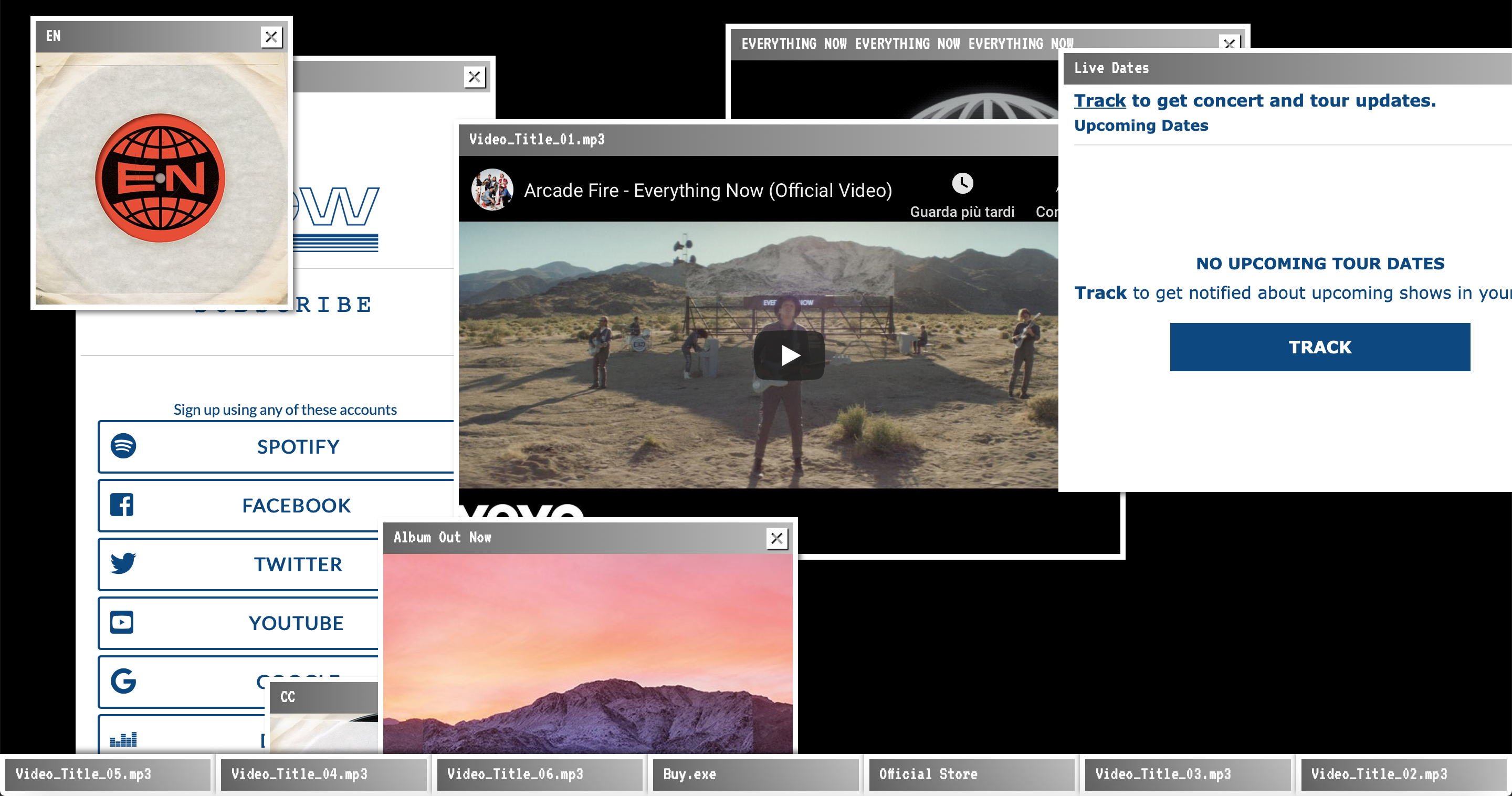 The website for Arcade Fire‘s album “Everything Now” takes the form of a series of Windows 98 style pop-up windows.
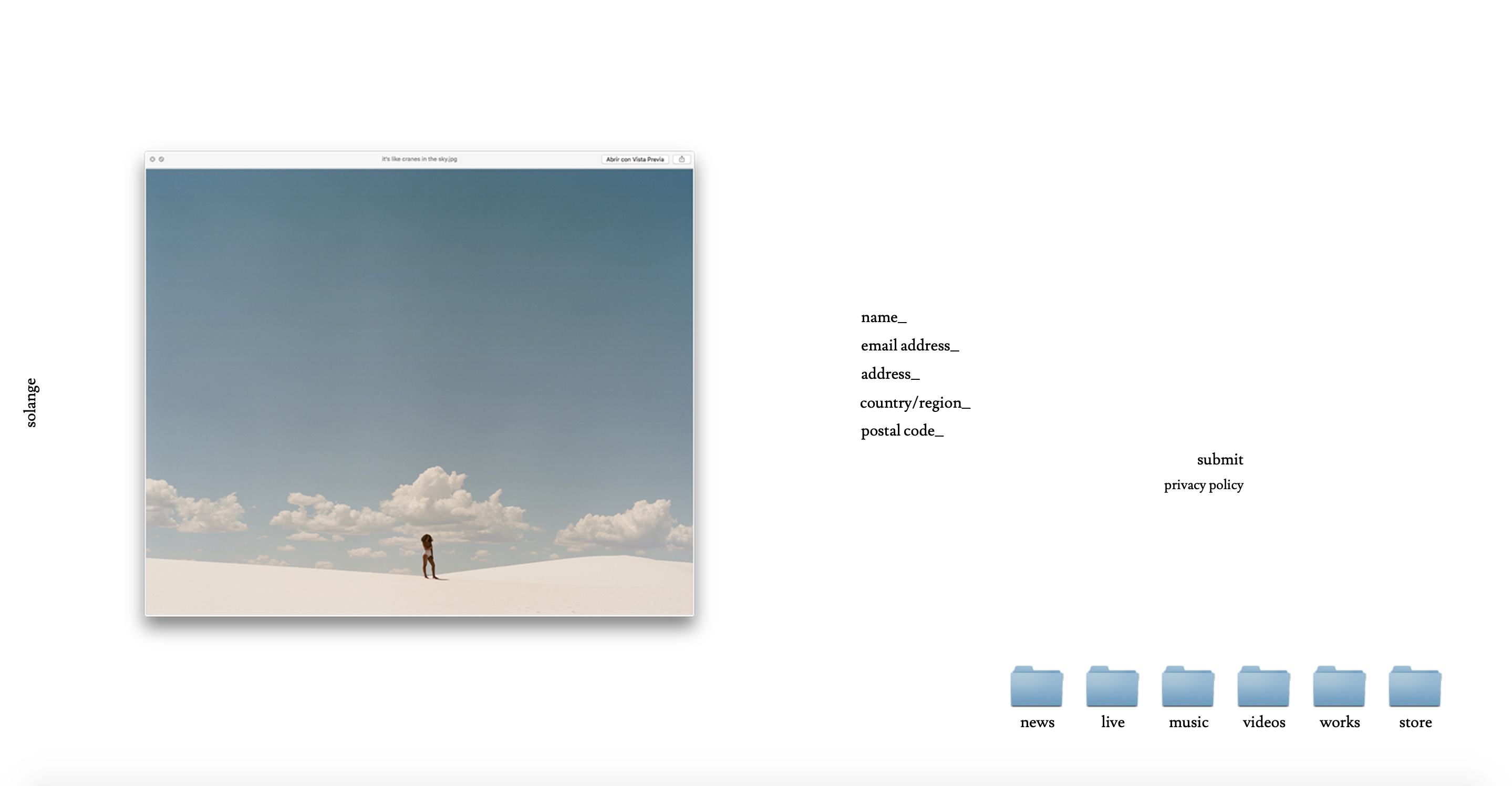
The homepage for Solange’s website looks like the desktop of an iMac G3 with its QuickTime windows and folders.
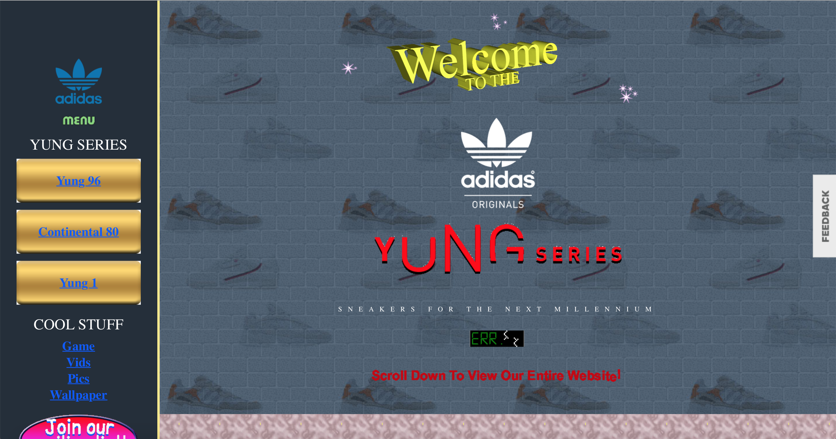
To promote the latest additions to the nineties-inspired Yung series, Adidas has created a site that revives the questionable aesthetic that reigned in the early days of the Internet, complete with oversized gifs, busy and repetitive backgrounds, pix art, system fonts, “under construction” banners and a visitor counter.
Rave Culture
At the end of the 1980s, a new musical genre emerged from Chicago: acid house. At the beginning of the 1990s, it quickly caught on and spread to the UK and Europe, where it was played to revellers everywhere from clubs to warehouses, from basements to forests, very often illegally. The term “rave” came to be used to describe the subculture that sprung up around the acid house movement.
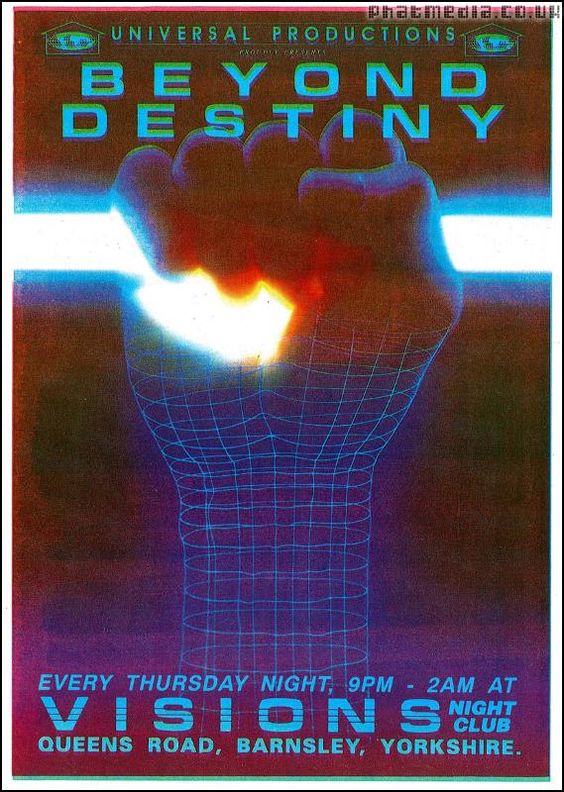
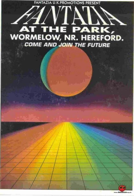
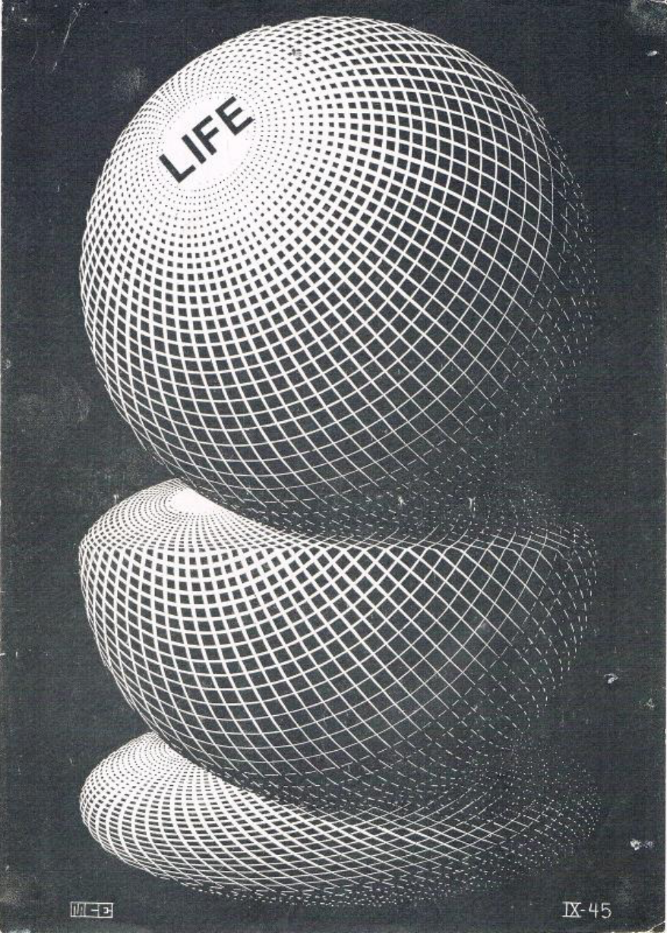
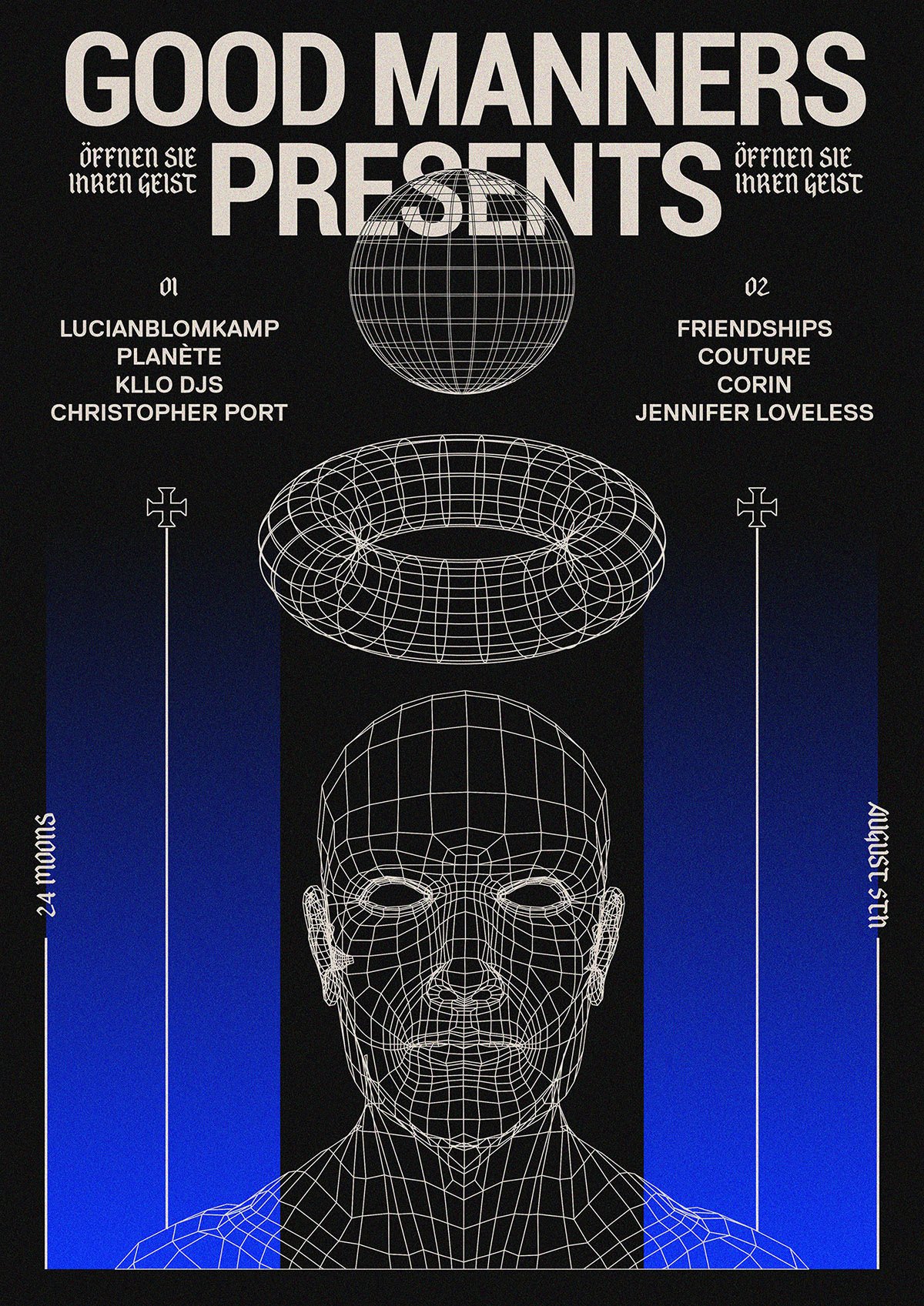
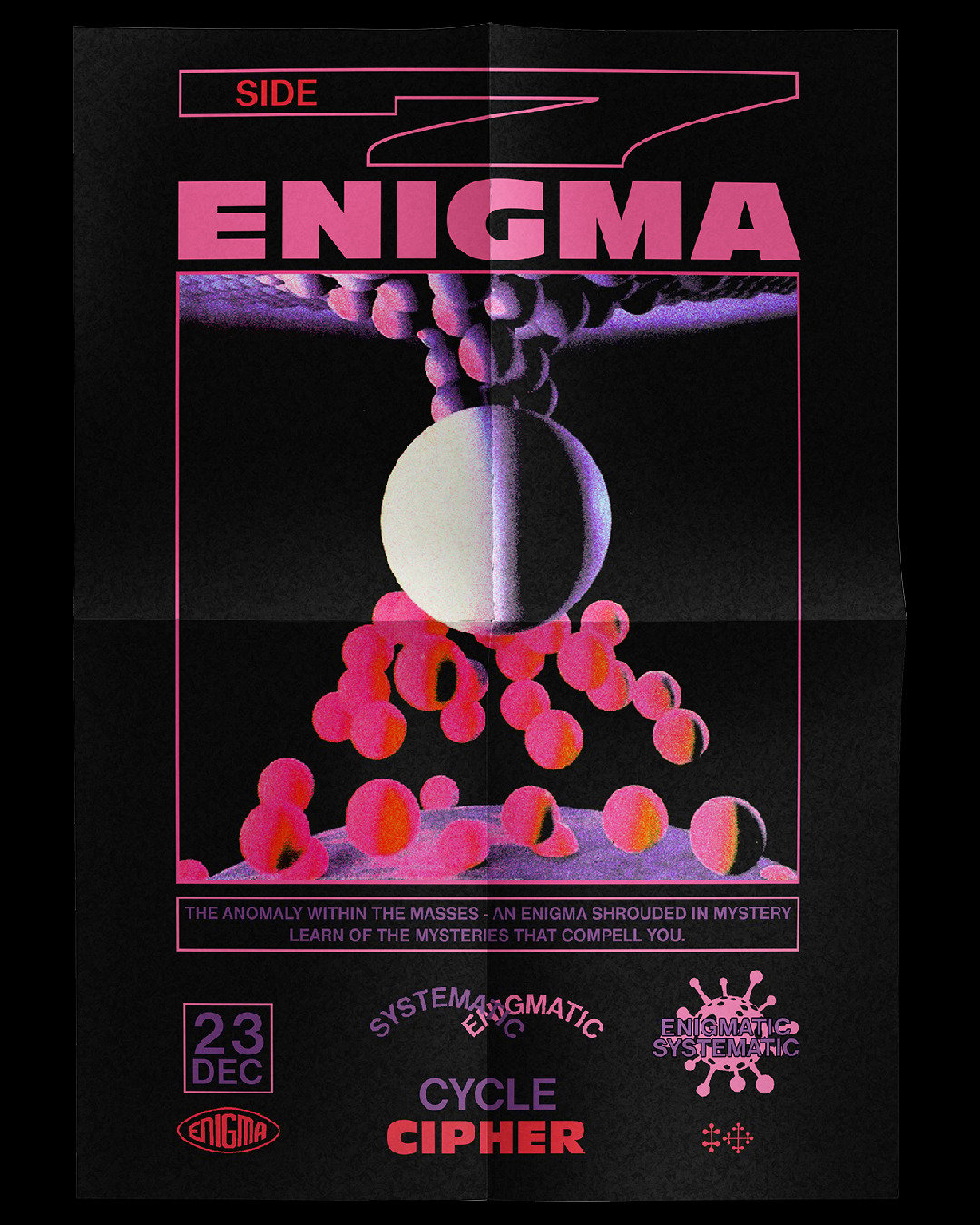
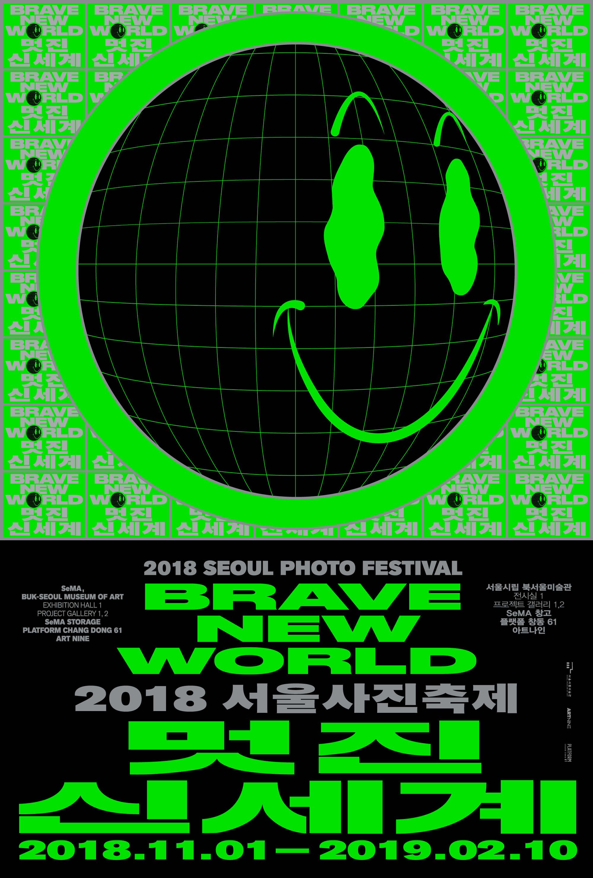
The only way to promote these events, other than by word-of-mouth, was through flyers and invitations. These developed their own very particular style that was spontaneous and eschewed convention. Typography was bold with block letters designed to be legible even while under the influence; colours were garish, backgrounds dark and gloomy, while patterns were often inspired by science fiction and surrealism, even at times borrowing from artists of the calibre of Escher.
The graphic language of rave culture has aroused the interest of many designers of late. On British designer David Rudnik’s website, you will find a collection of posters and graphics from the nineties that have inspired his work.
Ruben Martinho’s Well Wishers 88 project has generated a prolific output of posters and graphics in which you can see the influence, albeit reinterpreted, of iconic flyers from Fantazia, Dreamscape and Perception.
VHS, cassettes and Walkmans
Some items that were commonly used in the 90s but are now obsolete, especially pieces of technology, are today almost fetishised. The digital native generation in particular, never having used them in the past, sees them as a novelty. One such example is the audio cassette, sales of which are growing at an annual rate of 90%. At Urban Outfitters, you can find Walkmans and a wide selection of cassettes from contemporary artists alongside AirPods and Bluetooth speakers.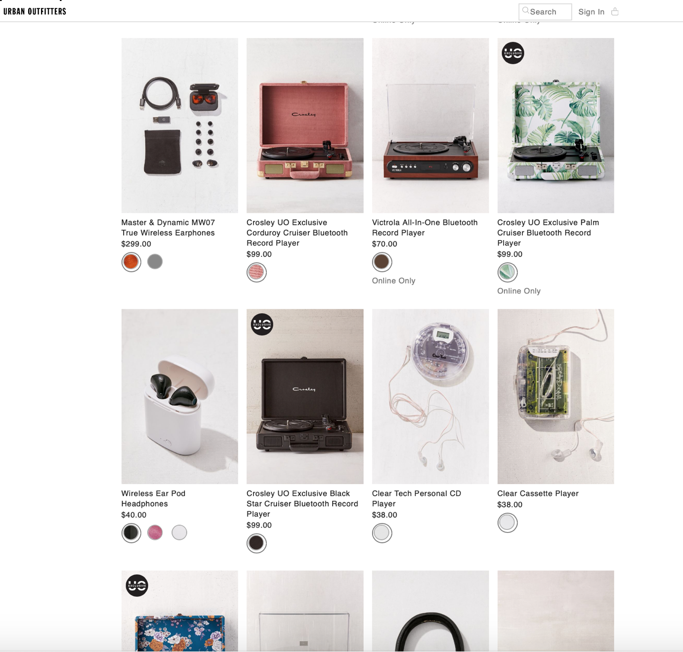
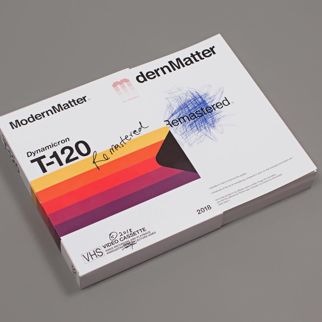
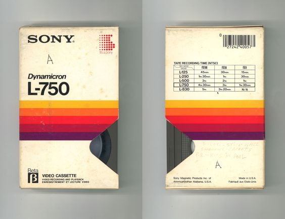
VHS (video tapes) are not seeing the same commercial revival today, but remain a source of inspiration from a visual perspective. The instantly recognisable graphics of blank VHS tapes have quietly become a classic of nineties design. Rainbow-like bands of colour, grids, sans serif fonts… The rules of composition were few and the variety of designs produced most inventive. Matthew Jones has collected and identified 400 different designs, dividing them into categories based on style.
For the latest edition of art and fashion magazine ModernMatter, Remastered edition, an issue dedicated to the art of “remastering” rendered through printing, the cover is a clear reference to blank VHS tapes.
This is just a little taste of the graphic world of the 1990s. Now sit back and marvel at how today’s graphic designers, creatives and advertisers reinterpret and recycle this aesthetic in the coming months.

