
Table of Contents
The logo for a company that sells bags made from recycled materials The logo for a firm that manufactures detergents with natural ingredients. The logo for a brand that makes clothes using sustainable processes. And the logo for a business that produces meat substitutes.
That’s what we’ll be talking about in this article: logos for businesses with the environment and sustainability at their core. “Eco logos”, “eco-friendly logos” or “green logos”. We could describe them in many different ways, but all these labels would be misleading. Because, in fact, such a category doesn’t really exist, and there isn’t a handbook for designing a logo that draws attention to green issues. So, then, what will you find below? Examples of logos that inhabit this world, that tell a compelling story and that show that a “green logo” doesn’t necessarily have to use the colour green.
A quick note before we start
Without overthinking it, imagine for a moment the generic logo for a firm that is environmentally conscious. How do you picture it? Green, with some natural elements and a soft, organic shape. Right?
The vast majority of logos that promote a sustainable message have these characteristics. In recent years, with the growing awareness for environmental issues, these types of logos have sprung up like mushrooms, often with very little difference between them. So now we’re faced with lots of logos that look the same, that don’t tell us anything about the brand and are just big green signs saying: “sustainability is good!”
Today, we’re put together a selection of logos for companies in the sustainable world that paint a compelling picture, albeit not necessarily in shades of green. Let’s take a look at them together.
Meow Meow Tweet: a fairy-tale logo
Meow Meow Tweet is a small firm that makes skincare products using vegan, organic and sustainable ingredients. What struck us about the brand is its fresh, witty and bold visuals and beautiful illustrations. A visit to its website takes you into a world populated by happy little animals that seem to be straight out of a fairy tale. And the logo? Two speech bubbles containing an exchange of quips between a cat and a bird. Through the metaphor of the fairy tale, the logo and visuals are saying that a better world is possible.
Lush: a distinctive logo 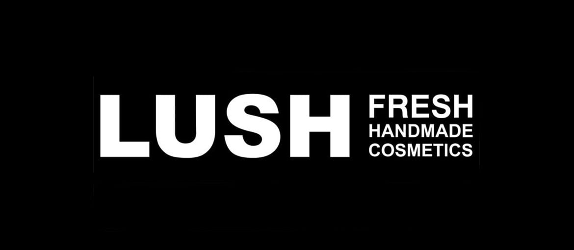 Lush creates cosmetics and body-care products with ingredients that are natural and, where possible, organic and vegetarian, taking care to reduce packaging in the interests of the environment. The logo? A hard, sans serif font. It’s modern and minimalist. A logo like this tell us it’s a young brand that’s on trend. Lush opts for black, a colour that goes against the grain of the green cosmetics world, but otherwise the brand has no interest conforming: it wants to stand out. And its logo proves it.
Patagonia: a logo that orients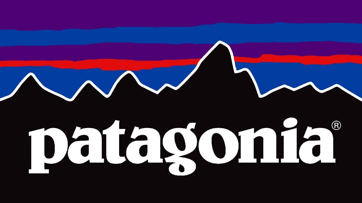 Patagonia produces clothing for outdoor activities. The brand is famous for its commitment to the environment. Indeed, as this article in Business Insider explains, in 1986 founder Yvon Chouinard “committed either 1% of sales or 10% of profits, whichever was greater, to environmental activism”. 72% of the materials used by the company are recycled, organic and traceable, and it uses sustainable production processes. But the distinctive character of the brand, and what made it so popular, is this: Patagonia redefined the look of sportswear (particularly mountain wear), which in the eighties was dominated by soft colours like beige, olive green and brown. To appeal to outdoorsy types and regular folk alike, Patagonia decided to adopt a vivid and bold colour palette that included bright red, turquoise, electric blue and purple. The same colours feature in its logo: the skyline of Mount Fitz Roy (which lies in Patagonia) is depicted in strong and loud colours. The same colours can be admired in the Patagonian sky when the sun sets, as well as in the brand’s collections.
Beyond Meat: a logo with superpowers
Beyond Meat produces plant-based meat substitutes. The company’s stated missions are to “improve human health, positively impact climate change address global resource constraints and improve animal welfare.” The Beyond Meat logo is the silhouette of a bull wearing a fluttering cape. That cape reminds us of a superhero’s costume: in this company’s story, the bull isn’t the sacrificial victim but the hero. Using an animal in the logo of a firm that produces plant-based foods might seem like a curious decision. But Beyond Meat is actually telling us that its products have the same taste as meat. And if you look a bit more closely at the cape, you’ll realise that it’s shaped like a leaf. So the brand’s entire story is contained in its logo. Nice work!
Freitag: a tough logo Freitag uses recycled raw materials to make its bags and backpacks. Old truck tarps are recovered and transformed into products that are sturdy and long-lasting. On the Freitag website, you’ll also find the S.W.A.P. section where you can swap Freitag bags with other customers instead of buying a new one, without spending a penny. You can’t get more sustainable than that! And the logo? It conveys solidity and sturdiness, characteristics that we find in their products. Sustainability isn’t completely absent from the logo, but rather is evoked through a specific attribute that’s also found in the products: toughness, which ensures a long life and reduces waste.
Alce Nero: a logo that embodies the company’s ethos
Alce Nero brings together Italian farmers and smallholders from South and Central America to produce organic foods. They are, as they proudly call themselves, “organic pioneers”. Back in the seventies, they were one of the first firms to speak out about green issues, very much swimming against the tide compared to the other brands in the market at the time. Perhaps the most enigmatic of those we’ve seen today, the brand’s logo represents: “The Black Moose, spiritual leader of the Sioux Oglala tribe, [who] rides in the opposite direction, carrying his message with great strength to other lands, beyond borders and beyond limits, because new and innovative visions are always possible.”
So, we’ve seen how a more creative and more personal “green logo” is possible. As, indeed, is more sustainable consumption.