

Table of Contents
What are grids?
Grids help give your page balance and structure. They make it very easy to align elements within your design and make it much simpler to work out where to place things. Web designers usually work within grids so their pages adapt correctly for different size devices, but not all print designers always use them (dependent on what they are designing).
Parts of a grid
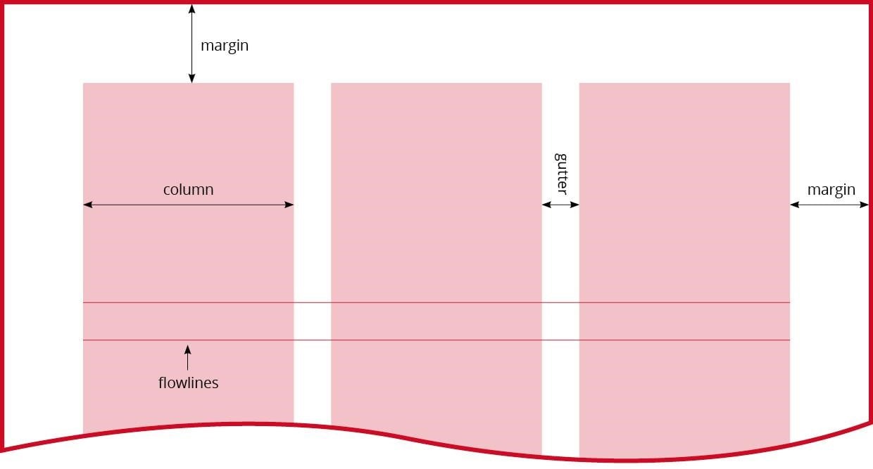
A grid is made up of several parts:
- Columns – These are the vertical divisions of space which break up your page.
- Gutters – The space between columns.
- Margins – This is the space between the edges of the page and your main content area.
- Flowlines – These are lines which break your page up horizontally.
- Modules – These are the blocks/areas that are created between your vertical column lines and horizontal flowlines.
Why use a grid?
I remember when I began using grids more and more in my work, I noticed how much quicker I could lay out a page. They really help you to keep your design organised and structured. They remove some of the decision making out of design, as you can easily see where an item should line up. They are especially useful when you are designing text-heavy documents like magazines or reports, where you need consistency. If you are working on a project with other designers or to corporate guidelines, a grid ensures that your designs will all have the same structure.
Types of grids
- Manuscript grid – This is a very simple type of grid made up of one column.
- Column grid – A column grid is really useful for breaking up text when otherwise it would be too long to read across a page.
- Modular grid – A modular grid is a grid made of blocks of content.
- Hierarchical grid – This type of grid is set out where content is structured in order of importance.
Manuscript grid

A simple one column grid, which can be used if you are laying out a book/manuscript. The only aspects of this grid you can really change is the size of your margins and the column width.
Column Grids
A column grid is probably the grid most commonly used. How you set them up can make a vast difference to how your page will look. For example, if you are working on an A5 document you are probably not going to want to split your page into more than 2 or a maximum of 3 columns. Any more than this will mean your lines of text will be very short and hard to read. The optimum line length of text for readability is 50-60 characters per line. You can obviously go above and below this figure, but if you push it too far your text will be difficult to read. Newspapers use column grids as it allows them to fit more text in an area. The more columns there are the more text that will fit. But, if the columns become too small they are hard to read.
The size of your margins and gutters on your page grid can make a real difference to whether your page feels light and airy or crammed together.
Sometimes when designing a document you might want to double the number of columns you might otherwise use. For example, if you were working on an A4 page and were thinking about a 3 column grid you might want to go for a 6 column grid instead. This gives you a lot more flexibility in your design. You can still create text that goes across 2 columns as though it was a 3 column grid but now you have the option to line up inset photos, captions or graphics across single narrower columns too.
Asymmetrical column grid
There’s no reason your columns have to be equal either. You can choose to make your columns asymmetrical. For instance, you might always want to have some words in a narrower column and then your main body text in a wider one or vice versa.
Baseline grid
When you are working with column grids on text-heavy documents like magazines, you might also want to consider using a baseline grid. A baseline grid is an invisible horizontal grid that goes across your page. It can be set up at different increments, but you would usually choose an increment the same as the leading on your body text. In software such as Indesign, you can then lock things to your baseline grid. This means that Indesign will only allow your text to line up with one of the grid lines. While it can be extremely useful for lining everything up, it can also sometimes be tricky to use as it is a very rigid structure.
If you want to take things even further you could even tilt your grid to make your design more dynamic. Although I would probably use this sparingly for feature pages rather than a whole document as it will be harder to read.
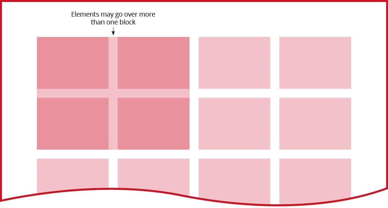
Modular Grids
Just like a column grid, a modular grid can have columns gutters and margins, but a modular grid is also broken up vertically into equal sections with horizontal gutters. One of the most common ways you might use a modular grid is for a selection of images. But you don’t have to just put one image in each of the boxes you have created. Some of your images may span several boxes to create more visual interest. Modular grids don’t just have to be used just for images though, you can also use them to organise text or other graphics.
Creating a grid with hierarchy
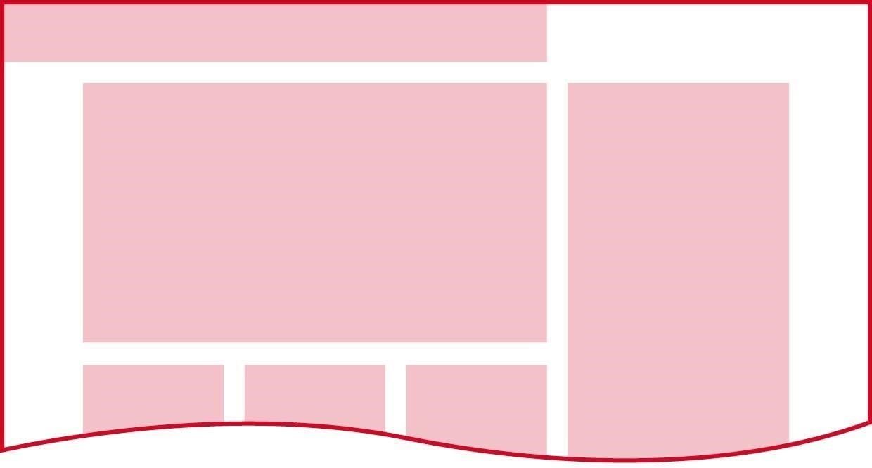
If you’ve ever seen a product catalogue page, you have probably seen a hierarchical grid. These pages often have a key product, the “hero” product which the company are keen to promote. This product will be in a larger section of its own with much larger areas for product titles, image and information than other products. A hierarchical grid can be used to ensure all these elements are always placed consistently on every product “hero” page.
Sketching out grids
When you’re designing something, for example, a magazine layout, you may find it useful to sketch out a thumbnail grid before you start. Imagine you had drawn a page with a 6 column grid. You can now consider the elements you need to place on the page and experiment sketching them out on the grid. It makes it a lot easier to work out where to place the elements so they will balance.
Breaking the grid rules
Just because you are using a grid for your design does not mean you have to rigidly stick to it. If you feel that an element works better not aligning with the grid, then do it. The purpose of the grid is to create structure, but you shouldn’t let it stunt your design flair.