
Table of Contents
We’re used to designing graphics, to seeing and evaluating them. We’re used to touching paper and assessing characteristics like weight and colour. We’re used to thinking about formats, products, content, photos and packaging. We’re used to checking and judging print quality. But rarely do we stop to think about the inks that bring graphics to life on paper.
Inks make printing vivid and visible.
Yet we know little about them and even less about how to assess them and understand their impact on the prints that we produce.
If you’ve ever visited or worked at a printer’s, you’ll know that inks are generally the preserve of machinists, the specialist employees who operate the printing presses. When you work with inks, you get messy, messier than a painter and decorator; when you do graphics, at worst, you get messy at lunch.
In this short article, we’ll give you a quick overview of the inks used by Pixartprinting to provide the best quality possible to its customers.
When it comes to inks, the first important distinction to make is between small format and large format printing: small format involves offset or digital printing on paper, while large format involves digital printing using different inks that must be suitable for substrates made from various materials.
Small-format printing
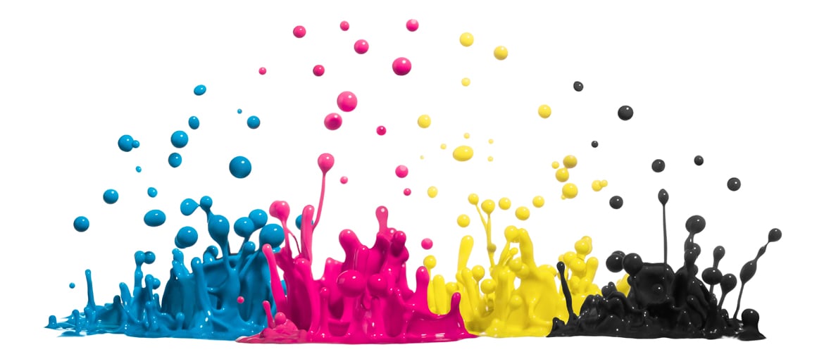
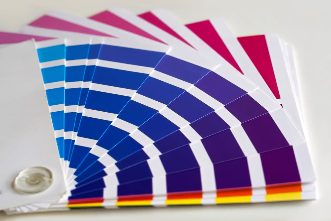
Offset printing does not use Pantone or other types of spot colours, but instead uses the four-colour model (CMYK).
UV inks with photosensitive pigments may be used for finishes.
For digital printing, we use the HP’s EPM (Enhanced Productivity Mode), which can use just three inks (CMY) and generate black (K) by overlapping all three inks.
Large-format printing
Here things get a little more complicated because some large-format products are used for exterior advertising, so we use UV inks that are resistant to sunlight.
We also offer special finishes (generally applied to specific areas of the substrate, defined by the customer with a vector path in the print file) by adding polymers to inks, which allows us to create 3D effects and gold or silver coatings.
For printing on Plexiglas, a transparent substrate, we use white ink.

Advice
To wrap things up, here are a couple of useful tips for preparing your print file so you get the best out of the inks used.
Firstly, create texts using solid black (100% or 100K); black is often overlooked when using programs like Word because they don’t offer colour management tools.
Secondly, for graphic products in general, ink saturation should never fall below 5%; in other words, don’t make colours that are too light, especially greys, otherwise they may not be visible on the paper.
Happy printing!