Organic snacks have become a hugely popular category in the food sector in recent years, so creating an ownable brand that stands out is essential for survival. So, when Livio Bisterzo, founder of Green Park Holdings, a food innovation company in the health and nutrition sector, developed a new product, he commissioned Jones Knowles Ritchie (JKR) to devise the brand personality.
Tosh Hall, JKR’s Global Executive Creative Director, notes, “He approached us with a new product technology for creating organic chickpea puffs and the idea of making snacking not only good for you and but also good for the earth. He had a concept, a name, and a desire to not just be another small food brand, but rather to have big impact and touch people across the globe.”
In other words, be a category disruptor, not a follower. The JKR team is quite adept at creating campaigns that resonate for clients like Budweiser, Kashi, Stella Artois, among others, so when evaluating this brand’s attributes, Hall and his team didn’t rely on existing competitive data for visual guidance. “When we start any project, we familiarize ourselves with the category, but don’t really look left or right to see what others are doing. We concentrated on what is unique and ownable to our brand,” he explains.

It was determined Hippeas’ primary consumers are millennials, who are deemed, “modern day hippies” and care greatly about what they put into their bodies and how their buying decisions impact the world at large. JKR developed fun, quirky messaging specifically targeting this group like “Peas and Love” and “Give Peas a Chance.” Hall says, “When your product is a very cool chickpea puff, it’s hard not to embrace a clever turn-of-phrase.”
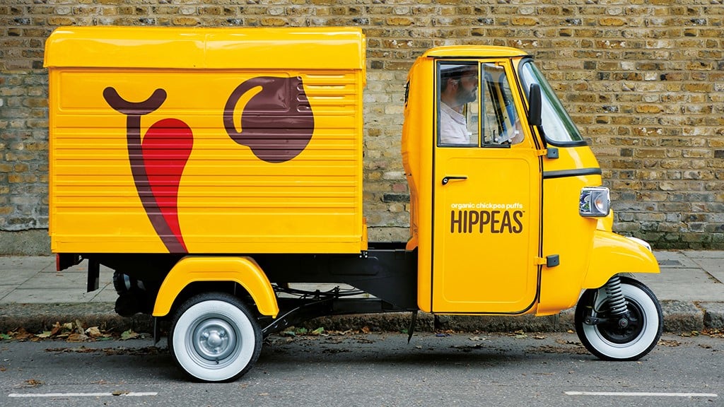
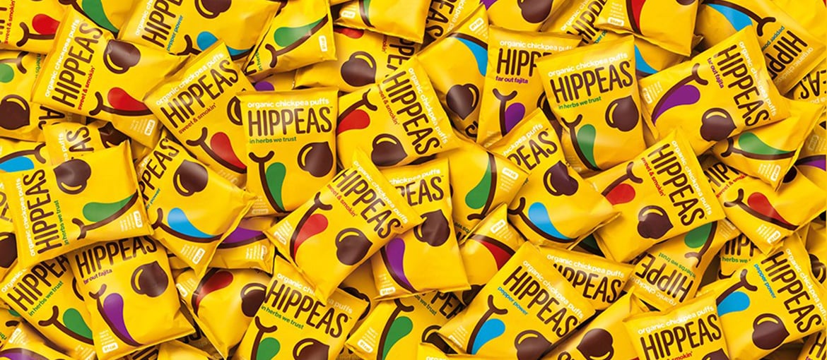
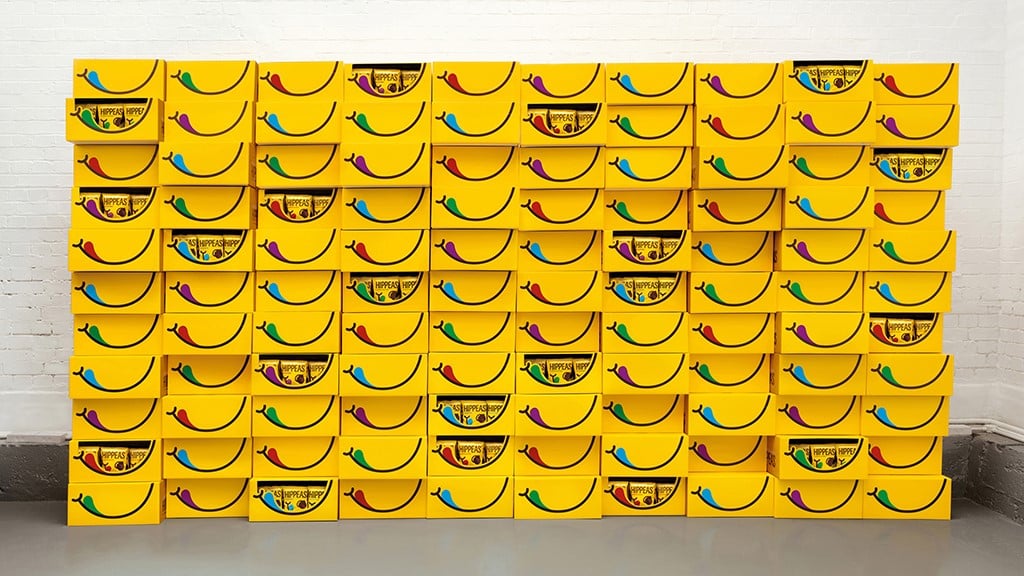
The JKR team worked closely with Bisterzo to create delectable flavor names that also resonate with an earth-loving crowd—Siracha Sunshine, Far Out Fajita, Maple Haze, and Pepper Power. But what really sets this brand apart on the shelf is its colors, since most organic, health-based brands tend to favor natural, earthy palettes. ““We deliberately wanted to stand out from the crowd of ‘organic’ looking things by being bold, colorful, and hopefully creating a bit of joy for consumers,” Hall says. “The color palette was developed to reflect the bright pop colors of the hippy era more than directly relating to flavor. We were able to create a distinctive system for each product.”
The final design solution is so simple, and it works effortlessly across all the brand materials. “We presented a small range of ideas, but only recommended the route you see in market. The difference between the original sketch and the final design is very minimal,” Hall notes, adding, “The best part of this project was how much the client trusted our team. He was a great partner on this project.”
Hippeas has had a phenomenal launch, and the brand is resonating with its audience both online and in stores. A unique selling point of the product is the “giving back” aspect. Hippeas has partnered with Farm Africa, so for every pack sold, a donation goes to farmers in eastern Africa to support their efforts to grow themselves out of poverty and build more prosperous lives. The product has come full circle in its efforts as a fun-loving, sustainable snack food.