Table of Contents
Today, we’re talking about a company whose products we’re sure you own, even if it’s just a little pencil for taking notes. We’re talking about IKEA, telling the story of one of the most successful business ideas ever and looking at how its logo has evolved over time.
How was IKEA born?
It’s no accident that we mentioned pencils at the top of the piece, because the story of this company starts with stationery. Everything began in Småland, a historical province in southern Sweden, the land of Ingvar Kamprad’s birth. In 1943, at just 17, this savvy teenager decided to start a company selling pens, wallets, picture frames and the like. He called it IKEA, an acronym created from the initials of his name and surname together with those of Elmtaryd and Agunnaryd, respectively, the farm and village where he had grown up.
For those unfamiliar with the area, a quick note about Småland: it’s a remote and rocky region that’s not easy to travel across. The constraints imposed by its lack of connectivity to large cities were what inspired the young Ingvar Kamprad to devise innovative solutions. Foremost among these was the IKEA catalogue, invented to promote the firm beyond the Småland region. The first catalogue was published in 1951, by which time the company had already started selling home furnishings.
Leafing through a copy today, we would find fifties-style furniture with a sophisticated design and truly competitive prices – features that continue to define the brand.

However, the real innovation lay in the way that products were delivered. The famous “flat packs” were in fact an invention “Made in Ikea”. And, once again, the idea was born out of a constraint: the difficulty in shipping large pieces of furniture economically. Which led to eureka moment: in 1956, IKEA started selling disassembled furniture in flat packs, as it still does today.
The evolution of the IKEA logo
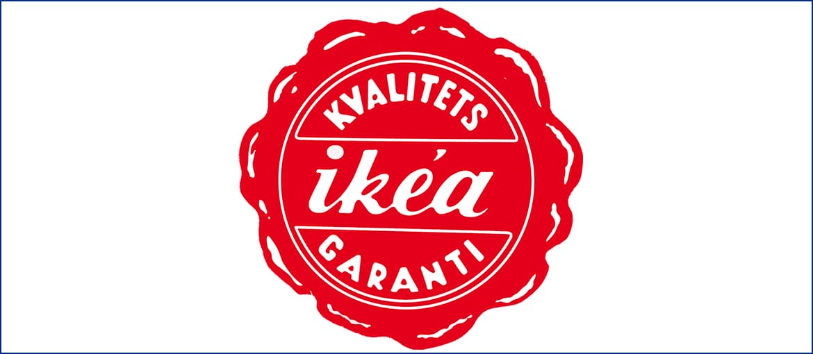
We’ve just seen how flat-pack shipping was one of IKEA’s greatest innovations. This explains why the 1951 logo looks like a claret-coloured wax seal – in the olden days, a seal was used to secure important letters and valuable parcels before sending. In the centre, we can see the company name in italics surrounded by the Swedish phrase “kvalitets garanti”, which means “quality guaranteed”. And there’s a good reason for this: the company was still relatively unknown, its products cost little and catalogue sales meant customers were not able to assess the quality of the furniture with their own eyes before purchase. So, to avoid the association “low price = low quality”, IKEA sought to shape customer perceptions through the logo.
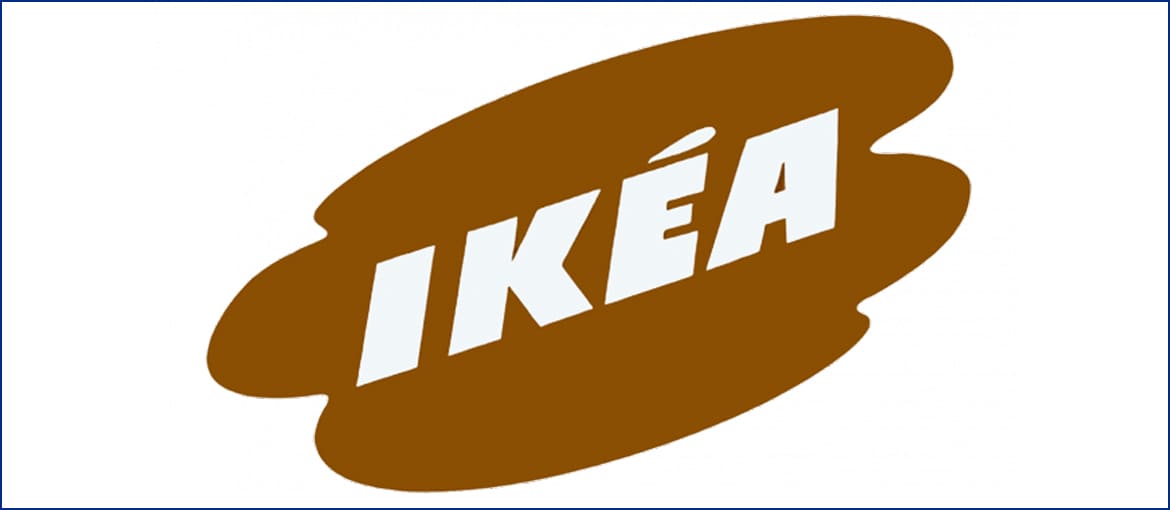
In 1954, the logo changed: the quality guarantee went, leaving just the company name inside an unevenly shaped patch of brown. Slanted diagonally to give a sense of dynamism, the lettering was written in block capitals using a very thick font, which emphasised the solidity of the company.
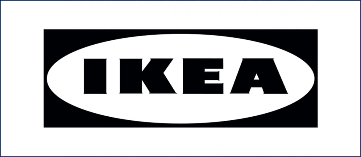
In 1967, IKEA adopted the logo that has remained almost unchanged to this day. It was the first outing for the two geometric shapes that are so familiar: the rectangle and the ellipsis. The colour scheme was black and white, and used a thick type face with sharp angles
As the years passed, the colours changed but the logo remained pretty much unchanged: after a brief flirtation with red (1981-1983), the logo turned yellow and blue in 1983. The colours evoke the Swedish flag, but that’s not all: yellow is the colour of positivity and energy, and inspires action; blue conveys trustworthiness and reliability, and has a reassuring effect.
Subsequent changes have been minor, almost imperceptible, and aimed at improving the logo’s legibility and reproducibility. Other than that, the logo has remained the same right up to the present.
Simplicity, immediacy, recognisability. These three words sum up the IKEA logo.

