
Table of Contents
You can be recognised as a “master” in a given field and still be alive: a case in point is Chris Ware, the American comic artist and cartoonist. Ware has hugely influenced comics with his extremely neat, meticulous and complex graphic style , and his stories of ordinary people told in an extraordinary way.
Ware is an author who makes highly creative use of lettering and text, which he skilfully mixes with images, so much so that his work is studied at some of the world’s most prestigious universities.
Early work and influences
Ware was born in Omaha, Nebraska: in his teenage years, he discovered Raw, Art Spiegelman’s comic anthology, which published experimental work by cartoonists like Robert Crumb and Charlie Burns, as well as avant-garde European comics by authors like Jacques Tardi.
Ware chanced upon the magazine in a somewhat amusing way, as he recalls in an interview with Charlie Rose: “I started reading Raw magazine (…) when I was searching (…) for pornography in the back room of my comic shop in Omaha, Nebraska. (…) There was a magazine sticking out of the back of a bin that said “Raw” on it and I thought, alright, this is it: I pulled it up but it was just like these weird European comics. I said, alright, whatever, and I bought it anyway, and that one issue changed by life”.
His first cartoons were published at the end of the 1980s on the comics pages of The Daily Texan, the student paper of the University of Texas. He continued to have his work published in various other titles before he was contacted by Art Spiegelman at Raw, which carried a number of his comics.
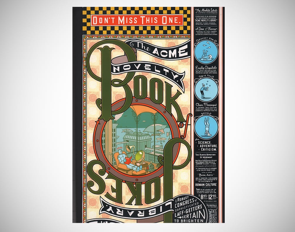
This experience gave him the confidence to explore new ways of drawing, as well as to experiment with printing techniques and self-publishing. He then started working on a his Acme Novelty Library series, which was published by Fantagraphics Books from 1993 to 2002, and subsequently self-published: with every issue, Ware challenged the conventions of comic-book publishing.
Ware’s biggest influences, other than Art Spiegelman of course, are early 20th century comics: from Winsor McCay with Little Nemo to Krazy Kat by George Herriman, to the underground comics of Robert Crumb and the timeless Charles M. Schulz, author of Peanuts and Snoopy.
These influences allowed Ware to draw on over a century of comic history to literally transform both the graphic and narrative vocabulary of the “ninth art”.
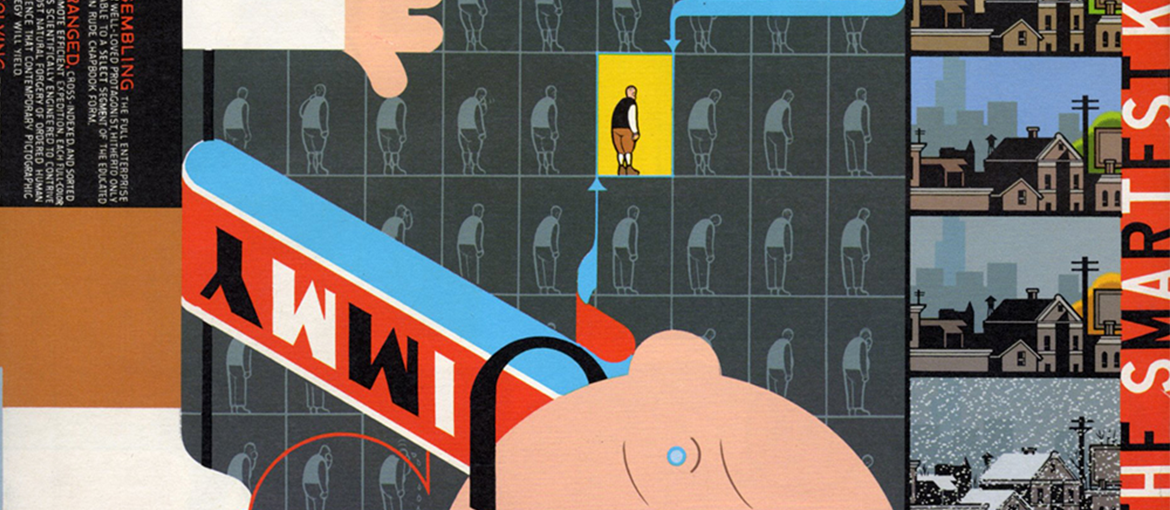
Jimmy Corrigan and the Chris Ware style
The year 2001 saw the release of Ware’s first major work, Jimmy Corrigan: The Smartest Kid on Earth, which immediately revealed his style and intention to create a true piece of art.
Seven years in the making, everything about it has been designed in the author’s inimitable style. The tale of an ordinary boy crippled by the fear of not being liked by others, it’s a typical Ware story: tinged with sadness, but very funny, it explores themes like social isolation, inner torment and depression.
This piece of work immediately made Ware one of the most important figures in not just the world of comics, but American literature too. His work straddles various genres and art forms: from the calligraphy of his meticulous lettering to graphic design, illustration and comic art. In 2002, Ware became the first cartoonist to be invited to exhibit at the Whitney Museum of American Art’s biennial show.
Chris Ware’s style comprises many different elements that are masterfully blended together:
- Ultra-clear lines: the people and buildings drawn by Ware always have clear outlines.
- Colours and backgrounds are always uniform, with little use of shading and textures.
- A page complexity that defies convention and requires reading and re-reading to grasp the many layers of meaning.
In fact, the pages of Chris Ware’s comics almost challenge the reader: for example, when reading Jimmy Corrigan, you have to keep turning the book vertically or horizontally, which creates reading experience that is always moving in different directions. The jumps in narrative and time are frequent, sometimes spanning generations, while the story moves in an wholly non-linear fashion.
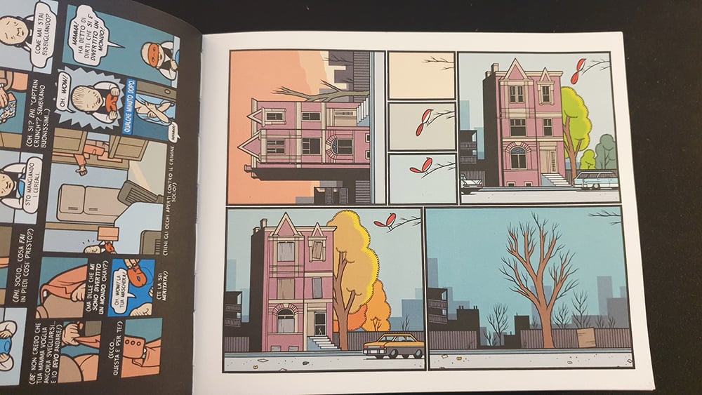
The complexity of Ware’s work can be seen in the smallest details, with some pages crammed full of panels.
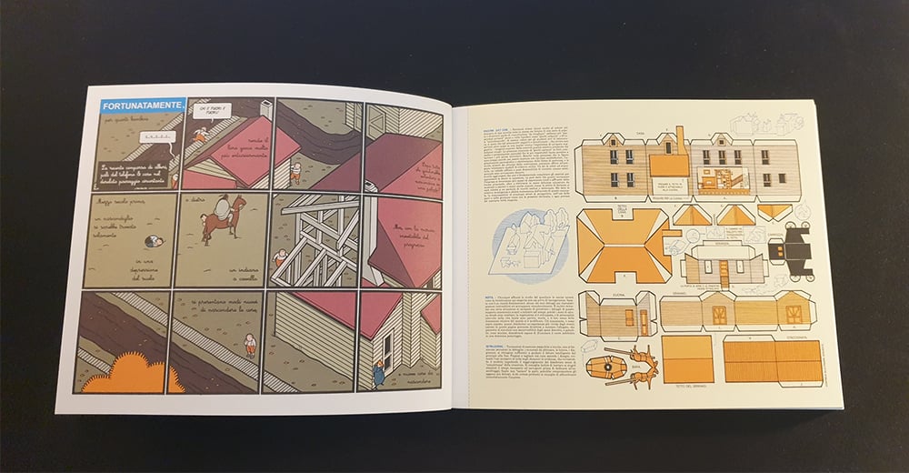
Comics as printed objects of art
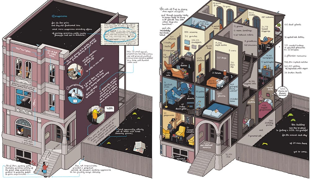
Recognition as one of the world’s most significant authors, and not just in the world of comics, came with the 2012 publication of Building Stories by Pantheon Books. It tells the story of an unnamed central character and others who live in a three-storey building in Chicago. But the tale is told in a rather unusual way: stories intertwine and the building itself becomes a character, with complex drawings that show the inside of the rooms on every floor.
It’s a monumental piece of work, which won Ware an Eisner Award in 2013, as well as a Harvey Award and the Special Jury Prize at the Angoulême Festival in 2015. It’s not just a comic book, but a box set containing a selection of printed pieces, from books to newspapers and posters.
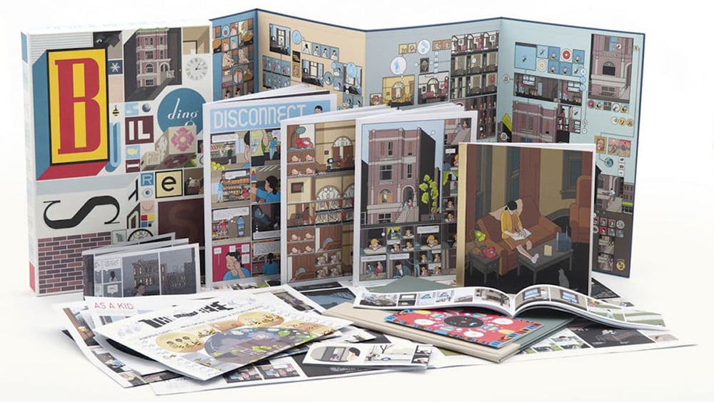
The work comprises 14 parts, each in a different format. Each part can be read in any order – in fact, Ware does not provide a set “path” to follow: once you’ve read them all, you’ll get a clearer picture of the story.
The plot switches between the past, present and future, which means the reader can read one part of the story, thinking it’s set in the present, only to realise it’s actually set in the past upon reading another part. There isn’t really an “ending” per se, but the non-linear structure of the story constantly brings to light new details and discoveries.
And therein lies the poetry of Chris Ware: Building Stories reflects on the ways that people remember their past and tend to rewrite memories in their minds.
Such is its importance that Building Stories has been compared by critics to James Joyce’s Ulysses and the novels of Calvino and Cortázar.
Monograph, Rusty Brown and The New Yorker
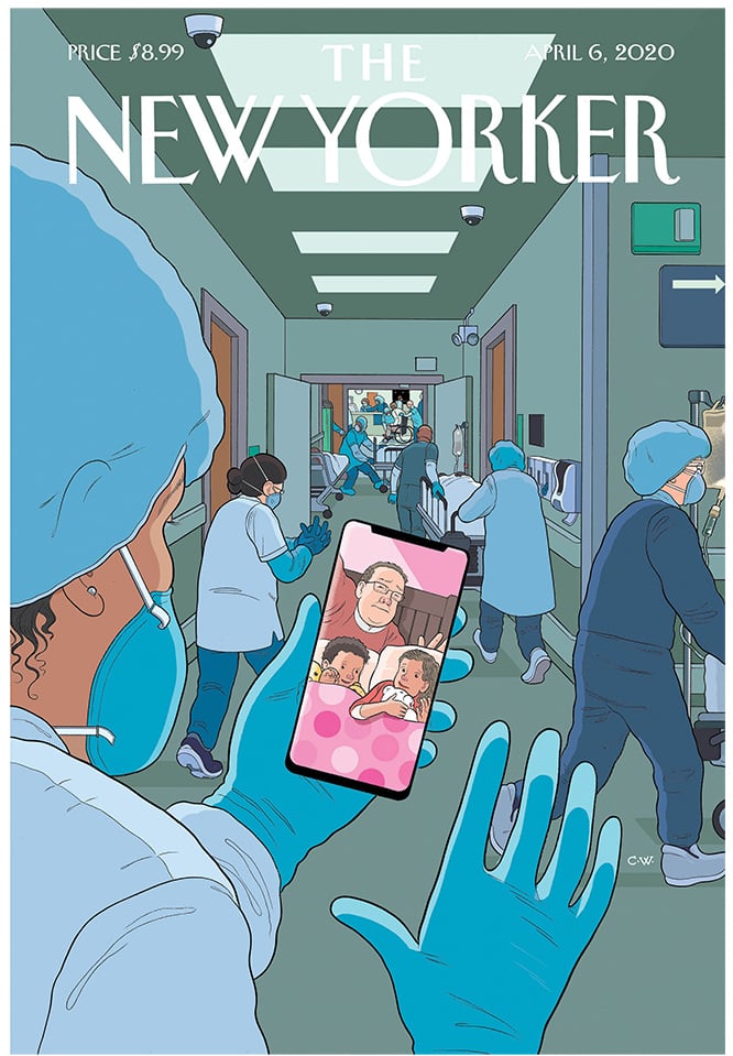
Ware has also written stories and designed countless covers for The New Yorker: since 1999, he has created some 25 covers for the magazine, including one recently during the pandemic. Telling many different stories in a single image, they are always rich in meaning and narrative layers.
The year 2017 saw the publication of Monograph, a huge volume in which Ware talks about his family, private life and art: this intimate account is probably one of the most complex books ever created, with images and drawings that literally merge into one another.
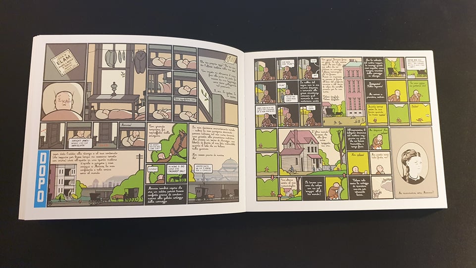
Chris Ware’s latest publication, Rusty Brown came out in 2019. His most mature work to date, it mixes graphic novel and comic book, and tells the story of characters living in a small, snow covered town in Nebraska.
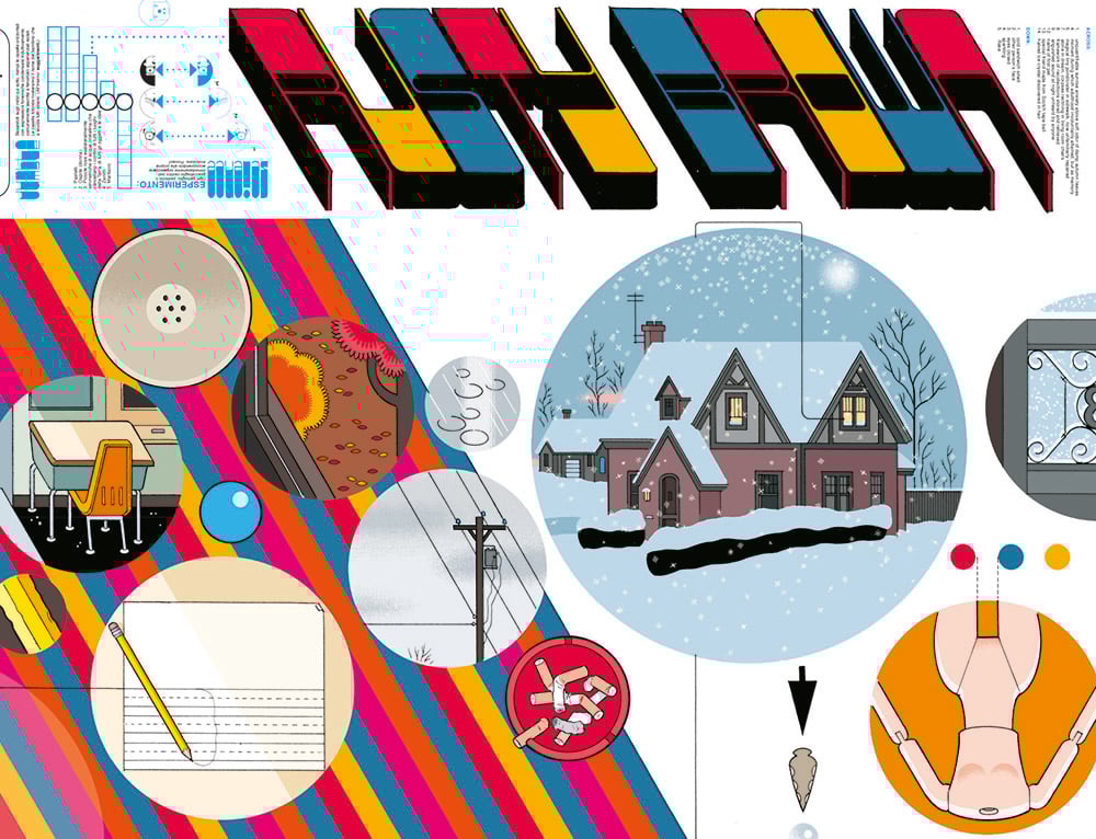
Parts of this novel were originally published in Ware’s Acme Novelty Library collection, but in Rusty Brown the story is continued and told with better narrative organisation. Indeed, this work cements Ware’s place among the greats, not just of comic art, but of American literature too.