
Table of Contents
Many designers and aspiring comic artists use Pixartprinting to print their stories and create an eye-catching portfolio with different artistic styles and sensibilities. Indeed, we live at a time when the variety in comic output has reached levels never seen before with myriad styles, genres and visions.
But comics aren’t the same everywhere in the world, as a side-by-side comparison of an issue Batman and Dylan Dog will show: the format, album size and page layout are all different, which influences the story and how it’s told.
In the United States, for example, they’re called comics, in Japan they’re manga, in Italy fumetto, while in France and Belgium it’s bande dessinée. Today we’re going to explore the world of Franco-Belgian comics, which is one of the largest and most influential markets for comics in Europe.
Our beginner’s guide to Franco-Belgian comics
How do you create a Franco-Belgian-style comic if, say, you’re putting together a portfolio to show publishers, or simply self-publishing your work?

First of all, you need to understand that underpinning the comic as a medium for expression are deep foundations and visual grammars that reflect the culture, history and society of a given country: these rules aren’t set in stone, but they do influence the approaches to storytelling, page layout and narrative time.
To get a better understanding of Franco-Belgian comics, we spoke to Saverio Tenuta, a comic artist who has worked extensively in France (with stints in the United States and Italy too): he’s the author of La Légende des Nuées Écarlates (Legend of the Scarlet Blades in the UK) and Le Masque de Fudo (in the UK, The Mask of Fudo), published by Humanoids.

The grammar of French comics and the basics of bande dessinée
The premise is very simple: a comic is made up of a number of essential parts, no matter where it’s from, namely:
- Panels: these are the single visual units of a comic, which contain drawing and dialogues. They are juxtaposed to create a comic strip.
- Grids: these are the structures that organise the panels on a page.
- Gutters: this are the white spaces between panels.
With the basics out of the way, it’s time to talk specifically about bande dessinée (BD), which literally means “drawn strip”. In France, especially for realistic releases, but also for some humorous bande dessinée, a very particular style is required, which is clean and tidy with stories that focus on adventure.
According Saverio Tenuta: “In France, the connection between the author and the character is much more intimate, especially compared with the American or Italian market: the reader can’t separate the author from the character and rarely is the world created by one author offered by another. As a result, it takes about a year to produce a book, so greater care and attention is given to the product, which showcases the author’s personality”.
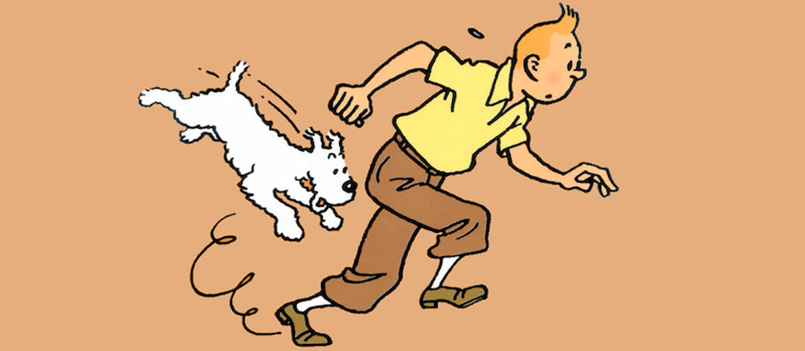
So many authors have shaped and influenced the world of Franco-Belgian comics over the years that it’s impossible to cite them all here. But among the greatest is surely Belgian Hergé with Tintin, the forefather of so-called “ligne claire” (clear line), a clean and clear style, in which every element of the panel is treated in the same way, in other words, using only clear strong lines and no hatching.
 On the left, a page from Tintin, squared and clean in classic Franco-Belgian style. On the right, The Airtight Garage, revolutionary in its structure and narrative because it is almost completely devoid of a plot.
Then there is the great Jean Giraud with the Blueberry Western series and, under his pseudonym Moebius, more experimental stories like The Airtight Garage and The Incal. And, of course, there is also a strong tradition of humorous comics, the best known of all being Asterix by René Goscinny and Albert Uderzo.
So, there are “conventional” approaches to Franco-Belgian comics, as well as people who have completely upended these.
The differences: graphics in Franco-Belgian comics
Now that we’ve seen a few examples of artists and work that have helped to define its aesthetic, it’s time to look at how the Franco-Belgian style is put together visually on the page.
Generally, in comics, the relationships between individual images are more important than the images themselves. The graphic design of the page, in other words, the number, position and size of the panels, is key.
So, it’s easier to understand the Franco-Belgian approach to layout by starting from the differences with other comic styles, such as the American style. Take a look at the two images below: the first page (on the left) is from Spider-Man Noir, a noir revisiting of Marvel’s famous superhero, while the second is the French series Cosa Nostra, which tells real-life American mafia stories that took place in the 30s and 40s.

These two pages show a scene in which the central event is a shootout. What immediately jumps out is the stark contrast between the layout of each page: the first, also aided by the events narrated, is hyper dynamic, while the second is very calm and contained. When we examine things further, we notice that on the first page, there are “only” five panels, while on the second there are nine, almost twice as many.
In Spider-Man Noir, the central event is positioned in the middle of the page, with a larger panel (the man shooting), without the slightest gutter, while the panels overlap with each other to provide continuity: everything happens in a matter of moments.
In the page from Cosa Nostra, on the other hand, we see the ambushing of one of the characters in the story: unlike on the first page, here we see that there is real “punctuation” provided by gutters that set the rhythm of events desired by the writer and illustrator. The page begins with a detail panel and the ambushers can only be seen through two other detail panels that hint at the events that are about to happen, without openly showing them.
“For France, the storytelling is important and everything needs to be smooth. The American style has more of a ‘wow’ effect; it has to hit you with big panels and then additional ones, while the French style has a much more precise reading direction: the panels must follow on from each other smoothly”, Tenuta told us.
So, in Franco-Belgian comics, storytelling is prioritised over spectacle for its own sake, with an emphasis on a carefully paced flow of images that guide the reader through the story.
The Franco-Belgian page and the finished product
The Franco-Belgian school has, over time, settled on a fairly square grid consisting of:
- 4 tiers
- 8 to 12 panels per page
- 46-page stories
This doesn’t mean to say that each publisher (e.g. Glénat, Delcourt or Dargaud) and author can’t have “their” own grid and way of working. Everything depends on the story and how they want to tell it.
That’s why there can be pages with three tiers and few panels (seven, for example) or with lots of panels (14-15): “In each case, it’s the proportions that change: the French grid is more squared compared to the American grid, which is longer and more vertical”, explained Tenuta.
But how is the drawing sheet laid out? Here, too, there isn’t a universal standard, but in general “there’s a grid that delimits the panels, then there’s the outer margin of the sheet. Also, there’s another outer grid in the page margin that is trimmed during printing and is bigger than the sheet by 5-6 millimetres”, says Tenuta.

In this example, the red rectangle represents the edge of the panel and the grid, while the green rectangle represents the edge of the page, in other words, where the sheet will be trimmed. Finally, the blue rectangle represents the outer grid that will be removed.
Why, on the original sheet, is there an outer margin that is removed during the printing phase? As Tenuta explains, it’s there because: “if the author decides to draw a panel that goes beyond the edge of the page, they aren’t then forced to draw right up against the edge of the page, which would be very awkward. So the author draws slightly beyond, that way they are certain that when the page is trimmed, that panel will go ‘beyond the page’, in other words, it will reach exactly the edge of the page”.
What format should be used for a French comic?
It’s definitely not A4, A3 or any other standard format. In fact, there aren’t any set dimensions used in the Franco-Belgian style, so the simplest and quickest approach is to use an album that’s already been published for reference (we used Blacksad), measure the page and mark the measurements on the drawing sheet (or photocopy the page and trace its grid), not forgetting the margins and cut line.
If, on the other hand, you prefer to draw “large”, i.e. at a scale that is bigger than the printed page, simply trace a diagonal line through the grid taken from the original page so you can maintain the right proportions.

The end product is usually printed in a high-quality hardcover and generally in colour. The standard French volume measures 24 × 32 cm with a 46-page story, although various different formats have been developed over the years (some with up to 60 or even 80 pages).
When it comes to printing, French albums are considered as books in their own right, so you might choose a hardcover with case binding to imitate this kind of album, while for a portfolio of individual pages or drawings, perfect binding, or staple binding may be a better choice.
We’ve reached the end of our journey into bande dessinée, a vast and richly varied world. Our advice is to read as many authors and stories as possible from this great tradition; it’s the only way to fully grasp its storytelling structures and techniques.