
Table of Contents
Love the shade of a flower in your garden or a handbag from your favourite brand? Well, you’re in luck: thanks to the Pantone Connect app and the Pantone Color Match Card, you can now find out their Pantone colour numbers in a matter of seconds. This nifty tool is ideal for graphic designers and colour obsessives alike.
The Pantone colour matching system
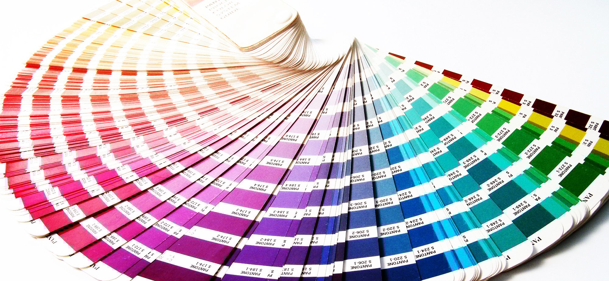
All creatives are familiar with Pantone, the most well-known and widely used colour matching system in the world. It was invented in 1963 to make it easier to match complex colours in the printing industry. The Pantone system soon became the simplest way to classify, communicate and match colours with its catalogue’s easy-to-use fan format. Every colour, in every tone and hue, was given a number. Pantone literally wrote the book on colour matching. For getting on 60 years now, the brand’s system has been an essential tool, not just for the design industry, but for paint, textile and plastic manufacturers too. What’s more, every year since 2000, the Pantone Color Institute has named a “Pantone Colour of the Year” at the beginning of December. It’s an announcement with far-reaching influence in society, from fashion to marketing, to social media and even politics.

The new tool for identifying real-life colours
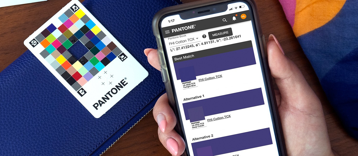
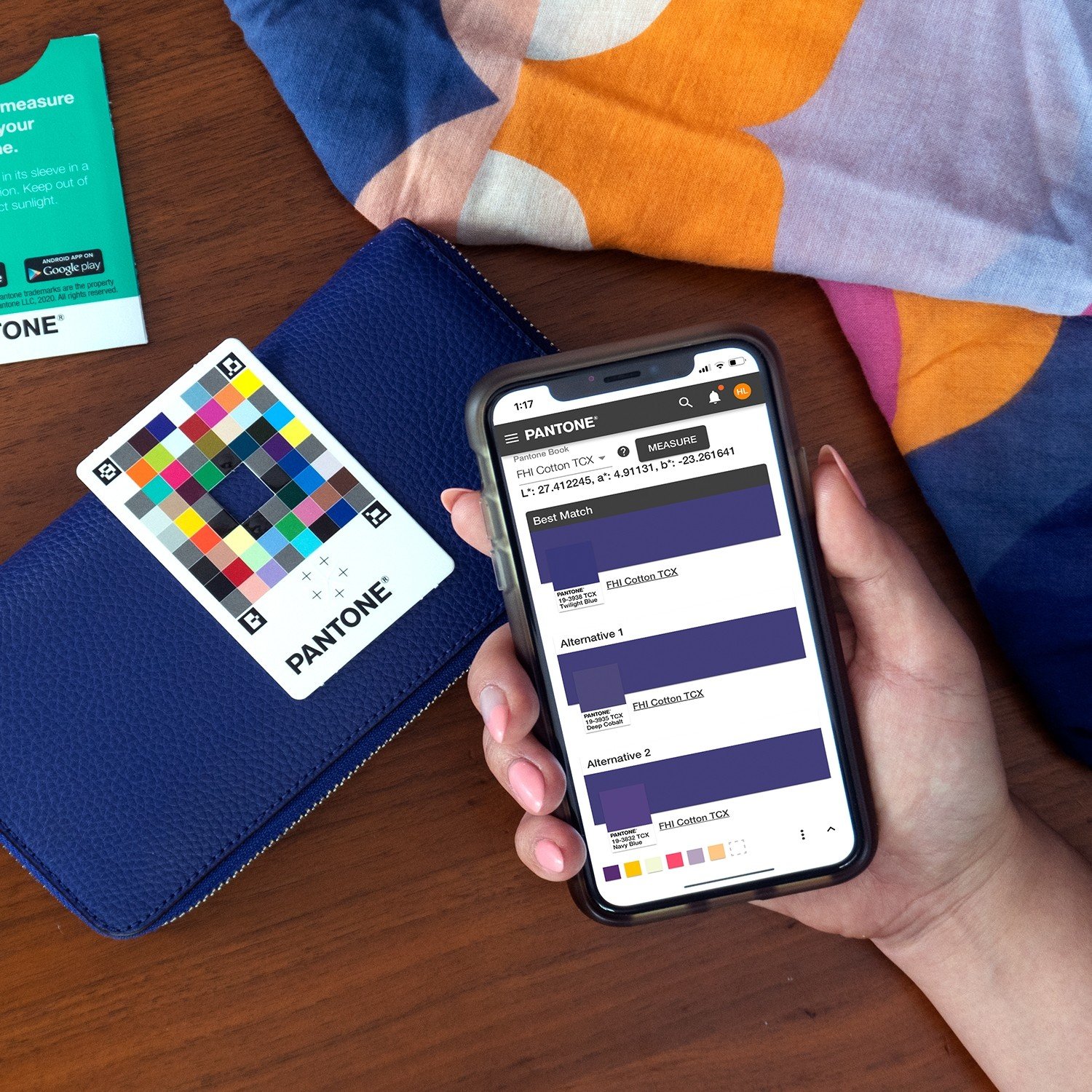
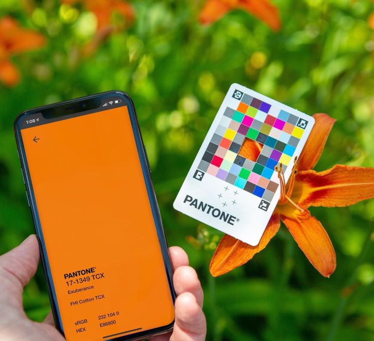
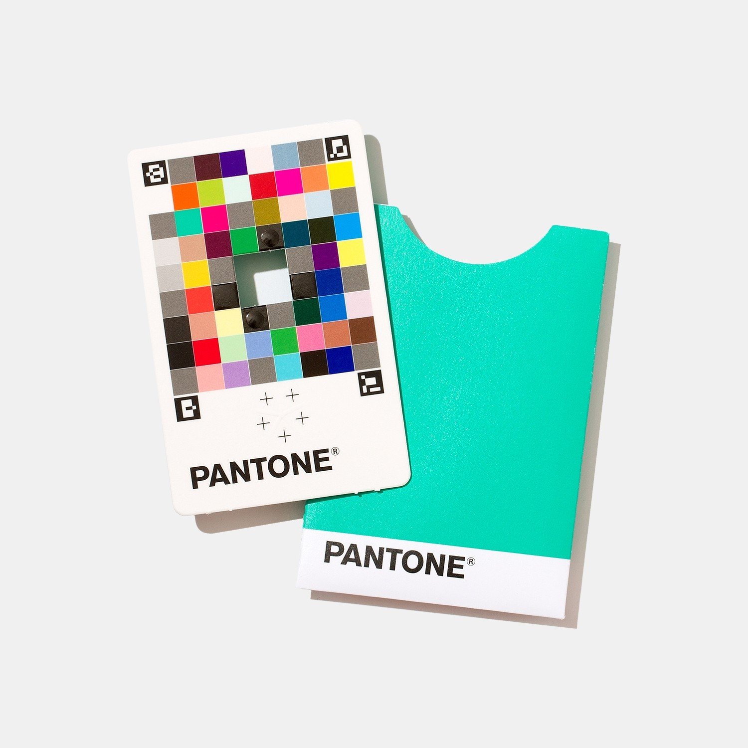
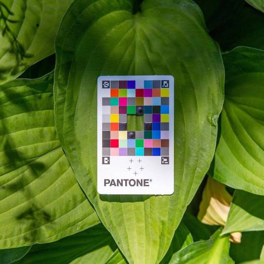
Today, Pantone has innovated once again by launching an app together with a physical colour matching card that lets creatives sample colours directly from real life. Indeed, while it’s easy to match a colour on a computer screen, it’s much more complicated to recreate the perfect shade of something real. Until now, to recreate an inspiring colour from the real world, you had to photograph the colour, then analyse and reconstitute it digitally. Problems with light levels and image quality meant that results weren’t always great. But now it’s easy to capture a colour digitally: with the Pantone Connect app and the Pantone Color Match Card, you can find the best Pantone colour matches with physical colour surfaces, objects and materials. The company even claims that, under the right conditions, the Pantone Color Match Card provides a far more accurate colour match than the conventional method for extracting colours from an image.
So, how does it work exactly?
The Pantone Color Match Card is about the size of a credit card. Printed with different Pantone colours and with an opening in the centre, this card is used as a benchmark. To match objects, coloured materials or surfaces to a Pantone shade, you simply place this card over the real-life colour that you want to capture. The colour is then measured with your mobile phone and the app using double lighting (flash and ambient light). The smartphone can then precisely identify this colour and the app gives you the matching colour in all current Pantone systems (PMS, FHI, CMJN, Skintone Guide). The colour can then be recorded in a palette for use in future projects. You can also find the colour in the various programs included in Adobe Creative Cloud. The Pantone Color Match Card retails for just over £15 and works together with a dedicated mobile app available for iOS and Android through both free and paid Pantone Connect accounts.
The smartphone: a device for capturing colour
As Nick Bazarian, senior product manager for Pantone Digital Solutions, explains: “While designers have previously taken photos with their phone to capture Pantone Colors from images, the results were more inspirational vs. accurate due to factors like poor lighting and camera performance. With the Color Match Card and Pantone Connect app, a designer’s phone has now become a legitimate colour capture device to match the physical world more accurately to Pantone Colors, as well as a workflow productivity tool to shorten the colour communication process, at a nominal cost.” However, although this solution might seem like a minor revolution for creatives, it’s actually not that original. Canadian DIY chain Réno-Dépôt developed a similar app in 2017 to showcase the huge variety of paint colours available. The Live Swatches app let users match any colour captured in real time with their phone’s camera to the SICO line of paints, which offers 1800 different colours.
So, there we have it: a new solution from Pantone that enables you to bridge the gap between the real and the digital. You can now precisely measure the colour of an object in front of you, or even the setting sun, and match it to a Pantone colour. Give it a go!