
Table of Contents
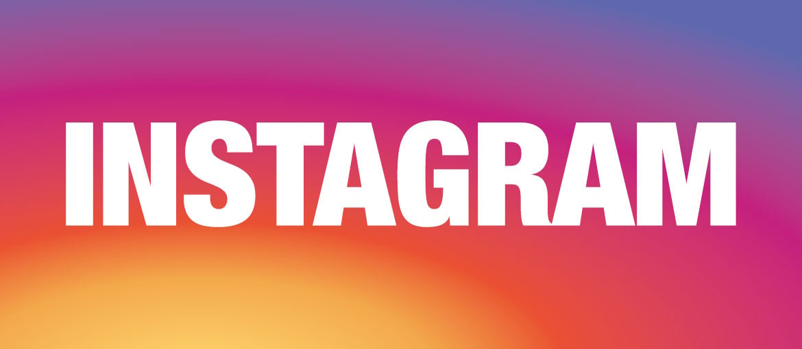
Instagram: evolution of a logo
How many Instagram logos can you remember?
Give it a little thought and most of you can probably remember two. But did you know that the app has actually had three different logos? Few can recall the first logo, which has very little in common with the current incarnation. We refresh your memory by looking back at the story behind the three logos, from 2010 to the today.
Who remembers the first Instagram logo?
The very first Instagram icon was designed by CEO and co-founder Kevin Systrom. As you can see, it was inspired by a vintage Polaroid camera

The icon was set against a clear background and slavishly imitated many of the details found on a Polaroid camera: a big flash, the rainbow strip running down the centre, three buttons and the viewfinder. The effect was deliberately three-dimensional and hyperrealist: note, for example, the shadow of the buttons on the bottom of the device. Such a detailed icon would be unthinkable for an icon today.
The “iconic” logo
The second logo, the one that you will definitely remember, was created designer and photographer Cole Rise in the autumn of 2010. The icon still depicts a camera, but this time it’s inspired by a Bell & Howell model from the fifties.

2: IMMAGINE SECONDO LOGO E MACCHINA
Legend has it that the logo was designed by Cole Rise in just 45 minutes and only needed a few tweaks to finalise it. The new icon was unveiled six months later, in 2011. Fun fact: Did you know that there’s also a back to the logo? Cole Rise designed it for fun.

The minimalist icon from 2016
On 11 May 2016, five years after its last redesign, the brand launched its third logo, which was nine months in the making.
https://vimeo.com/166138104
Here’s how Instagram unveiled its new design in an article published on Medium.

As is often the case with drastic change, the response from users was not universally positive, with the new logo widely mocked and criticised on social media.
The new logo’s features
What happened to the app’s signature rainbow? And where did the viewfinder and lens go? Well, look carefully and you’ll see that these elements have simply been abstracted into the new icon: the rainbow lives on in the three-colour gradient, while the viewfinder and lens are represented by a dot and a circle respectively. The logo still suggests a camera, staying true to the company’s roots, but the image is abstract and forward-looking. It’s a minimalist icon that is perfectly in keeping with new trends in graphic design.

The new image is compact, flat and, above all, easily distinguishable in small format. The rainbow has been reduced to three colours that fade into one another: pink, purple and yellow. This colour gradient unleashes more energy, warmth and dynamism than three separate colours would. With hindsight, it’s clear just how avant-garde the logo is in its use of gradient, flattening, simplification and abstraction.
So, what can we learn from the Instagram redesign? It teaches us that real change is initially hard to understand and accept: it takes time for its revolutionary significance to be appreciated. And it takes courage for a brand to depart abruptly from what many fans are used to. It requires vision.