
Table of Contents
Julia Sysmäläinen, a designer and philologist, has her roots in Finland and Russia, but has been living and working in Berlin for many years. Fluent in four languages, she is experienced in corporate and type design and has worked as a design director in Erik Spiekermann’s agencies for more than 12 years. Her Berlin-based studio Juliasys Studio was founded in 2008 where she and her team focus on branding, custom type design, and information architecture.
Julia’s work and her fascinating background have always interested me, therefore I was happy to be able to chat with her about her personal story, but also deep dive into her work with the Beiersdorf AG and the creation of NIVEA Care Type.
JuliaSys’s amazing background
Julia, you have an interesting background, can you tell us a bit more about your roots?
My roots are like this: My father is Finnish, my mother is Russian, and I am both — or, in other words, I am roughly in the middle. I feel equally at home in either language when speaking, but also when reading or writing, regardless of whether texts are in Latin or Cyrillic script. In other respects, too, my Finnish and my Russian characteristics are pretty much in balance. I have the Finnish dislike for small talk, and at the same time, I love the Russian warmth and conviviality. And I share the Russian working style of trial and error and improvisation. I come from a region called Karelia, which belongs partly to Finland, partly to Russia.
“I see typefaces not just as tools, but as a visualization of personalities”.
My parents got divorced when I was quite young, and after that, I traveled back and forth for many years. I am still doing that, but now my travel routes are usually triangular: Germany – Finland – Russia. The German and English languages I learned much later, and I feel much less close to them. But I like to read literature in all four languages, no matter how well I know them – and I seldom feel confused, actually. After having worked in Erik Spiekermann’s various agencies for more than 12 years and now running my own studio it’s natural for me to discuss design questions in German and English.
You are a trained designer and philologist – what was first and how did you manage to combine these two professions?
Languages and literature are my hobby number one. It all began with my passion for reading – mainly Finnish and Russian literature. Later, when I was already studying literature I discovered that besides literary content and literary form there was also the visual shape of the text. What fascinates me most is where it all comes together — in manuscripts, letters, everything written down by the authors. Typography and type design became one of the highlights for me when studying design. Afterward, having moved to Berlin to work at the United Designers Network I discovered the wonderful manuscript department at the National Library. I directly fell in love with it and got the inspiration to design typefaces based on the original handwritten artifacts of writers and other historical personalities.

You have a very special and unique way of creating your typefaces – can you tell us a bit more about that?
My typefaces are often based on just this kind of material – handwritten artifacts of writers and other historical personalities. FF Mister K is the best known of these: a complete type family based on Franz Kafka’s manuscripts — sometimes closer to the original, sometimes a few steps away. I proceeded in a similar way when developing Emily In White and a typeface I made for the Moscow based Art Lebedev Studio, ALS FinlandiaScript. For the former, the starting point was a series of poems by Emily Dickinson, written on slips of paper sewn together (she called them “fascicles”); for the latter, letters written by the composer Jean Sibelius. Also, my ALS SyysScript (Finnish for “Autumn Script”) had a model — although not a historical one – a Soviet postcard that my Aunt Katri sent me many years ago to invite me to go mushrooming.
The later typefaces I made are not directly connected to persons, but they still have a personal feel and in fact, I see them not only as tools to make language visible but also as visualizations of personalities. In the last years, I have been involved quite deeply with the research of handwriting psychologists such as the Swedish psychologist Teut Wallner. Many of us are familiar with the term “graphology”, which became popular in the late 19th century. Handwriting-psychology evolved from this as a scientific discipline studying the relationship of personality traits and handwriting features. Being scientific, its results have to be repeatable and independent of the examiner.


Tell me more about how you approach the creation of a new design or a font for example? How do you work differently for personal projects vs. client projects?
When I do work based on historical material, being a philologist, the content of a writer’s texts is equally important to me as their visual appearance. If their content and literary quality didn’t convince me, I wouldn’t think of using them as a source for a typeface. So there is always research going on: before I begin with the design work, and it continues while I am doing it. In this time is not a factor to consider, and it can take years before I release a typeface.
With clients’ orders, it’s different: There is a clear goal and a limited amount of time. I start with a number of try-outs and early designs that I present to the client quite soon. It’s better to talk to them at an early stage and get their opinion. Otherwise, you might end up doing a lot of unnecessary work. When the style is agreed on, I simultaneously create outlines and do OpenType coding, continuously checking the visual appearance of test words. If it’s a multilingual project, I usually start with English, then move on to other character sets.
Selected Project: NIVEA Care TypeHow did your collaboration with Nivea came about, did they approach you directly?
Beiersdorf was interested in my previous script typefaces with a strong personality and I gave a presentation of my work in Hamburg. The cooperation is still continuing today and there are new projects underway. – There are confidentiality issues involved with this, so I can’t be more precise than this.
Can you tell me some rough details about the font family, how it currently exists?
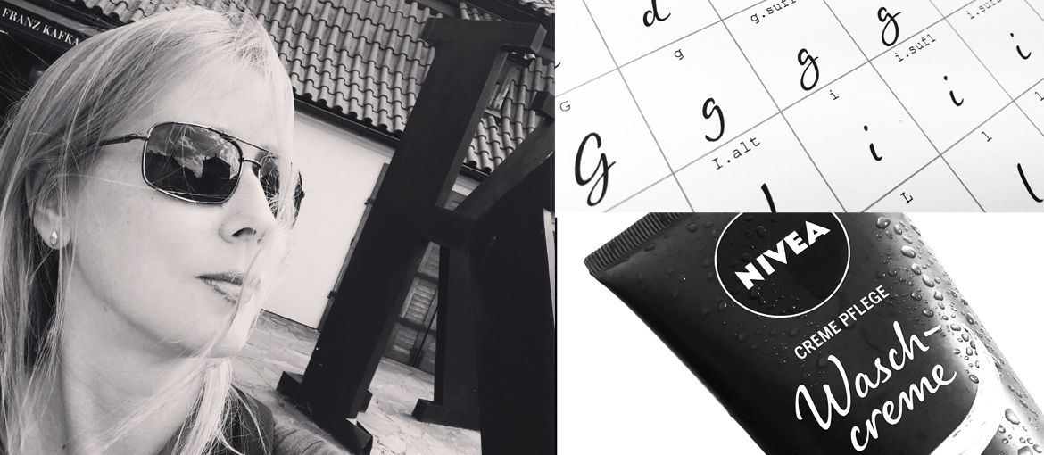
We have been working with the NIVEA brand for quite a while now. The OpenType font group we developed is called NIVEA Care Type and is understood to be the imaginary handwriting of the NIVEA brand persona, the “NIVEA women” which had been developed for the brand previously. The fonts are used on product packaging and marketing materials and have the function to present exactly that personality in the look and feel of the brand.
Currently, both the Latin and the Cyrillic Care Type contain over 2000 glyphs (among them about 1500 ligatures) with coding for automatic contextual substitution.
So, how did you get to create this imaginary handwriting for the persona?
Before starting the actual design, we held multiple workshops were we used methods from handwriting-psychology and – analysis to determine the style of the typeface.Doing the kick-off workshop starting this project our two main questions were: What are the personality traits of NIVEA’s persona, and how can these features be visualized in “her” handwriting style? The persona is described as an authentic, lively and dynamic personality, not hesitant or even frail.
Her basic attitude is positive, she is open toward people and to new experiences. She is not an actress, image building is not for her. This all was given by NIVEA. Our task was to translate this personality description into the elements of a handwriting style. In a workshop, we used a method called “impression-characteristic” (Eindruckscharakter).
In this method, handwriting samples are described using 150 pre-tested expressions grouped in 24 semantically distinct subsets. The workshop group selects the most fitting features, and afterwards the results are brought together in a single protocol.
The chosen characteristics that we had to incorporate were:
- Expressions of movement: energetic, dynamic, flowing, lively
- Expressions relating to clarity: precise, well-balanced, uncluttered, clear
- Expressions relating to individuality: sophisticated, individual (overstatements like distinguished or offbeat were not chosen)
- Expressions relating to the strength of will: steadfast, determined, confident
- The expressions “warm” and “light” implying friendliness and easiness
Of course, these selected impression-characteristics left lots of room for interpretation. But they did provide a necessary frame for developing the NIVEA Woman’s handwriting style.

Currently, the NIVEA Care Type supports over 100 languages with Latin and Cyrillic alphabets. Below is a selection of those languages in which Care Type is in use at present. So far the Regular weight is predominant, but depending on the product kind and background effects on labels also Bold is used.
So how would you summarize the final design?
Even though there are thousands of handwriting fonts on the retail market, it was obvious for me from the beginning that the NIVEA Woman personality could be visualized convincingly only with a tailored typeface. Besides the stylistic reasons, there are also technical ones. Available handwriting fonts very seldom contain the full character sets needed for an international brand. Extended Cyrillic and Greek are almost never included. Further developing such restricted fonts is time demanding and usually leads to poor compromises. In contrast, a method of tailoring in continuous cooperation with the client and associated design agencies gave me the chance to test and improve our results in an early phase. As especially positive I experienced the making of drafts in lettering that could be used in practice well before completion of the fonts.


Which type of projects do you enjoy more – personal projects like “FF Mister K” or client work like for Nivea?
I enjoy both kinds of work, and I often do them side by side. – It’s very satisfying to tailor-design a typeface so it fulfills exactly your customer’s needs – and it’s fun to see it afterward in use.
And it’s, even more, a pleasure and always a bit of a surprise to see one of your retail fonts – which you spend a really long time working on, not knowing if it will be a success or not – pop up somewhere where you wouldn’t have expected it – on a poster series of a Moscow museum, on food packaging in Finland or as the signage and identity font of an arts and crafts shop in Prague.
If you want more information about character driven type design, visit juliasys.com