
Table of Contents
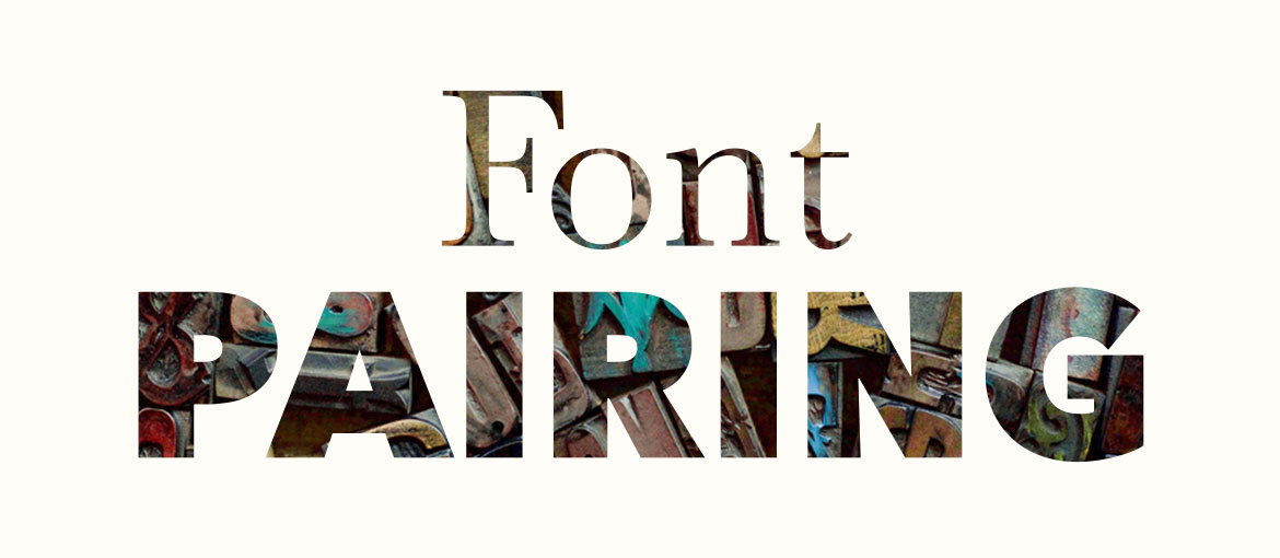
In our handbook on typography, we gave you some great advice for better font pairing. It’s no exaggeration to call it an art: deciding which fonts to use in a graphic design project is not straightforward, which is why it’s not unusual to come across a hodgepodge of clashing styles.
That’s why we decided to dedicate an entire new article to the matter. In it, we’ll outline the basic principles of font pairing, show you some examples of winning font combinations and look at the tools that will do the heavy lifting for you: font pairing tools. Right, let’s get stuck in because we’ve got loads of things to tell you.
The golden rules of font pairing
We asked our graphic designers if there were any rules that underpinned the art of font pairing. They gave us a bunch of tips that make up a sort of “anti-clash kit” for pairing fonts properly. Let’s open it up and see what’s inside.
1.Define the content’s hierarchy
Before even thinking about which fonts to choose, decide the hierarchy you want to give to your content. Are you working for example on a poster? You’ll have to think about the title, subtitle text and any image caption. The choice of fonts and their weight will create a visual hierarchy. What’s this hierarchy for? To establish an order of reading and help people understand the content. It’s essential.
2.Limit the number of fonts used
It’s a good idea to select a limited number of fonts to work with, trying not to use more than two or three in a single project. This will prevent confusion and the reader will be grateful for the resulting clarity.
3.Keep it in the family
We already recommended this in our handbook: if you need to create visual hierarchies but don’t want to take too many risks by combining different fonts, use font families: this will ensure visual coherence. Within a family, you can find serif and sans serif fonts; square and round fonts; and fonts with differing weights and widths. These variations will help you to establish hierarchies.
4.Don’t pair fonts that are similar
It’s one thing to pair fonts from the same family; it’s quite another to pair similar fonts. You need to take great care with the latter: pairing fonts that are similar and have virtually imperceptible differences can create a messy and even uncomfortable visual effect.
5.Pair serif and sans serif fonts
Pairing serif and sans serif fonts is a classic trick. Look around and you’ll see that it’s a common combination. Usually, in graphic design for printing, sans serif is used for titles and serif for the body of the text. In fact, serifs make printed text easier to read. It’s a different story when it comes to screens: here, sans serif fonts are easier to read. That said, don’t be held hostage to the “rule”, because this is not, in fact, a rule.
6.Use fonts from the same era
Because their styles are often complementary. Pickingyour fonts in accordance to their history means having an awareness and a healthy respect for the personality and mood of different typefaces. Pulling this off requires a good knowledge of typographical history. Speaking of which, an excellent place to start is “Just My Type. A Book About Fonts” by Simon Garfield, a collection of stories about the art of typography.
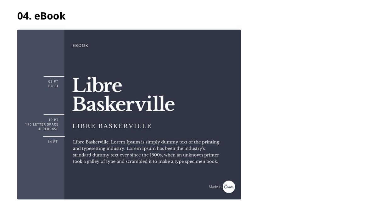
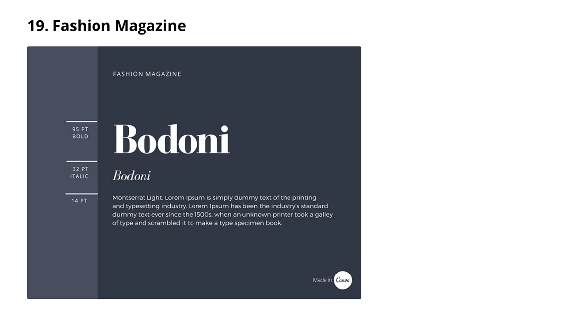
And before you start playing around with tools, read Canva’s guide to font pairing, in which you’ll find some 30 examples of font combinations classified by project type and industry. Because, as you already know, every font has its own personality and this must match your project and audience. Here are two examples of font pairing taken from the guide. The first is for an e-book, the second is for a fashion magazine.
Font pairing: tools that lend a helping hand
If you’re a designer, don’t look away in disgust. Font pairing tools are not just for beginners: they are very useful for discovering new fonts, learning about their history and experimenting with different combinations. All the tools that we recommend work in the same way: they start with a font chosen by you and suggest complementary fonts. Oh, and they’re all free!
Font Combinations
Font Combinations by Canva starts with a given font and suggests between one and ( more rarely) five fonts to pair it with. A simple and practical tool for finding the right font combination.
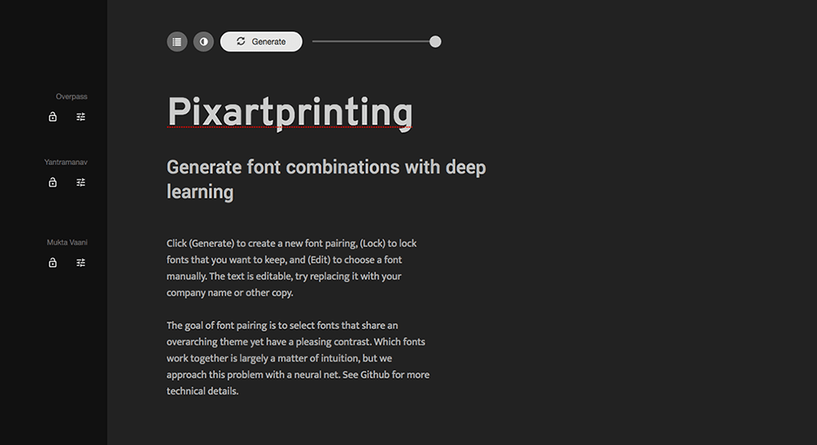
Fontjoy
Fontjoy works in much the same way, but the interesting thing about this tool is that on the top right of the screen is a “Generate” button. This lets you balance the contrast between the typefaces that you’re pairing and goes from “high contrast” to “very similar”. What’s more, the test text is editable, so you can immediately see the font’s effect on your content.
Mixfont
With Mixfont, on the other hand, you can not only combine fonts and find new ones, but you can also read about their history and discover their “top pairings”, in other words, the most popular font pairings on the web.
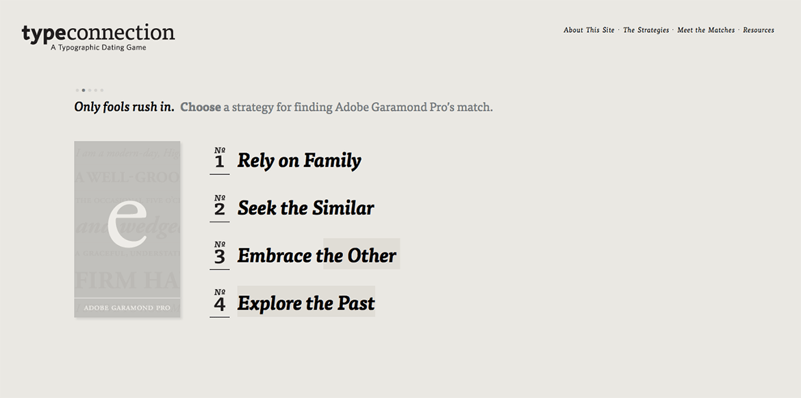
Type Connection
Lastly, there’s Type Connection, which offers a few extra features: it starts with one font (telling you about its history), gives you four strategies for finding its match (same family, similar font, contrasting but complementary and shared history) and, for each strategy, shows you three candidate fonts for pairing. When you pick your preferred combination, a new page opens providing you with in-depth information on the fonts’ typographical features.
Check them out and then ask yourself: are font-pairing tools really just for amateurs?