Table of Contents
Unless you’re a complete novice in the field of typography, you’ll know that, when it comes to fonts and how text is laid out, you can’t rely on your personal taste alone. When designing texts for the web, brochures, books, business cards, posters, flyers, magazines or any other materials with written content, there are various typographical and layout-related rules to consider. The aim of this post is to refresh your memory of some of them!
We’ve put together a series of suggestions to create our own little typography handbook. But don’t be fooled by its size: it contains some important advice!
Section 1. Fonts
Above all else, a great graphic design project requires great fonts, which must suit the brand’s personality and sit together harmoniously. Fonts come in two different forms:
Serif fonts originally stem from written Latin, and are the most common style used for printed items like books, magazines and newspapers. The reason for this is simple: the serifs reduce the space between one letter and the next, creating continuity and thus making long texts on paper easier to read.
Sans serif fonts, meanwhile, are a more recent creation, first produced in the nineteenth century. Unlike serif fonts, they do not have extensions at the end of the various strokes, and are more linear and angular, and therefore more legible on a screen or when printing in very small sizes. They are found in printed form in footnotes, captions, business cards and children’s books.
Now for the crux of the matter: how to combine fonts within a graphic project.
Choosing fonts and font pairing
Fonts guide readers in their exploration of the page, and tell them the order in which things should be read. As well as the size of the characters, these visual hierarchies are created through font pairing. But how does this work? And how do you know if two fonts work well together? There’s no simple answer! We therefore recommend choosing one of two different routes:
Option 1: use font families. This is definitely the most convenient option. Choose a family of fonts for your project that includes both a serif and sans serif version of the typeface. This means you can use, for example, the serif fonts for titles and sans serif for the body of the text, creating a hierarchy between the fonts without running the risk of using pairings that don’t work well together.
Option 2: combine different fonts. If you choose this option, we have two pieces of advice:
- Never use more than two or three fonts in the same project, or you risk a chaotic and messy result.
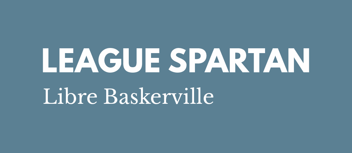
- Never combine similar-looking fonts. In general, the more different the fonts are, the better they will work together. For example, a modern font like League Spartan, with a highly geometric structure, goes very well with the elegant and traditional Libre Baskerville.

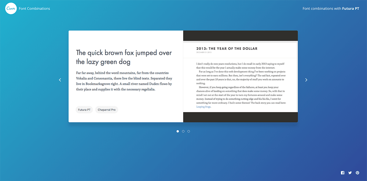
If you can’t find the perfect combination, use a font pairing tool to help you. One example is Canva’s Font Combinations tool, which starts from a given font and suggests one that matches it. You really can’t go wrong!

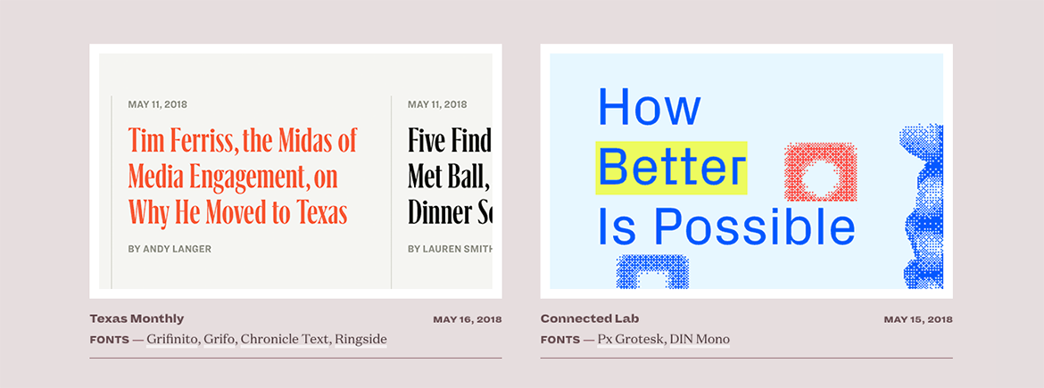
Another website worth a look is Typewolf. On it you can discover new fonts to use as an alternative to your standard choices, read up on their history, stay updated on new trends in typography and draw inspiration from some truly exceptional examples of font pairing.

There are two other recommendations we’d like to make regarding fonts before we start considering the layout:
- Pay attention to the fonts’ tone of voice, and choose fonts that best suit your project. In general, serif fonts are more classic and formal, while sans serif fonts have a more modern, technical and informal feel. Also, bear in mind that every font has its own slightly different character. Using Helvetica is not like using Futura: they may both be sans serifs, but the former is much more serious than the latter.
- Think about the font size. To make reading long texts easier, we recommend sticking to a size of at least 13px on the web; on paper, on the other hand, you shouldn’t go below 11pt.
Now we’re ready to discuss the layout!
Section 2. A bit of content design
Once you’ve chosen your ideal fonts in the perfect combinations, it’s time to look at the layout of the text. It’s worth sticking to a few rules to make the layout look more cohesive and increase the readability of the text, particularly if it is long:
Divide the text into paragraphs. Big walls of text scare readers and make reading more difficult. For this reason, long texts should be divided into paragraphs… but make them nice and snappy!
Line length. Whether the text is being printed or published online, we recommend paying attention to the length of the lines, which should not be too long or too short. Usually the ‘ideal’ line length is 66 characters: anything above or below this value makes reading harder.
Provide readers with footholds in the text. Dealing with long texts? Avoid justifying them, and align them flush left, which helps readers to find their way around the text without losing their place. Parallel structures, such as bulleted lists, provide very useful access points for readers. Bold text is also helpful for instantly drawing attention to key concepts. By the way, use bold, not uppercase, to highlight important words or ideas.
Margins. There are no set-in-stone rules when it comes to the width of margins. On a page of text they vary from 1.5 cm to 2.5 cm on each side, while the bottom margin is usually larger, since there has to be enough space for footnotes or page numbers. When creating the layout for a book, you also have to leave enough space for the binding – approximately half a centimetre on the inside margin. You can find the option you’re looking for in Word in Layout > Custom Margins > Gutter.
Line spacing. The line spacing, of course, is the gap between two lines of text. For easy reading, choose single line spacing, which is fine even for page sizes smaller than A4. A smaller gap will make the page of text too dense and unattractive to read. In general, always choose a value somewhere between 1 and 1.5. Remember that for easy-to-read text the line spacing should be greater than the height of the written line (usually 120% of the height of the characters).
Widows and orphans. Widows are words or very short lines of text at the end of a paragraph that leave a large blank space in the line. They are called orphans if they are at the start of a page or column of text. Widows and orphans are typographical mistakes that spoil the harmony of the page. Lines shorter than one-third of the total length of the line should also be avoided.
Tracking. This is the distance between one word and the word that follows. It is proportionate in value to the size of the font and, in general, is larger than the space used for the letter ‘i’, but smaller than that required for the letter ‘e’. We do not recommend altering this value, which will already be optimised for the font you have chosen. Only in a few specific cases does increasing it prove useful. In texts written in uppercase, for example, increasing the tracking by 10% may help make reading quicker and easier.
We’ve reached the end of our small handbook of important advice. We hope we’ve given you some useful suggestions to hone your graphic design projects and give them a more harmonious look.

