

Table of Contents
Words and images. If there’s one secret for an effective message, it lies in the relationship between these two elements. Learning to manage the relationship between the written and visual parts of an advertisement, poster, Facebook post or simple flyer is the key to creating communication projects that work.
In this article, we’ll take a practical look at some clear guidelines that you can apply straight away, wherever you work: from micro business to SME to major brand.
Words and images: the difference between journalism and advertising
Of course, on newspaper front pages, book covers and so on, there is a mix of words and images. But the way they are used is very different from the unique language of advertising.
Let’s take an example: on the front page of a newspaper, you might read a headline like: “Big freeze hits Britain”. This headline says it all: it doesn’t need to be accompanied by an image delivering the same message. If there’s enough space, and if it’s worthwhile, the article could run beside a photo of a frozen city.
The image repeats on a visual level what the words have already explained. In this case, then, we can talk of a caption relationship, because the image simply illustrates what we already learnt from the headline. If, however, we were working on an advertising campaign, an image of frozen road could be accompanied by a headline like: “A perfect day”. It would work well, say, in an advertisement for a car with four-wheel drive boasting outstanding grip even in the most challenging conditions. For the owner of that car, we discover from this apparently contradictory relationship between words and images that even a day like the one in the picture is indeed a perfect day.
That’s right, it’s precisely the apparent contradiction between words and images that grabs the reader’s eye and, for a moment, triggers a question in their mind: we have caught their attention because we have gone beyond a caption relationship between text and image, encouraging the reader to solve the puzzle of this strange combination. The reader completes the message, giving it meaning, when they understand that, with four-wheel drive, even adverse conditions are perfect. And in doing so, they feel rewarded, just like when we get a joke and feel clever about it.
The relationship between words and images: four key principles
We have already seen how, to create an effective message, words and images are not just thrown together randomly, nor in a simple caption relationship. We have to do so knowingly, building a message that intrigues the reader and leaves them room to decode it.
But are there any guiding principles that we can follow to get our communications right? Certainly: there are rules that can help us craft effective messages, playing with verbal and visual language to make what we say more interesting, relevant and surprising to our target audience. Whether it’s the design for a leaflet, the cover of a brochure, an outdoor poster or digital content for a social network.
1. Anchoring: images intrigue with ambiguity, words explain
Let’s take an example from my book “Digital copywriting – How to write copy for the digital age“: imagine a single, symbolic chip presented against a white background. One end has clearly been dipped in ketchup and the effect, ambiguous and intriguing, clearly resembles a match. This image captivates us because it raises one question: what does it mean?

We can attribute many meanings to it, but in the decoding process we are guided by the text. A simple, two-word headline tells us how we should interpret this image, anchoring it to the Burger King brand, whose logo features at the bottom right of the image.
And the headline? Fiery fries.
This famous campaign to launch Burger King’s Fiery Fries provides the perfect example of anchoring: an ambiguous and extremely suggestive image that perplexes the reader is paired with a very simple and direct headline, which anchors the meaning of the image to the message it wants to convey. So, we’ve already learnt one very useful guideline that we can make our own.
2. Convergence: words suggest, images explain
Let’s again start with a real-life example. Not long ago, Apple published an advertising campaign in major newspapers. The headline said: ‘There are some ideas we want every company to copy.’
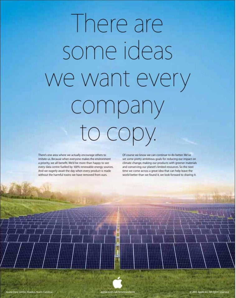
What does it mean? Does Apple want people to copy its patents? Obviously not, and it’s the image that dispels any doubts the headline may have sown in the mind. In the visual, we see an array of solar panels on a green meadow. Now it all becomes clear: the message is about the tech giant’s investments in sustainable energy, which its competitors are unlikely to have matched. We have just learnt a guiding principle that complements anchoring, convergence: here it’s the headline that intrigues, grabs the attention and triggers a question, while the image simply provides a concrete example
.3. Partial divergence: similarities and differences intermingle
Another very useful example of the relationship between words and images can be found in video ad released by Ichnusa beer in 2017. To emphasise the tough and proud Sardinian identity that is the brand’s signature, the scenes from the video and the text superimposed on them enjoy a relationship of partial divergence: we see, for example, old fishermen still hauling nets full of fish onto their boats with their bare hands.
The words our sushi flash up on screen. Next, over shots of a “nuraghe”, an ancient stone building that has come to symbolise Sardinia, we get our loft apartments. Then, a bearded shepherd contrasts with our hipsters, followed by an epic scene of waves crashing against rocks captioned with our sound. Finally, while a man enjoys a big gulp of Ichnusa beer, the words our soul are displayed.
At first glance, the relationship between words and images leaves us baffled: sure, sushi is made from fish, but what we see is definitely not sushi. Just as a nuraghe is clearly not a loft. But the contrast is not total, it’s just partial. In a certain sense, it’s true that what we see is raw fish, which is what you need to make sushi, and that the shepherd does have beard like a hipster, even though he’s probably never seen one.
The guiding principle of partial divergence lies in this ambiguity between words and images that seemingly contradict one another while also leaving ambiguous areas of similarity. By deciphering the code according to which words and images are matched, anyone can grasp the message: Ichnusa’s Sardinian identity contrasts with the bland and hackneyed “cool” other beers like to reference, thus creating a more authentic image that emphasises its difference.
4. Opposites: when words contradict images
A classic example for understanding and mastering the principle of opposites is the legendary “Lemon” advertisement for the Volkswagen Beetle.
Really? You’re advertising a brand-new car and you give it the headline “Lemon”?! (In American English, a lemon is car with lots of manufacturing defects). Only by reading the bodycopy do we understand that the car has been classified as a lemon by an extremely strict quality inspector who found a slight scratch that nobody else would have noticed. Yet this tiny little blemish is enough to stop the Beetle leaving the factory.
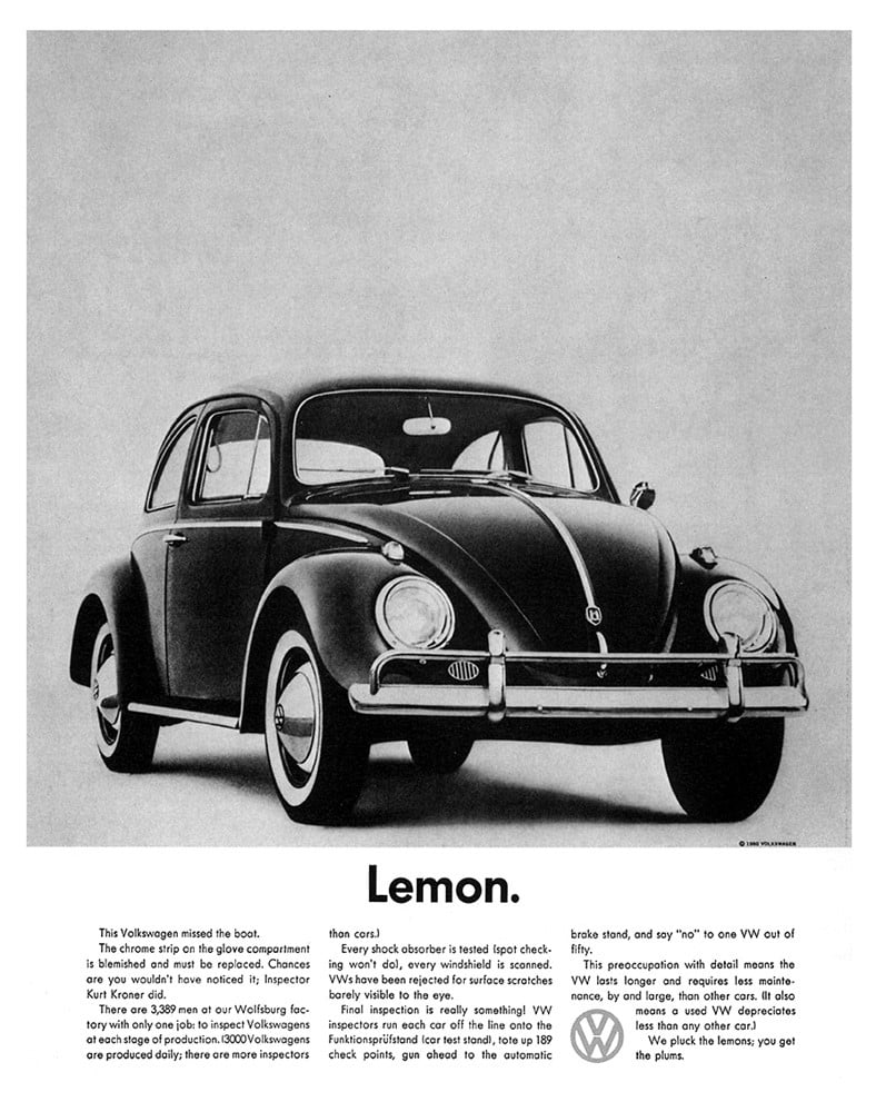
That’s why, we learn, you’ll never find a lemon from Volkswagen on the market. So here we have a case of complete opposition: a relationship that’s rather difficult to master but one that can have powerful results. Speaking of which, the first example with the frozen road and the headline alluding to a perfect day is another example of images and words placed in opposition.
The relationship between words and images: conclusions
In this article, we’ve seen four key principles that can be immediately applied to create communication that genuinely piques the interest of existing and potential customers by best exploiting the relationship between words and images.
These principles are just as valid for print as they are for digital media: the cover of a flyer will be more relevant to our reader if designed based on these criteria, and the same goes for digital content for posting on Facebook.
There’s no limit to their use – you just need a bit of practice to master them.