
Table of Contents
PART 1. CREATING AND PRODUCING COLOR
1. What research goes into creating a new colour?
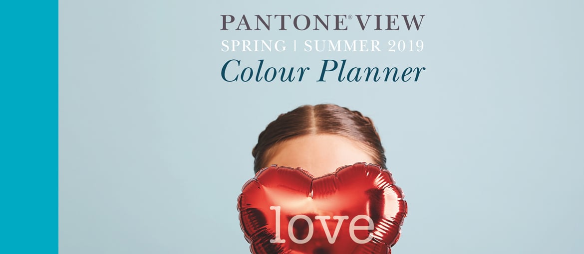
 With an emphasis on ensuring our color palettes are fresh and relevant to the markets we serve, color trends are a major component factoring into the selection and then physical creation of new colors that get added into our different Pantone color system palettes. Our global team of trend forecasters, coupled with View Publications partnership where we produce our PANTONEVIEW Colour Trend forecast two years ahead of the season, give us insight into the colors in their specific tints and tones that will be important across design in the future. The ability to glean these insights and quickly react keep us one step ahead and enable our clients to apply these colors to their brand or products, in line with consumer demand.
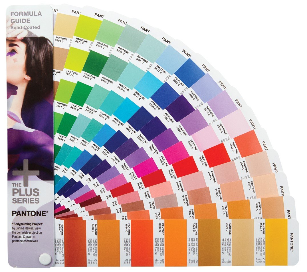
2. Pantone has some 32,000 unique colour IDs and counting. Your own research suggests that choosing a colour is 95% emotional and 5% rational. What research (into psychology, socioeconomics, perception) has “categorised” this emotivity and translated it into a universal colour system like Pantone’s?
Our research, which notes that as much as 95% of consumer decision making is dictated by the subconscious, concludes that it is perception and not logic which drives the majority of consumer purchasing decisions. This research result is not something that can be directly translated into the colors we chose to include within different Pantone color system palettes, however, as perception is not tied to any one color but rather to individual preferences.
With that said, individual preferences are emotional and consumer response to the exact same color can shift over time and based on context. To make sure the color research we compile is current and relevant, our team at the Pantone Color Institute conducts color word association studies on an ongoing basis. Additionally, our color association research plays a role in color messages, meanings and how the mixing of colors can create a mood.
3. Given the subjectivity of colour perception, must Pantone technicians be tested to ensure that they can distinguish between almost imperceptible differences between tones?
It is critically important that any Pantone technician involved in making color decisions has the ability to distinguish between almost imperceptible color shade differences. Each year they are required to take the Farnsworth Munsell 100 hue test, a standardized measure of chromatic discrimination that evaluates an individual’s ability to discern color. The test involves the accurate sorting of 85 coloured caps into incremental hue variations. A superior score must be achieved to pass this highly difficult test and become a Pantone color technician.
4. What are the colours you use for printing made from? Are they chemical or natural/plant-based colours?
All the inks we use to print our colors are plant based and are made naturally.
PART 2. COLOUR OF THE YEAR
1. What criteria do you use to choose the colour of the year?
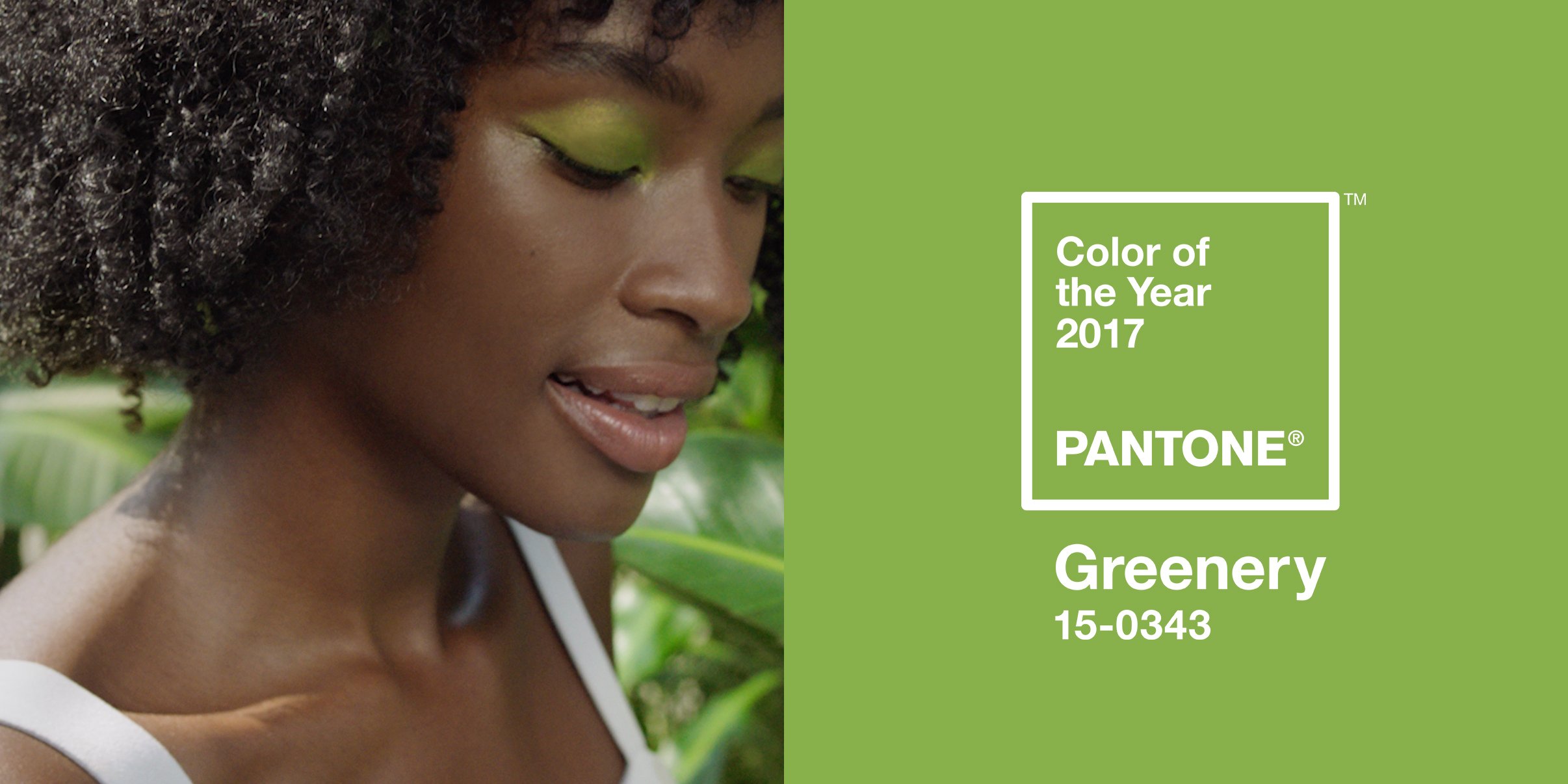
The color we select to be our Pantone Color of the Year is one which we think best communicates what is taking place in our global culture at a moment in time; a color we see crossing all areas of design that serves as an expression of a mood and an attitude on the part of the consumers. The emotional aspect of color is a large aspect of our decision making, as we want to ensure that the colors we select are reflective of the collective mindset. With color and context so intertwined, there really are reasons why a color family or individual color comes into prominence when it does. For the most part, the popularity of a color is symbolic of the age we are living in.
For our team at the Pantone Color Institute, this is a process that requires thoughtful consideration and analysis. To arrive at the selection each year, our team at the Pantone Color Institute comb the world, actively searching for general lifestyle color trends and new color influences for our seasonal color trend forecast reports. At the same time, we look out for the color that we see as ascending, and seems to be building in importance across all areas of design. Some of the areas we look to for insight include the entertainment industry and films in production, traveling art collections and new artists, street art/street style, fashion, all areas of design, popular travel destinations, as well as new lifestyles, playstyles and socio-economic conditions. Influences may also stem from new technologies, materials, textures and effects that impact color, relevant social media platforms and even up-coming sporting events that capture worldwide attention.
2. How many alternatives are considered before the definitive colour is selected?
Colors build in importance. It is only very rarely that we see a color become an immediate sensation overnight. Keeping this in mind, typically the color family, and sometimes even the color we select as Pantone Color of the Year, has been on our radar the year before. But it did not get chosen, as we did not view it as the one color that was really pushing through, or as the single shade we think had the ability to communicate the color message that best reflected what was taking place in our culture at a moment in time.
PART 3. ABOUT THE COMPANY
1. What does colour mean to you?
I am a color lover. For me color is life; it is expression; it is freedom. Color engages. Color defines. Color is the first thing we see when we open our eyes; it creates the magic and the mood. Tied to our other senses, color can be tantalizingly suggestive of scent and can even be so evocative that our mouth might water just by seeing a particular color. Without color, life could be a vision of black and white. And while quite beautiful and dramatic, for me personally a life without color would not be enough to capture the essence and bounty of all that life has to offer.
2. What are your brand values?
Pantone is an iconic name in design. Epitomized in the Pantone chip, our brand aesthetic is simple, fun, bold and elegant. Core to our brand values is celebrating the importance of color in design. We work every day to inspire designers and make color critical decisions easier at every stage of the workflow, from inspiration and palette development to production and the realization of their vision which lands on the shop floor.
3. Pantone is a lifestyle, offering branded everyday objects, clothes and soon even hotels. How do you develop your corporate image?
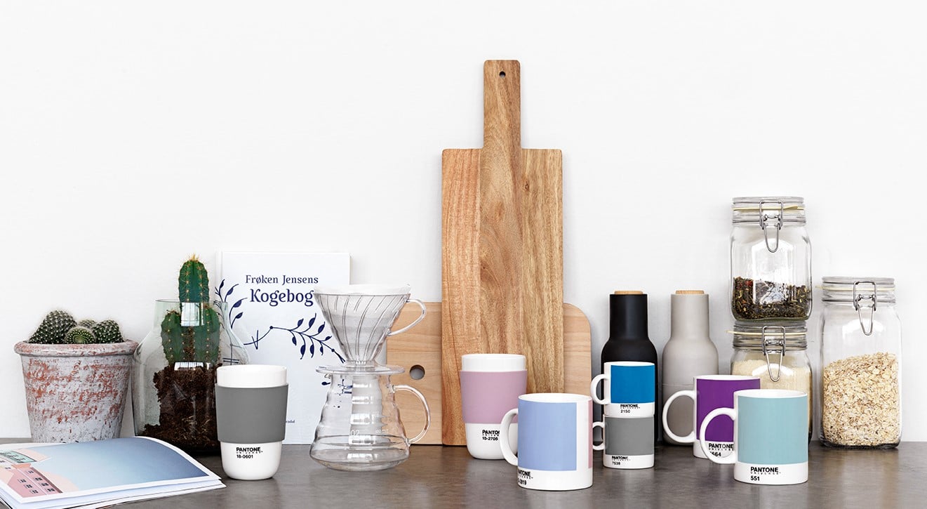
Pantone lifestyle, the consumer licensing division of Pantone bring Pantone’s power as the global authority on color directly to consumers through design-driven, forward-thinking, high-quality products across every lifestyle category. Pantone’s consumer products capture the power of color to democratize design for the masses. Our licensed products express our personality: simple, fun, bold, and elegant, through a unique combination of color, design, and craftsmanship.
Color: Pantone consumer lifestyle products highlight creative colors with a wink, unexpected, interesting color combinations and colors distinct & separated from one another
Simple & Elegant Design: Products are utilitarian and are characterized by their simple, elegant and clever design features. They have a modern and geometric aesthetic with hard lines and right angles.
Bold, Quality Materials: The materials we use reach beyond the basics; they have a tactile sensation and are interesting to the touch.
4. You’re a leading company in the graphics and design world. Do you have green policies? How do you develop them?
As a leading company in the graphics and design world with a global clientele it is very important for us to follow green guidelines around the world and create products that are environmentally friendly. We develop our green policies in line with what is required by the geographical locations of our clients and the nature of the markets we serve. The paper our PANTONE PLUS and PANTONE fashion, home and interiors guides are printed or coated with is manufactured using renewable green electricity (e-green) and made with post-consumer recycled fiber; the pigments used in our PANTONE fashion, home and interior paper formats contain no lead or chromium; the dyestuffs used to create our cotton formats are environmentally safe and adhere to GOTS guidelines and the formats themselves are made with Yupo, a 100% recyclable, waterproof, tree-free synthetic paper. Our manufacturing process is streamlined to use less energy and water; and our factory is illuminated with energy saving LED light fixtures.
5. Your decisions have a major influence on the design world. How did you become such an authority?
Pantone has been in the business of color for 55 years. We began in 1963 as a color language standard of 10 colors intended to enable accurate reproduction of color for the print industry. Today we serve millions of clients around the world as a source of inspiration for the global design community; helping them to select, communicate and control color across every imaginable surface and material. We became an authority through our focus and dedication on the business of color; developing tools and services that help the designer realize his creative vision. In so doing, we continue to build a unique worldwide presence as a one stop shop for all things color related.