
Table of Contents
Jan Van Toorn is considered one of the leading figures of Dutch graphic design and his work (spanning over 50 years) continues to influence designers around the world. Van Toorn was born in Tiel in 1932, but lived most of his life in Amsterdam, where as a teenager he started working in a printworks.Van Toorn trained at the Amsterdamse Grafische School (Amsterdam Graphic Design School) and the Instituut voor Kunstnijverheidsonderwijs (now known as the Gerrit Rietveld Academie[1]). From the 1960s onwards, Jan Van Toorn showed himself to be a radical graphic designer, albeit one with a stable career and an international reputation.
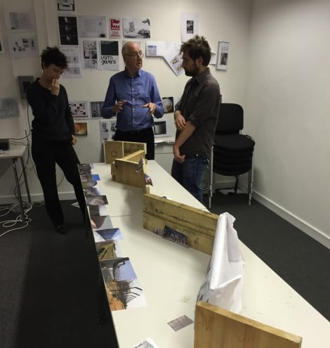
The Dutch designer was also an academic and theorist of the discipline. He taught graphic design in various schools and institutes in the Netherlands and abroad, and wrote extensively about the role of the graphic designer in contemporary society and the socio-political issues that he believed the profession should address.
Media manipulation and representation
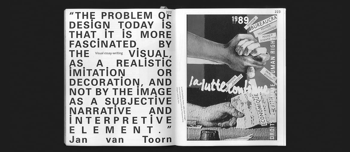
Jan Van Toorn always placed the image at the centre of design, and his interest in the media and its power to manipulate only grew with time. From the 1970s, the designer’s priority was to make the public aware of the mechanisms used for manipulation through his work.
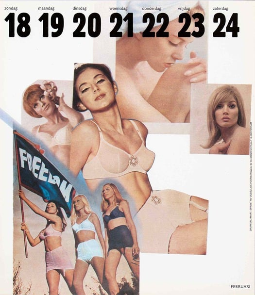

Van Toorn’s collaboration with the Mart Sprujit printworks began in the 1960s[2], and after what he called his “classical” phase (pared-back layouts with a focus on typography), Van Toorn started to experiment with the power of images. The themes explored in the calendars that he designed for the printworks were social and political, such as sexism and imperialism, but also more personal, like identity and the territoriality of Dutch houses.
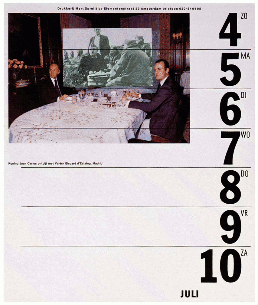

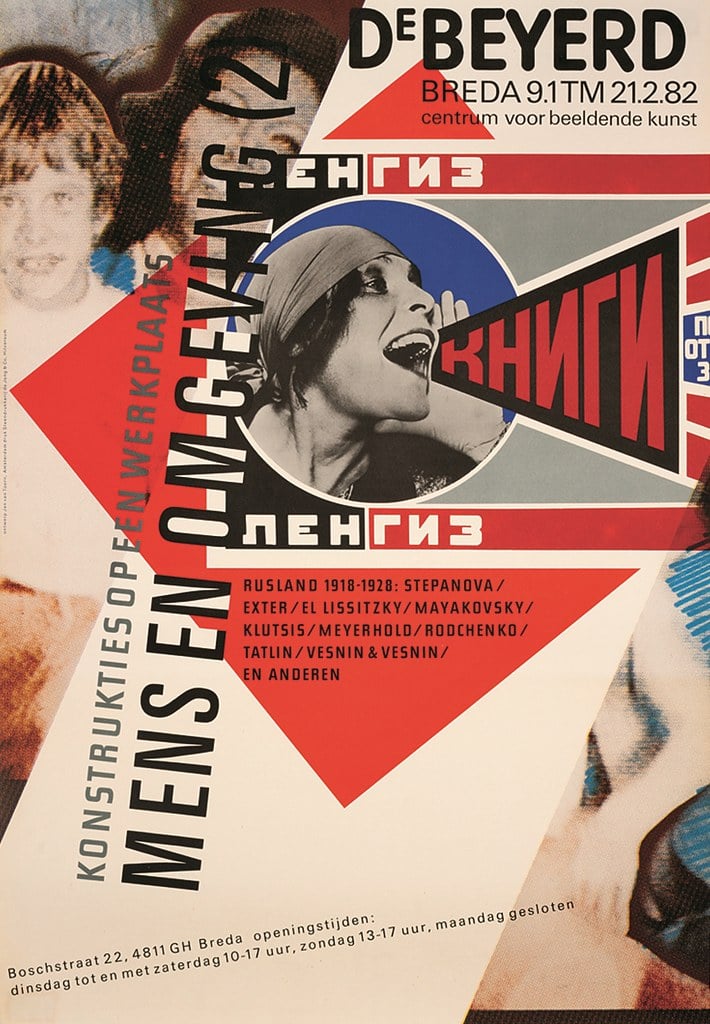
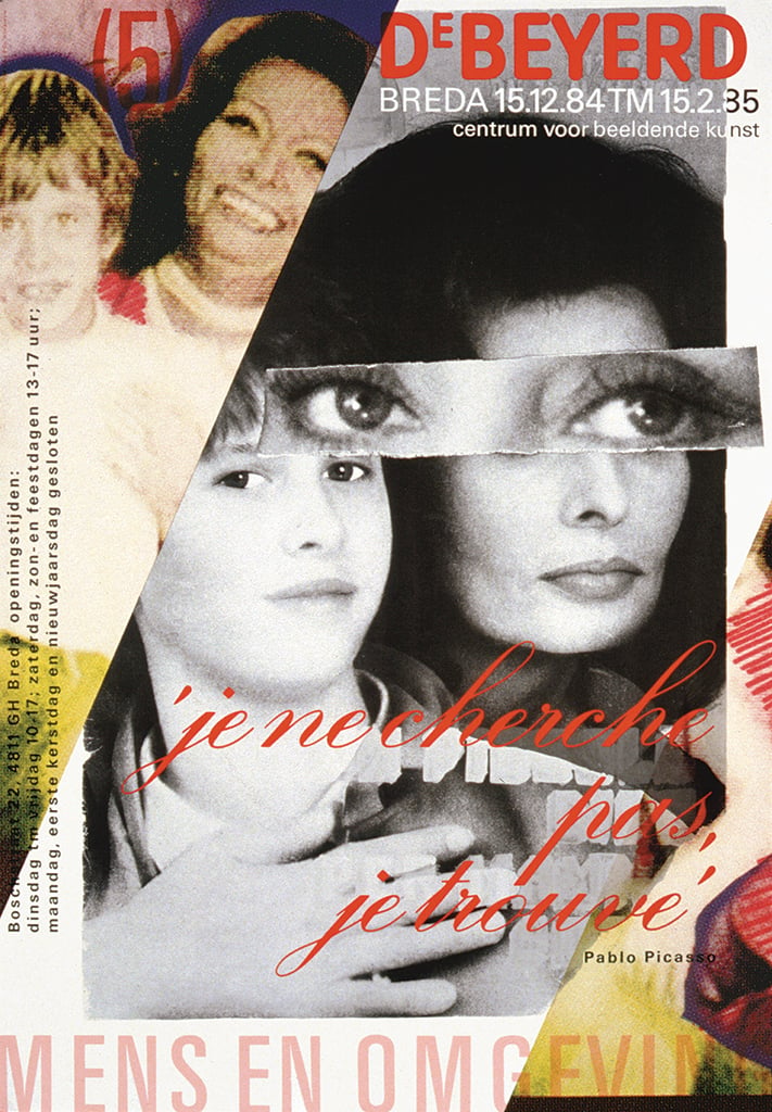
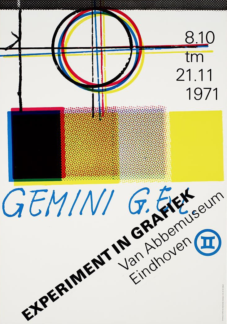
Collage, graphic interventions and image alterations, and experimental typography often done by hand: these were the defining features of Van Toorn’s most famous calendars. Elements that were also present in a series of posters designed in 1980 with the title ‘Man and the environment’[3], as well as later posters created by the designer.
Eindhoven’s Van Abbemuseum
Van Toorn always challenged the culture of his time, especially what was considered “official”. He perceived the museum as a producer of artistic and media ideologies, and sought to shake up people’s consciousness through unconventional visual artefacts. He designed a series of posters and exhibition catalogues for the Van Abbemuseum in Eindhoven[4], ignoring the museum’s design guidelines and creating material with a markedly informal tone.
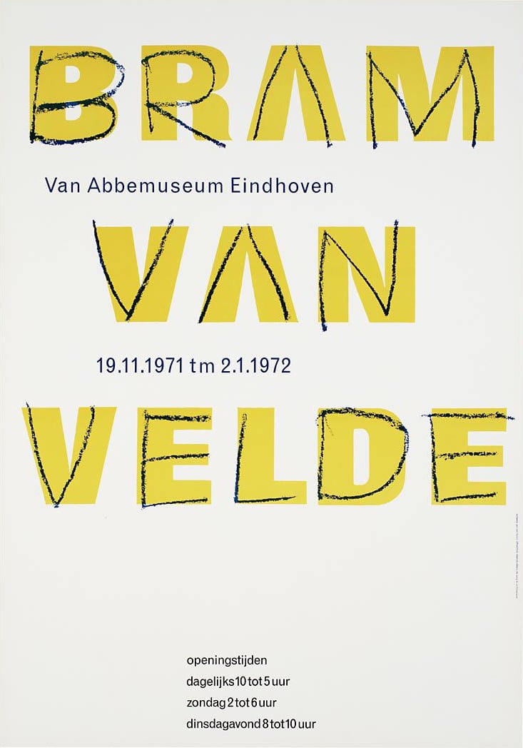
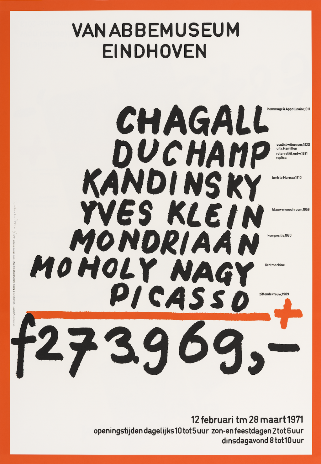
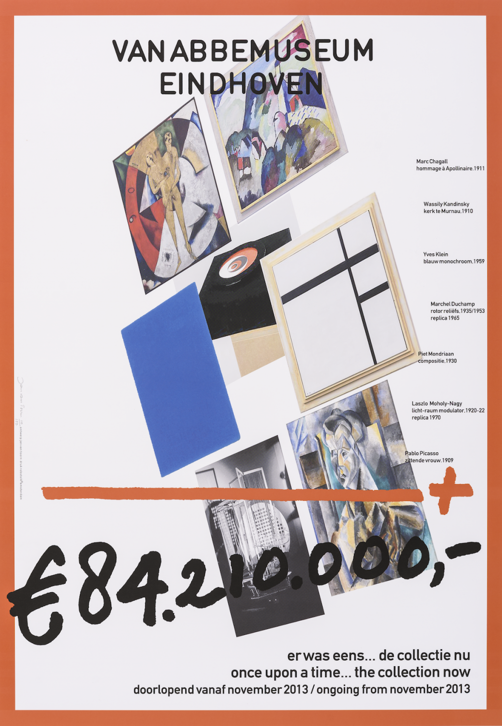
Among the most famous posters Van Toorn designed for the museum is this one for a 1971 exhibition, in which all the designer’s hallmarks can be seen. Informal typography and a provocative message: the poster’s focus is the total value of all pieces on display in the exhibition.
Academic positions
From 1980 onwards, there were fewer opportunities to work on provocative projects and Jan Van Toorn turned his attention to teaching. The designer held positions at various Dutch art and design schools, including: Gerrit Rietveld Academy in Amsterdam (1968-1985), the Institute of Art History at the University of Amsterdam (1981-1982) and Eindhoven Technical University (1982-1983). More recently, he also headed the Printing, Photography and Video Department at the State Academy of Fine Arts in Amsterdam and taught at Rhode Island School of Design in the United States.
Van Toorn never expanded his team, and right up to the end of his career he worked together with his wife in his home/studio in Amsterdam. Interested in understanding and challenging contemporary culture, he often cited other authors and artists in both his design work and writing, including Umberto Eco, Jean-Luc Godard and Rainer Werner Fassbinder[5].
The debate with Wim Crouwel
November 1972 saw a public debate between two Dutch design greats: Jan Van Toorn and Wim Crouwel (founder of the Total Design movement)[7]. Debates discussing the ethical, political and cultural implications of graphic design are rare, but the encounter between Van Toorn and Crouwel was a healthy example of commitment to and passion for the discipline.
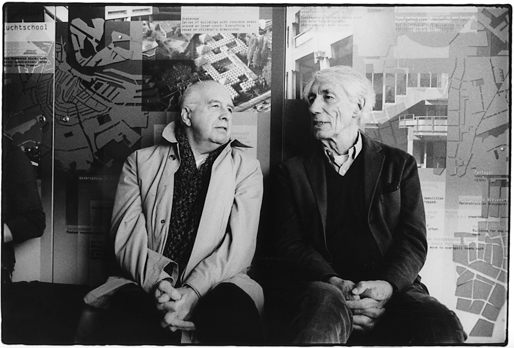
At the heart of the debate was objectivity versus subjectivity. Crouwel made the case for the designer as a neutral messenger; Van Toorn, on the other hand, argued that the designer must make interventions, promote criticism and awareness. Crouwel’s work was labelled as modernist, and characterised graphically by rigid grids, sober typography, and a neutral, formal tone[8]. Van Toorn always practised the opposite, and during the debate claimed that Crouwel’s work had made the Dutch style uniform and dull.

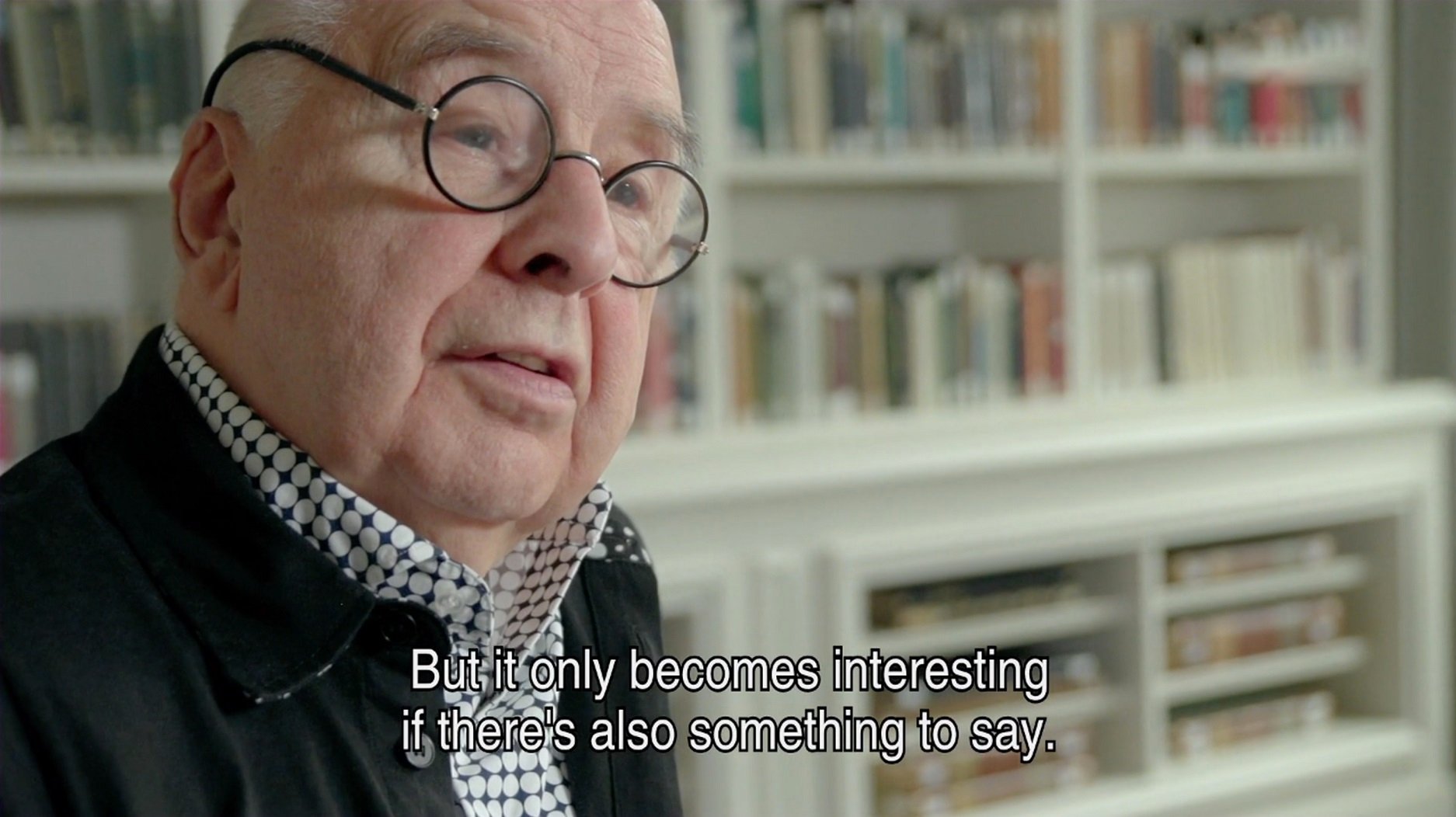
Years after this famous debate, Dutch design is more diverse than ever. But Van Toorn certainly earnt himself a place in history with work that combined seduction and alienation, revealing its role as a manipulator, and questioning the way in which we interpret visual artefacts.
[1] https://rietveldacademie.nl/
[2] https://www.dutchgraphicroots.nl/?p=1233
[3] https://emotionandlight.wordpress.com/2012/02/27/jan-van-toorn-meaning-and-power/
[4] https://vanabbemuseum.nl/en/programme/programme/staging-the-message/
[5] https://modesofcriticism.org/staging-the-message/
[6] https://vimeo.com/68990353
[7] https://designobserver.com/feature/the-debate/38883/
[8] http://www.eyemagazine.com/feature/article/modern-method