Table of Contents
World renowned for its groundbreaking use of photography, Life was one of the most influential American magazines of the 20th century.
Founded in 1883, the title went through various iterations before finally settling on a weekly, photography-focused news format in 1936. Until this point, the magazine had a lighter slant and made heavier use of illustrations, including work by the great Norman Rockwell. Indeed, it was in these pages that Rockwell so brilliantly charted a changing America. His realistic illustrations had just a touch of caricature – the perfect fit for the humorous tone of early Life magazine.
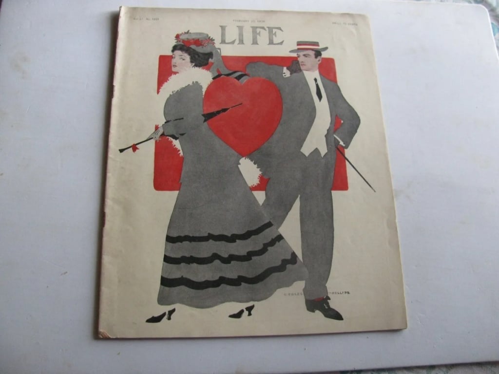
In its fresh guise as a weekly news magazine, Life pioneered the use of documentary photography and helped invent the new discipline of photojournalism, which soon spread around the world.
Life‘s circulation peaked in the 1960s, then slowly and steadily declined in the face of fierce competition and the rise of new media. The crisis point came in the 2000s, when the title ceased print publication and went online only.

PHOTOGRAPHY TAKES THE LEAD
When publisher Henry Luce 1936 acquired the magazine in 1936, he had a clear vision of the role it should play for the American public. He saw it as a means: “To see life; to see the world; to eyewitness great events; to watch the faces of the poor and the gestures of the proud; […] to see and to take pleasure in seeing; to see and be amazed; to see and be instructed”. Life was to document the modern world through raw and realistic photography.
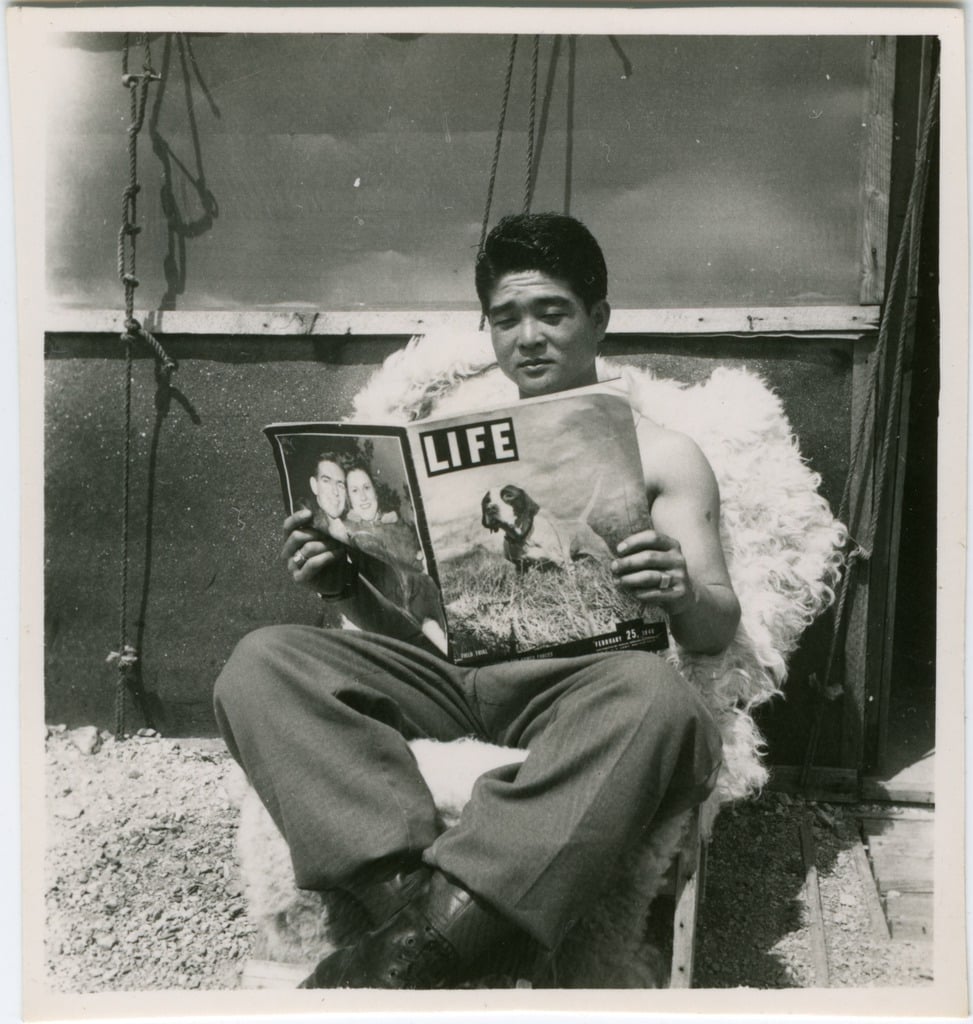
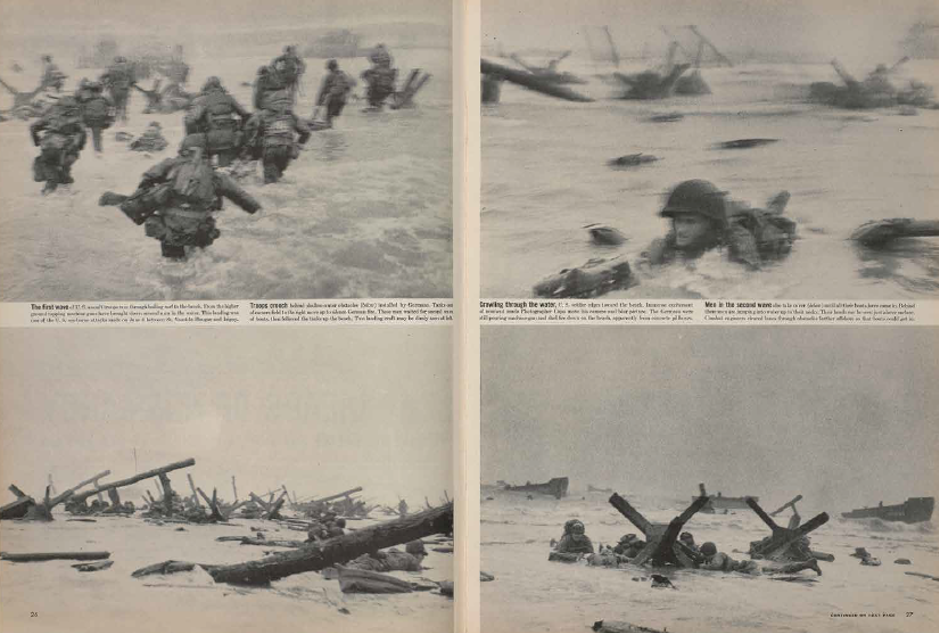
The magazine was built around full-page photos with brief captions: photographers were the new journalists.
The outbreak of World War II saw more success. Life brought readers news and photographs from every front, working with some of the greatest photographers of the era, including Robert Capa, W. Eugene Smith, Henri Cartier-Bresson, Dorothea Lange and Gordon Parks.
RED AND BLACK FOR MEMORABLE COVERS
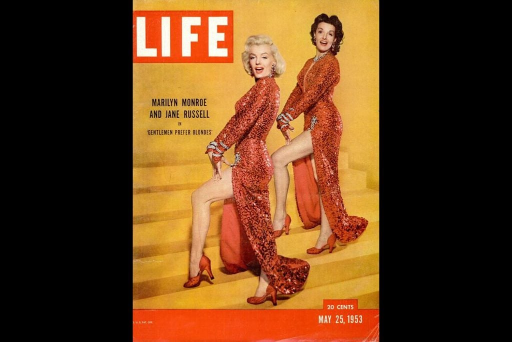
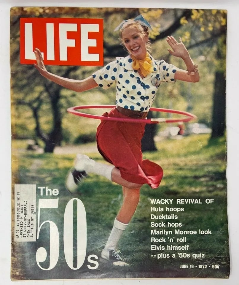
Mid-twentieth century American magazine covers sought to stand out with simple yet powerful design: full page images, solid mastheads and two contrasting colours, with red the king (as we saw with Time magazine).

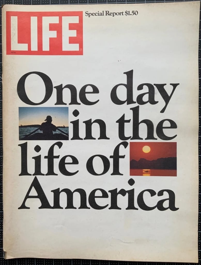
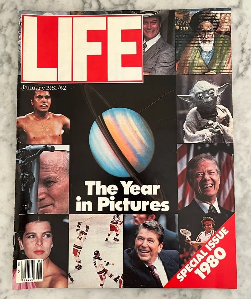
Designed in 1936, Life’s logo became one of the most recognisable brands in publishing thanks to its sheer simplicity: four white letters in a compact, linear sans-serif font (likely a bespoke design) spell out the word LIFE on a bright red background. This rectangle was cleverly positioned in the top-left corner, where the eye naturally begins reading any text.
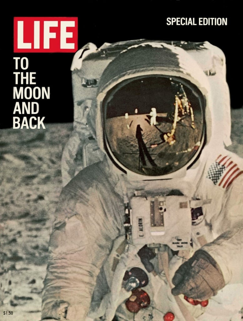
This minimalist composition immediately indicates that images reign supreme and the stories inside will be told primarily through photographs rather than words.
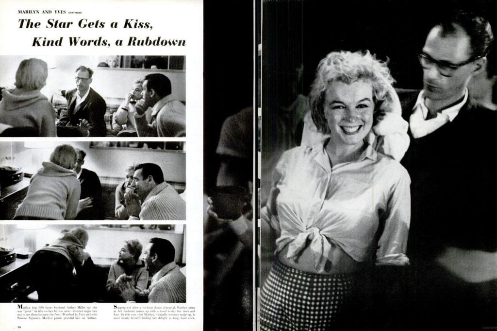
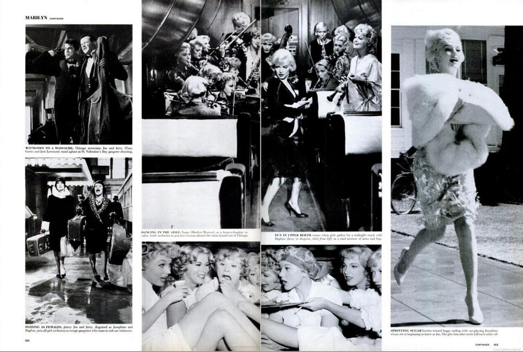
Below, we take a closer a look at a handful of the many features and covers that Life dedicated over the years to that star of all stars, Marylin Monroe.
VISUAL STORYTELLING
In Life magazine, photography took on an important new role: instead of being decorative or descriptive, it told a story. To this end, pictures were often laid out in sequences, like panels in a comic, as can be seen in the double-page spreads devoted to Marylin Monroe.
In the example below, a feature on a day in the life of Audrey Hepburn, the almost chaotic layout creates a sense of dynamism and narrative flow across the pages.
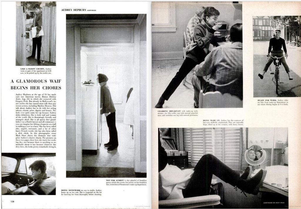
Life‘s visual storytelling places readers at the heart of the action, which seems to unfold before their very eyes. And unlike moving pictures, static images allow time and space for thoughts and feelings to emerge in the minds of readers, building tension and sustaining interest. Narration in journalism would never be the same again.
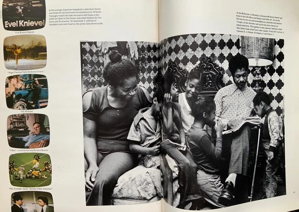
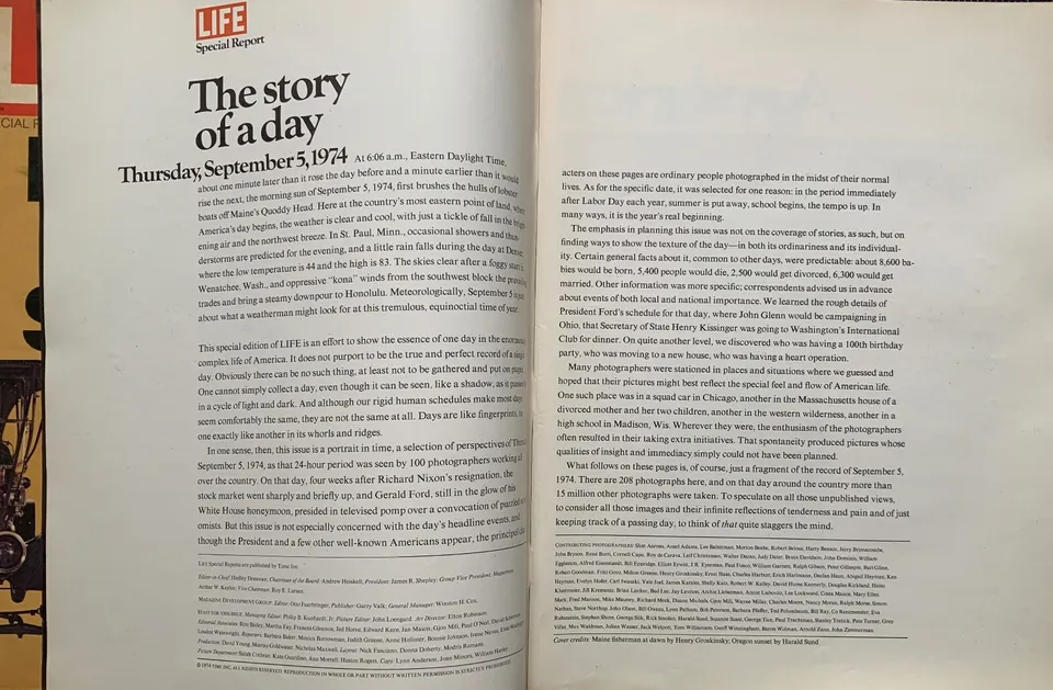
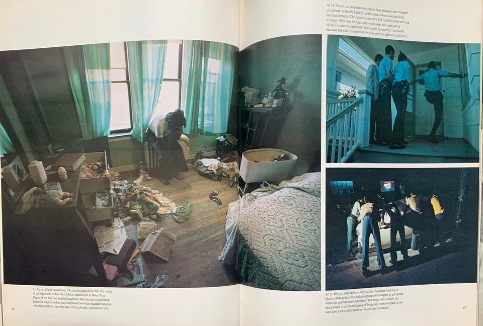
The next example is from a special edition devoted to a typical day for an African-American family. The piece takes us inside their home and offers a glimpse of their everyday reality.
GRAPHIC DESIGN FOR STORYTELLING
In a publication so heavily focused on visual storytelling, graphic design needs to be low-key and logical. The magazine used a simple but flexible layout that enabled photos in various formats to be moved around inside modular grids.
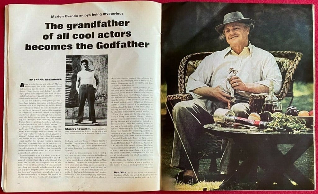
When it comes to fonts, the picture’s a little hazier: in the absence of any detailed graphic design analysis, all we have to go on are the few images found online.
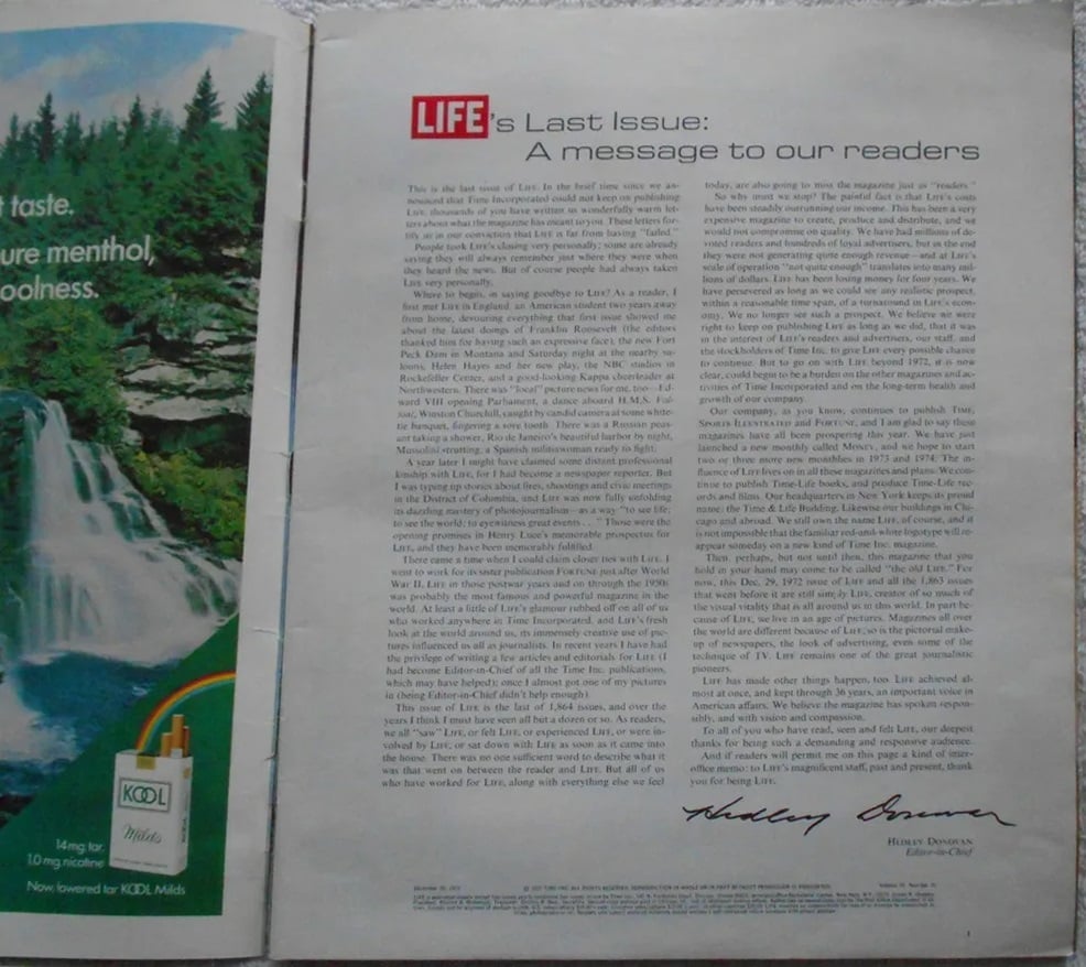
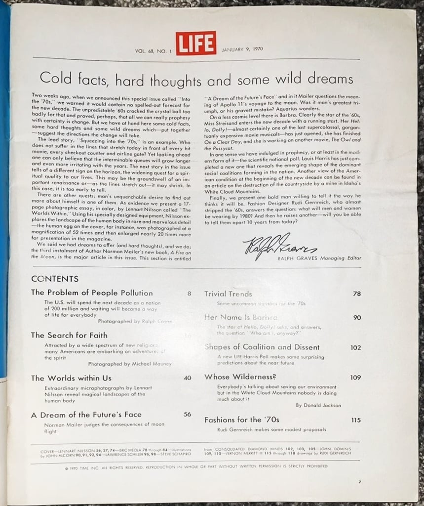
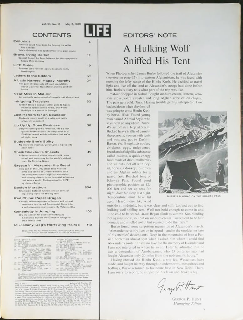
The magazine almost always used font pairing, where a serif font is used for the body copy and a sans-serif for headlines. As a result, a page could switch from Helvetica to, say, Eurostile which, truth be told, didn’t really suit the house style, to Goudy, which lent heft to headlines, to various versions of Grotesk, which echoed the logo.
Such seemingly arbitrary shifts are plain to see on these editorial pages from the sixties and seventies, a period in which the publication tried to toe the line between modern and classical typography, with mixed results.
The eighties saw an attempt to standardise the iconic Life logo using a modern font, Trade Gothic, with dismal results.
THE MAGAZINE THAT INVENTED PHOTOJOURNALISM
Life will be forever remembered for pioneering a new way of putting together a magazine, one that uses photos to tell stories rather than simply illustrate them, flipping the traditional hierarchy between words and images on its head. In its pages, text accompanied photos, helping to flesh out the story and bring readers closer to the subject.
In some ways, this approach foreshadowed today’s digital media landscape in which images (whether photos or illustrations) are often used to say quickly and powerfully what might take a thousand words. The visual storytelling found in the digital versions of the world’s leading newspapers is the direct descendant of a magazine founded over a century ago, which, with simplicity and audacity, revolutionised the way news stories were told.
Image sources:
https://humanities.princeton.edu/event/behind-the-iconic-images-in-life-magazine/
https://www.nydailynews.com/2022/11/22/life-magazine-through-the-years-see-the-most-iconic-covers/
https://www.vogue.fr/fashion-culture/article/life-magazine-photographs-for-auction
https://www.picturecorrect.com/the-story-of-life-magazine-built-on-powerful-photography/

