
Table of Contents
Customisation is key to expressing personality. In almost every situation and market, we naturally seek something customised. That’s because we want to feel unique and different from everyone else.
In the same way, firms want to stand out from one another. Especially when it comes to branding: uniqueness and recognisability are vital for effective communication and commercial success. Which is why we use trademarks, graphic elements whose main purpose is to make a company or organisation recognisable.
Graphic elements and brands: symbols, logotypes and…fonts!
In the vast world of branding, we find all sorts of graphic elements that help make firms immediately recognisable. When we think of the most famous graphic elements used for identifying a brand, logos immediately come to mind. These are devices that represent a product, service, company or organisation. A logo typically comprises a symbol or a graphic representation or version of a name. Here you can see some of the most successful examples.
We can divide logos into two types:
- Symbols or icons
- Logotypes
Symbols
Symbols are simple and intuitive images that represent a company. They can be figurative, associative or abstract. This type of logo must be instantly recognisable, memorable and it must work when reproduced in any size.

Logotypes
Logotypes or wordmarks, represent a firm through its name (or its acronym) using lettering only. The typographic style of a logotype must be unique and must stand out from any homonyms. And legibility is key to its success.
When developing a company’s corporate image, in addition to the logo, other graphic elements are included, such as one or more fonts for use in all aspects of a brand’s identity. In recent years, there has been a growing trend for major firms to design (or commission) a custom font, rather than choose an existing one.
Custom fonts were introduced a decade ago in the tech industry. The aim was to save money by not having to pay licensing fees for existing fonts. But today, this choice no longer seems to be about saving money, but instead has more to do with customisation.
A tailor-made font conveys a firm’s identity with every inch of text. It’s undoubtedly one of the most important tools for displaying the individuality of a brand in any medium.
Although a custom font can cost bigger firms up to $100,000, in the long run it could actually save them money. Let’s take a look at four brands who decided to create their own custom font.
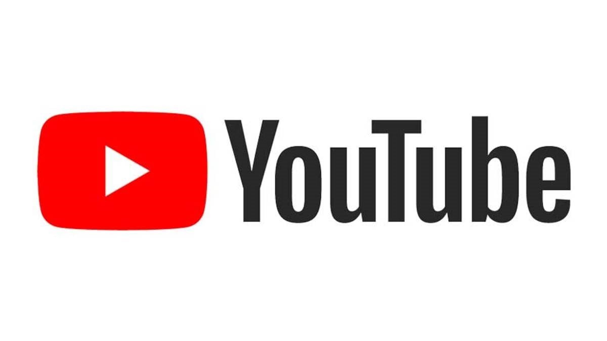
YouTube: an immediate and iconic font
YouTube, the online world’s most famous video platform, underwent a ‘brand refresh’ in 2017. The following year, the company introduced a custom font, YouTube Sans (https://saffron-consultants.com/projects/youtube).
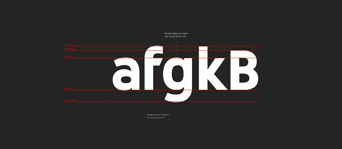
In YouTube’s case, the starting point for designing the new font was the ‘Play’ button.The button icon was altered to make the angles and curves more harmonious.
And the shape of the letters was inspired by the same button: they are rounded to match the outer contours of the icon, with diagonal cuts inspired by the ‘Play’ triangle.
The main aim of this font is to better convey the company’s aesthetic. This typeface is very expressive, but at the same time, simple and bold, just like YouTube.
London 2012 Olympics: a nod to ancient Greece
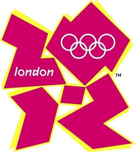
In 2012, the Olympic Games were held in London. For this huge series of events, a brand identity comprising multiple elements was created. The most of important of these was the logo.
A symbol was created that arranged the numbers 2, 0, 1, and 2 in a squared formation which was inspired by the city’s spirit and architecture. The most important characteristic of this logo was its flexibility: it could interact with partner and sponsor logos, and also be used as a space for inserting images and multimedia content.
Among the various elements created for the London Olympics was a tailor-made font, 2012Headline (https://fonts2u.com/london-olympics-2012.font), which was designed to be used in titles and large lettering.
It was inspired by a font created in 1997, Klute, which itself was based on Gothic script and ancient graffiti. And it’s easy to see why: the shape of the letters evokes the world of ancient Greece and the original Olympic games.
And if the sceptics among you are wondering why the ‘o’ is completely round, the answer lies in its nod to the Olympic rings, the enduring symbol of the games.
Prada: a font that strengthens connections with the brand
Prada is one of the world’s most famous fashion houses. Established in Milan in 1913 and today headed by Miuccia Prada, granddaughter of founder Mario, it’s a brand that has always known how to stand out.
Prada’s wordmark has remained more or less the same since it was founded. The typographical style has remained the same too, bar a few tweaks from time to time. Unique and iconic, the Prada logo is one of the most recognisable in the fashion world.
In 2012, working with a design studio, Prada decided to create a custom font. And so Prada Candy (https://www.designspiration.net/save/6530643175848/) was born, a typeface that is still evolving today.
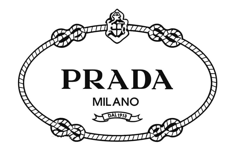
Behind this project lay a desire to increase recognition of the wordmark, to grow this brand asset and leverage its uniqueness across all communication materials.
Over time, this typeface has been used to bring into the Prada universe the label’s new products, or those that were furthest from the brand’s concept. Its role is therefore to forge an extra connection with the brand.
On a technical level, the font is designed for use in uppercase only, and on few words at a time. This keeps the connection with the logotype and ensures no originality is lost by standardising it.
Apple: a font with clarity and legibility at its core
Some companies just use a wordmark, while others use a wordmark together with a symbol. There are very few firms able to use just a symbol, without lettering. Apple is one of these. Its brand awareness is such that the famous apple is enough to identify the brand.
This symbol has hardly changed since the company was founded, and it’s always been highly recognisable. Rarely does the firm add the word ‘Apple’ beside the symbol.
In terms of typography, the firm used the Helvetica font for many years. One of the most famous typefaces out there, it’s renowned for its clarity and simplicity.
In 2013, Apple decided to create its own font, San Francisco (https://developer.apple.com/fonts/). In keeping with its reputation for pared-down, minimalist aesthetics, it’s a sans serif typeface which, at first glance, appears very similar to Helvetica.
Once again, the motivation for creating this font was customisation. The company strengthened its identity by creating a font that would be used on every Apple device and be seen by millions of people around the world.
In addition to uniqueness, there were also practical reasons behind Apple’s decision. San Francisco is in fact a typeface that has been meticulously designed for better onscreen legibility. The shapes of the letters are ideal for use on electronic devices, especially those with small screens.
So, while Apple has a logo that differs from the other examples above, it still needs a custom font. The symbol is very strong and instantly recognisable, but a custom font is required to convey the company’s personality in every aspect of its corporate image.
What’s more, this typeface also fulfils two important criteria: it adheres to Apple’s minimalist aesthetic and offers enhanced legibility.