
Table of Contents
It has been translated into at least 38 different languages and sold over 150 million copies worldwide: The Lord of the Rings, J. R. R. Tolkien’s fantasy adventure trilogy, is one of the most successful books ever written.
The future popularity of his work and the universe in which it was set, one complete with its own languages and mythology, would have been hard to imagine for Tolkien, a professor of Anglo-Saxon, when he was writing. And he wasn’t alone. Even his first publisher struggled to grasp the potential of The Lord of the Rings, so much so that it decided to publish the book in three volumes instead of one. In doing so, they hoped to limit the financial risks involved with what, at the time, seemed to be a title with limited appeal beyond a handful of fantasy fans.
Fortunately, things turned out differently.
In the years that followed, countless different editions of The Lord of the Rings would be published around the world, be they collectible, extended, unauthorised or paperback versions (which were somewhat disdained by the author).
Today we’re telling the story of The Lord of the Rings through its covers: from the most iconic to the most unusual.
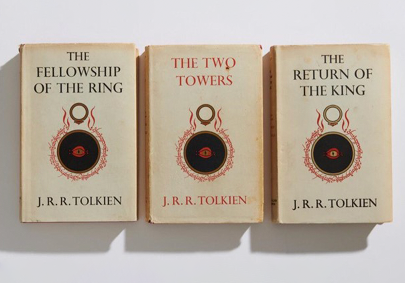
The cover of the first edition of The Lord of the Rings
The first edition of The Lord of the Rings was published in three volumes between July 1954 and October 1955, after anything but a linear writing process.

In fact, from 1937 to 1949, Tolkien spent a number of spells working on his book, which he initially conceived as a single volume. However, publishers George Allen and Unwin had other ideas: worried that such a weighty tome may turn out to be a flop, they decided to split it into three volumes to limit the risks and spread out printing costs.
Tolkien, who reached a point where he feared his book would never be published, grudgingly accepted the decision. And he at least had the consolation of the elegant, minimalist cover featuring one of his own illustrations of the Eye of Sauron surrounded by Elvish runes and the infamous ring.
Cor Blok’s peculiar Dutch covers
If, when you think of The Lord of the Rings, what immediately comes to mind is the typical fantasy aesthetic, then the cover for the paperback Dutch edition from 1965 will surprise you.

Dutch was the first foreign language in which the legendary trilogy was published, but the first edition was far from a bestseller. It wasn’t until Het Spectrum’s paperback edition came out, adorned with Cor Blok’s strikingly simple cover art, that it found a wider audience in the Dutch-speaking world.

Cor Blok, an illustrator and lecturer in the history of modern art, opted for a simple, fairytale-like style. His drawings still leave lots of room for the imagination and are a far cry from typical fantasy aesthetic that would later come to dominate covers around the world.
Although J. R. R. Tolkien had always been highly critical of paperback versions, in this case he was so taken by Cor Blok’s illustrations that he bought two of them for himself.
The “unauthorised” cover
In 1965, Ace Books published an edition of The Lord of the Rings in the United States that is today much coveted by collectors: it’s known as the “unauthorised” edition.
For over a year, it was the only edition on sale in the United States, and helped Tolkien’s work to become hugely popular. But it did less for the author’s bank balance – at least at first – because the publisher managed to get away with paying J. R. R. Tolkien next to nothing by exploiting a loophole in copyright law.

Regardless, the covers of this edition would be etched into the imaginations of a generation of Americans. The background of each volume featured one of three primary colours against which Jack Gaughan’s dynamic illustrations were set.
Despite the controversy surrounding its publication, Tolkien quite liked the covers of the unauthorised edition. But the same couldn’t be said for another US edition…
Tolkien was baffled by Barbara Remington’s quirky cover art for the Ballentine edition
“What has it got to do with the story? Where is this place? Why emus? And what is the thing in the foreground with pink bulbs?”, asked the author of The Lord of the Rings on seeing the cover for the first authorised paperback edition in the United States, published by Ballantine in 1965.

In her defence, the artist, American painter Barbara Remington, said that she hadn’t read The Lord of the Rings and worked off a brief synopsis of the book provided by the publisher. There was a similar controversy around the cover for The Hobbit, Tolkien’s children’s book that inspired the trilogy. Remington included a lion on the cover of The Hobbit, which Tolkien told the publisher to remove immediately: the lion did not appear on later editions.
While Tolkien didn’t like Barbara Remington’s work, many fans did. And in the sixties, she even designed a popular poster that brought together the three motifs from her covers into one big composition.
The covers drawn by Tolkien
Perhaps in an attempt to make amends for its previous gaffes, Ballantine decided to use illustrations by Tolkien himself for the cover art featured on later editions.

The three illustrations in pencil, ink and watercolour offer a rare glimpse of one of The Lord of the Rings author’s other talents: drawing.
Indeed, Tolkien would often express his vivid imagination as drawings, illustrations, maps and artefacts that accompanies his writing. Sadly, much of Tolkien’s art work has been lost.
The nineties covers that inspired the film
Anyone who read The Lord of the Rings in the nineties will remember the superb cover art by Alan Lee. His illustrations are powerful and imaginative, majestic and epic, and just a little bit mysterious.

Alan Lee’s covers were first used for Harper Collins’ 1991 illustrated edition celebrating Tolkien’s centenary.
The British painter’s watercolours were a huge success and would influence The Lord of the Rings aesthetic for years to come. Indeed, they inspired Peter Jackson’s blockbuster film adaptation. Not only did the Kiwi director use Lee’s art as point of reference for his films, he also asked Lee to work on production of the films – which lasted seven years!
The artist would play a direct role in shaping the film’s aesthetic together with Jackson.
The weird Polish covers of The Lord of the Rings
It’s when we look to Eastern Europe and the countries that once belonged to the Soviet bloc that we truly see how Tolkien’s world was able to inspire unique and unusual cover art.

A prime example is the 1981 Polish edition of The Lord of the Rings, which features strange and unsettling faces on the covers of each volume. They are the work of Jerzy Czerniawski, an artist who specialised in creating posters for the counter culture in seventies Poland.
The choice of artwork for these covers was probably also part of a deliberate strategy to evade censorship, as Tolkien’s trilogy was viewed with suspicion within the Eastern Bloc. But even after the fall of the Iron Curtain, the Polish tradition of singular covers continued: a 2006 paperback edition featured details from paintings by mysterious Flemish painter Hieronymus Bosch.

Soviet covers of The Lord of the Rings
In Cold War Russia, readers of Tolkien’s masterpiece were treated to covers that would have surprised a Western audience.

This is especially true of the illustrations by Ukrainian artist Sergej Iukhimov, which were used for the 1993 edition of The Lord of the Rings and are, according to scholars, among the most complex and nuanced to date.
Iukhimov’s powerful images combine the medieval and the modern in a style reminiscent of biblical mosaics. The result is quite unique.

Some fans may turn up their noses at these interpretations because they contrast so starkly with the aesthetic typically associated with Tolkien’s fantasy masterpiece. But they show us just how powerful the imagination is: Tolkien’s richly detailed and highly creative work is able to inspire the mind’s eye of publishers, illustrators and readers across the world.
And what about you? Which is your favourite cover of The Lord of the Rings?
Would you like to help us add to or improve the content of this article? Check our guidelines and send us your request via email at: seo@pixartprinting.com.