
Table of Contents
Packaging luxury items can be tricky, because you don’t want to overpromise on the product or overshadow it. The product is the star, while the packaging is its bodyguard—there to protect it and let consumers know it’s important. Great package design speaks volumes about the product, its price-point and values, and where it stands in relation to similar products.
Luxury is often associated with high-ticket items, but that’s not always the case. A luxury item is something special, that you wouldn’t normally buy, like a piece of jewelry, a fine spirit, or a beauty treatment. You’ll see below that packaging for these items comes in many forms, colors and textures, all to the benefit of the product.
Alchemy Oils
Brand design: Sheridan&Co.
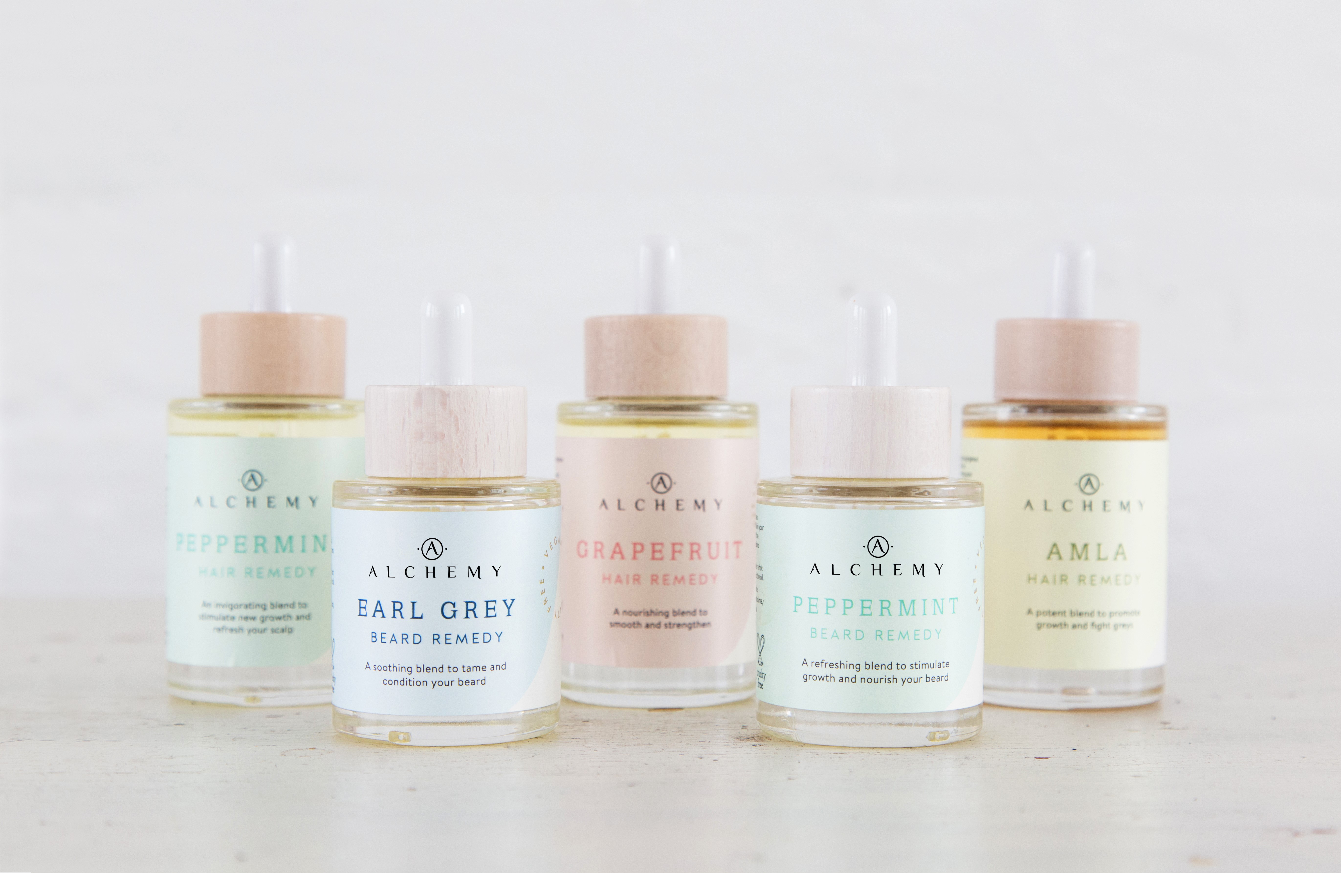
The ancient Ayurvedic practice of hair oiling in India has been resurrected by Alchemy Oils using pure, nourishing, natural ingredients to promote hair strength and growth. Alchemy has simplified a time-intensive process and created solutions for all hair types. To promote their wellness brand and target it to millennials, they hired Sheridan&Co to update their brand presence, including the packaging.
“The objective was to explore a more luxurious visual direction that celebrated the brand’s Ayurvedic provenance, pure ingredients and promotion of self care rituals. More especially, the design solution needed to ensure that it resonated with both male and female consumers without alienating the nuances unique to the different tribes,” says Michael Sheridan, chairman and CEO, of Sheridan&Co.
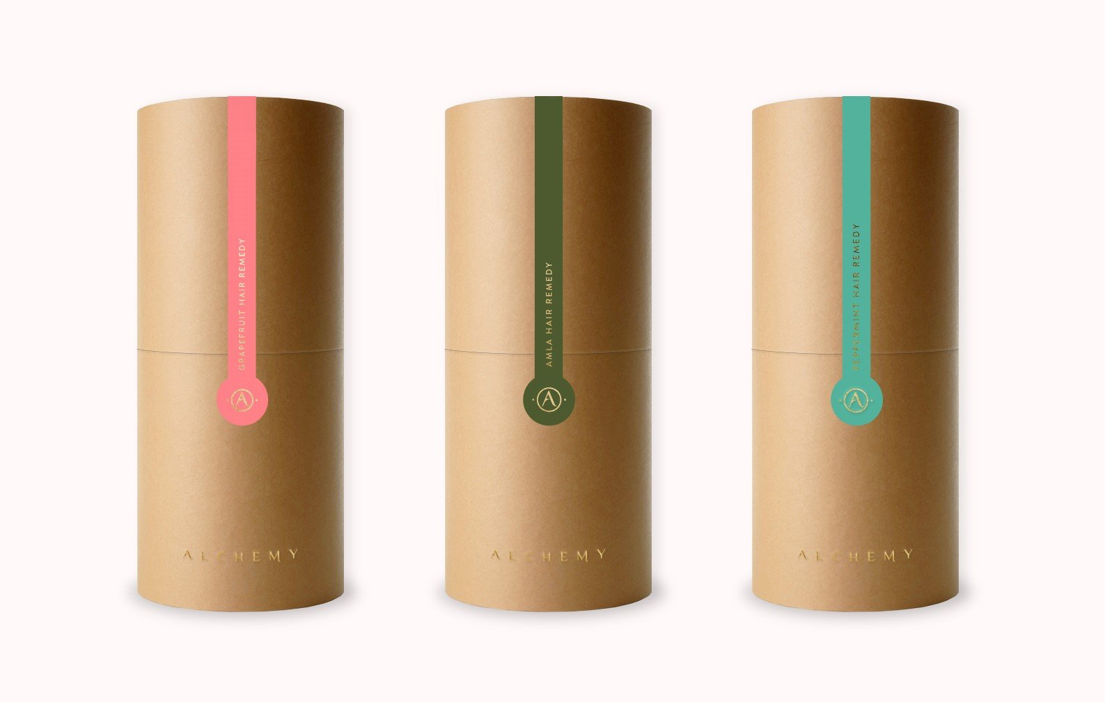
Using its existing pastel color palette, the designers used different colors for each product “flavor,” while retaining the sophisticated all-cap serif typeface for the descriptions. The labels are placed directly on the bottles which are packaged in an outer plain cardboard box, given a premium feel with the gold foil Alchemy logo—a subtle nod to the precious honey-hued nectar encased within the apothecary-style bottle.
“Alchemy Oils appeals to a largely Millennial audience – their ideas of lifestyle and beauty are far from the pomposity, superficiality and excess of generations before them. The beauty industry is increasingly being influenced by activists fighting for more diverse representations of people from all cultural backgrounds and sexual persuasions. The acceptance of flaws and idiosyncrasies is becoming an empowering movement. Consumers have moved towards a culture of imperfection, vulnerability and diversity. This is reflected in the rise of messaging promoting ‘honest’ self-image. Alchemy Oils’ natural proposition fits well with this ethos; therefore the design solution needed to capture the zeitgeist and engage with an anti-perfectionist mentality of sorts,” notes Sheridan.
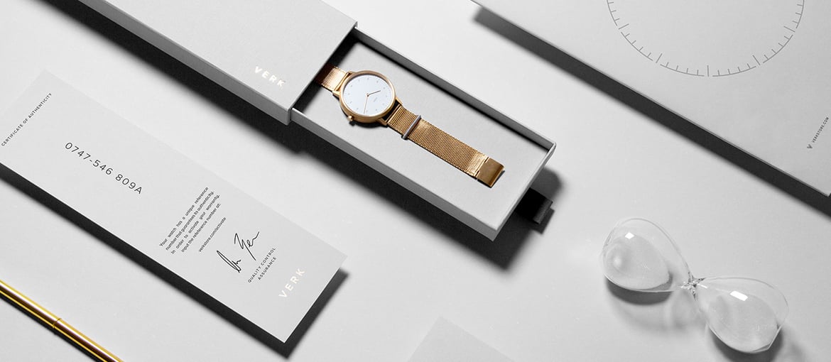
Verk
Brand design: Studio Ahremark
Verk is a Swedish watch manufacturer focusing on the essentials of timekeeping, inspired by the Scandinavian design heritage. Verk, which translates to ‘artwork’ as well as ‘clockwork’ in Swedish, has an artistic and simplistic approach to the art of watchmaking creating functional and aesthetic watches fitted for the modern man and woman.
They hired Studio Ahremark to create a strong visual identity and elegant packaging that would help them stand out in this competitive market and create a luxurious experience for consumers. Designer Hannes Ahremark says, “Nordic design is heavily based around the idea of simplicity and functionalism. It’s a long tradition of wanting to create design solutions that are easily accessible, democratic and environmentally friendly.”
He says, “Visually the approach was based on the idea of using one single paper for the brand as far we’d be able to. Reduction and simplicity help in clarifying communicative aspects and very often minimizes waste. This coherent solution is also based on the idea that the watch is meant to be the centerpiece and the packaging shouldn’t be nervously screaming for attention. The packaging in that sense becomes the canvas and the watch becomes the painting.”
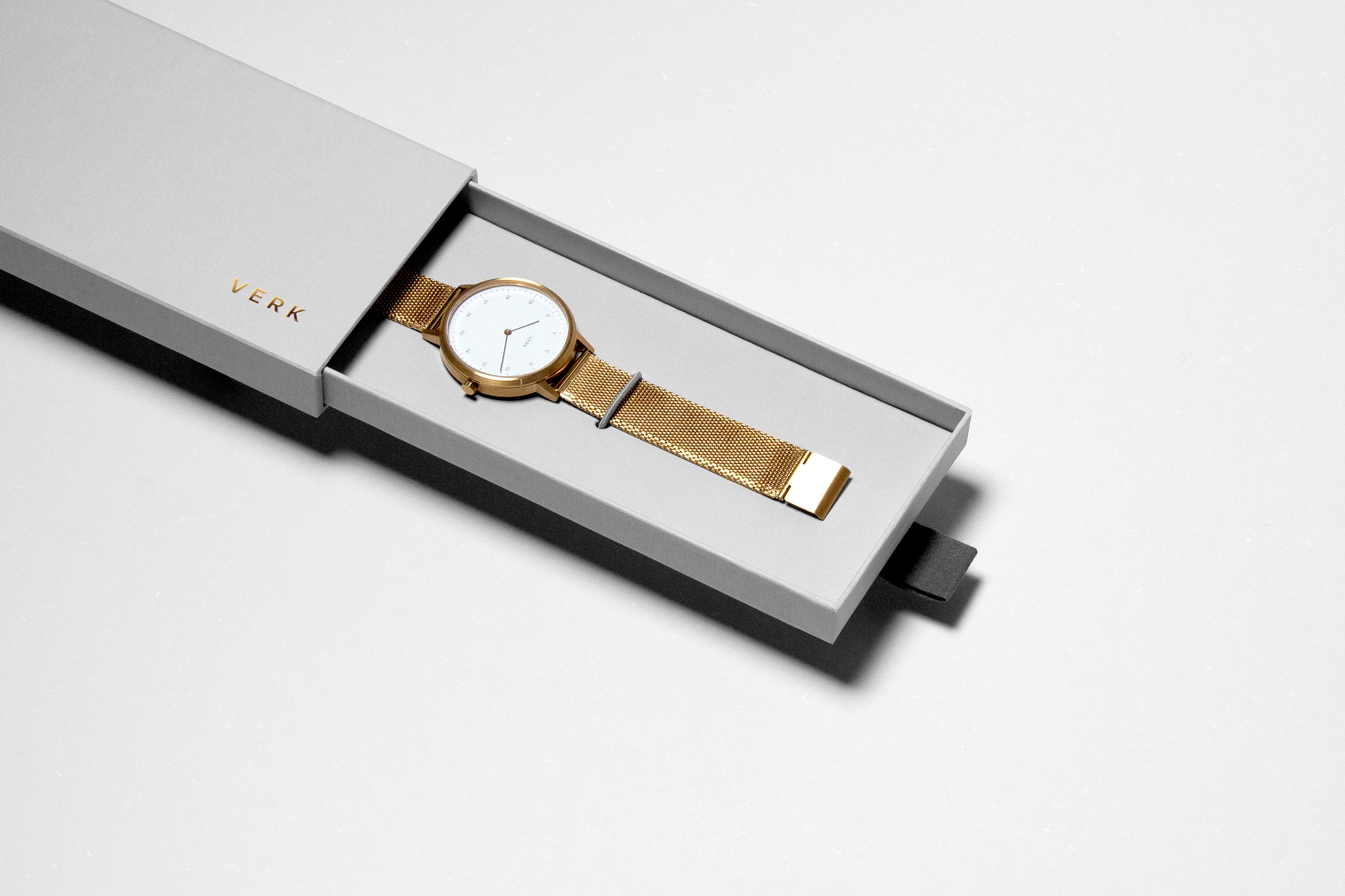
The print house helped the designers source the sturdy and tactile packaging materials and eventually turned their concepts into the resulting package, which features a foil-stamped word mark. “The idea behind the gold color is that instead of introducing more ‘artificial’ colors to the mix, we would use the colors that resemble materials already found on the watches. In this sense creating a visual identity and packaging that complements the watch instead of competing with it,” Ahremark notes.
He adds, “It was important that the packaging and all the printed material that came with the watch had a strictly coherent and unifying look and feel. All material was based on the same grid and the same set of base dimensions. When those initial requirements and goals were set, the design naturally was shaped inside those boundaries. The idea was always to create a luxurious experience where even the tiniest asset would get the appropriate attention.”