

Table of Contents
What colour do you see when you think of Ferrari, Coca-Cola, Post-it or Tiffany? That’s right, it’s a very precise colour (which may even be a registered trademark).
Just like a name or logo, a colour can become an identifier for a brand, capable of speaking for the brand, even in its absence. Here we trace the history of four colours that have been intrinsic to the success of four global brands.
Post-it yellow
Canary yellow, the colour synonymous with 3M’s Post-it notes, was chosen by pure chance. And chance, as we’ll see, has played a decisive role in the brand’s 30-year history.We look at how.
The “father” of the Post-it was Spencer Silver, an engineer at 3M. In 1968, he invented a light glue that adhered to any surface and could be stuck, unstuck and re-stuck without leaving a mark. This discovery was the result of chance, or rather, error. Spencer Silver stumbled across his light glue while he was trying to create a completely different adhesive. And initially he had no idea what to do with his discovery. It was his colleague, Art Fry, who saw its potential.
Art Fry sung in the church choir and struggled to manage his score: he would insert little pieces of paper between the pages as markers, but they kept falling out. So, he decided to stick them onto the score with the glue that Silver discovered. And so the first Post-it notes were born.In 1980, large-scale production began in the United States and, thanks to contributions from many others, the little yellow sheets soon spread around the world.

But why yellow? You might think that the choice of colour was the result of extensive testing and research. Indeed, yellow stands out among white sheets on a desk, it’s a colour that stimulates mental processes and aids the memorisation of notes. All very plausible, but that’s not what happened: to conduct the first tests, Spencer Silver went to the 3M warehouse to look for some paper samples and all he could find was Canary Yellow paper. And that’s how the Post-it got its iconic colour.
Coca-Cola Red
When we think of Coca-Cola, we see bright red in our mind’s eye. You won’t find this colour in any Pantone colour chart, because it’s a combination of three different shades of red. James Sommerville, VP of global design at Coca-Cola, considers Coca-Cola Red to be the company’s “second secret formula”.
Who decided red would be the Coca-Cola’s colour? To find out, we need to jump back in time to 1886, when Frank Mason Robinson designed the Coca-Cola logo in the iconic Spencerian script and chose the colours red and black, a combination he particularly liked. Over the years, the logo has remained pretty much unchanged, bar the addition of the red disc in 1948, which further strengthened the link between the brand and the colour.
An interesting fact: despite what many believe, it wasn’t Coca-Cola who dressed Santa Claus in red. Rather, from 1931 onwards, the company simply began using an image of Santa in his habitual attire. There are, in fact, countless images of Santa wearing his traditional red costume from well before this date.
Ferrari Rosso Corsa
Enzo Ferrari: “Ask a child to draw a car and he will undoubtedly make it red”.
In the collective imagination, fast cars are Ferrari red. Red is the colour of the Ferrari Formula One team’s livery and is the most popular colour with the firm’s customers. Among all the shades of red (and there are many at Ferrari), there is only one that the company considers truly iconic: “Ferrari Rosso Corsa” or Ferrari racing red.
So what’s the story behind this colour? From the 1930s to the 1960s, the rules of international motor racing stipulated a colour be assigned to each country, and Italy’s colour was red. The colour was adopted by Ferrari and, over the years, became an integral part of the brand’s identity. Let’s not forget that red is the colour of fire, power, passion, luxury, wealth and vitality. And, according to studies into the psychology of colour, red generates energy, excitement, happiness and joy. In other words, red is Ferrari through and through.
Tiffany Blue
It’s an unmistakeable shade of turquoise that makes women the world over jump with joy: it’s Tiffany Blue, Pantone colour code PMS 1837. A colour that has become a brand.
Remember when, in January 2017, Michelle Obama presented a gift to new first lady Melania Trump? Photos of the moment show the outgoing first lady handing over a distinctive blue box. And the world immediately knew the gift came from luxury jewellers Tiffany & Co. (It was a silver picture frame).
What are the origins of Tiffany Blue? Charles Lewis Tiffany, the company’s founder, chose the colour for the cover of his jewellery collection’s annual catalogue, first published in 1845. The shade of turquoise was a blend of robin egg blue and forget-me-not blue. Later, Tiffany Blue would also be used on the iconic (and trademarked) boxes in which every Tiffany piece is presented, as well as on shopping bags and advertising material.
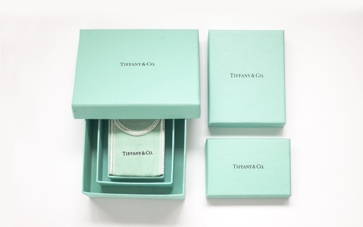
In this instance, the choice of colour was no accident: turquoise was the traditional colour of Victorian brides, who on their wedding day would often give guests a turquoise brooch in the shape of a swallow. What’s more, the colour symbolises elegance and sophistication, exclusivity and luxury. What better colour for Tiffany?