A logo is a bit like a shopfront. It’s the first thing that you notice about a brand. It can consist of a monogram, lettering, a pictogram, a mascot, an emblem or a combination of several elements. Whatever form it takes, it should convey a message, stand out and, above all, be recognisable. It’s a symbol that is both simple and complex, each of whose components greatly influences the way in which the logo is perceived. Today, more and more brands are embracing logos devoid of any mention of their name, but few companies enjoy the brand recognition that allows them to do so… as American firm Mastercard is doing today.
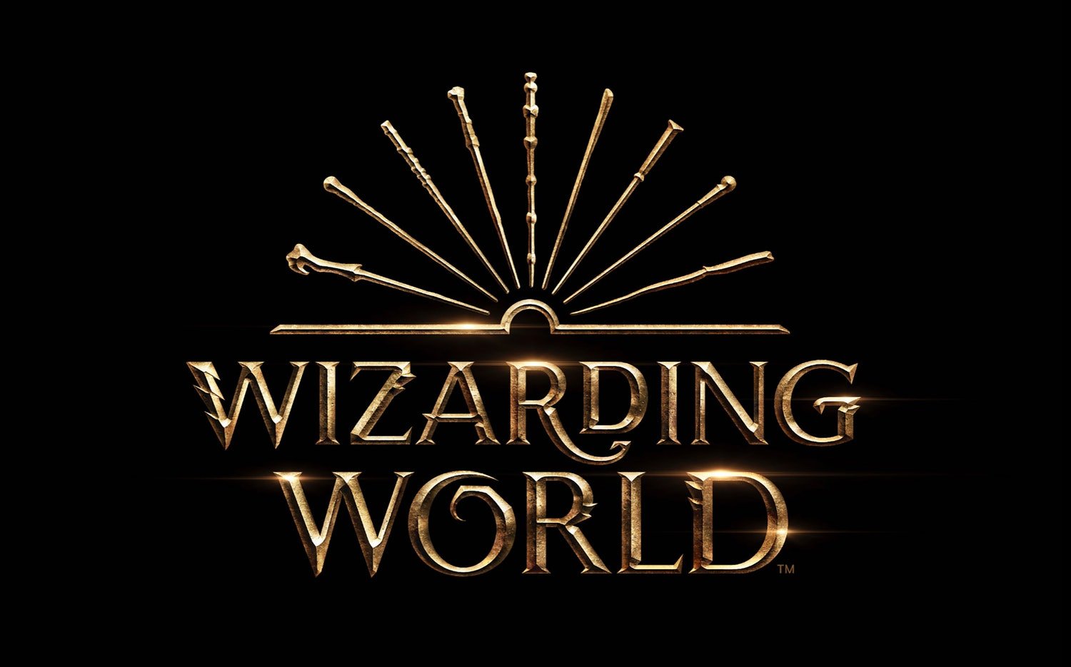
This new nameless identity is the work of Michael Bierut and London-based design agency Pentagram (Bierut is a partner in the firm’s New York office). Bierut is a celebrated graphic designer who created the logo for Hillary Clinton’s 2016 presidential campaign. As for Pentagram, its notable work includes the visual identity for the Wizarding World franchise, which encompasses the magical universe of Harry Potter and Fantastic Beasts.
More recently, they were behind the new graphic identity for Slack, the collaborative communication platform launched in 2014 and which now has several million users worldwide.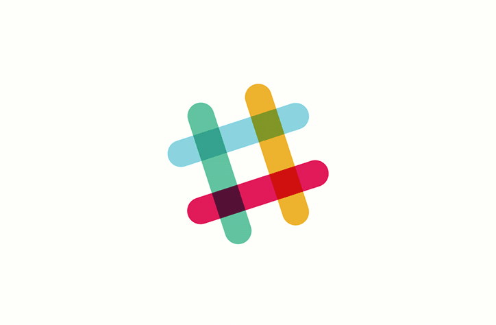
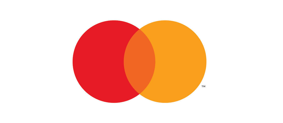
This is the second time that this prestigious design agency has worked with Mastercard. Pentagram is in fact continuing the evolution process that it began in 2016, when the agency modernised the logo by cleaning up the visuals and embracing the trend towards sans sérif typefaces. Mastercard explained this desire for change in a press release: ‘As the consumer and commercial landscape continues to evolve, the Mastercard symbol represents Mastercard better than one word ever could, and the flexible modern design will allow it to work seamlessly across the digital landscape.’
![]()
This transition has been gradual, with Mastercard first conducting research to see whether people could identify the brand without its name. As Raja Rajamannar, Mastercard’s chief marketing and communication officer explained: “With more than 80 percent of people spontaneously recognizing the Mastercard symbol without the word ‘mastercard,’ we felt ready to take this next step in our brand evolution. We are proud of our rich brand heritage and are excited to see the iconic circles standing on their own.’
Indeed, the overlapping red and yellow symbols have represented the brand for over 50 years. They are part of its DNA. They symbolise many things and are now well engrained in the minds of consumers. This graphical simplicity is what more and more brands are after, says Michael Bierut: ‘We live in a time where, increasingly, we communicate not through words but through icons and symbols. Mastercard has had the great fortune of being represented by two interlocking circles, one red, one yellow, since its founding in 1966.’
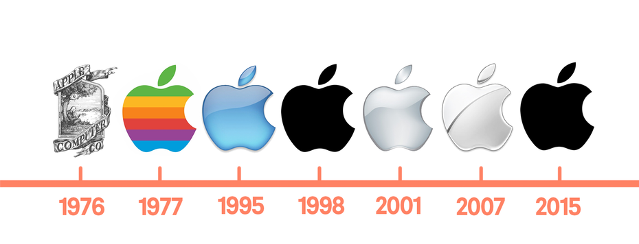
But while it was not until 2019 that Mastercard decided it no longer needed its name to communicate with consumers, others took this bold step many years before. One of the best examples is the Apple logo, which has been synonymous with simplicity and sophistication since 1977. As the aesthetic of the firm’s products has evolved, so has the Apple logo, always perfectly encapsulating the brand’s personality.
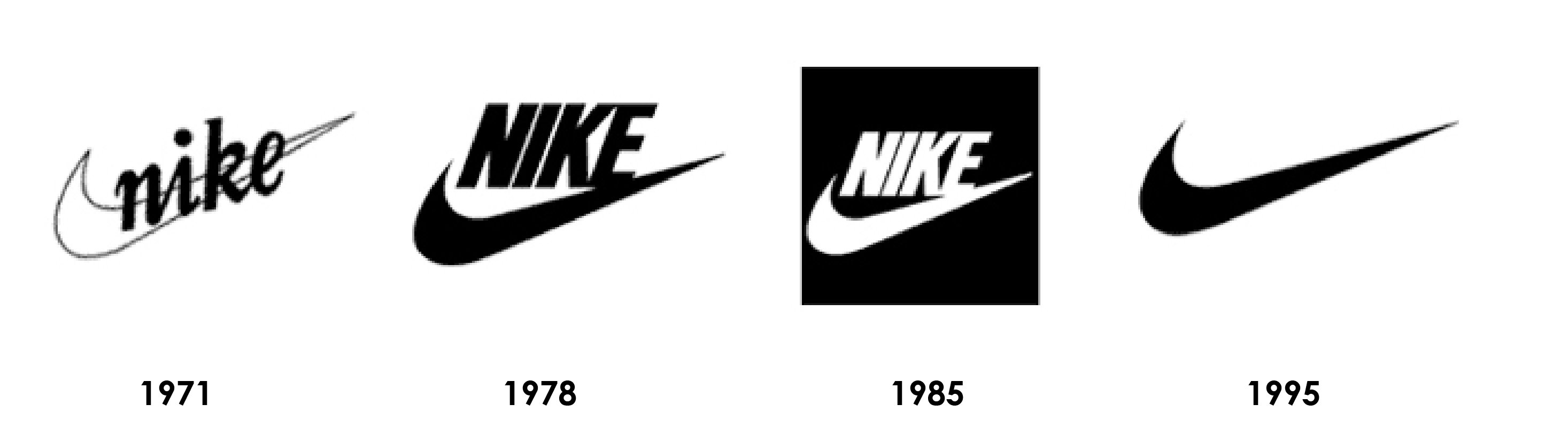
Another fine example is the world’s most famous comma, albeit one that is back to front and horizontal. We’re talking about Nike’s Swoosh logo of course. It was back in 1995 that the brand decided to dispense with the name from its logo, leaving just the Swoosh. The Swoosh represents the wing of the Greek goddess Nike, who symbolises victory.
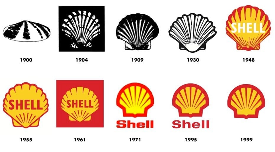
Switching industries, Shell has used the shell pictogram alone since 1999. Like Mastercard, the Anglo-Dutch oil giant has always used the same symbol in its logo. It’s now one of the most recognised logos on the planet.
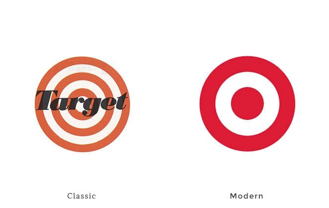
We should also mention the American discount retailer Target. In 1989, the firm temporarily removed the pictogram from its logo, leaving just the brand name. But the red and white target was so well known that everybody associated it with the brand. The famous target symbol made its big come-back in 2006 and this time it was the text that disappeared.
Yet another example is McDonald’s, who for years have been using just the golden arches. The brand is so famous that the fast-food giant can allow itself the luxury of creating advertising campaigns that feature no logo, product name or tagline. Something that very few brands can do…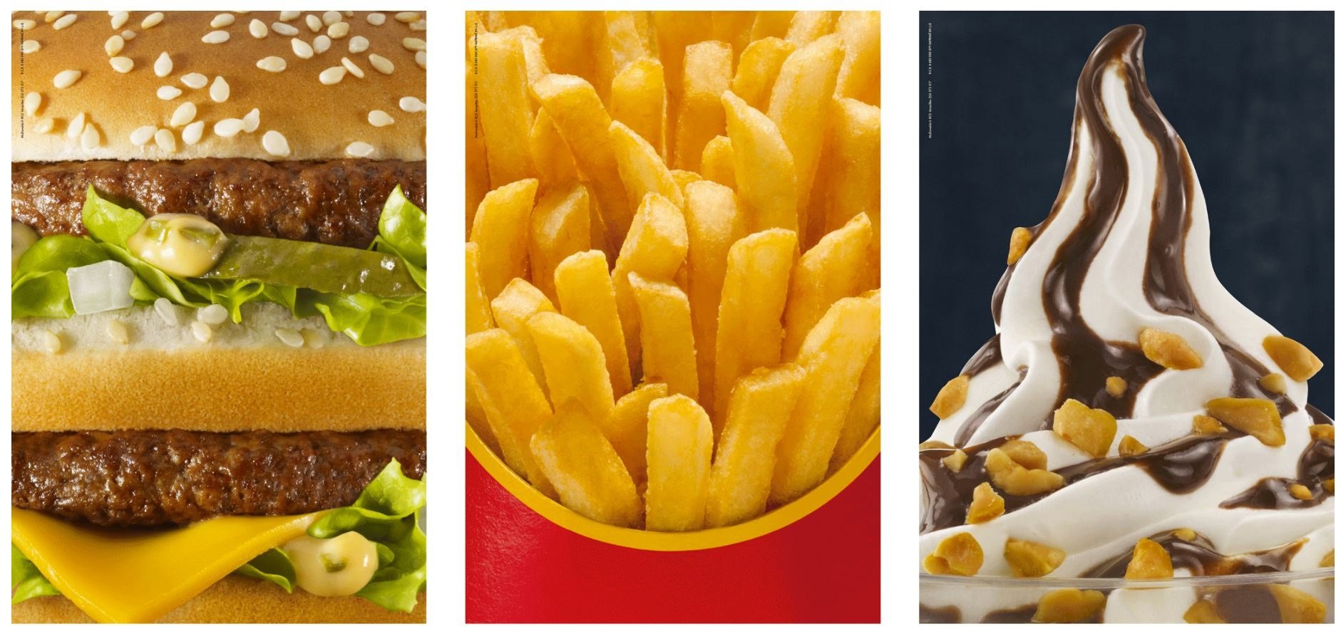
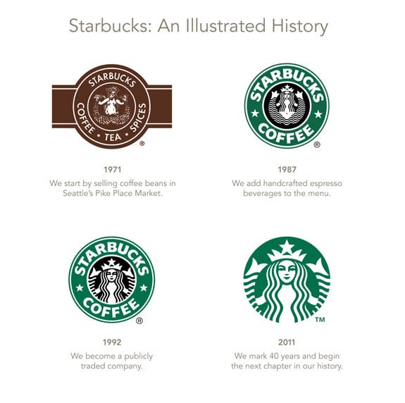
Last but not least is Starbucks, which in 2011 dropped the name from its logo, leaving the siren design only. At the time, the move generated much comment on social media, which were still in their phase of exponential growth.