
Table of Contents
As a young girl, Paula Scher wanted to be an artist.
At the Tyler School of Art, she realised that she wasn’t great at painting and tried her hand at graphic design instead. It wasn’t love at first sight. Initially, she took a course on basic design – focused on the Swiss School and using Bauhaus teaching methodologies – which she found uninspiring. But with the second course, things became more interesting. She understood that graphic design wasn’t just about arranging and managing elements on the page, but was about ideas too.
On the advice of a teacher, she moved to New York after college. It was the mid-1970s. She got a job at publisher Random House and then another at the CBS record label. At CBS, she worked on promotions and advertising at first, then, after a brief stint at Atlantic Records, she switched to album covers. She designed 150 covers a year. It was during this period that she learnt the art of presenting and defending her work: album covers had to be approved by the band, so the ability to explain the work and win the artists’ trust was essential.
Among the covers created by Scher is this one for Boston – interestingly, its incredible success still baffles her today.

In 1973, Scher married Seymour Chwast, a celebrity from the graphic design world who, together with Milton Glaser, founded Push Pin Studios. The couple then divorced, remained apart for six years, and then got remarried. Together in life, but separate in work, to this day they have never worked together on a single project.
At the end of the 1970s, through her mentor Henrietta Condak she rediscovered 20th-century modernism: the constructivists, dadaism, De Stijl, all the grassroots movements from 1914 to 1940. Much of her visual vocabulary comes from the experimentation of that period and approaches taken by these movements. One of her most famous pieces from that era is the “Best of Jazz” poster from 1979.

In 1982, she left CBS to open her own agency with the goal of working for magazines. Despite having received numerous awards for her work at CBS, she struggled to find work in with magazines at first. But her break came when Time Inc. hired her to develop a prototype for a new magazine called Quality.
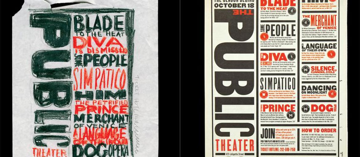
The collaboration with New York’s The Public Theatre
In 1991, Scher became the first woman partner at Pentagram, the prestigious design agency founded by Alan Fletcher. A few years later, she began working with The Public Theater in one of the longest-running collaborations of her career. In 2019, she published Twenty-Five Years at the Public, A Love Story, in which she looked back at their work together.

Scher is still in charge of The Public’s visual identity, as well as posters for shows and the annual summer festival, Shakespeare in the Park.
In 1995, she created an instant design classic: the poster for the musical Bring in ’da Noise, Bring in ’da Funk. It would spawn countless copycat designs, and not just in poster art. Noise/Funk is the piece often used to sum up the work of Paula Scher. It might not be her favourite, but it perfectly encapsulates her idea of graphic design.

The typographic aesthetic used in the posters for Noise/Funk was copied so widely that Paula Scher decided to change approach the following season and for every season thereafter.
In 2001, Scher’s collaboration with The Public became pro-bono, and for a time she was even on the theatre’s board.

The visual identities for MoMA, the Met and the Sundance Festival
In Twenty-Five Years at the Public, Paula Scher explains how the collaboration began and has evolved over the years to become her “research and development” project. What she learnt from her successes and failures she applied to her work on the visual identities for MoMA, the Met (Metropolitan Museum of Art), the New York City Ballet and the New York Philharmonic.
Over the years, she has also worked with the Sundance Festival (the independent film festival founded by Robert Redford), for which she designed the visual identity for the Sundance Institute as well as a couple of editions of the festival.

Paula Scher hasn’t just designed visual identities for theatres, museums and festivals. In 2012, she created the visual identity for Microsoft Windows. And she also worked on the redesign of the Tiffany and CityBank brands.

The AIGA Gold Medal, teaching and advice for young designers
Paula Scher was born in 1948. As we mentioned earlier, she has received multiple prizes and awards. She was awarded the AIGA’s Gold Medal (the highest honour bestowed by the American Institute of Graphic Arts, where she also served as president between 1998 and 2000). She’s also a member of the AGI, the prestigious international graphic design organisation founded by Cassandre in the 1950s.
For many years, Scher taught at the School of Visual Art di New York. She has two pieces of advice for aspiring designers: “One: spend the first one to five years learning how to design and present design from somebody who is terrific at it. Having that basic understanding will carry you through the rest of their career. The second is this: develop the ability to explain, defend, and promote your work.”
When you’re presenting a design in meeting, it’s important to know when to end it. So explains Scher in an episode of the docuseries Abstract. Each participant in the meeting has expectations. When you start presenting, if you’ve done a good job, often the level of expectation grows significantly. When it reaches its highest level, someone objects and then the design ends up below expectations. At that point, concessions are made and you need to end the presentation before an interminable back and forth of proposals and counter-proposals begins.
When she was young, she wanted to be an artist, but felt she wasn’t good enough. But now that she’s one of the world’s most influential graphic designers, she has started painting again. Over the years, she has been creating maps with super-thick writing that very much recall her graphic design work. With this project, she is putting into practice the advice an illustration teacher once gave here: “illustrate with type”. (The same teacher who encouraged her to move to New York).
**********
Bibliography
- Abstract: The Art of Design, Netflix
- Paula Scher, The Great Discontent
- Paula Scher, Beautiful Thinkers Project
- Twenty-Five Years at the Public, A Love Story, by Paula Scher