
Table of Contents
In around 2010, the fashion world was swept by a very specific stylistic trend. It seemed that the most prestigious brands were all changing their visual identity, and all in the same way. Logos were being “refreshed” or redesigned according to a common set of rules:
- Geometric and neutral sans serif fonts
- Typefaces in upper case.
It appears that the idea was to make these brands more global by moving away from references to their heritage and simplifying their form. Let’s take a look at some of the most interesting examples from recent years.
Saint Laurent
In 2012, French designer Hedi Slimane was appointed Creative Director at one of the world’s most renowned fashion labels: Yves Saint Laurent. Soon after taking the reins, Slimane decided to update the brand’s visual identity.
He didn’t just change the logo, but the very name itself, from “Yves Saint Laurent” to “Saint Laurent”. The new logo is a nod the house’s original name, “Saint Laurent Rive Gauche”, and uses the Helvetica font, which also dates to 1960s, the era in which the Saint Laurent brand was founded.

Despite initial criticism, which mainly centred on the decision to abandon the logo and monogram, designed by the celebrated painter Cassandre in 1961, the new identity has been a success. It won Wallpaper*’s “Best Rebranding” prize and kicked off the trend for minimalist branding in fashion.
Calvin Klein
Calvin Klein took to Instagram to unveil its new logo in 2017. The new typography was described as a “return to the spirit of the original”.
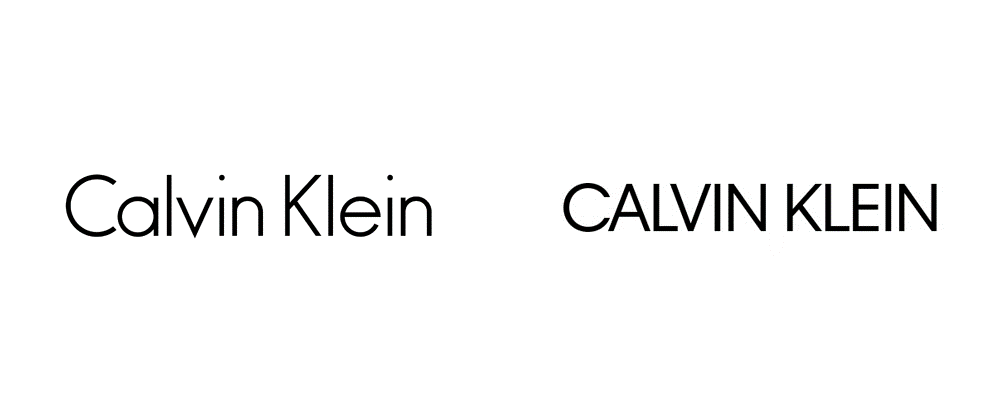
For this design, creative director Raf Simons worked with legendary designer Peter Saville, perhaps best known for his album covers for Joy Division and New Order (of whom Simons is a huge fan). The logo still resembles the original, yet without appearing too vintage.
Balenciaga
Balenciaga also moved in the same direction with its new logo. Inspired by the clarity and readability of street signs, the new logo is more compact and neutral in style, and was designed in-house.
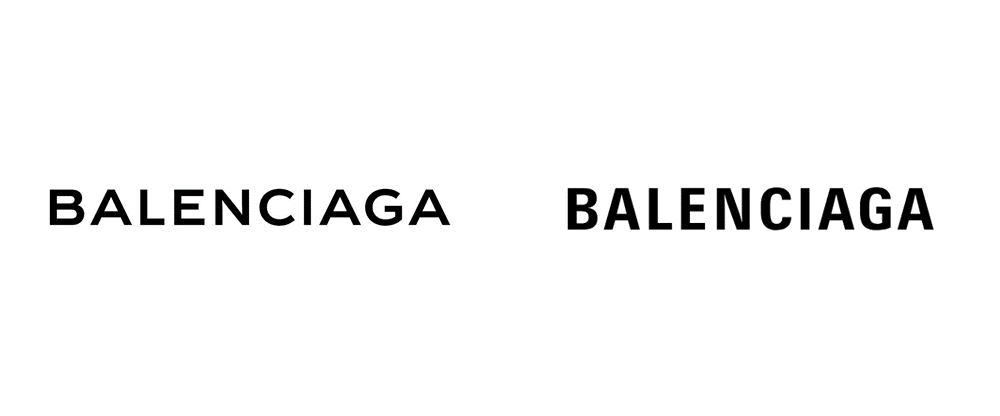
The updated logo is part of a broader plan from creative director Demna Gvasalia who, since his appointment in 2015, has shaken up Balenciaga’s identity. That same year, design agency Bureau Borsche created a new website for the label, cementing its norm-core aesthetic.
Burberry
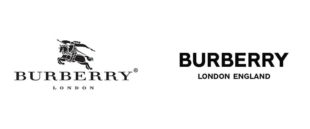
Together with Saint Laurent, Burberry represents the most radical and controversial example of rebranding in recent years. The logo morphed from an elegant serif – unchanged for 20 years – into a clean, geometric sans serif. What’s more, the Equestrian Knight motif that had been used since 1901 was also ditched.
The aim was to make the brand more international and contemporary; having lost the stylistic reference to England, it was decided to add “London England” as a second line to the logo.
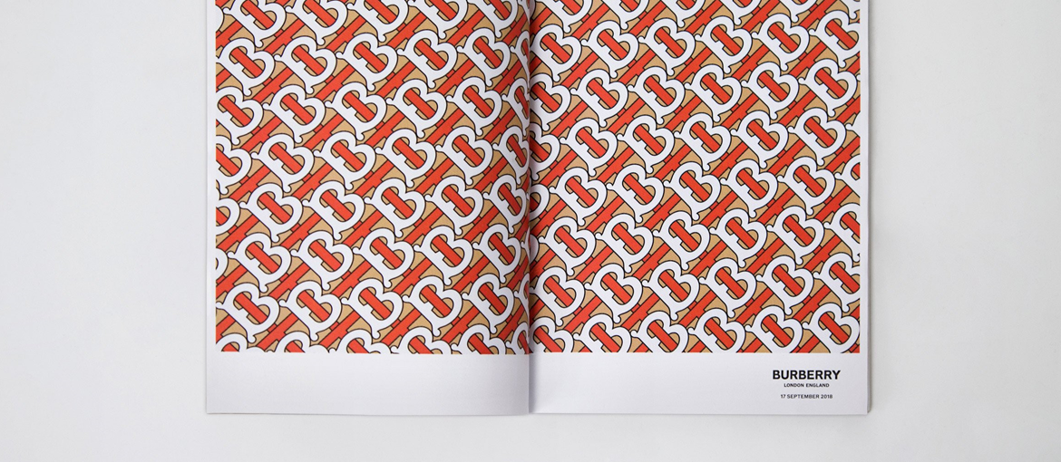
Creative director Riccardo Tisci collaborated with Peter Saville on the design. Together, they also created a monogram dedicated to founder Thomas Burberry to be used principally as a pattern.
Celine
A much subtler and less radical example is that of Celine. Ordered by Hedi Slimane, the new logo got rid of the accent on the “e” and refined the form and spacing between the letters.
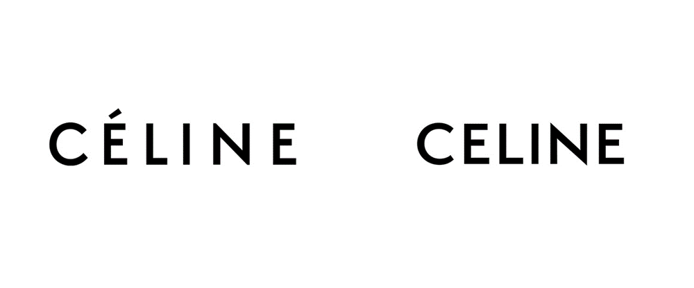
In a post on Instagram, the label explained that the accent had been dropped for balance, and that the typography was directly inspired by the logo used in 1960s.
Balmain
At the pre-fall show in December 2018, Oliver Rousteing, Balmain’s creative director, revealed a new logo. The fresh typography was created in-house and it took over six months to get it right.
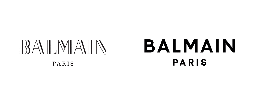
The idea behind the new lettering is to move away from a vintage style.

The brand also unveiled a monogram that harmoniously combines the “B” of Balmain with the “P” of Pierre (the house’s founder). Its purpose is to increase the label’s recognisability and consolidate its identity.
Zara – the odd one out
The exception that proves the rule is the new Zara logo. Unveiled in January 2019, it keeps the same style as that designed in 2011. It still uses a serif typeface, but the spacing between the letters is closer.
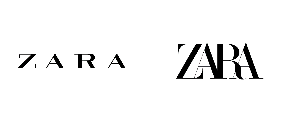
The design proved controversial with both customers and insiders in the graphic design and fashion industries. Critics said that the overlapping letters and reduced spacing between them created a muddled jumble of shapes.
The future of fashion logos
So, what’s going on with fashion logos? The trend set by Saint Laurent, Calvin Klein et al. has both technical and social drivers. At a technical level, the concept of the logo is changing: it is becoming a neutral and barely differentiated container designed to leave room for the brand’s character to shine. The way logos are employed is also very different today than it was 50 years ago, due to the different types of media in which a brand’s visual identity is used. The sans serif aesthetic is clearer and more legible across a range of formats, especially digital.
A closer look at the social reasons behind this stylistic trend reveals a strong desire to leave the past behind. A revolution is underway, which all began with the dropping of the first names of many fashion house founders. In this era, past opinions and attitudes are being re-assessed, so it’s understandable if major fashion labels don’t necessarily want to be associated with the names of people who today might be considered patriarchs.
This break with the past translates visually into the adoption of plain and modern geometric typefaces, the exact opposite of the what we’ve become used to. But this industry-wide uniformity is risky because it prevents different cultures from expressing themselves in their own voice. So, while good intentions may lie behind this revolution, it may end up creating a world in which all fashion logos are the same.