Table of Contents
The typefaces used in European newspapers have changed a lot in recent years with the advent of digital channels and the need to stand out from other titles. The font chosen by a newspaper must always achieve two goals: on the one hand, it must be easy to read and take up little space; on the other, it must become a familiar and recognisable sign for the reader.
That’s why the most famous European newspapers periodically commission new typefaces by internationally renowned design agencies. The main aim is to earn the loyalty and trust of their readers. Or, in the words of Mario García, news design expert and adjunct professor at Columbia Journalism School: “The role of typography and design […] is to really remind you that you are in the place you trust.” Something which, in the era of fake news, is no mean feat.
The United Kingdom: birth place of Times New Roman
Having commissioned one of the world’s most famous fonts, Times New Roman, back in 1931, in recent years the The Times of London has adopted several variants of this serif typeface that are more modern and personal. The latest version, created in 2006 by Brody Associates, is Times Modern, specifically designed for smaller text and featuring serifs with 45-degree curves. The font was subsequently revisited by the type foundry Monotype, who added two new versions, UltraLight and ExtraBold, as well as a series italics.

This year, another venerable British newspaper, The Guardian, launched new typefaces for its headlines as part of a wider graphic makeover that included the logo and website, and saw the format shrink from Berliner to tabloid. The new font, called Guardian Headline, was born out of the necessity to reduce the space taken up by headlines while maintaining a unique, recognisable style and providing better readability on digital devices. The result is a strong and striking typeface.
Italy: modernity meets tradition
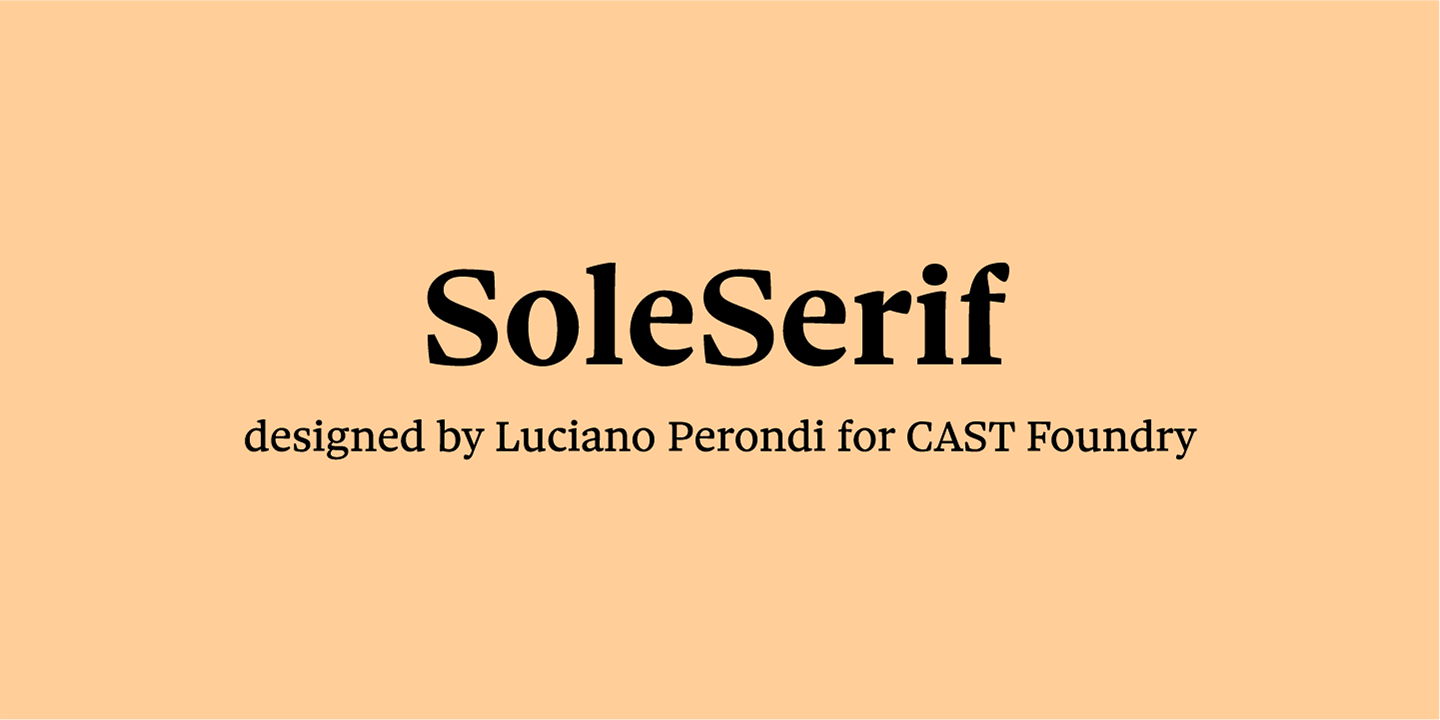
In Italy, too, some of the most famous newspapers have commissioned the creation of special new fonts. One of these is business daily Il Sole 24 Ore, which in 2010 asked Luciano Perondi to work on a new, easier-to-read typeface. The result was Sole Serif. Although inspired by sixteenth-century Venetian calligraphy and the world of publishing, it is also modern and understated.

In 2018, the paper decided to add Sole Sans, a new linear typeface designed to make graphs, diagrams and tables even more legible at small font sizes whether in print or on screen.
This font also harks back to yesteryear, from the sculpted characters of English neoclassicism to the first English sans serifs of the 19th century, but is more vertical and its terminals are more closed compared to Sole Serif.In 2011, Corriere della Sera got a makeover with two new fonts: Brera for the front-page headline – featuring clean lines and an open geometry designed to text distortion – and Solferino for the other headlines, a serif font that adds a great deal of elegance to the page.
It’s an aesthetic yet functional choice that has allowed the publishers to improve legibility by increasing the line spacing and contrast.
Spain: the quest for cleanliness and personality
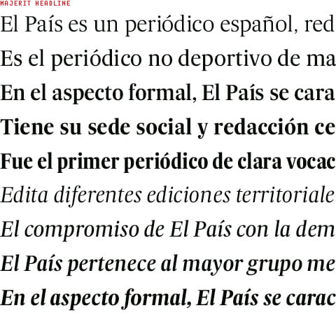
In 2007, El País, Spain’s biggest selling newspaper, commissioned celebrated Portuguese typographer Mario Feliciano to redesign its typeface. The switch from black and white to colour, along with technological innovations, called for lettering that was better suited to new printing methods and papers. So the paper asked Feliciano to replace the old Times font with something modern, but without a drastic break with the past. And so Majerit was born, a classical and neutral looking serifed font in a contemporary style designed for easier reading.

Another major Spanish newspaper, El Mundo, underwent a complete graphic overhaul in 2009, both for the print version and the digital version and its related magazines. A new cleaner and more legible typeface, Imperial, was introduced for the body text, while the size of the font and line spacing were increased by half a point.
For the headlines, Valencia Extra Bold was adopted, while Neo Sans S.T.D. was selected for sports headlines because it allowed the reporting of events in a “literary and almost subjective” tone.
So that wraps up our look at the fonts used by some of Europe’s most famous newspapers. Along the way, we’ve seen how typefaces are now a fundamental part of a strong visual identity that can make a paper stand out from other titles and win readers’ trust.

