
Table of Contents
The visual language, iconic images and signature techniques from nineties album art
Cover art is an integral part of an album’s meaning and imagery. It’s no coincidence that the fortunes of photographers and musicians are often intertwined. Indeed, they have given us graphic design masterpieces that have not only graced album covers but become synonymous with entire generations and musical genres (Andy Warhol’s banana for the Velvet Underground or Storm Thorgerson’s prism for Pink Floyd, to name but two).
With the advent of digital technology, which has revolutionised the music industry, buying a CD or record to admire its cover art or read the lyrics has become something of a rarity. But album cover design has not disappeared: it continues to be an extraordinary tool, along with video, for representing the imagination of a musician or group. It’s just that, as with many other things, its value as a printed product, as a physical item, was being lost. Recently, however, nostalgia combined with a growing desire to touch objects with our own hands, has led to a revival in paper books and vinyl records . People are rediscovering analogue, which of course includes records and music.
In this article, you’ll find a selection of covers from nineties albums that defined the decade’s music and pop culture. The advent of Photoshop, the explosion of independent labels and the success of designers with subversive ideas close to the rock scene meant that, in the nineties, album art was particularly creative and innovative. The fact that the CD, with its compact size, was the dominant format, did not prevent certain covers from achieving iconic status.
Below you’ll find some of the most memorable album covers of the nineties organised by style and technique used. Enjoy your trip down memory lane!
Digitally processed photographs
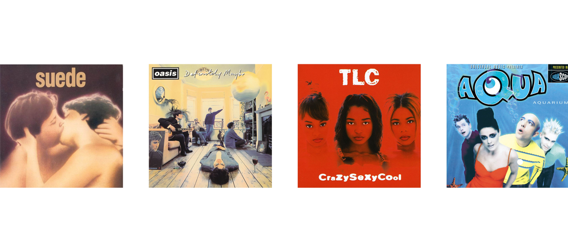
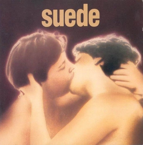
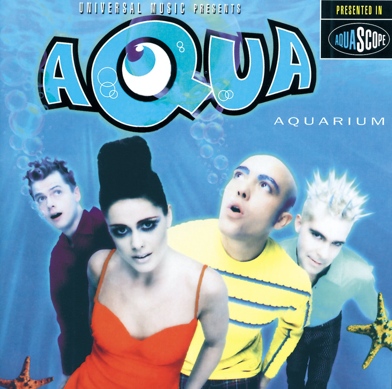
With the arrival of software for digitally manipulating images, photography lost its status as a tool for faithfully documenting reality. The boundaries between photography, illustration and image editing became blurred. The album covers presented here a perfect example, even though the end results differ. On the one hand Suede and Definitely Maybe feature dreamlike and surreal images that use unnatural colours and lighting, while on the other, Aquarium has an almost cartoonish feel.
And thanks to this type of effect, the cover of Suede is highly sensual and somewhat ambiguous as to the sex of the couple kissing. The original photograph was taken by Tee Corinne and shows, in its entirety, a woman kissing another woman in a wheelchair. The band had wanted to use the whole photo, but Corinne refused permission, citing her desire to protect the women’s identity. Suede, Suede (1993). Photograph by Tee Corinne.

Superimposed images
Another popular technique for image processing in the nineties, one that was also made possible by new software, was the superimposing of several images with differing degrees of transparency. The result is a complex, layered effect which, if done well, creates an organic whole.
A perfect example of this technique is the iconic cover of Illmatic by Nas, a landmark in hip-hop album art. Designed by Aimee Macauley, it superimposes a photo of Nas as a child over a picture of housing projects taken by Danny Clinch. The image perfectly embodies the themes, mood and quality of the record. Nas grew up in the ghetto of Queensbridge, New York City, imagining a life for himself and forming an idea of the world that did not go beyond the boundaries of his neighbourhood.


Illustration
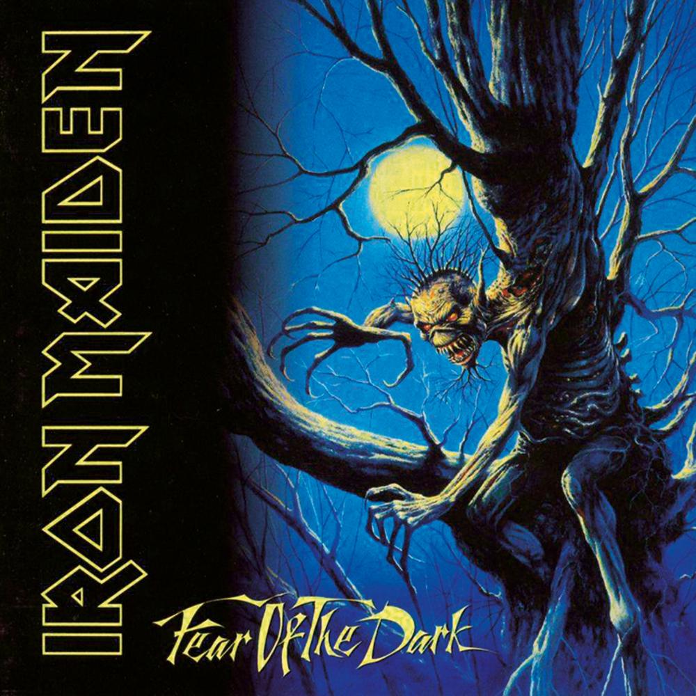
Illustrated album covers had been around for decades, but the nineties, saw digitally drawn illustrations spawn a whole new style. And here we have to mention the friendship between Iron Maiden and Derek Riggs, who, starting with their 1980 debut, worked on all of their album covers in the 80s and 90s, drawing the mascot “Eddie” and defining the band’s visual language.
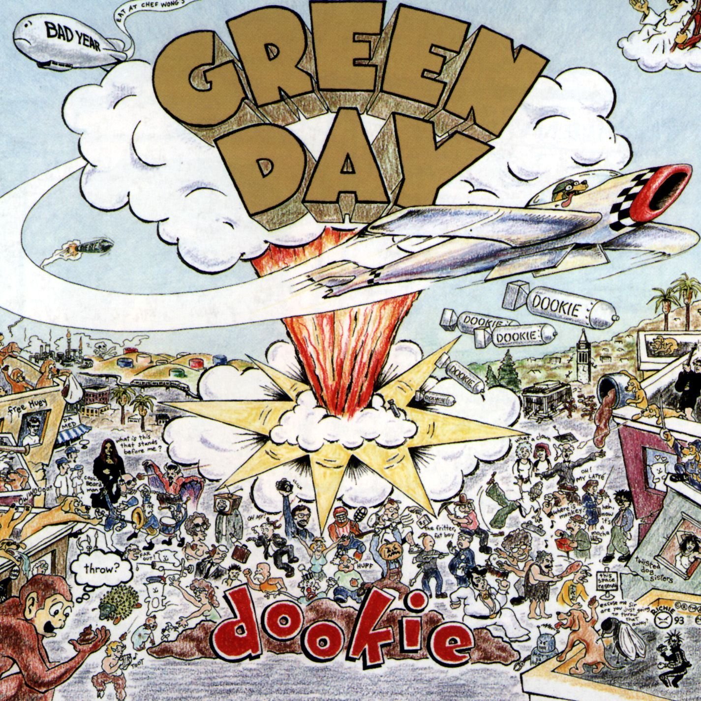
Although a completely different style, this category also includes the cover of Dookie by Green Day. The cartoonish aesthetic, rich detail and numerous “Easter eggs” make it super recognisable.

Minimalism
While many illustrated covers favoured abundant detail and saturated space, some album art opted for stark simplicity.
A prime example is Metallica’s eponymous 1991 LP, nicknamed The Black Album, which both in name and cover composition reveals its simplicity. Only the band’s iconic logo, designed by frontman James Hetfield, and a curled serpent inspired by the Gadsden flag, appear in grey against the black background.


Photographs that defy expectations
An approach to album art which isn’t closely associated with a particular period or style, thus lending it a timeless feel, is the cover photograph of something with no clear and direct link with the record’s title and themes. It’s left up to the viewer, and listener, to fill in the blanks between what they see and what they hear. Surprisingly, it’s often the case that photos which at first have no apparent link with the band, eventually become an integral part of their visual identity.
One of the most famous examples, which has been widely imitated and often parodied, is Nirvana’s Nevermind . The idea formed in Kurt Cobain’s mind after he saw a documentary on water births, which completely fascinated him. Interestingly, the theme of maternity would return on the next album, In Utero. The label pushed hard to have the baby boy’s genitals covered but Cobain was vehemently opposed. He claimed that the only alternative he would have considered was to cover the area with a sticker reading: “If you’re offended by this, you must be a closet pedophile”. Shot specially for the album cover by photographer Kirk Weddle in a local swimming pool, the photo is an enduring symbol of nineties pop culture.


Paintings
Some musicians opt for a more artistic and abstract style for their covers, resulting in some genuine masterpieces.
At a time when prominent logos ruled rock, hip-hop collective A Tribe Called Quest created one of the genre’s most recognisable covers for their album The Low End Theory, featuring a nude painted in phosphorescent red and green. The vivid colours and eccentric imagination chime perfectly with group’s creative vision.
Another unique piece of cover art can be found on Primal Scream’s Screamadelica. It was painted by Paul Cannell, Creation Records’ in-house artist at the time. Cannell was inspired by a damp patch that he saw on the ceiling of the label’s offices while under the influence of LSD.
This is just a taster of the incredible designs that appeared on CD covers released in the nineties. Rummage around in your attic, and you’re bound to unearth some of these great albums and more.

