
Table of Contents
Pink, turquoise, pale yellow, emerald green, amethyst, carrot… Pastel colours are soft, muted shades used extensively in many fields of design: from furniture to advertising graphics, from fashion to web design, and even in the cinema.
They are typically associated with moods like optimism, joy, serenity and innocence. But, as we’ll see, it’s best not to take anything for granted: even pastel colours leave a lot of room for creative experimentation.
Today we’d like to tell you everything there is to know about pastel colours: what they are, when they are used, and how to create an online pastel palette. Basically, we’ll teach you how to make the best possible use of pastel colours in graphic design.

What are pastel colours?
Pastel colours are a family of soft and muted colours. Technically they are made by increasing the brightness and reducing the saturation of any base colour. In theory, therefore, any colour can have a pastel version, although in practice the most popular are colours like red, orange, yellow, green and blue.

Some of the best-known and most popular pastel colours are lavender, peach, mint green, pink, mauve and turquoise. They are usually best when used in a matt version. Pastel colours can be warm if you start from warm colours like red or orange, or cool if you use green or blue as your base.
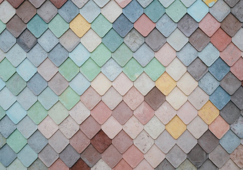
You can easily generate an effective range of pastel palettes online [we gave advice on the best platforms for creating a palette in a few seconds in this article]. Here, for example, is a selection of useful pastel palettes selected by Color Hunt.

How to use pastel colours
Pastel colours are associated with positive feelings like optimism, joy, romanticism and summer, and have a classic, relaxing and soft appearance. Their strength lies in their relatively low colour saturation.
Like all colour types, pastel colours have an effect on our mind and body, provoking a range of sensations. Here is a list of the main moods associated with pastel colours:
- Serenity. Peace and calm are often connected with the use of pastel colours, as is simple living.
- Optimism. Pastel colours are often associated with spring and joie de vivre, without too many excesses. A pastel palette toasts the beginning of new things.
- Romanticism. Some pastel colours are typically associated with romanticism, especially when used in vintage styles like shabby chic.
- Elegance. Pastel colours are always moderate and never excessive, and so are perfect for creating a classy palette.

When used in graphic or product design, pastel colours are perfect for natural and environmentally friendly items, particularly cosmetics, beauty products and children’s goods. Pastel colours can also be an excellent choice for sophisticated invites to weddings, christenings and other ceremonies. The artwork for certain food-related products can also look good with a pastel palette: from confectionery and pastries to organic bakeries and ice cream parlours. In home furnishings, meanwhile, pastel colours are often associated with the 1950s, but they can also be used for relaxing and cheerful bedrooms.
Pastel colours in fashion and design
Pastel colours, which are still extremely popular today, have periodically dominated fashion, art and design trends over the decades.
The 1950s is the decade we tend to associate most with pastel colours. For example, in interior design, this is when American style came to the fore, inspiring trends in Europe too as a symbol of wellbeing and modernity. Bathrooms and kitchens were filled with mint green, pink, pale yellow or pastel blue objects, furniture and appliances, and these things are still given a pastel palette today whenever we want to hark back to that age. Pastel colours were also widespread on clothing in the 1950s, such as single-colour skirts and dresses or bags with candy pastel shades.

Pastel colours are also an important part of shabby chic, a retro style that enhances or simulates wear and tear on objects and furniture. This relaxing, fairy-tale home decor style frequently makes use of colours like yellow, green, cream, light blue, pink and lilac.
But pastel colours are not relegated exclusively to vintage looks. Italian director Sofia Coppola, for example, is a fan of the pastel palette, and uses it a great deal in her films. Looking beyond the western world, pastel colours are essential to the Japanese kawaii style: the look that gave rise to Hello Kitty.

Kawaii, which in Japanese means ‘cute’ or ‘graceful’, is full of soft colours and rounded shapes, and is seen in various sectors: everything from design to clothing, food, toys and interior decor. Pastel colours are also used in a very original way in hybrid styles, including pastel goth, which mixes goth and grunge elements with more muted and playful shades, and pastel punk.

Basically, there is still plenty of scope for experimenting with pastel colours, and, as always in design, it’s best not to take anything for granted.
How about you? Have you used a pastel palette in any of your designs?
Would you like to help us add to or improve the content of this article? Check our guidelines and send us your request via email at: seo@pixartprinting.com.