
Table of Contents
People have been touting the demise of print for over a decade, but it’s more alive than ever as designers and artists take print projects to the extremes on posters, album covers, and books.
From playbills and posters, to album covers and books, print design is still very much relevant despite what you’ve been hearing for years about the internet replacing print. In fact, nostalgia has played a huge factor in this—what’s old is new again. We may spend more time staring at our screens, but we still like cool posters on our walls, and books lining our shelves. And vinyl is back in a big way, and with it so are album covers.
Here, we talk to three artists who are creating edgy illustrations and designs for print projects that are way cooler than anything you’ll see online.
Sophie Bass
Bristol, UK
“I always work by hand. For me it’s the most important and natural part of the design process and the part I love the most. The initial painting/drawing process feels organic and kind of magical. Finishing off pieces on Photoshop is necessary, but I enjoy it much less, though I do love seeing the image come to life with the final alterations done on the computer,” says Sophie Bass. “I know I could save a lot of time by learning how to draw on the computer but working with my hands is so integral to my work.”
She goes through sketchbooks at an alarming rate because she spends a lot of time drawing and redrawing her images to hit the right note for the assignment. “Once I’ve gathered my images and knowledge I spend a day just drawing, playing about in my sketchbook with new shapes and motifs relevant to the work. I always sleep on the drawings then come back to them the next day to piece them together into a finished composition,” she says. Only when she’s satisfied with the final, does she scan it and refining the color palette.
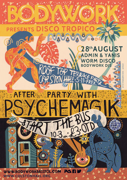
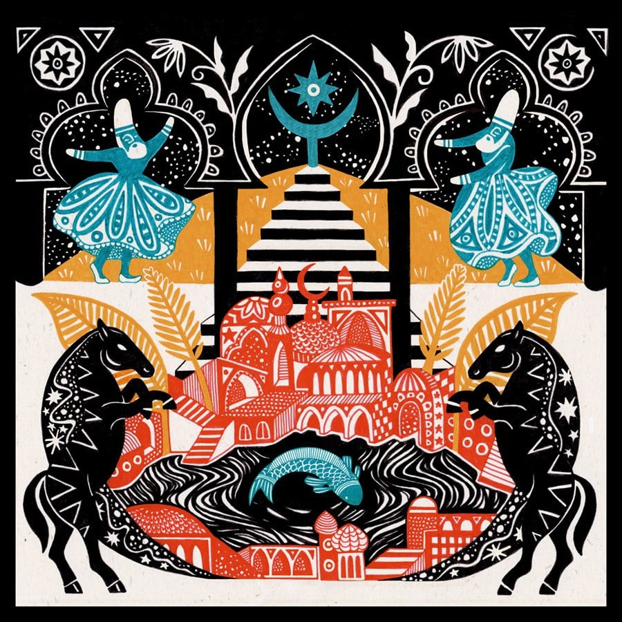
These posters for different club nights, are high-energy and impactful. The first is a psychedelic funk part that was a split event—it had two venues; one venue for day, the other for night. “The women represent day and night respectively, like a sun and moon goddess. The rest of the design was made with tropical partying in mind,” she notes.
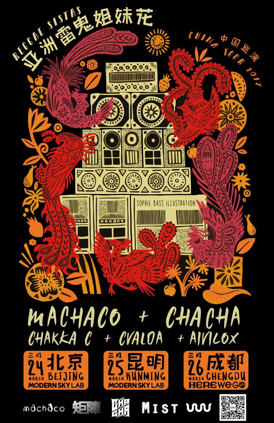
For Machaco + Chaca, she drew a large sound system in the center flanked by mythological women. “I was asked to represent vibrant energy, love and respect for nature, consciousness and feminism, alongside the music. There were five women involved in the tour so the five phoenixes represent each of them. The phoenix being very important and symbolic in East Asian mythology.”
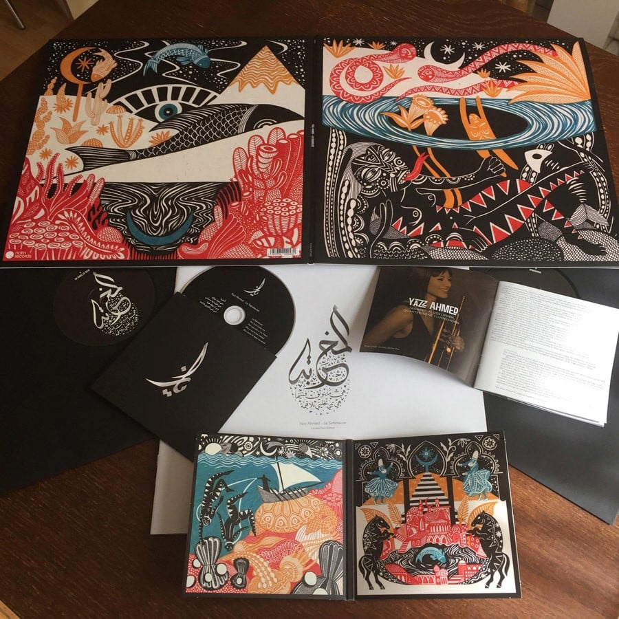
“I always listen to the music I make artwork for. It’s good to make time for this part of the process as it ensures a genuine and personal reaction within my work,” Bass explains. “I generally write a lot more than draw during that listening session – writing down the images that are conjured, the colors I can hear, anything the music reminds me of, and just generally the way it makes me feel. Then, I take that information and work with it throughout, dipping back into the music when I need to.” With projects like this, the actual printing is out of her hands, especially when working with record labels. “I put my trust in the experts, and so far I have never been let down!”
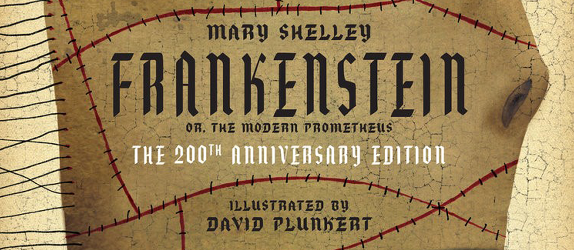
David Plunkert, Spur Design
Baltimore, MD
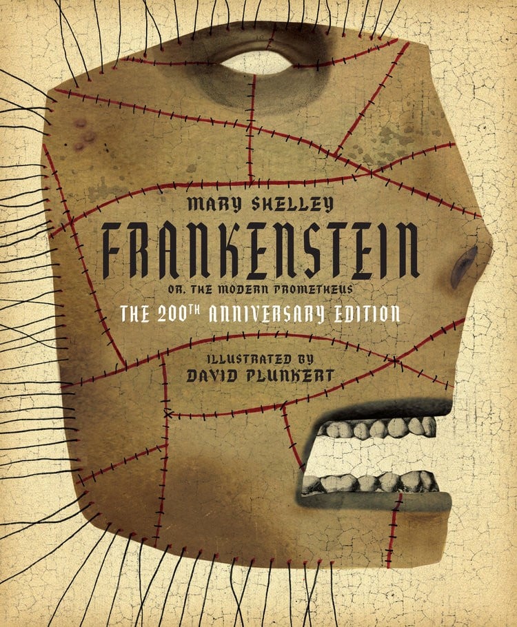
David Plunkert is an internationally recognized designer and illustrator who is known for his eccentric collage sensibilities that often feature heads on anatomically incorrect bodies or no bodies at all. They are often simultaneously brilliant, beautiful and disturbing. His illustrations for the Theatre Project, don’t contain heads, per se, but do feature haunting images reflective of each performance’s content.
Since 2003, Plunkert has been designing a set of four to six posters each year for Baltimore’s Theatre Project. “Every year they contact me to do a set of posters. We sit down and decide which performances need posters based on which shows need promotion and which offer the most interesting content for a poster. However, the first point is the most important parameter,” he explains.
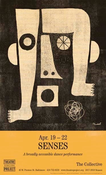
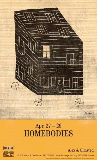
The images are used on the programs, online, and are printed as 14 x 23-inch posters that are hung on the street. “I generally try to keep the spontaneity of the thumbnail sketch. I also try to reflect the performance’s content and whether it’s a drama, comedy, dance, etc. In the case of Senses, four human senses are referenced as parts of a face. Legs and feet are used to represent touch since it’s a dance performance,” Plunkert notes. “The image on Homebodies is more straightforward. It’s a rework of the main prop in the play: an artbox that the performers interact with.”
To save on printing costs, the posters are printed in two colors. “I generally pick colors based on what I haven’t done in prior years,” he says. “The colors matter less conceptually to the individual performances than they do to make the given series of posters visually cohesive. I’ve also played around with all of the posters having a common ink plate. In the case of this season’s posters, the golden rod plate is the same for all four posters and only the black plate is distinct.”
Print runs are limited to between 200 and 250, and are printed on French Paper. In fact, French recently did a promotional booklet that included 36 of the posters from various seasons.
Zoran Pungercar, Look Back and Laugh
Ljubljana, Slovenia
This small publishing house in Slovenia likes to laugh at itself (just look at its URL, which is too long to list here). But, it takes printing very seriously. Creative Director, Zoran Pungercar, likes to experiment with images, type and graphics in everything he publishes.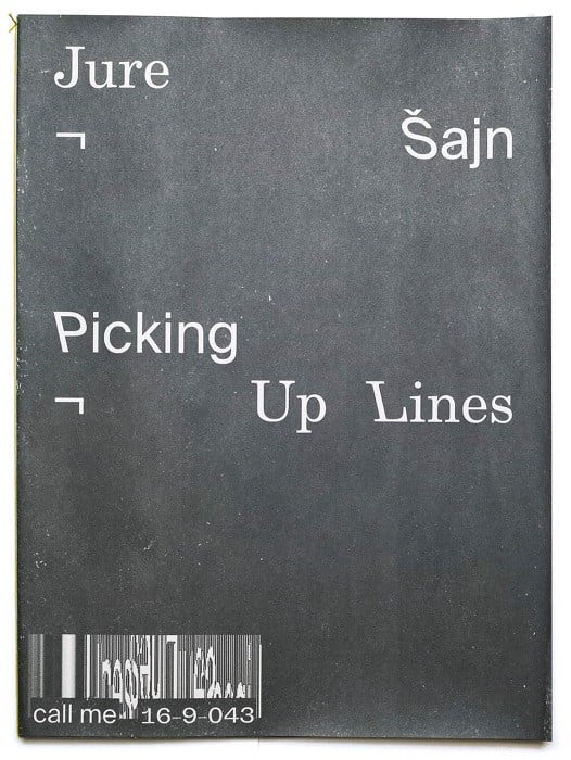
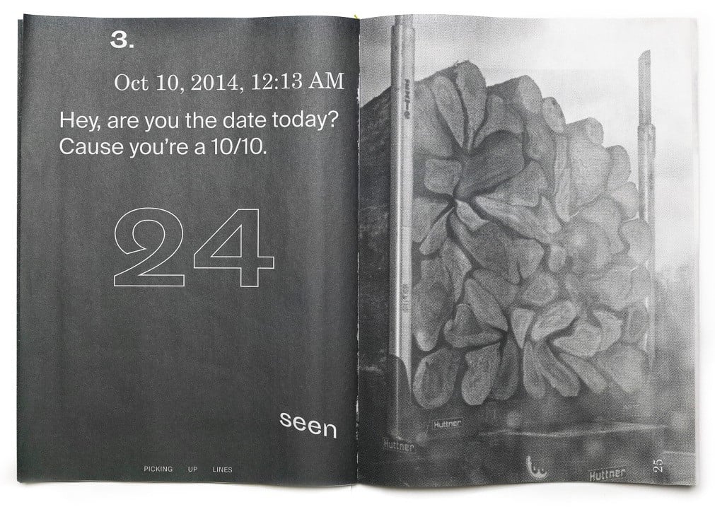
“This book is about the exploration of transforming images, photos, and graphics and translating them into an artbook format. It’s juxtaposed with sleazy pick-up lines, and it’s printed on very thin newsprint, which sort of goes well with cheap quotes and cheap lines,” he says.
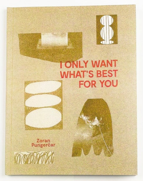
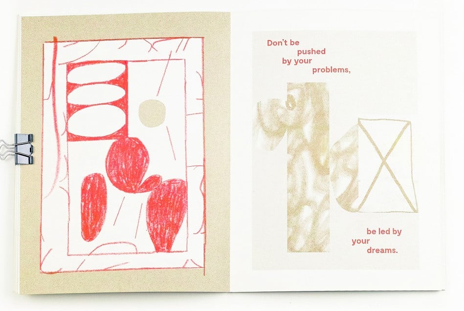
“I was searching for positive quotes online, the ones people (our moms) usually share on Facebook. Usually bold fonts set on images of sunsets, nature, and other motivational and positive visual content. I combined these quotes with my abstract drawings and collages to see what would happen if you take two completely different ideas out of context,” he explains. “Will these texts be taken more seriously because of the visuals next to it, or will drawings look absolutely ridiculous because they are combined with these texts?”
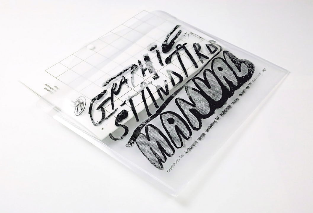
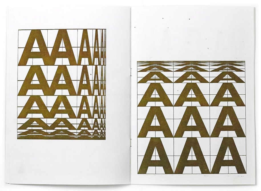
“This is a very simple publication which consists just of grids and distorted letter As. It’s a mock on the world of serious, classic graphic design manuals, that are coveted almost like religious objects by designers. At the same time, these manuals dictate how we perceive graphic design and show just one way of arriving at a solution, and everything else is forbidden or useless.”