
Table of Contents
If we had to rank the graphic products most maligned by businesses and designers alike, the product catalogue would be challenging for top spot.
Generation after generation of catalogues have been graphically neglected with pages and pages of tables, tiny images, technical text and little effort to emotionally engage the reader.
There are generally two types of catalogue users:
- Those who use it to choose products (the catalogue is a sort of atlas for finding and purchasing what they want);
- Those who use it to sell products (the catalogue is a tool of the trade that must be easily understandable, quickly consultable and full of information that can be used to sell).
From the classic catalogue to the “IKEA model”: catalogues that inspire and engage
For decades, with few exceptions, the product catalogue did just fine without having to say much, excite or engage the reader: it said what it had to say clearly and that was enough.
But once companies began selling products directly to consumers, cutting out the middlemen (shops, dealerships, sales reps, etc.), things began to change.
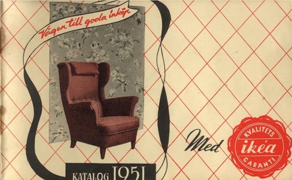
One of the world’s best-known catalogues is undoubtedly Ikea’s.
Although the first version dates to 1951, it wasn’t until the sixties that the catalogue took on the form we know today: in other words, a collection of photos featuring rooms filled with Swedish furniture.
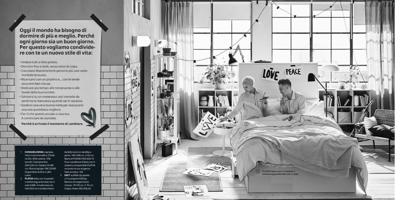
The catalogue allowed customers to step inside Ikea-furnished homes and gave the impression that these sets represented reality. This gave them an idea of how they could use the furniture as well as the look and feel it would create in their home.
Simply put, consumers were heavily engaged in choosing their purchase: they were shown a potential use case for products in the home which went beyond the technical specifications of individual items.
Ever since, catalogues have been getting better looking and more important.
In this article, we’ll look at some examples of good catalogue design, focusing on:
- Features
- Highlights
- Notable graphic-design choices
Let’s kick off our catalogue roundup.
Furniture: the “editorial” catalogues of Frau and Vestre
When a firm like Frau produces a catalogue, it is vital to convey an image of a high-quality product with an illustrious history: it must confirm customers’ impression of the brand.
You might think this is obvious: the catalogue is a piece of customer-facing promotional material, after all. But it’s important to remember that a catalogue isn’t a brochure: its job isn’t to shout about the quality of the product, but rather confirm it.
In the purchasing process, the catalogue lies at an intermediate stage between the brochure and checkout: when the consumer has the catalogue in their hand, it means that they’ve decided to buy something. Which explains why catalogues are found at points of sale, not anywhere and everywhere.
And that’s why a prestigious Italian brand like Frau employs the services of one of Italy’s most renowned design agencies, Studio FM Milano.
As you can see from the images, the catalogue is more like a magazine: it engages readers and shows not just every shape, colour and fabric combination for Frau products but, above all, brings them into the universe that these products represent.
Simple graphic forms and vintage-effect photos hark back to the armchair’s heyday; the minimalist graphics are also in keeping with an outstanding example of Italian design.
The covers of many catalogues look more like those of coffee table books: because, at the end of the day, where better to read than in your own living room in your favourite armchair?
But the catalogue still performs its traditional function, taking an original yet ordered and easily comprehensible approach.
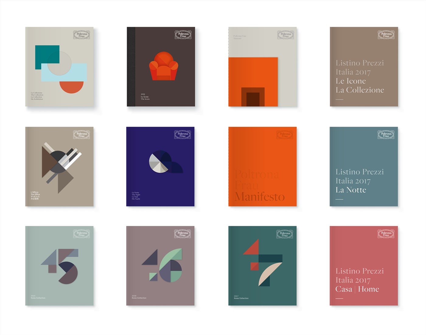
And the product is shown little because what matters is everything that goes with it.
Also in the furniture sector comes the catalogue from Vestre, the Scandinavian producer of urban furniture: here, minimalism and clean lines meet black and white photography, while particular care is given to the page with colour samples.
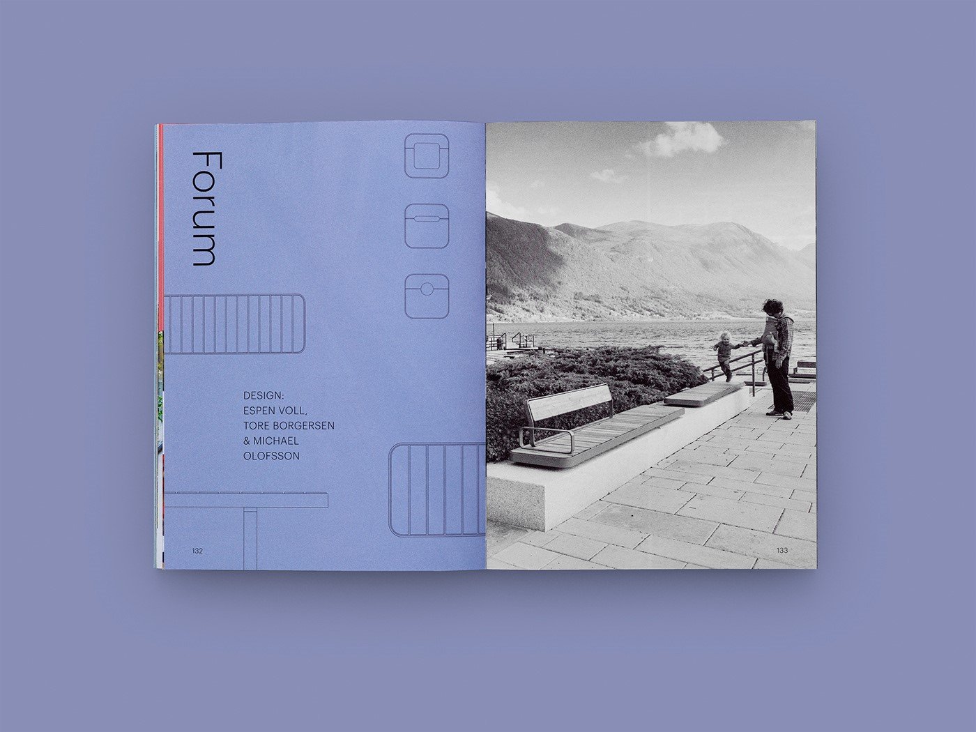
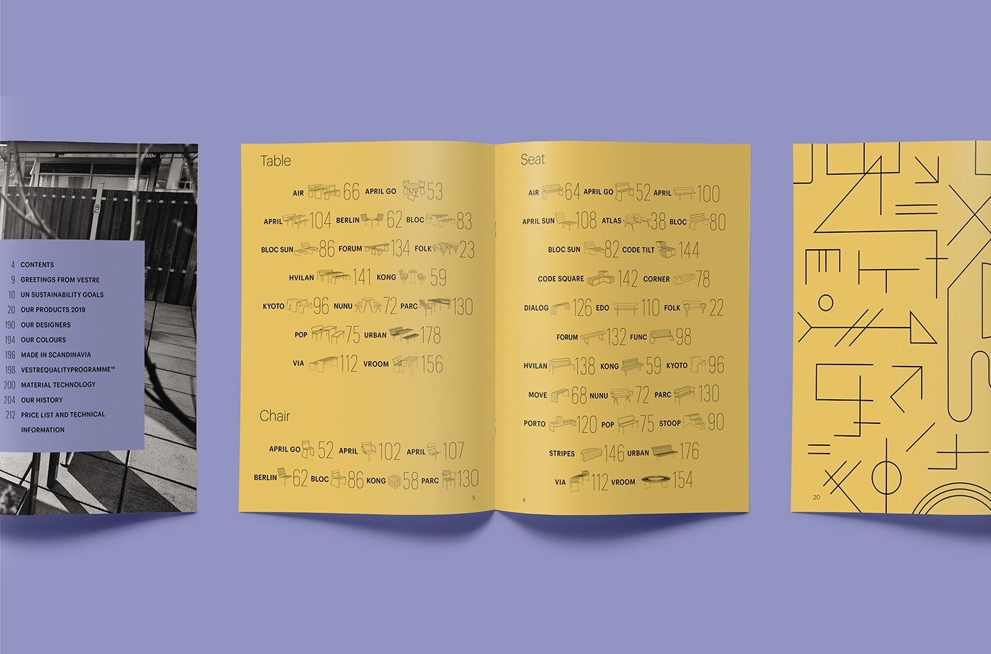
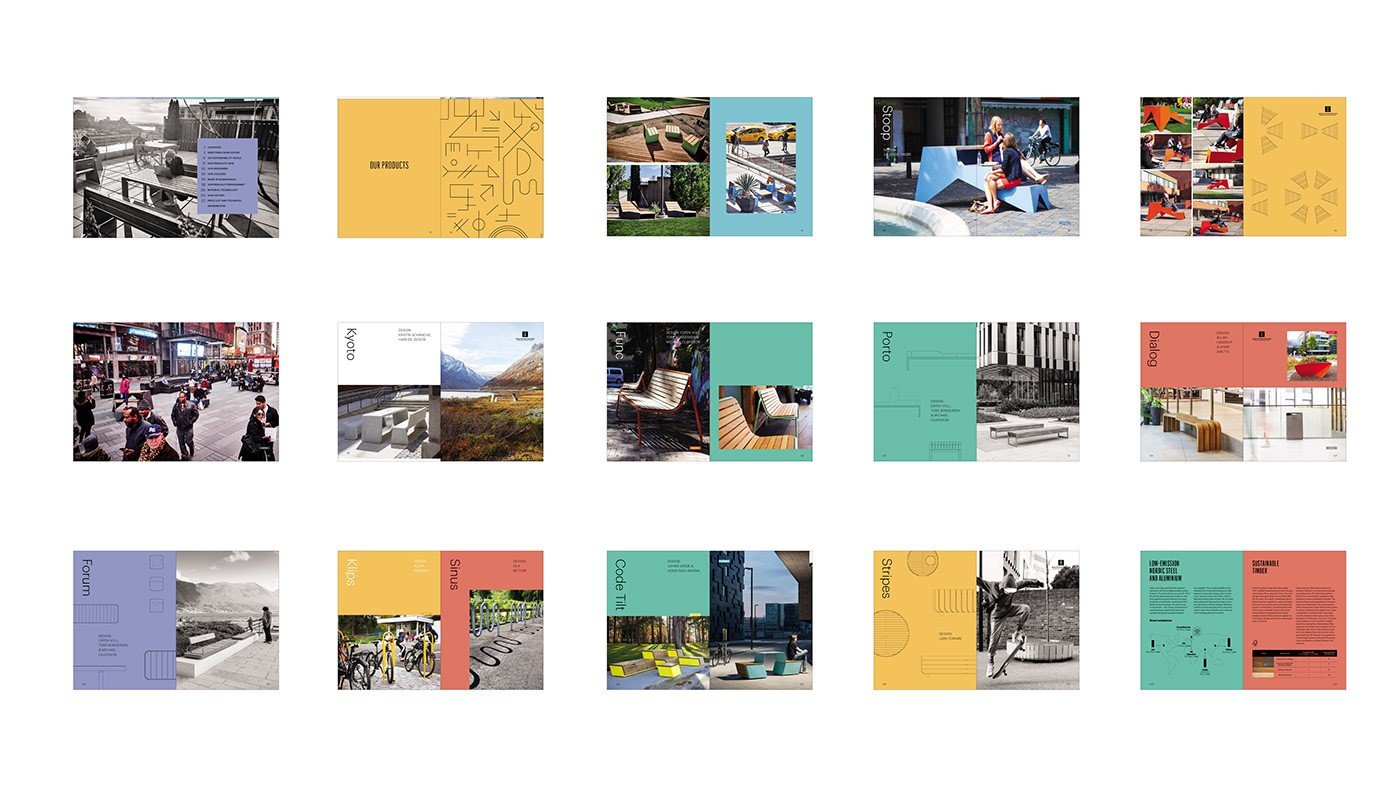
The cover and opening pages give nods to today’s most on-trend magazines, while instead of a traditional table format, the index uses icons and numbers.
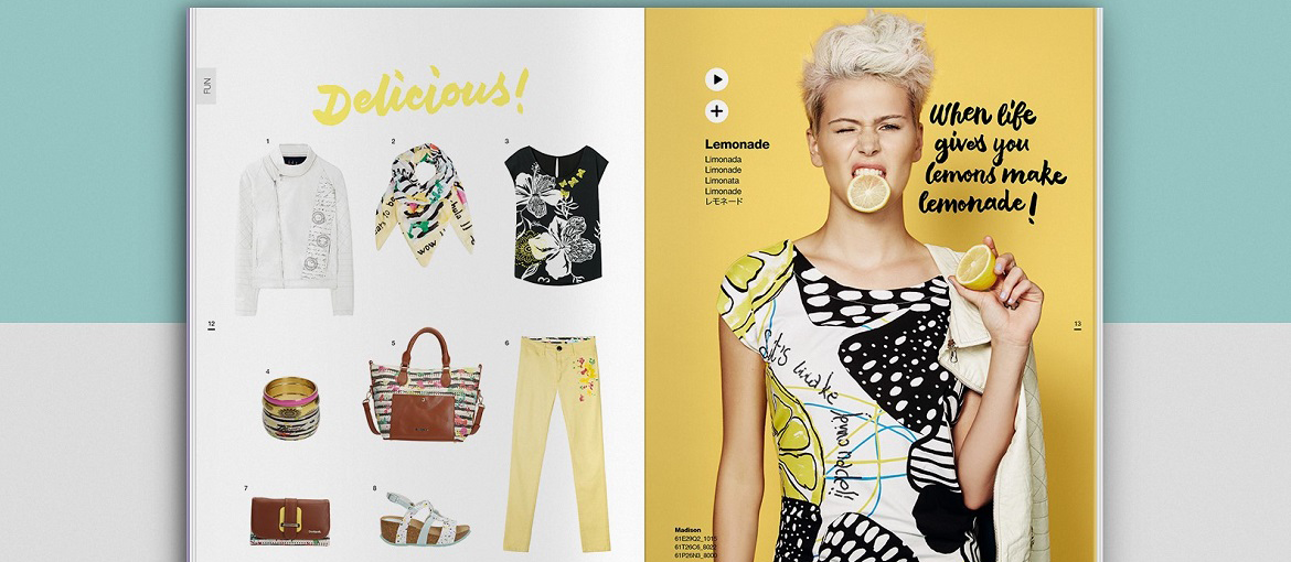
Fashion catalogues: the bold and daring design of Desigual & Happy Socks
For examples of brightly coloured and graphically daring catalogues, look no further than the fashion industry.
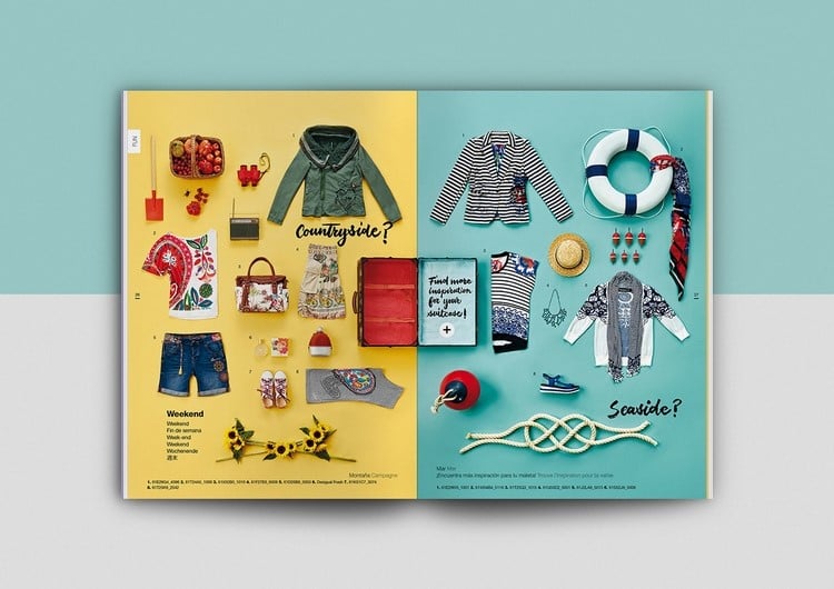
This is the catalogue for Desigual, the Spanish clothing label. Its graphic design resembles that of a fashion magazine with products arranged in asymmetrical grids.
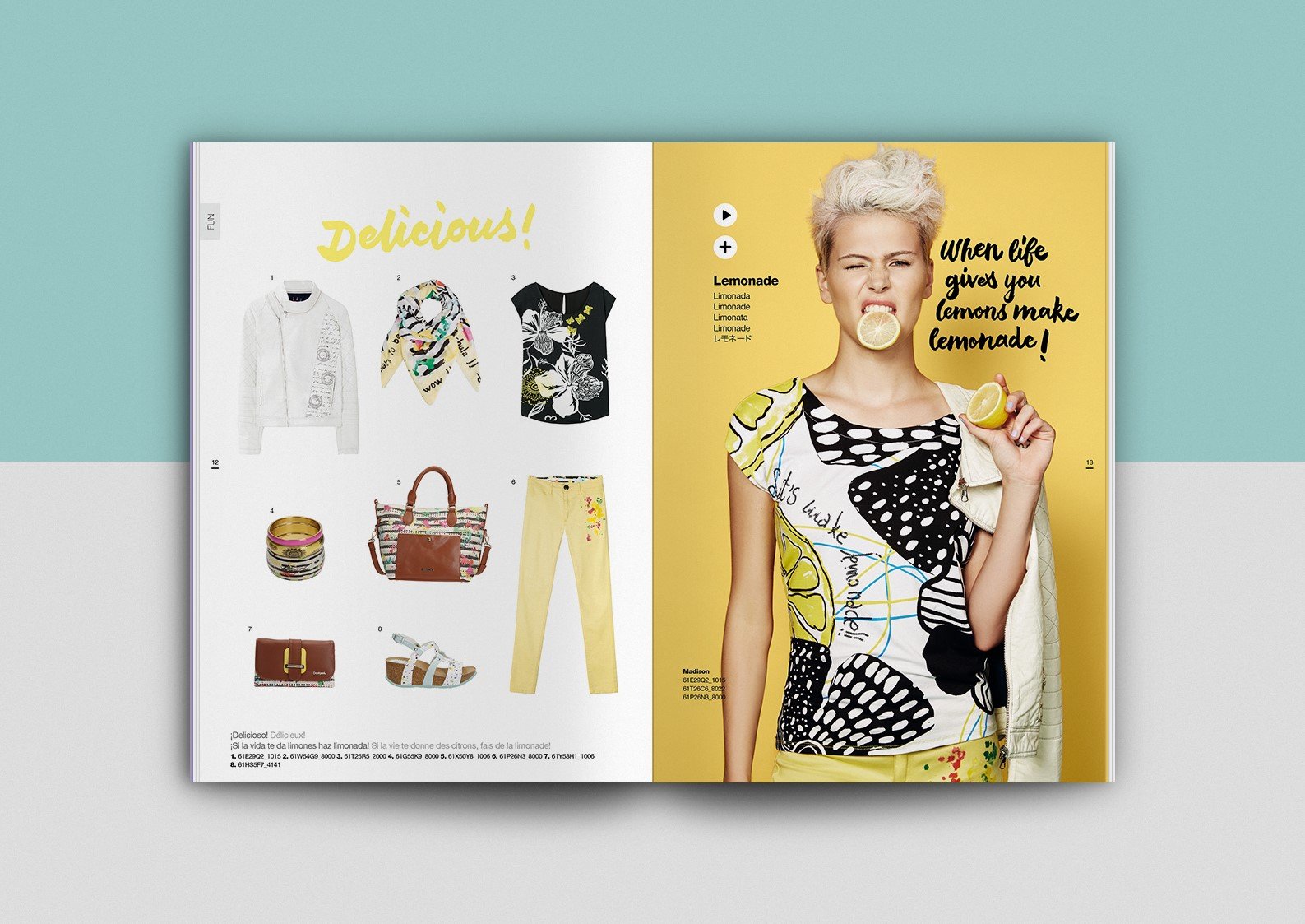
One thing’s for sure: the more a brand tries to occupy a niche by presenting itself as pop, colourful and unusual, the more original its catalogue will be.
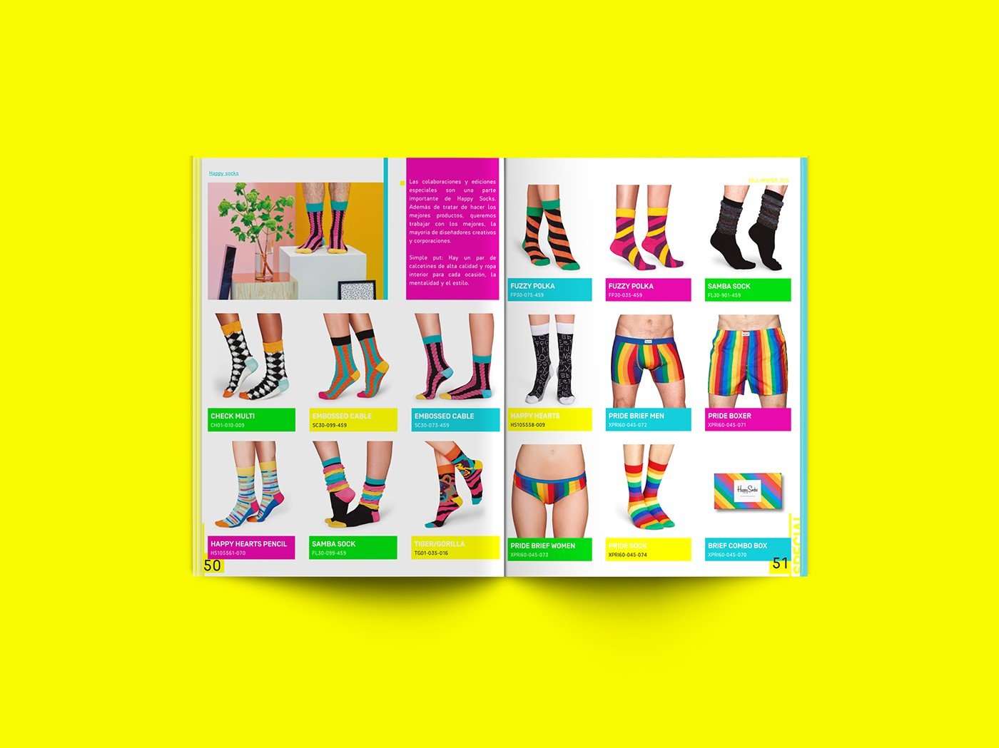
One such example is Happy Socks, the technicoloured sock brand: the catalogue’s graphics play with sock patterns and colours while maintaining coherence and legibility throughout.
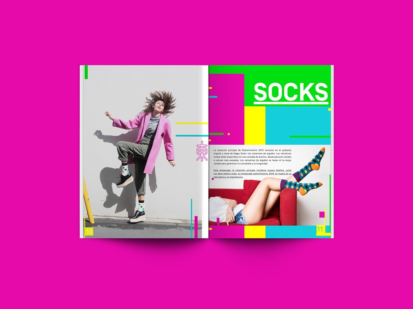
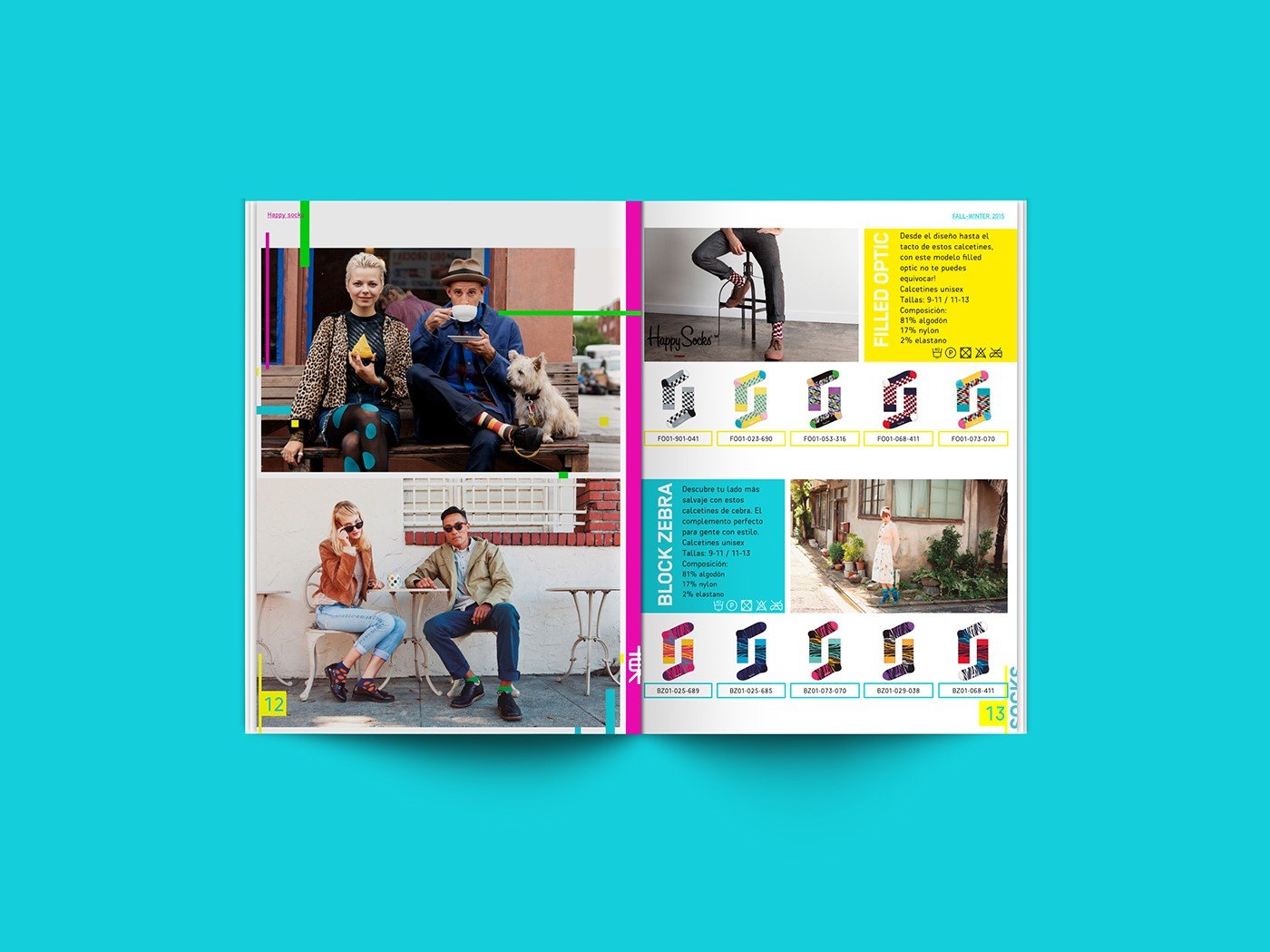
Of course, in clothing catalogues, you also need to show garments as they are worn, which means you need to photograph people.
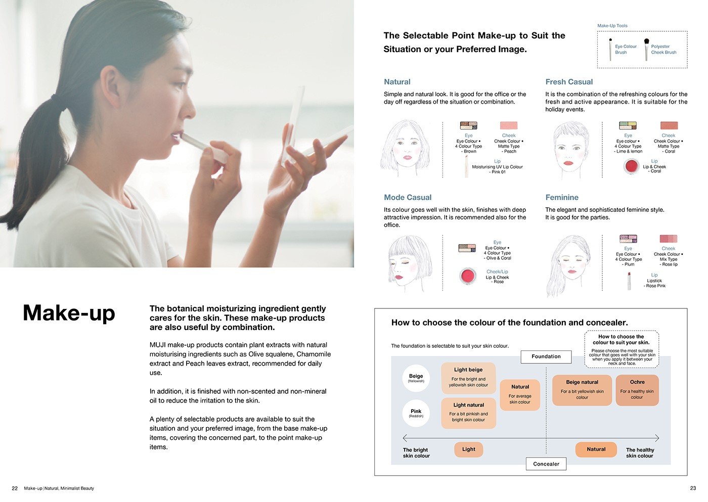
Cosmetics catalogues: Muji’s minimalism
We conclude with one of the most minimalist catalogues out there: the Muji catalogue. It adopts a Zen aesthetic and graphic elegance, making minimal use of the elements available: a Helvetica font, black and white, paragraph rules and beautiful photos. It’s all there.

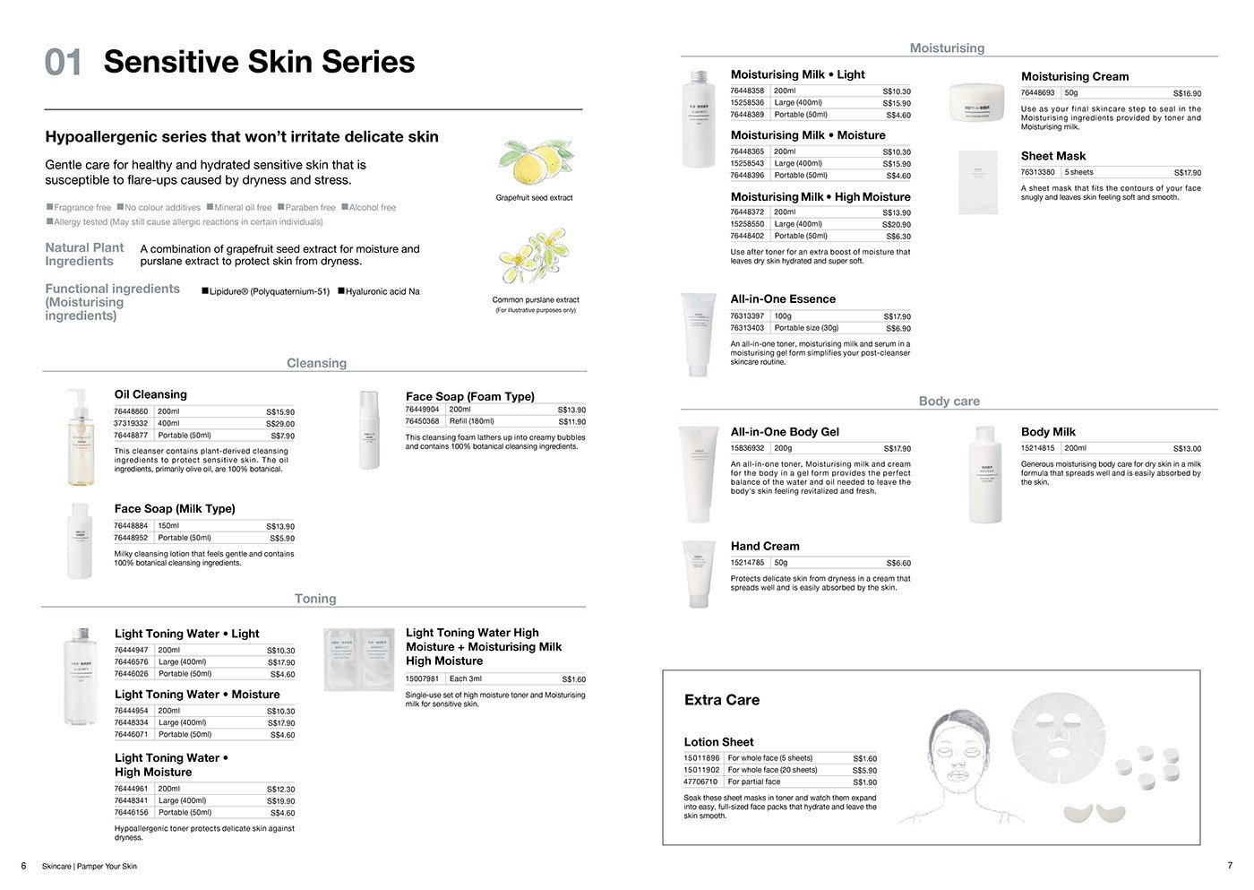
The catalogue worksgreat: it’s informative and clearly conveys the brand’s proposition and values.
A product catalogue can be beautiful
The secret lies in finding the right balance between informative graphic design and product photos. This balance must bring to life a product that can tell a story, one that can showcase the firm’s mission and values.
Increasingly, the catalogue is becoming an advertising tool, something that people can take home and choose what to buy in the comfort of their own living room. Ikea teaches us that the catalogue can even be bedtime reading, inspiring dreams of a new house and a new life.
A modern catalogue must know how to engage
The graphic designer’s job is to use all the elements at their disposal – photos, information and, above all, the company’s corporate image – to try to find cues for developing the catalogue not as a list of products, but as a magazine that tells a story.
Succeeding in this challenge will make the catalogue memorable and help grow sales.