
Table of Contents
Unforgettable characters, meme-worthy scenes, line after memorable line, violence, humour and too many B-movie references to count: Pulp Fiction is Quentin Tarantino’s masterpiece – and one of the greatest gangster films ever made.
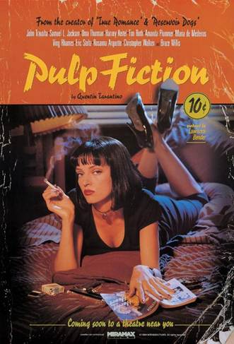
But there’s something else great about the film: its poster. Showing Uma Thurman lounging on a bed with a jet-black bob, cigarette in hand and a sultry side-eyed stare towards the camera, it became an ubiquitous sight in teen bedrooms and uni halls across the planet in the nineties.
It’s one of the most successful movies posters ever. Yet it doesn’t follow the usual rules of the genre. And did you know that the original version of the poster – now incredibly rare – was pulled days after its release? Or that the film’s title is a nod to popular crime novels?
Today we’re looking at the making of the Pulp Fiction poster: from the creative choices made to the interesting anecdotes behind this classic.
What’s does the Pulp Fiction poster show?
The Pulp Fiction poster is anything but conventional. It shows neither a scene from the film nor its main characters. Instead, it focuses on a supporting role: Mia Wallace, wife of mob boss Marsellus.
Played brilliantly by Uma Thurman in a career-defining performance, Mia Wallace is depicted in a sensual, self-confident pose. The femme fatale has a pistol, a pack of cigarettes and book titled Pulp Fiction close to hand. As we’ll see, two of these elements will land the producers in hot water.
David Dinerstein, then head of marketing at Miramax, the company that produced the film, explained that the photo shoot for the poster was “designed specifically to provide a feeling similar to the one you would experience after seeing the film”. It meant they didn’t have to use a still from the film or show all the main protagonists. In case you haven’t seen it, Pulp Fiction is a collage of interconnected stories about larger-than-life characters told in non-linear fashion.
But choosing Mia Wallace for the poster was a masterstroke. “If you’re going to provide [the cast] equal likeness, it’s typically not going to be a very arresting piece of key art or a poster,” reasoned Dinerstein.
Fun fact about Miramax. Pulp Fiction was the first film fully produced by the Weinstein brothers, who made their fortune making independent films in the nineties. Miramax took over production after TriStar pulled out, saying Pulp Fiction was “too long, violent, and unfilmable”.
The inspiration behind the Pulp Fiction poster
To tell the story of the Pulp Fiction poster, we’ll be relying on first-hand accounts from its creator, James Verdesoto. A Hollywood legend, the Ecuadorian-American designer’s curriculum vitae contains over 400 movie posters, including The English Patient and Ocean’s Eleven.
For Verdesoto, every project is like embarking on an experimental journey, which is key lesson for us all. And for the experiment that was the Pulp Fiction poster, he and his team won the Key Art Award – a sort of Oscar for movie marketing – and, of course, eternal fame.
Verdesoto recalls how they rushed to get the poster done: the film has already been selected for the Cannes Film Festival (where it won the Palme d’Or).
Inspiration for the poster came from literary genre known as pulp fiction that’s alluded to in the film’s title.
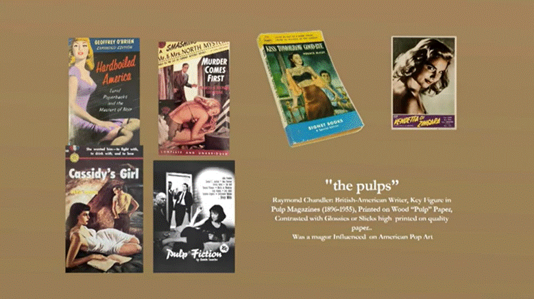
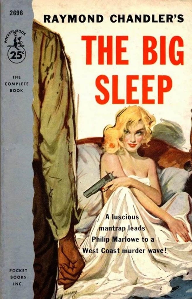
But what is the pulp genre? Hugely popular between the 1930s and 1950s, pulp is a genre of fiction full of gangsters, gambling dens, hitmen, beautiful women, sex and violence. It’s most famous exponent was Raymond Chandler, best known for his page-turning stories about private detective Philip Marlowe.
The pulp genre takes its name from the paper stock it was printed on: wood pulp a cheap, rough-grained paper similar to that used for newspapers and quite different to the glossy paper used for most magazines. Pulp magazines (and later books) were made to be carried in a pocket and read to kill time when riding the subway or waiting in line.
Anyway, back to the Pulp Fiction poster. Searching for inspiration, Verdesoto scoured the covers of dozens of pulp novels from the 1940s and 1950s. He noticed that there were five recurring motifs: “a girl with a gun, a bed, a doorway, alleyways, and a guy with a fedora hat”.
The Pulp Fiction poster works so well because it embraces these clichés, perfectly capturing the film’s pulp-novel atmosphere and endless nods to the genre.
How the Pulp Fiction poster was made
Now the design team had their idea for the poster, it was time to create preparatory sketches. In the mid-nineties, designers had begun to use Photoshop, but Verdesoto still preferred to draw by hand, adding in elements that were photocopied and cut out with scissors. He only used editing software for the finishing touches.
Next came the photo shoot, which was entrusted to Los Angeles-based Iranian-American photographer Firooz Zahedi. The shoot took half a day. And it’s here that something happened that would completely transform the poster.
The Weinsteins’ initial idea was to show a half-naked Mia Wallace wearing an unbuttoned men’s shirt. But Thurman refused, arguing it was completely out of character. Luckily, alternative clothes were available on set, so Thurman picked out the now-famous all-black outfit and heels. And the red pendant she borrowed from the wardrobe assistant!
With hindsight, the actor clearly did the right thing: the photos from the shoot were stunning. Once Verdesoto had chosen the shot with the right pose, he added the finishing touches, overlaying “pulp novel cover” graphics, as well as fake scuffs, creases and tears to create a dog-eared appearance.
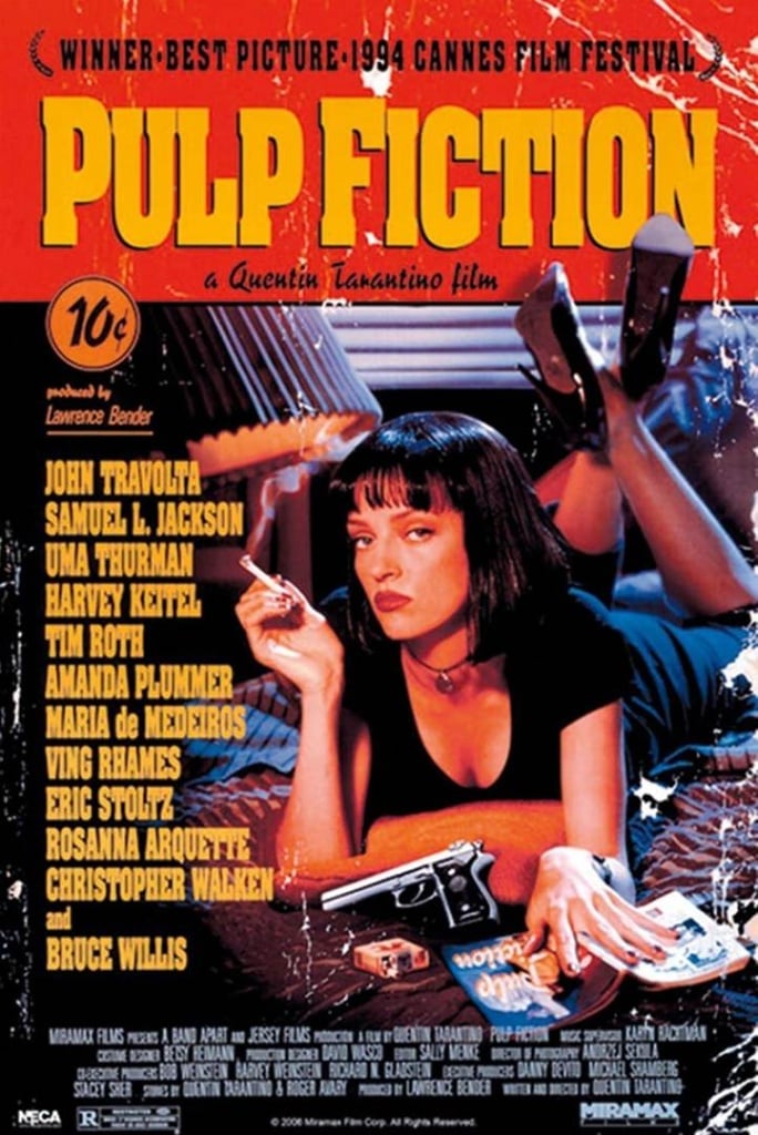
Here’s the final poster, unveiled at Cannes…
Look closely, and you’ll realise this isn’t the same image you’re used to seeing. Because there was another plot twist in this poster’s story…
The Pulp Fiction poster that was pulled
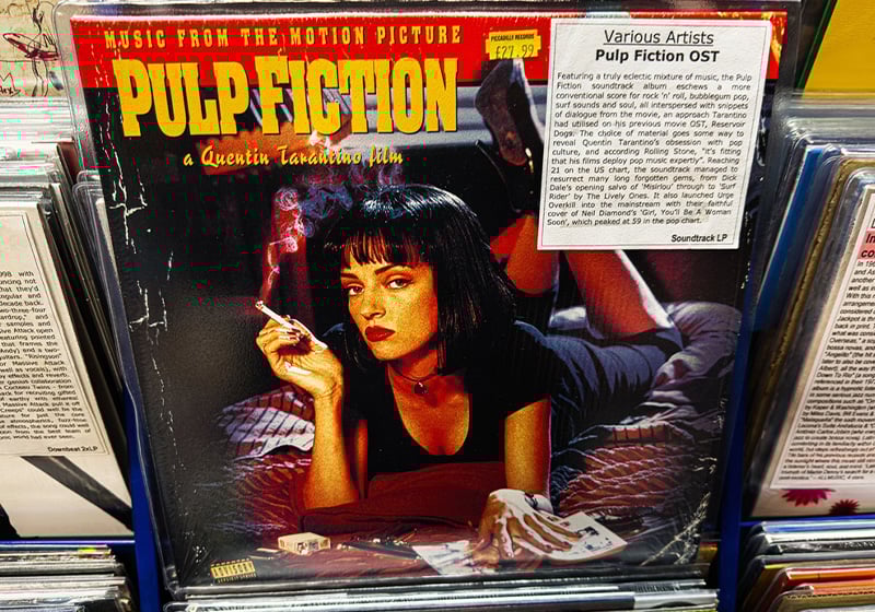
If you place the two official Pulp Fiction posters from 1994 side by side, you’ll notice three key differences about the main image the title of novel, the brand of cigarettes and the position of the pistol.
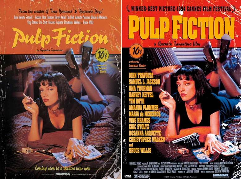
In the original poster – rare copies of which now fetch thousands of dollars – the title of the book is Harlot in the Heart by Norman Bligh and the brand of cigarettes is Lucky Strike. Problem was, neither the author nor the tobacco company had given their permission, so Miramax had to withdraw the poster.
In the new version, the book was replaced by an imaginary novel titled Pulp Fiction, the cigarette brand was obscured and, for reasons unknown, the pistol was made more prominent. The font for the title was also swapped out for a chunkier one. [If you want to learn more about fonts used by Quentin Tarantino, we’ve got a whole article on it].
Lawsuits over the poster didn’t end there. In 2021, photographer Firooz Zahedi alleged Miramax used his photograph in thousands of pieces of merchandise without paying him the royalties he was due. But the judge threw out the case, ruling that the photographer should have complained earlier.
Will this poster be back in court again?
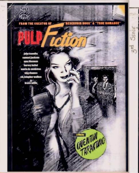
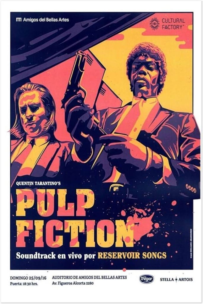
Alternative, fan-made Pulp Fiction posters
Tarantino’s film has become an integral part of pop culture. But, despite already having a classic poster, hundreds of fans have indulged their fantasies and made their own alternative posters for the film. Let’s have a look at a few.
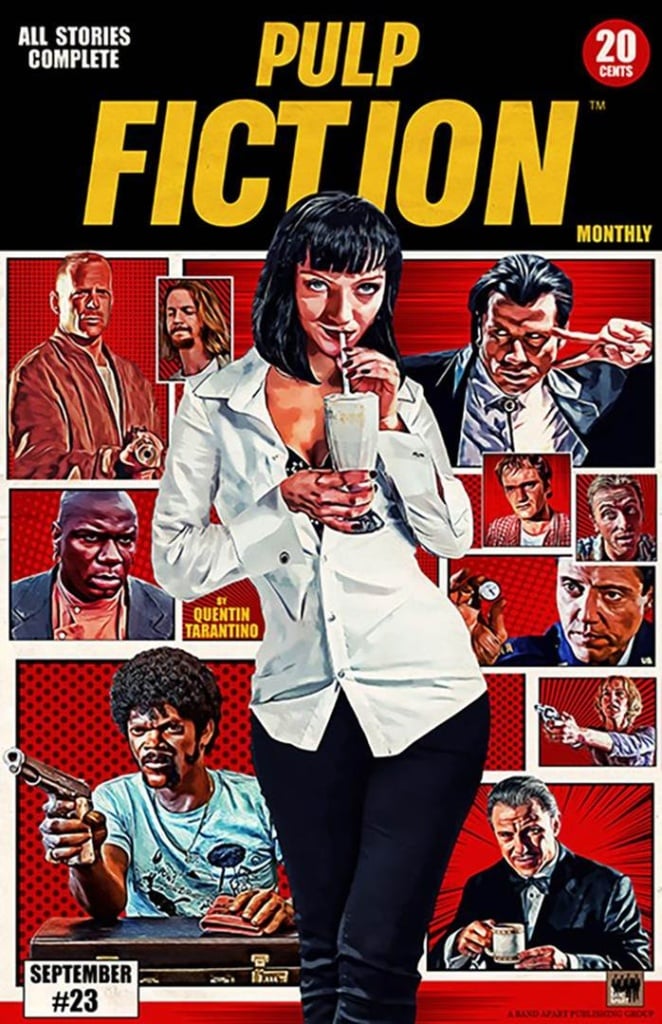
Front and centre in this poster are arguably Pulp Fiction‘s two main characters: gangsters Vincent Vega and Jules Winnfield, played by John Travolta and Samuel L. Jackson respectively.
A fan-made poster that’s more of an ensemble piece than the official version. While Verdesoto’s was inspired by pulp novels, this one takes its cues from pulp magazines.
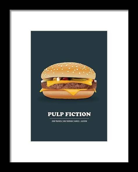
This minimalist alternative features only one character: the hamburger. Or “the cornerstone of any nutritious breakfast”, as Jules declares in this much-quoted scene from the movie.
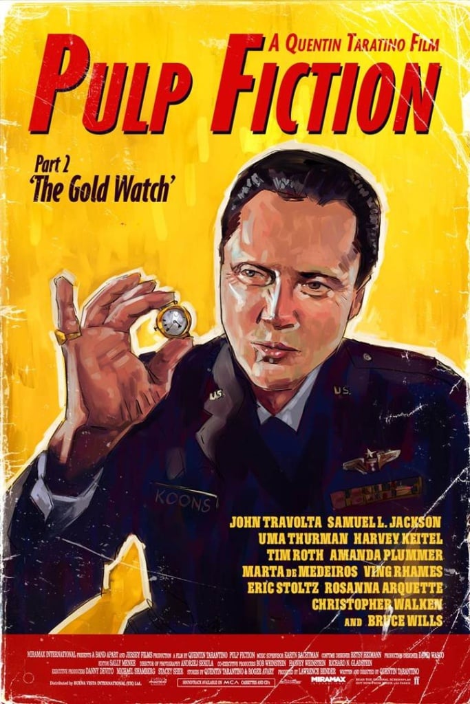
The tale of a watch passed down from father to son in unconventional manner (and an item whose fate will have repercussions for the plot) is alluded to on this fan-made poster showing boxer Butch’s father, played by Christopher Walken.
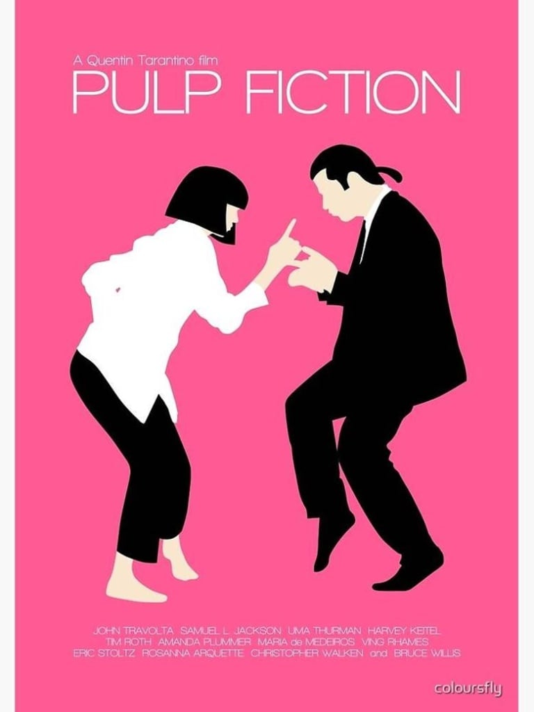
And we wrap things up with an alternative poster depicting the memorable dance scene between Mia Wallace and Vincent Vega, before their evening takes an unexpected twist.
Have you ever considered creating your own alternative Pulp Fiction poster? And what do you think about the story behind the original? Are there any lessons for your next project?