It is often argued that contemporary lettering arose as a response to digital design – a way of seeking out the organic in the face of the alleged coldness of the mechanical. It is true to say that any innovation or technical advance has always been naturally followed by a wave of traditionalist revisionism.
The current trend in lettering has been brewing for more than a decade, but it truly exploded a few years ago, boosted by the expansion of social media like Pinterest and Instagram.
The expansion of digital design has also, paradoxically, prompted a rise in lettering and other more decorative forms of graphic expression. In part, this is because tools such as graphic tablets or certain digital editing programs allow you to create compositions that simulate the decorative effects of manual lettering.

Another explanation is that, since the beginning of this century, after several decades of being demonised by an extreme and misunderstood modernity, the decorative has become acceptable once more. Though this is not the first time in the history of design that this has happened, it is no longer linked to a specific cultural or artistic status – rather, it has become an everyday and popular need.
Furthermore, at a time when, theoretically, anyone can do anything on a computer, we seek the natural challenge of doing something that can only be done without one, and we feel the need to define personal styles and the distinction that comes with something unique. And so, we turn to old and obsolete techniques that allow us to challenge ourselves.

The final explanation is that, given the commercialisation of the modern world, the need arises to do something without a commercial use, merely for the simple pleasure of visual enjoyment, or for the joy of doing something for oneself. Not everything has to be perfect, and lettering is one of the current manifestations of how much we need imperfection in our lives. However, even with all these nuances and adjustments imposed by this contemporary context, lettering has once again become a professional practice that is gaining traction.
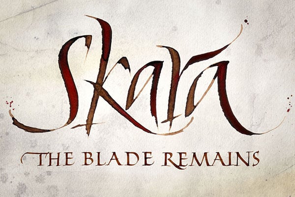
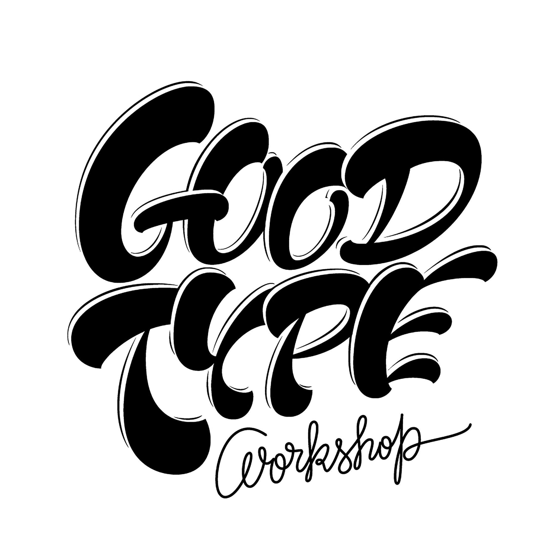
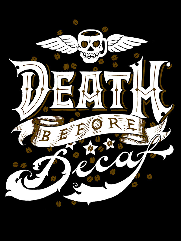
It should be made clear at this point that, although all three disciplines work with letters, there are major differences between typography, calligraphy and lettering. Very broadly speaking, typography is essentially mechanised writing, calligraphy is based on the physical act of writing, while lettering is essentially letter illustration.
The strength of lettering lies in uniting the expressiveness of calligraphy, the communicated nature of typography and the suggestive power of illustration, all in one unique piece. But however much the result may evoke a sense of inventiveness, immediacy, or freedom, it requires a great deal of planning for exactly the reasons mentioned above.
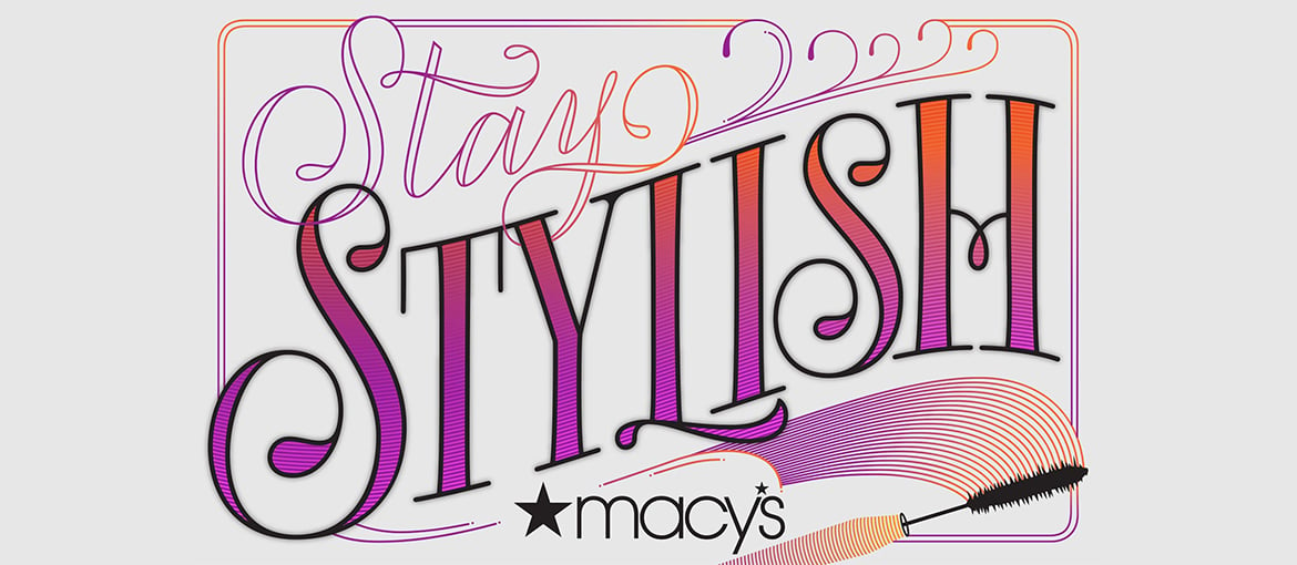
In a professional context, its uses range from logo design, packaging or advertising, to illustrations for media or book covers or even unique, customised objects, such as simple wedding invitations. The important thing is not so much that it looks pretty or attractive, but that it fits the purpose it was designed for and correctly conveys the right message. Unlike many standardised solutions, which need to follow a pre-established design system to maintain consistency, lettering must fit the message like a second skin. This means that a single piece, with a particular style, should not be used for different projects.
We also often forget that the letter itself— be it typography, calligraphy or lettering— is a means of communication, so we cannot uncouple it from the content it is conveying and merely enjoy its form. Good lettering designers know this, and use this exact principle as the basis on which to create their pieces, rather than limiting themselves to the simple recreation of a historical model or mere aesthetic enjoyment.
Perhaps you’re reading this because you’re interested in the decorative side of lettering, and think it could be a fun hobby. If that’s the case, you’ll discover a fascinating field full of endless enjoyment. However, if you are interested from a professional viewpoint and cannot pay a recognised expert, allow me to share some tips:
- Firstly, if you want to learn how to do lettering, do not do it on your own: learn from the great masters. If you get the chance, go to one of the many workshops held the world over. There will almost certainly be one in your city or nearby. If you can’t, sign up for an online course. Many of the masters offer these online courses and have even published some very formative books.
- Practice every day, as much as you can. Learn the basics and repeat them to make them your own over time – they should be unlike any other. The great masters took years to develop their expertise. It is perfectly normal that you’ll produce some botched efforts at first – the exact same happened to them, so do not despair. Draw, draw and draw.

Copyright: Martina Flor - Although historical styles tend to be the best examples, and undoubtedly the best way to educate the eye and learn lettering, don’t get obsessed with them or try to reproduce them exactly. The important thing is that you understand how they worked and what technical and communicative needs they responded to.
- Nor should you settle for just one model of lettering; there will always be many more to explore and discover, since every style has its own characteristics and meanings. However, it is also not advisable to mix more than two in a single piece. Several different styles together create confusion and all the communicate values of good lettering end up getting lost in the noise.
- Try to interact with other practitioners of lettering and follow the advice of the great masters. Many of them are more accessible than you’d think, and there’s nothing like direct contact. You’ll also notice how no one does anything exactly the same, how it is a very open community, and how sharing ideas is the best way to develop your own work.

Copyright: Iván Castro - Finally, you need to understand that, in the modern world of design, computers and editing programmes are nothing more than complementary tools to lettering. Correcting a mistake, changing a colour or vectorising our manual work is not a betrayal of the essence; in fact, there’s nothing to prevent us from improving it. The mistake is to think that anything digital is artificial and automatic when, in many cases, the processes we carry out with the computer require a great deal of craftsmanship.

Copyright: Iván Castro
So, how long will this lettering trend last, you wonder? There are those who see the current profusion as an unbearable bubble that will pop any minute. The truth is that all trends first arise as a reaction to the everyday and established. They appear as a breath of fresh air that requires us to take a step back from that which is currently dominant. But what was alternative yesterday and a massive trend today, could tomorrow be a cliché that immediately becomes ridiculous and annoying.
For now, there is nothing to indicate that lettering is entering this stage of decline. Quite the contrary. The danger however lies in the temptation to finish decorating any design with lettering that appears to be hand-drawn, so that the distinctiveness is diluted. This not only hurts the piece itself and its own communicative function, but also the lettering profession as a whole, since it ends up trivialising it, so that it loses its natural feel. Because great lettering is much more than drawing pretty letters.

