
Table of Contents
In the early 20th century, before the term graphic design had even emerged, Julius Klinger and Lucian Bernhard were among the most influential poster artists in the German-speaking world. As more and more companies capitalised on advancements in printing technology, Klinger and Bernhard created advertising material in styles that would leave a lasting impression on graphic design.
Julius Klinger was an Austrian artist whose illustrations influenced the design of posters around the turn of the millennium. After studying at Vienna’s Technologisches Gewerbemuseum (a school for higher technical education), Klinger worked as an illustrator for magazines including Wiener Mode (‘Viennese Fashion’).
Inspired by his collaboration with the fashion magazine, his illustrations and caricatures display an abstract quality. Moreover, his use of humour helped to shape the artistic, illustrative poster style. What made Klinger’s work unmistakeable was, above all, the contrast between fine drawings and thick typography. His artwork embodied the transition from classical to early-modernist poster design.
Julius Klinger
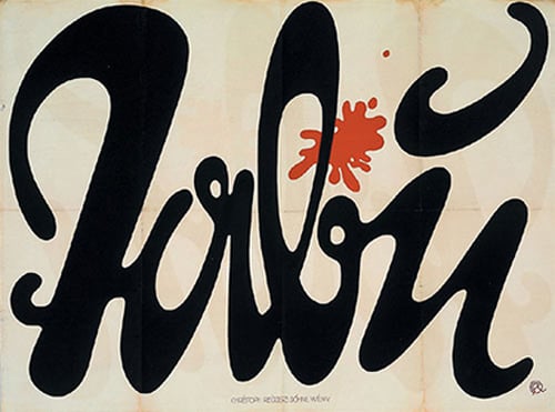
In early 1918, Klinger designed a widespread promotional campaign for the major cigarette brand ‘Tabu’. Appearing on several never-before-used surfaces such as walls and posters attached to construction hoardings, it represented one of the first ever strategic advertising campaigns.![]()
After his time spent working in Munich, Klinger moved to Berlin, where, aside from designing posters, he devoted himself mainly to book illustration. He also produced works for various public institutions including the Berlin Zoo, as well for well-known cultural venues. The emotion and personality inherent in his work continued to capture the imagination. And, in the 1920s, it laid the foundation for modern graphic art.
Klinger’s advertising poster for the 1909 Berlin Air Show achieved great renown. The poster depicts four people looking up towards the sky, standing on a tent on which the text is printed. It became so popular that it went on to be issued in several variations. Designs like this one meant that Klinger became one of the most in-demand artists at the art-printing company Hollerbaum & Schmidt, a leader in its field in Germany.
Lucian Bernhard
Lucian Bernhard was a German typographer, graphic designer, and professor. He studied at the Munich Academy of Fine Arts before moving to Berlin in 1901 to work at Hollerbaum & Schmidt. There, he produced posters for various companies, including well-known brands such as pen manufacturers Pelikan and Faber Castell, as well as engineering firm Bosch. Bernhard gained popularity through his stylistic reinterpretations of advertising space; by way of reduction, his posters drew attention to a compact message and, above all, a central image.
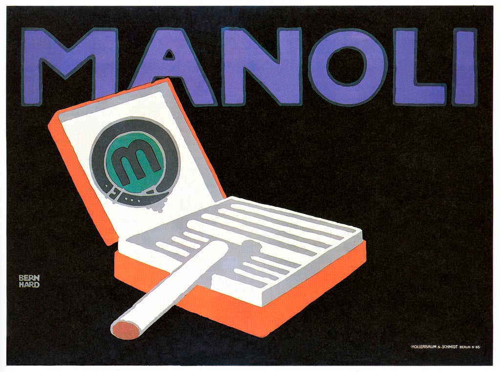
His distinctive style employed bold colours and abstract forms, bore only the most essential information, and represented a departure from more decorative and detailed posters; it thereby served as a forerunner to modernist styles. Bernhard not only pioneered a new genre that remained relevant for decades to come and inspired early modernism, but also applied his novel techniques to several brands, such as Manoli and Adler. Today he is considered to be the father of the Sachplakat (‘Object Poster’) style.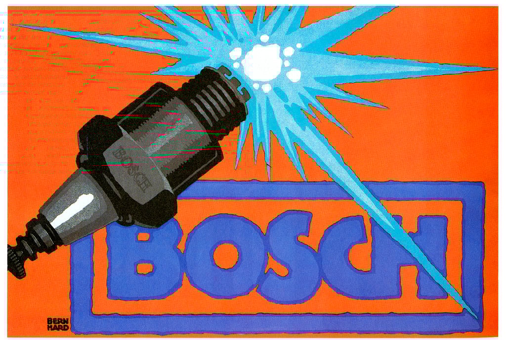
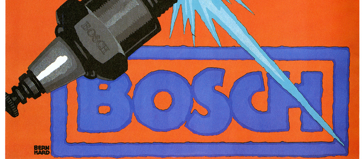
His work influenced the poster and logo design of international brands. He left his mark on Bosch, for example, where his design still serves as a logo. In 1914, he designed a poster in which the logo is set in uppercase characters covering the breadth of the design surface. The image of the spark plug was aligned diagonally and placed on a large colour background. Used in numerous posters, this aesthetic came to define the advertising industry of the time. The continued influence of Lucian Bernhard’s style is evident in many modern advertising posters.
During his time in Berlin, Bernhard, like Klinger, produced illustrations and designed book covers. Berlin was also where he founded the magazine Das Plakat (‘The Poster’), which later became known as Gebrauchsgraphik (‘Commercial Graphics’). It was among the leading design publications of the 1920s and still exists today as the bilingual magazine Novum. Bernhard created over 30 fonts, including Bernhard Gotik, Bernhard Fashion, and Lucian, which he often used in order to capture the look and feel of the brands he worked with. To this day, companies such as Pelikan base their logos on Bernhard’s designs.
From the beginning of the 1920s, Lucian Bernhard lived in the USA, where, as a professor, he passed on his intuitive approach and increasingly focused his attentions on art. His graphic designs and timeless fonts have retained their impact even after all these years.