
Table of Contents
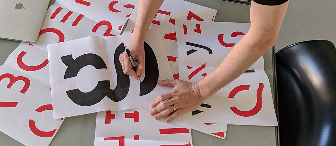
Sans Forgetica is the first font in the world designed specifically to help people remember the things they read. This rebellious typeface, which breaks various rules of type design to achieve its precise aim, was created by an interdisciplinary team of Australian designers and researchers from the School of Design and the Behavioural Business Lab at the Royal Melbourne Institute of Technology (RMIT).
The font combines psychological theories and principles of design to significantly increase reading difficulty, and therefore boost memory retention. Basically, the font helps you to remember because it is more difficult to read. One of the font’s creators, type designer Stephen Banham, told us more about how this font was designed.
What is Sans Forgetica, and how does it work?
First of all, Banham pointed out that this is an unconventional font “because it is not centred on clarity and aesthetic beauty“. Instead, it applies a psychological principle known as “desirable difficulty“, mainly through the unique appearance of the font’s backwards slant, from right to left, which is highly unusual for a font that is designed to be read.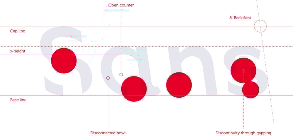 The second, immediately apparent difference is the incomplete characters, with clear gaps in their shapes. “The letters create a sort of puzzle that slows the reading process down, forcing readers to complete the ‘broken‘ shapes in their mind (the principle of closure). Readers therefore spend longer on each word, giving the brain more time to complete a deeper cognitive process and increasing the amount of information stored“.
Our brains use memory to store information and then retrieve it later on. It was the university that suggested Banham develop this font: “They wanted to demonstrate that the problem of how information is recalled could be investigated by combining two very different fields, behavioural psychology and type design, in order to help students study better. Personally, I’m very interested in how design can be used to activate parts of the brain connected to memory. As a type designer, this project forced me to approach the design process in a counter-intuitive way, by applying an idea from a completely different area (psychology) to my own field“.
And it is this combination of disciplines that makes this typeface unique, bringing with it some changes to the classic rules of type design. For example, the font is left-leaning, whereas we are used to seeing italics that slope from left to right. In typography, the only words written with italics that lean from right to left are river names on maps, giving you some idea of just how odd Sans Forgetica is.
Testing Sans Forgetica: does it really work?
As it was a university research project, the typeface underwent testing to assess its effectiveness. The team created three different fonts at the start of the research, each with a different level of reading difficulty.
Sans Forgetica proved to be the best suited to improving memorisation. It breaks some of the classic rules, but only up to a certain point, slowing down your reading but without ever being difficult to understand, and therefore increasing your ability to memorise whatever you are reading.
The tests themselves were taken by around 400 Australian university students, both in person at the laboratory and online, in an experiment conducted by the RMIT’s Behavioural Business Lab. Three new fonts were designed for them following the principle of “desirable difficulty” and tested by asking the students to recall pairs of words presented in each typeface. The fonts were an Albion font with gaps, an Albion font with gaps and a backwards slant (Sans Forgetica) and an Albion font with gaps, a backwards slant and an asymmetrical design.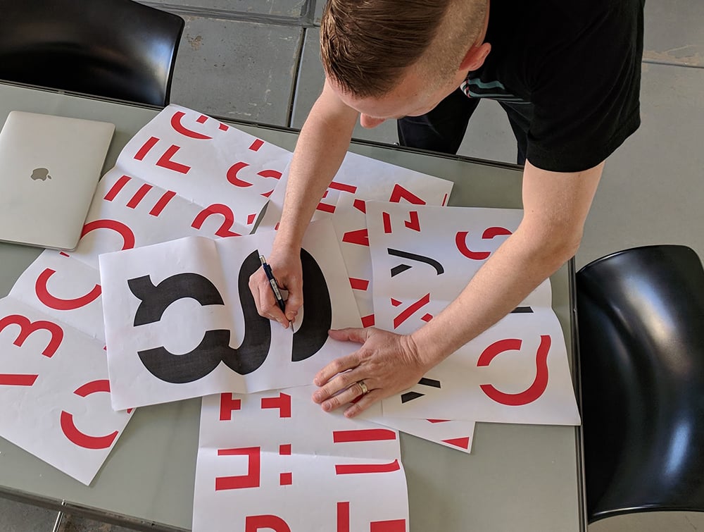 “The 96 participants who examined pairs of words during the testing in the lab remembered more pairs of words written in Sans Forgetica (69%) than those presented in the other two font types (61%)“, Banham confirmed. This represents a significant improvement and, in addition, given that the tests were carried out both in paper and digital form (offline and online), the font was shown to be effective both for a printed text and when read on a screen. Cognitive psychologists believe that, given the same reading time, more information is stored when reading short texts written with this font.
Applying Sans Forgetica to study or business
Sans Forgetica can be downloaded for free from its official website, and many people are already using it in a range of different fields: “People have even tested it in areas outside its original scope, for example as a way of dealing with things like dyslexia and dementia, and it’s also getting plenty of use in teaching“. Researchers are currently working on an academic paper, which, once published, could inspire many more people to use the font in other areas.
Research shows it may be useful for helping to recall short phrases, quotations or summary information, and it could therefore also be used in the field of printed and online advertising, to ensure messages are lodged for longer in readers’ minds.
From flyers and brochures to stickers and packaging, a small space could be given over to Sans Forgetica to print an (almost) unforgettable message: “Sans Forgetica should not be seen as some kind of panacea. I’ve been asked if this font could help people to stop forgetting where they’ve put their car keys. The answer is no!“, Banham concluded with a smile.