Table of Contents
Shop signs: examples, ideas and tips for choosing the right one
Visibility, clarity and recognisability are the watchwords when it comes to designing an effective sign. Today we’re going to show you different types of signs and give you some tips on choosing the right one for your business.
The shop sign: what is it and what is it for?
Simply put, a shop sign is a piece of writing or image that indicates the presence of a business. As such, it’s also a tool for advertising and attracting potential customers. To ensure good visibility, it’s usually positioned above the entrance to the business, and carries the shop’s logo. Just the logo? Well, it depends: if the logo or name aren’t well known and/or self-explanatory, it can also indicate the type of business. For example, the “Mary & Paul” laundry could have a sign with the “Mary & Paul” name and logo, accompanied by: “Laundry”.
To get a better understanding of how a sign is made, let’s have a look at a few more examples.
Ideas for and examples of shop signs
Signs can be divided into two main categories that differ principally in terms of price and visibility.
Illuminated signs
These signs have a built-in illumination system that increases visibility at night or in busy squares and streets – if, for example, the shop lies near a major junction, an illuminated sign can help it to stand out amid the visual clutter. A classic example is the green cross sign used by pharmacies, which is visible from afar and in the dark.
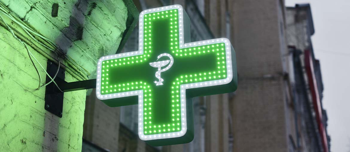
Of course, this type of sign costs more than one that isn’t illuminated, as it’s more complicated to manufacture.
Let’s run over the main types of illuminated signs that can be found in our cities.
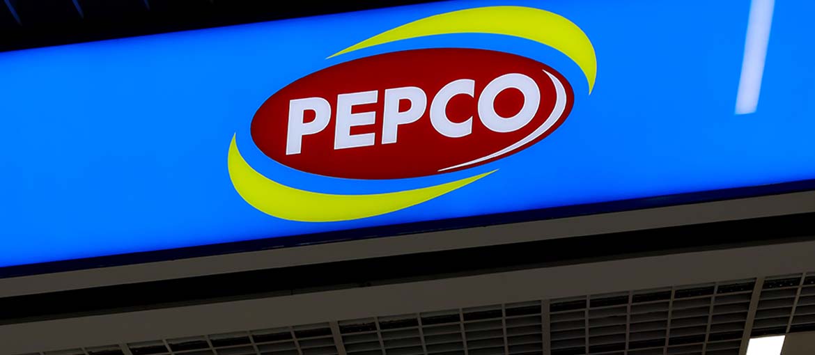
Light boxes
Tthese are signs with LED lights inside. Their main advantage? They’re highly visible, even from a distance.
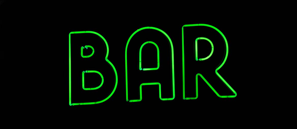
Illuminating letters
Made from aluminium, steel or plastic, these letters have LED lights inside that make them visible at night. We like them because they have a retro look.
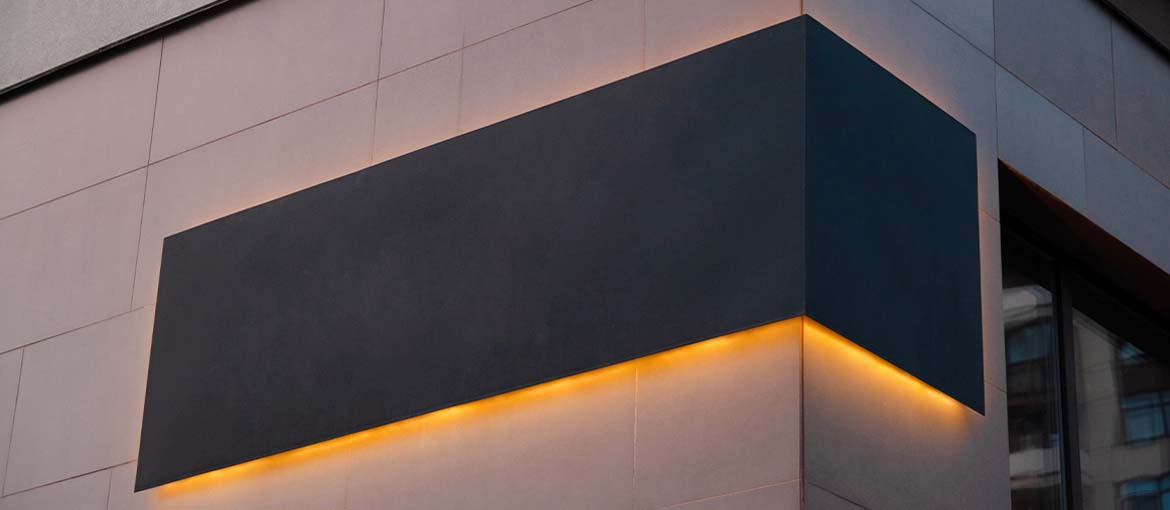
Backlit sign
these signs are illuminated by LEDs positioned behind them. They create an elegant effect, surrounding the sign with a halo of soft light.
Illuminated totem
These are vertical signs that are illuminated by a lighting system inside. They are usually placed on the ground near the shop’s entrance. Pros: they ensure excellent visibility to passers-by on the pavement – they’re impossible to miss! Cons: they take up a lot of space. And they are no substitute for the classic sign above the shop entrance because totems aren’t very visible from afar.

Non-illuminated signs
These signs don’t have built-in lighting system, which usually means they’re cheaper. They don’t give the same visibility as an illuminated sign, but if your shop is already well lit, they should suffice. There are many options to choose from – let’s take a look at a few below.
There’s the sign printed on a rigid panel (Foamex, Plexiglass, aluminium or Correx) that offers countless possibilities for customisation.
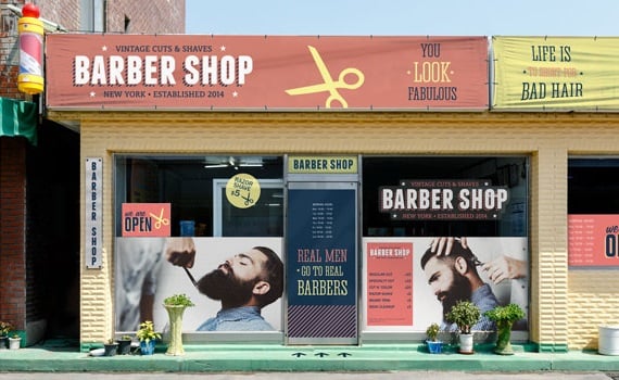
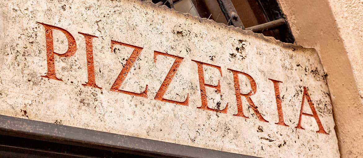
If you want to give your business a retro vibe, you could opt for a sign that is engraved on a piece of marble or wood.

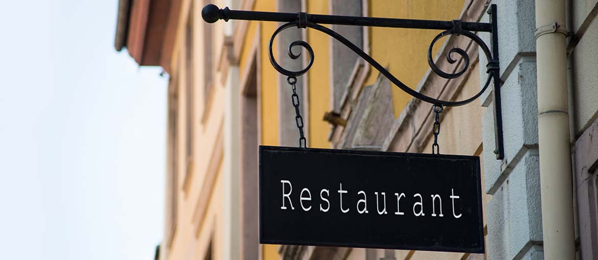
Or you could go for a wrought-iron hanging sign.
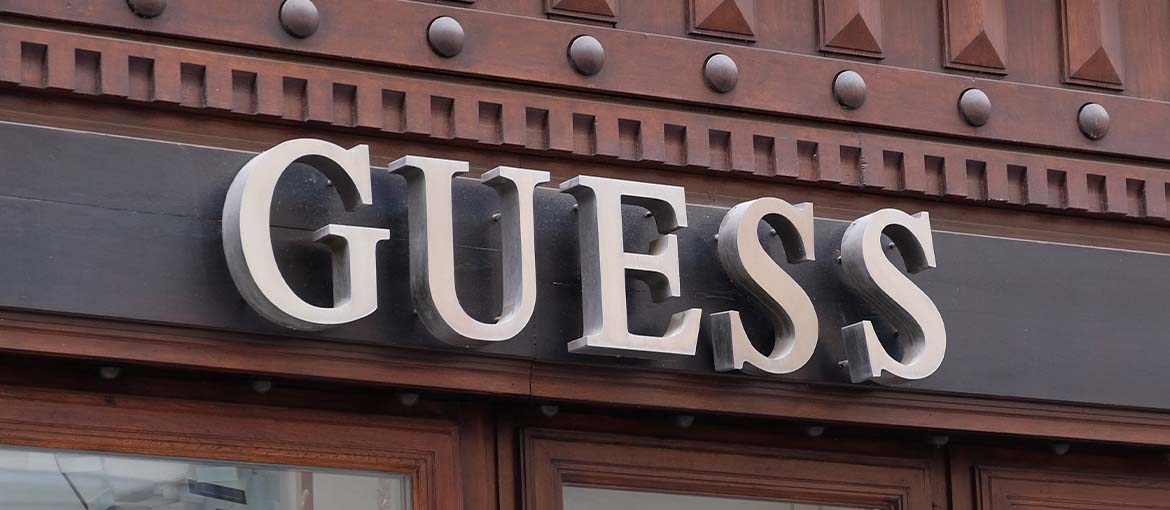
Want to really make your sign stand out from a distance? Then choose a 3D sign, with relief lettering and/or logo. However, these are more complicated to make, so cost more.
Which brings us to an obvious question…
How much does a sign cost?
The answer is, it depends:
- On the type you choose. As we’ve already seen, illuminated and 3D signs cost more than simple printed signs.
- On the cost of the tradespeople you use to put up the sign.
Tips for designing an effective sign
Recognisability, clarity, visibility. As we said at the top, these are the watchwords. Here are some tips for signs that deliver these qualities.
For a recognisable sign:
- Be consistent with your brand’s identity. In other words, use fonts and colours that a part of its visual identity.
- Keep your target in mind: a sign should speak to your potential customers.
- Respect the style of the shop and the architecture of the building that it’s in – particular care is needed for businesses operating in historic areas.
- Study the competition: this will tell you whether there are aesthetic norms that need to be followed in the area, and help you work out how to stand out.
For a clear and legible sign:
- Use just a few elements, otherwise you risk creating confusion.
- Pay particular attention to letter size and thickness, and to kerning. Text must be legible from afar, even in low light and by people passing by quickly in cars, on bikes etc. Don’t “shout”: gigantic letters can look inelegant.
- Go for a good contrast in colour between font and background that brings out the shop’s name and/or logo.
Now that you’ve got a clearer idea of what to do, it’s time to start designing!

