
Table of Contents
Stanley Kubrick is one of the most celebrated directors of all time. He made relatively few films – 13 in a career spanning almost 50 years – yet in each of them he always explored new stories, emotions and settings: from deep space to the Vietnam war, from ancient Rome to the intimate psychology of a couple.
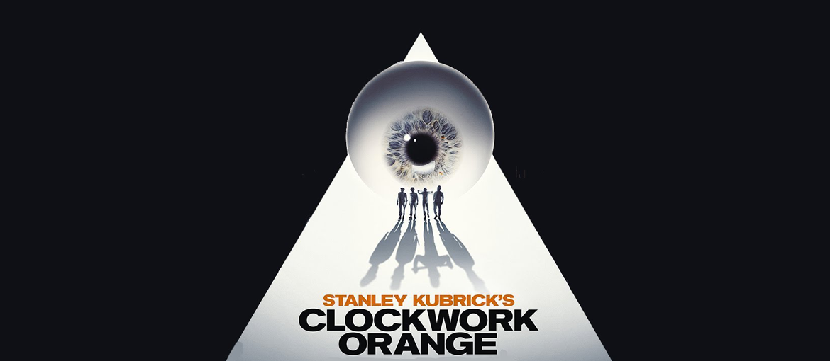
Many scenes from his films have been etched into our imaginations – the monolith in 2001: A Space Odyssey, Jack Nicholson’s axe in The Shining, the pedicure in Lolita and the menacing walk of the droogs in A Clockwork Orange.
But what typefaces did Kubrick use to introduce these powerful movies? And what are the stories behind the lettering used on his most famous posters? Today, we’re taking a closer look at a selection of the fonts used by Kubrick in some of his most famous releases, as well exploring his typographic passions.
Dr. Strangelove
Stanley Kubrick’s filmography includes everything from thrillers to war films, period pieces to erotic dramas. With his seventh film, Dr. Strangelove or: How I Learned to Stop Worrying and Love the Bomb, released in 1964, he added comedy to the list.
In this black satire, Kubrick challenges the audience by bringing a Cold War parody to the screen at the very height of tensions between the United States and the USSR. The film is full of discordant elements — humour and drama, erotic urges and death — which critics say represent the binary around which the whole film is constructed.

Even the opening credits play with contrast, superimposing almost childlike lettering over a scene in which a bomber is being refuelled in mid-air (which some see as a metaphor for sex). The credits were created by Pablo Ferro, a Cuban designer who up to that point had mainly worked in advertising. He worked with Kubrick again on the hypnotic trailer for A Clockwork Orange and would go on to design the credits for over 100 films, including The Addams Family, Men in Black and Beetlejuice.
Pablo Ferro’s lettering marks a clear departure from the style commonly used in the cinema until that point: it’s informal, extraordinarily elongated and thin. As such, it’s perfect for what Kubrick wanted to do: to show text and important images in the background at the same time. It worked so well that the director was able to fill the entire screen with the credits!
2001: A Space Odyssey
2001: A Space Odyssey, Stanley Kubrick’s science fiction masterpiece, also came out at a particularly significant moment in history: 1968, just a year before man walked on the moon for the first time.
The opening credits for the film are probably the most iconic of all the director’s pictures, showing dawn as seen from space and set to the inimitable notes of Richard Strauss. The film’s title appears in the extremely legible and well-defined characters of Gill Sans. It’s one of the all-time classic sans-serif fonts, so much so that it’s been called “the British Helvetica“.
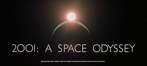
Eric Gill designed the font in 1928. He based it on the typeface used for the London Underground at the time and wanted the it to compete with the sans serif fonts that were then in vogue, like Futura. The font was an instant success and is today used in the logos for some of the world’s most well-known brands, including the BBC and Tommy Hilfiger. Fun fact: in the title credits for Kubrick’s film, the letter “O” is used for the zeros of “2001”.
For the 2001: A Space Odyssey poster, Kubrick instead chose Futura which, as we’ll see, was one of his favourite fonts. And another fascinating connection between the moon landings and Kubrick’s film is that the plaque left on the moon by the American astronauts to celebrate its “conquest” was also engraved in Futura.
The Shining
That Stanley Kubrick was an extremely fussy perfectionist is well known. But less well known is that his exacting requirements also extended to lettering, as the following anecdote from the making of his 1980 psychological thriller The Shining reveals.
The lettering used in the poster was created by Saul Bass. Bass was the legendary graphic designer and illustrator who revolutionised the world of cinema with his credits and movie posters, producing genuine works of art for Hitchcock (Vertigo and North by Northwest), Ridley Scott (Alien) and Spartacus, one of Kubrick’s previous films. But even Bass’s fame would not spare him Kubrick’s fastidiousness.
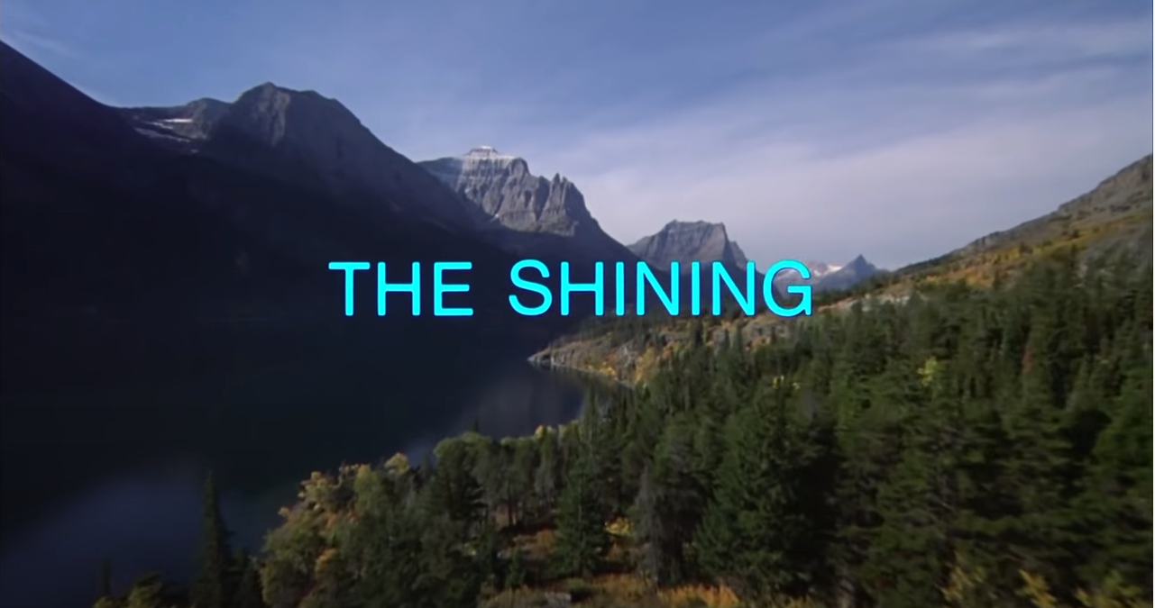
Saul Bass submitted five drafts for the poster for The Shining, but none of these would satisfy the director, who said the lettering was: “hard to read” and “not compact enough” (you’ll find the full story here). It’s said that Kubrick made him produce over 300 drafts before he was finally satisfied.
If you think back to the opening scene of The Shining, it’s hard not to feel a sense of deep foreboding: a long shot follows the family’s car as it winds across a remote and mountainous landscape, the score heightening the anxiety. But the final touch is the font. A neutral Helvetica – one of the most famous, if not the most famous, sans serif fonts – contrasts with everything thanks to a highly disturbing element: the colour.
Barry Lyndon
Barry Lyndon (1975), Kubrick’s second historical drama, follows the adventures – and, above all, misadventures – of an Irish chancer in 18th Europe. It’s a highly visual film with a meticulously put together aesthetic: the whole film was shot with natural light, candles and oil lamps thanks to a special lens originally developed by Zeiss for NASA.
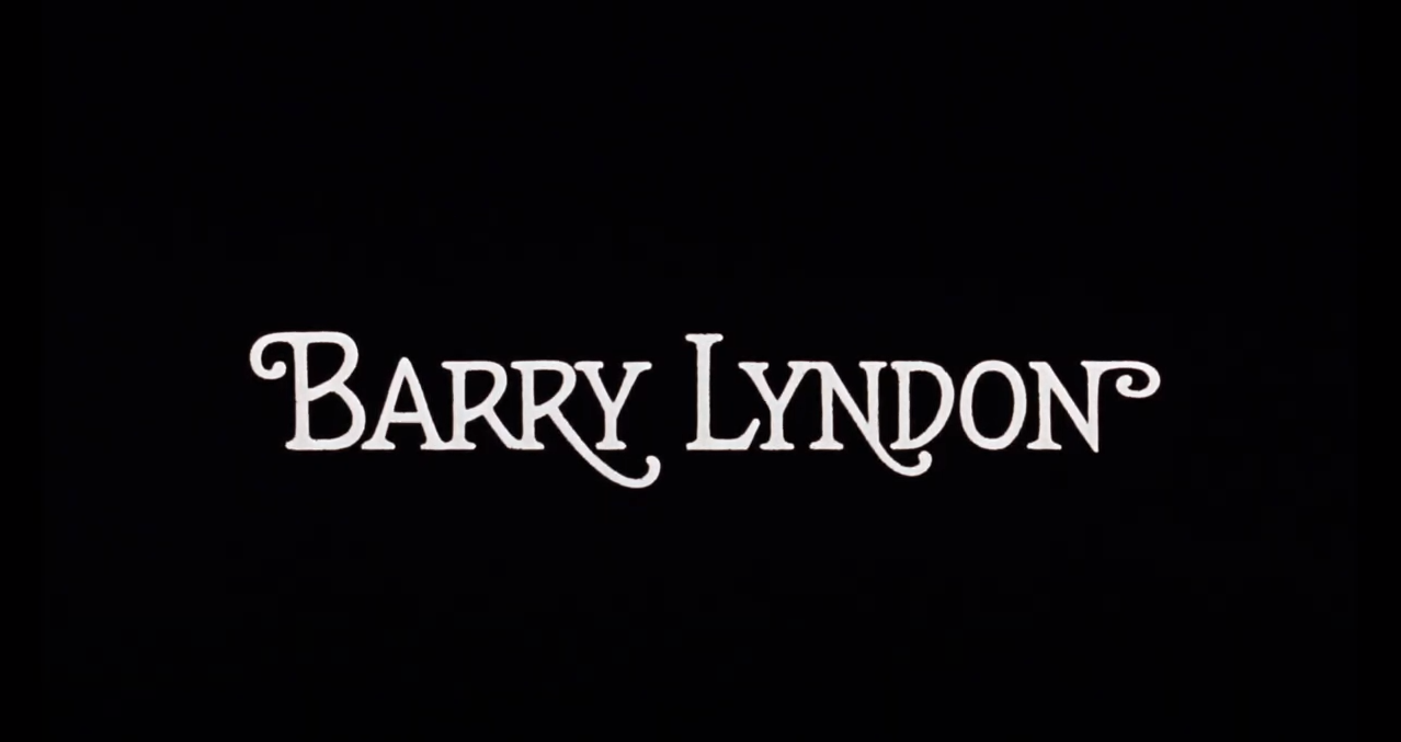
Barry Lyndon is also a work that stands apart from the rest of Kubrick’s output for two reasons: it doesn’t deal with the director’s usual themes, and it’s one of the very rare cases in which serifed typefaces (with particularly pronounced flourishes) are used for the credits. They are the work of Bill Gold , who, after weeks of intensely swapping ideas with the director, designed the poster and the entire alphabet of characters that Kubrick used for the film’s opening credits and chapter titles.
Bill Gold was a graphic designer who created hundreds posters for movies, including Casablanca, The Exorcist and Dial M for Murder, and many of Clint Eastwood’s films.
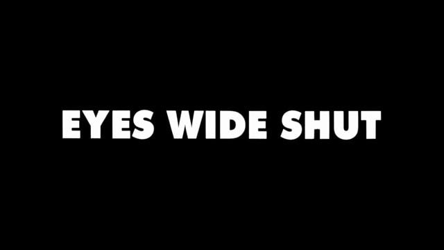
Eyes Wide Shut
Eyes Wide Shut, the last film that Stanley Kubrick completed (the director died in the year the film was released, 1999), is a drama with erotic overtones. The opening credits displayed in white against a black background, are bold, well-defined, and take up the whole screen, but let us glimpse for a moment, as if through a crack, the scene in which Nicole Kidman slips off her dress. The font used for the credits is Futura in its Extra Bold variant.
In an interview a few years ago, Tony Frewin – Kubrick’s long-serving personal assistant – recounted how Futura was the director’s favourite typeface and how Frewin frequently tried, and failed, to convince Kubrick to use serifed fonts. In actual fact, Kubrick didn’t use Futura that often: it only features in the opening credits for his last film, as well as various posters and trailers.
As we’ve seen, the visual richness of Stanley Kubrick’s films is often enhanced by classic fonts that are clean and sans serif. They are simple typefaces which, in the hands of other directors, might have looked ordinary. But Kubrick, through his cinematographic skill, makes them a powerful and indelible part of some of the most famous opening scenes in cinema. That’s the magic of Stanley Kubrick: his ability to make the simplest things iconic – whether they are fonts or feelings.
Would you like to help us add to or improve the content of this article? Check our guidelines and send us your request via email at: seo@pixartprinting.com.