
With so many microbrews infiltrating the marketplace—and taking up valuable shelf space in retail outlets—having a memorable package design that stands out from the crowd is more important than ever. So when Ommegang Brewery, based in Cooperstown, New York, decided to update its brand, they hired French illustrator, Yann Legendre, to bring their packaging to life.
Each ale has a fun, quirky back story, so the art needed to portray those qualities and bring them to life. Legendre notes, “They were looking for an artist who would bring a sense of movement, openness, storytelling, and wit in the art, to both honor their history and reflect a stylish, dynamic, and modern approach.”
He credits Ommegang’s art director Larry Bennett, with devising the clever stories. “Typically, we look for a story idea that may lead to a brewing idea, that will create an even better story idea,” Bennett says. “We have a great history with Belgium and American brewing, so we don’t often have to pull rabbits out of hats. Unless it’s a story that involves magic.”
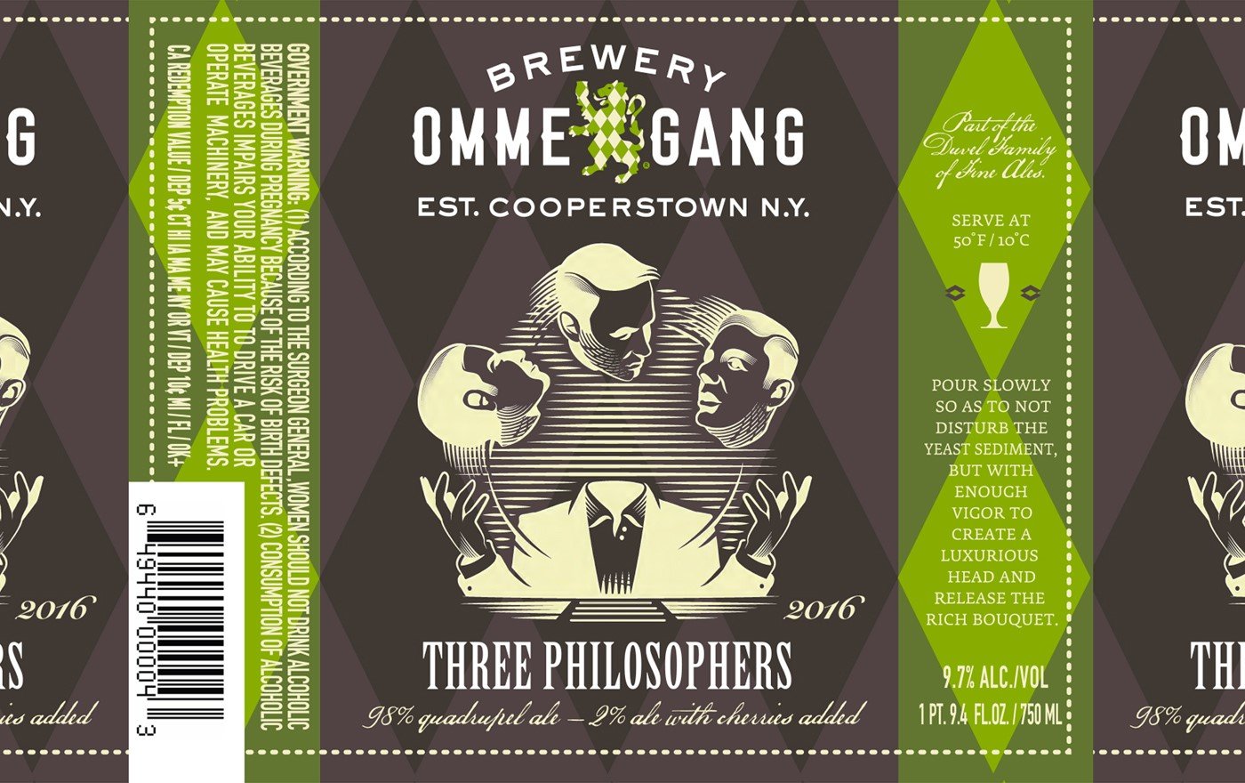
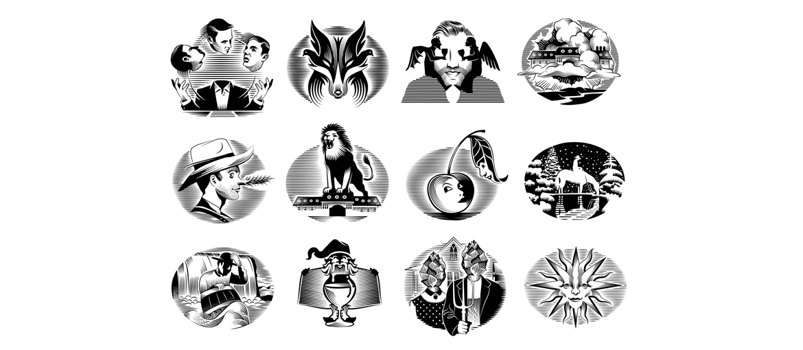
Legendre created compelling characters to bring the narrative to life. For instance, for “The Three Philosophers” ale, he drew a headless man, juggling three heads. “The story evolved from three philosophers in a William Blake play, Island in the Moon, who talk about why/how/if they would do something remarkable,” he says, so he each head has a questionable expression.
“For each project, Larry gave me the story and a series of visual references or ideas,” Legendre recalls. “He never asked me to draw a particular thing. He was more interested in how I interpreted the story and brought a new layer to it. The stories are like fairy tales, with different characters and scenes, so it was really fun to work on.”
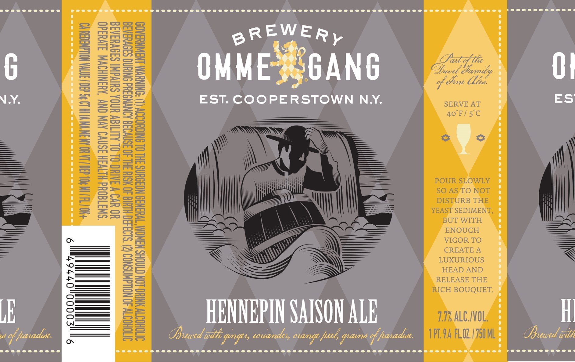
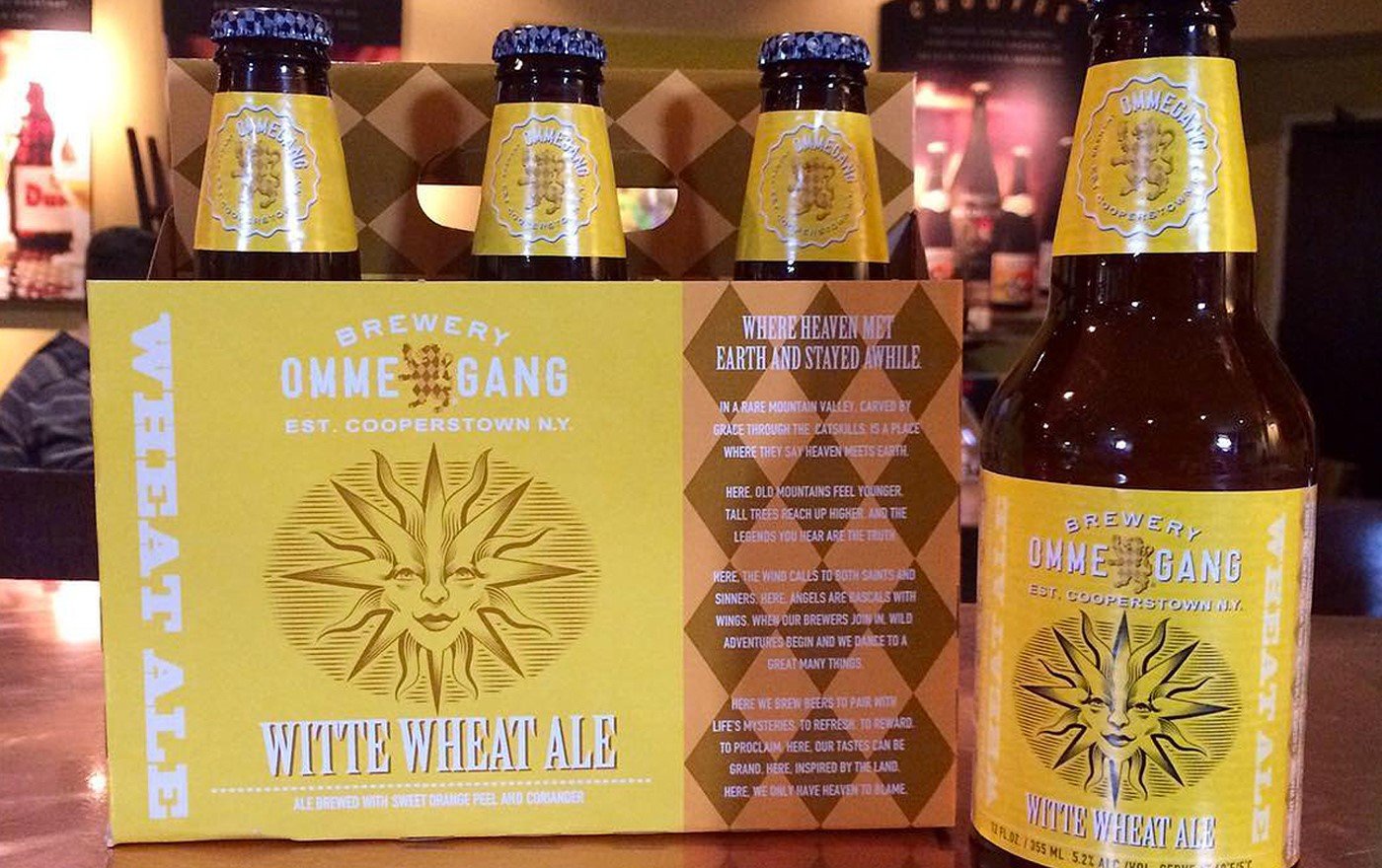
 Legendre drew everything in black-and-white, and then Bennett’s team reversed and dropped the illustrations in front of a colored argyle background in many cases. “We developed a color palette that works with the beers and seasons. For example, wheat beers tend to be warm and summery, while winter ales tend to be cool,” Bennett says. Getting everything right for production was crucial, especially when working with more than one printer, as they do. “The labels are printed at one place, the four and six packs at another, and the cartons another. Each printer specializes in what they do, but they talk to each other and to me on color matching. We send draw downs, color chips, and samples back and forth to get everything in sync.”
Fortunately, their system works. The artist’s crisp renderings pop off the packaging, bringing the characters to life as he intended. Legendre is known for his large-scale posters that hang in shop windows in Paris, so for this project, he treated the labels as if they were mini-posters, paying special attention to how they will be produced and presented. “I spend a lot of time making sure each illustration is perfectly set up for a certain printing technique, whether it’s silkscreened, foiled stamped, or offset.”
In fact, he loves the whole production process. “Printing to me is like bringing the work to life. I have a deep relationship with this art. My grandfather was a book binder, so I was exposed to this at a very young age. The quality of the papers, the smell of the inks, leathers, glue, etc.—it’s ingrained in me and it influences how I work.”
All of these considerations have paid off for the brewery, which has noticed a bump in sales since the packaging was updated with Legendre’s illustrations. “I’ve admired Yann’s work for several years, so he was my first pick for this project. His illustrations have a strong, conceptual framework, and they convey the ideas perfectly,” Bennett notes.