
Table of Contents
So many eco-friendly packages are reminiscent of brown paper sacks—boring, colorless, no personality. The materials, themselves, can be difficult to navigate from a design perspective to make them more palatable, and avoid the use of harmful glues, inks, and bindings. Here, four firms have successfully navigated the eco terrain to come up with tactile and beautiful design solutions that meet the strict recycling, reusable, or biodegradable packaging standards.
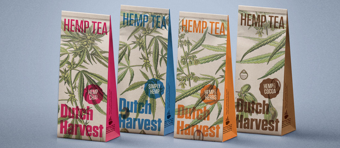
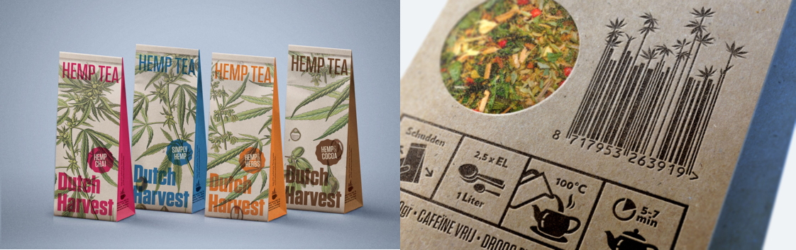
Dutch Harvest Hemp Tea
Design: Tenzing
Illustrator: Walther Otto Müller
When the actual product is eco-friendly by nature (“tea with a mission”), it’s natural that the branding and packaging must walk the walk and follow suit. Designer Arjan van Woensel says, “Esther Molenwijk, the owner of Dutch Harvest, is someone who clearly sees the value of the entire hemp plant and took up this project to showcase the multiple uses of this amazing crop. The design needed to reflect the eco-cred of the product, but—and this was a big but—without becoming too weirdy-beardy.” And by “weirdy-beardy” he means the stereotypical earth-friendly (ie tree hugger) references. It also needed to stand out on the tea shelf in retail outlets, which is a challenge in itself with all the offerings available.
Since this company was started through a crowd-funding campaign, Molenwijk wanted to include customers in the design decision, so van Woensel mocked up four designs and asked supporters to vote on their favorite. “Esther loves collaboration and she wanted to include customers right from the start. Fortunately, they chose the design I would have chosen, although I liked them all,” he says. “We get so much positive feedback that we must have made the right decision.”
The design is colorful, yet retains an eco-friendly feel due to its materials, which was a challenge in and of itself. “It was very clear it needed to be 100% compostable, which was a bit hard because we wanted a window in the pouch. And all of the existing (eco) pouches available at the time had a petroleum-based lining,” he explains. So van Woensel and his client worked with two manufacturers (Bio4Pack and Paperwise) to create a unique, 100% biodegradable, lined pouch. “The lining and plastic window in the bag have been specially created for Dutch Harvest from cellulose-based plastic and the paper is made from agricultural waste,” he explains.
Pro Tip: Be prepared to go out of your way to find partners who can deliver exactly what you need when working with sustainable materials.
Level Cannabis
Agency: Folklor
Designer: Claire Typaldos
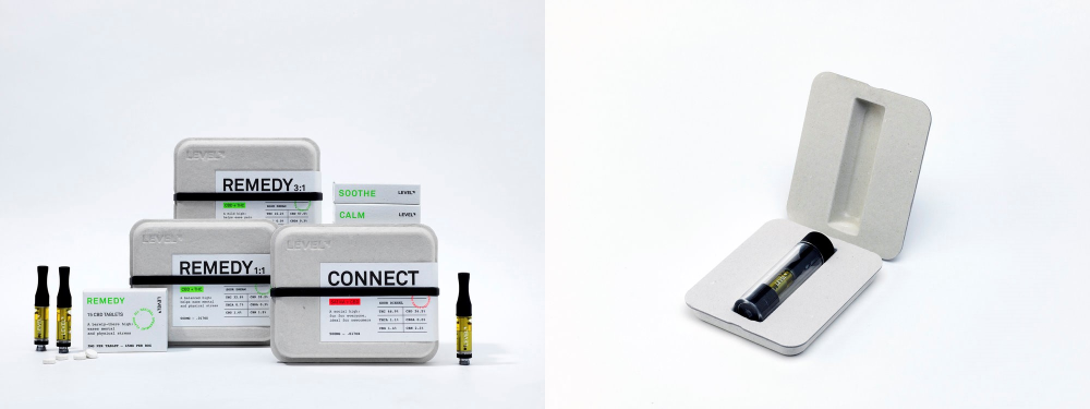
Level hired designer Claire Typaldos to redesign its brand to convey the essence behind the science of cannabis without detracting casual customers. “What makes Level special is its high quality and the fact that it’s completely pesticide-free, additive-free, and has no solvents. We wanted to the branding to reflect this with a simple, organic design,” she says.
The packaging is made of recycled pulpboard, which is traditionally used for egg cartons. “We wanted to use it in a unique way—as high-end packaging that also doubles as a nice object the customer could keep. We liked the idea that the customer would think twice before throwing away the box,” Typaldos notes, although it was learning experience working with the factories molding the boxes. It took several prototyping phases to get the design just right.
The label cleverly incorporates the scientific elements for each product strain, using colors to distinguish them. She says, “They wanted to share as much information as possible so that the customer knows what’s going into their bodies. We used Akkurat for the modern and clean titles, and Courier for the more scientific, informational sections. There was a nice interplay between the two.” A deep, debossed logo takes center stage on the box, highlighting the natural quality of the pulpboard.
Pro Tip: Be sure to budget in time and money to test different printing and design techniques.
Poopbags
Design: Tondo
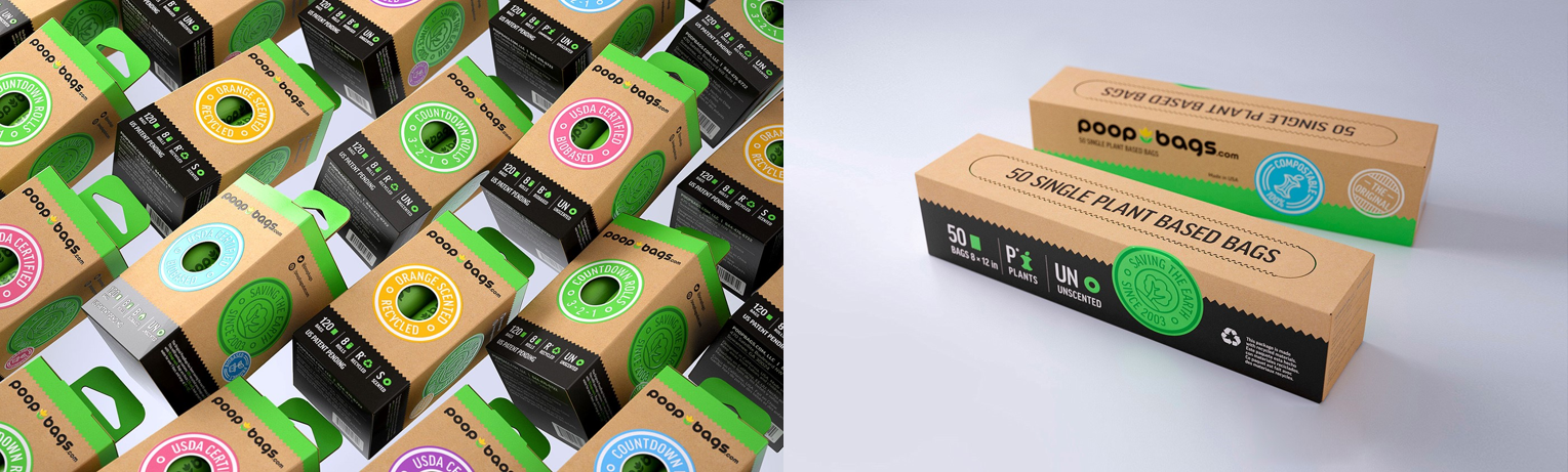
Picking up after your pooch is a rite of passage for dog owners—albeit, one of the less enjoyable aspects—so why not use a product you feel good about? Poopbags is dedicated to using eco-friendly materials in their packaging and product and having a sense of humor about it. “With a name like Poopbags, you can’t take yourself too seriously,” says Tondo’s creative director and designer Max Ali. Tondo was hired to redesign the brand to give it consistent presence in the market and stand out in a category that is dull by nature.
“If you want the design to be both eco-friendly and appealing, you have to be smart,” he says. “Each small element should carry a meaning and convey a message, but also keep in mind that the package should be fun and eye catching on shelf.” The flower logo signifies sprouting life and the outdoors, and stamps were designed as an easily recognizable brand element that can be modified to carry different messages. “The box itself is made of recycled materials, and our main concern was to be able to separate the types of products with minimum design elements,” Ali says.
Colors clearly distinguish the different products by how they are produced—Green is recycled; Orange is for orange-scented; Purple is biodegradable; and Blue is plant based. All the packages are also made with recycled materials.
Pro Tip: Just because you’re branding an eco-friendly product, doesn’t mean the design needs to be dull. Maximize the use of colors to stand out on the shelf.
Hippo&Crate
Design: Alphabet
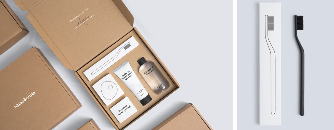
Ordering personal hygiene products such as soaps, lotions, and shaving kits, has become increasingly popular in recent years. Hippo&Crate is the first subscription-based toothcare brand. The name itself is borrowed from Greek physician Hippocrates, who was considered one of the most outstanding figures in the history of healthcare, and as a nod to the crate-like boxes that arrive at customers’ doors.
“In response to an industry that tends to overwhelm consumers with specs and jargon, we crafted a unique visual language to establish Hippo&Crate as a brand that stands for beautiful, honest, and affordable toothcare,” notes Alphabet partner and creative director Abbas Mushtaq. And, of course, the products are sustainable, as well as the packaging. The toothpaste and mouthwash are vegan, gluten-free, sustainably harvested, and toothpaste tube is made of 100 percent recyclable aluminum and printed using environmentally friendly ink.
The designers suggested the packaging be inline with the products since so many of them will be shipped around the world. “We didn’t want it to be harmful to the environment, and personally, we just love cardboard engineering!” He adds, “You have to be wary about the application of ink and how color looks on the packaging—especially stuff in the CMYK range. In the end we opted for simple hits of black and white to make sure it contrasts well. You also need to be careful with smaller type because of ink bleeding on recyclable material. It was a blessing in disguise as we ended up going for a simple, bold approach to help with that.
Pro Tip: Using two colors and simple imagery can actually elevate the design. Simplicity doesn’t have to be simple.