

Table of Contents
The word “logo” is an abbreviation of “logotype”, which comes from the Greek λόγος meaning “word” and τύπος meaning “imprint”. A logo is a graphic symbol that represents a product, company or idea. But a logo is also an emblem of the era and environment in which people live. The evolution of logo design can be traced right the way back to ancient Greece, when sovereigns and their dynasties would use monograms for their coins. Modern logo design, however, dates back to the Renaissance, around the 13th century. At the time, goldsmiths, paper makers and others would use gold stamps, engraved symbols, watermarks or simple ceramic fingerprints.
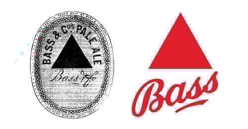
These days, all firms use a sign, icon, symbol or combination of the three as a logo: it is undoubtedly one of the most striking aspects of modern companies. And they are everywhere: on magazines, the internet, our smartphones. Today, logo means branding: although the concept itself is quite recent (previously, a sudden change in form or font would go unnoticed), the first trademark was registered in 1875 in Great Britain. It was the logo for Bass Pale Ale: the simple design and iconic triangle helped Bass become the world’s biggest brewer in 1890, and was even explicitly cited by James Joyce in Ulysses.
The graphic symbols that we see today are the fruit of countless design techniques created and applied over the last two hundred years. From Art Nouveau and Liberty style to the flat design that’s so popular today, we’ll be looking at how the logo has evolved and what these powerful symbols say about the past and present.
Ornamentation aplenty and complex logos
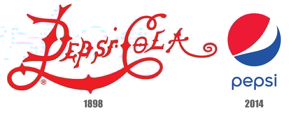
The Victorian era saw many artists drawn to what we today call graphic design. The logos of the period feature heavily seriffed and ornamented shapes and fonts. A perfect example is the first logo for Pepsi Cola, which dates to 1898 and was the creation of pharmacist Caleb Bradham. When we compare it to the latest Pepsi logo from 2014, we discover an enormous difference dictated by the era: today, there is a tendency to eliminate almost any type of complexity from these types of symbols to make them immediately recognisable.
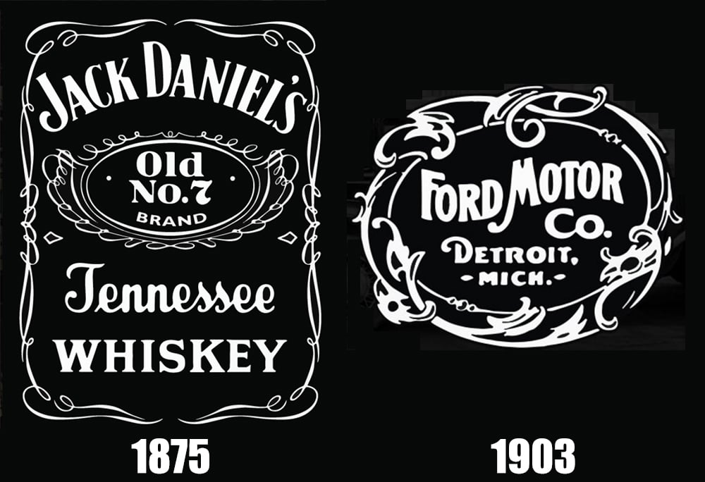
This international phenomenon has redefined the use of decorative elements in logo design, using simple forms that have more complicated elements and illustrated initials. This can be seen in the iconic Jack Daniel’s logo, as well as the first Ford logo, with their more rounded forms.
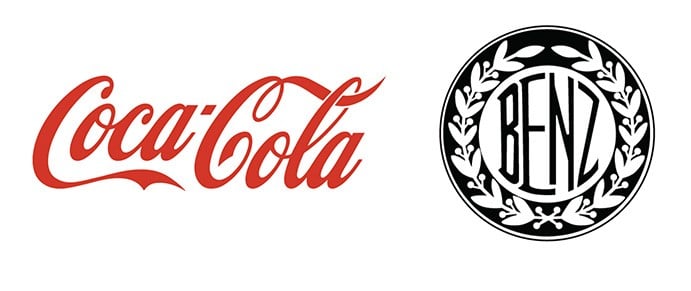
But the hand-written fonts of the Art Nouveau style made it a very popular graphic design philosophy. This inspired logo designers to use natural forms in the structure of these signs and symbols, as exemplified in the logos for Coca Cola and Mercedes, two logos from three different eras.
Simplification and rounded geometry
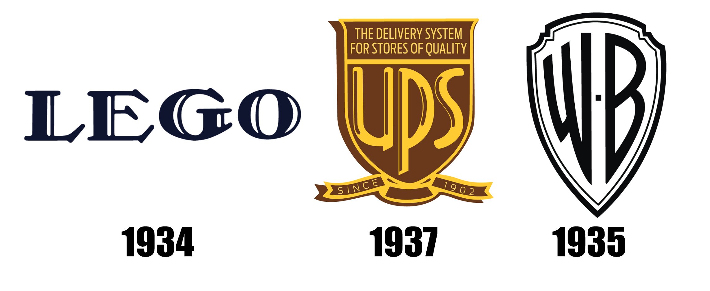
It was probably around the 1930s that companies began to realise the power of logos and, therefore, that they had to be legible and immediately recognisable. Seriffed fonts were adopted for logos like Kodak and Lego, while Coca-Cola and Pepsi simplified theirs somewhat. The Art Deco style combined tradition with mechanical and material elements, as well as rich colours and rounded geometry.
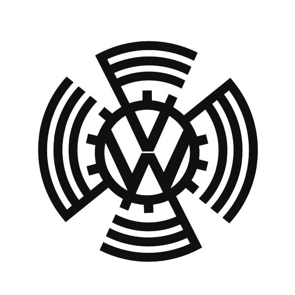
Standing in contrast to the serifs and flowers of Art Deco was German expressionism with its precise, squared lines and ordered vision of the world, as seen in the Volkswagen logo from 1938, a trademark par excellence. It’s a minimal approach that perhaps helps us understand the Germany of that era.
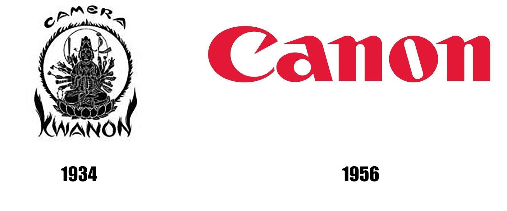
A notable exception was Canon, the camera and lens manufacturer. If you compare its first logo (a nod to an eastern divinity) to its current, the transformation is striking. Interestingly, the last time Canon introduced a new logo was 1956, so the logo shown on the right is the one used today.
The 1970s and 1980s usher in a new era of originality
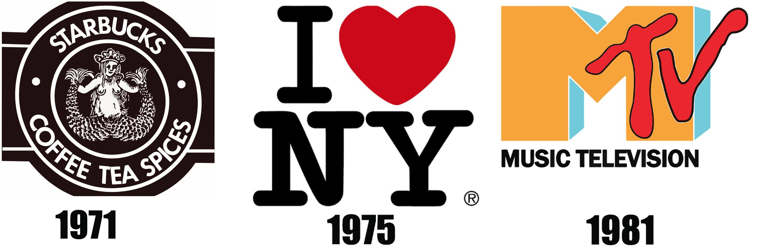
The design industry matured and learned something about itself during the 1970s. Some logos had managed to withstand the test of time by becoming simpler and clearer. As the years advanced, so did postmodernism with graphic designers revisiting symbolism and ornamentation in logos that had been abandoned previously. It also heralded the combining of unusual colours, like in the MTV logo.
The digital age and flat design
We’re not really talking about a historical movement here, because it’s continuing today. Logos designed for the digital world could adopt any style, but we’ve now become used to the flat design that’s now used by almost every firm that has to create a logo.
Logos used to look great on headed paper, which not all companies want or need today. As a result, the very concept of the logo has been simplified: most companies, regardless of their sector, have adopted simpler symbols, opting for something that is instantly recognisable on social media or small devices like smartphones. This minimalism eschews the use of design elements giving the illusion of three dimensions and instead opts for simple elements, letters and flat colours.
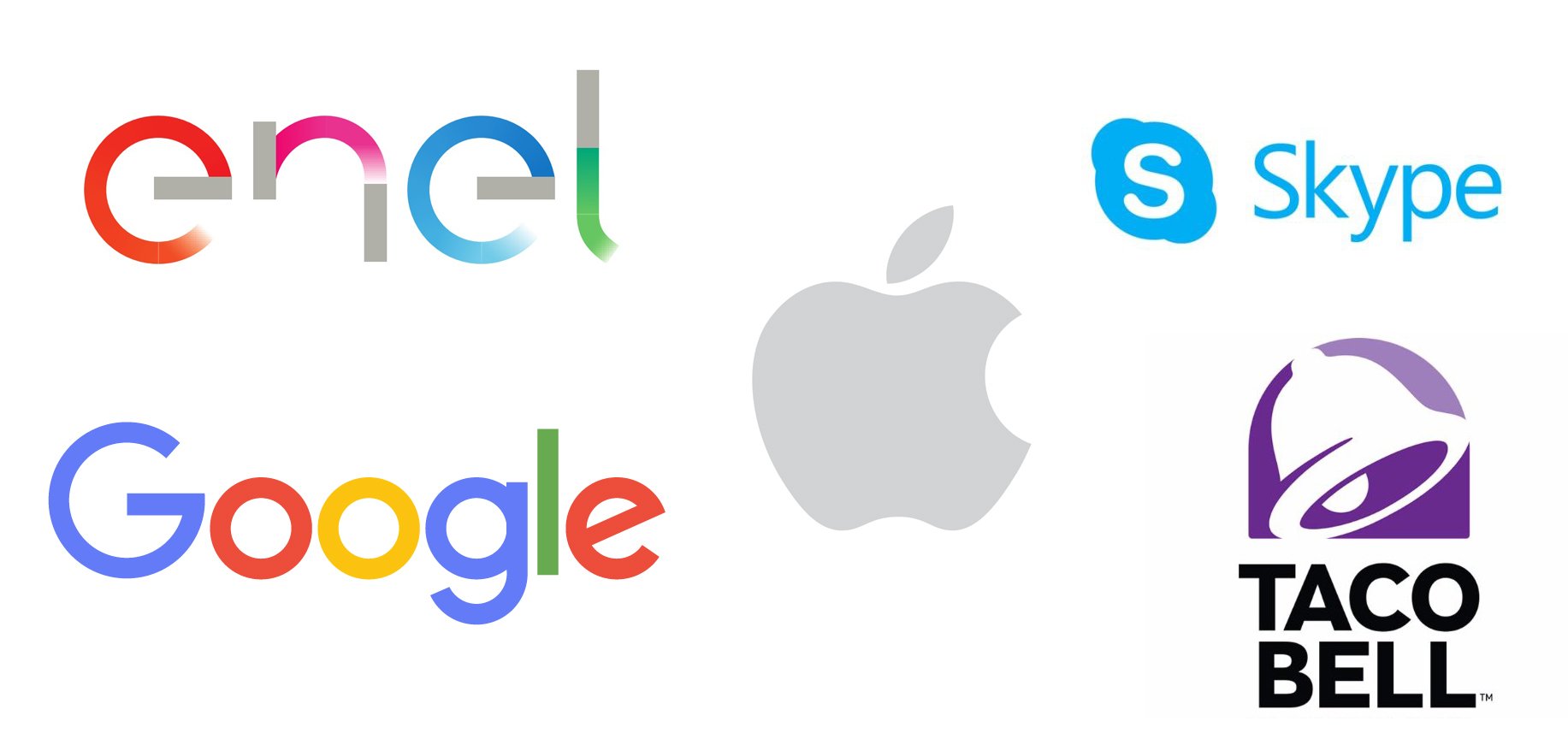
The path embarked upon 200 years ago is a long one. Open innovation and collaboration have certainly changed the dynamics of the graphic design industry and this is bound to affect the future of logos. What will happen after this hyper-simplification, sans serif fonts and minimalism? It may be that, to stand out, some brands will aim for greater complexity in their logos. Indeed, brands like Taco Bell and Italian utilities company Enel use gradients in their logos to set them apart from the flat design used by competitors.
In the future, we may have to think about how logos are viewed in virtual reality, even if the rules and recipes will always be the same: a logo must be immediately identifiable with the company and its values.