Table of Contents
The world of printing has undergone huge technological upheaval over the past 30 years: it has been transformed from a skilled manual trade that involved setting lead type to layout a page, to the efficiency of graphic design software. Along the way, there have been quantum leaps for printers, who once upon a time more used to getting their hands dirty manually cleaning lead type and choking on the ammonia fumes of proofing machines.
But now chemicals and manual processes are a thing of the past, with only vague references to them left in the textbooks of today’s apprentice printers. They have no inkling of the smells, clangour, deafening rhythms, stained hands, cuts from acetate film, or corrections made with a Stanley knife and sticky tape, all of which seem like ancient history, yet were still part and parcel of the trade as recently as a decade ago.
But when you talk to someone working in printing or pre-press, this old world is still present in the words they use, some highly technical and precise, others obsolete.
Understanding this language can be vital when preparing work for printing, especially complex projects.
Below is a short (and incomplete) glossary of this terminology. Feel free to add to it by sharing your personal experiences by commenting on Facebook!
Glossary of the twentieth-century printer
-
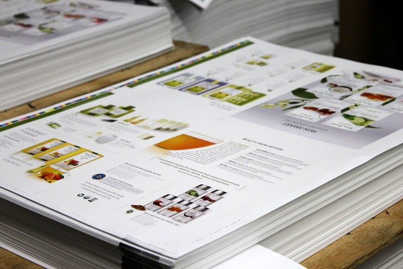
Bleed
This term has nothing to do with blood, but is in fact a term widely used when talking about trimming the edges of the sheet.
The bleed is printing that continues beyond the line along which the sheet will be trimmed. Originally, this trim was not “finished” but was left visible.
The bleed allows the sheet to be trimmed with a margin of error of 1-2 mm. In the past, folding machines could be out by a millimetre or two, so the bleed was necessary to prevent an unsightly white line at the edge of the printed page. New technologies, however, allow the bleed to be reduced to 1 mm in some cases.
-
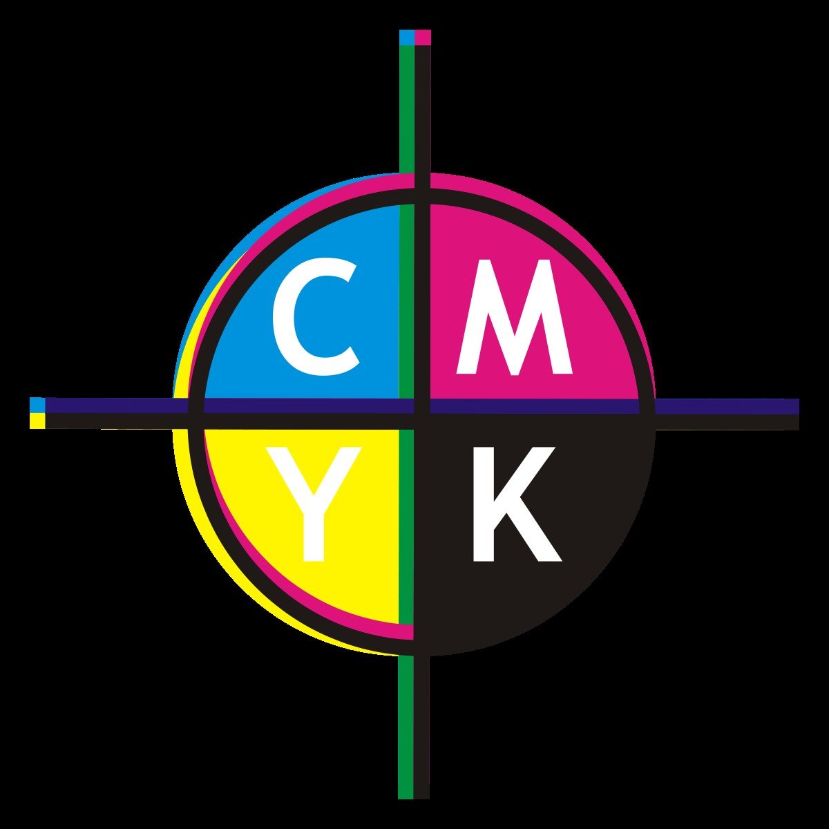
Out of Registration
This is perhaps a more widely understood term, although, thanks to new printing technologies, the spectre of colours falling out of registration no longer hangs over printworks as it once did. It’s a problem that occurs when plates for different colours (C, M, Y, K or others) are not properly aligned, and results in a blurred image.
-
Knockout
A term that refers to overprinting: instead of overlapping two colours or elements, and risking the base colour altering the top colour, the bottom colour is not printed.
In other words, when you have to use a particular colour (gold, for example), you might have to print it on white, which means not having an image beneath; so you “knockout” the area where other colours would usually be.
Using this option (which can be selected in InDesign) incorrectly can result in colours being out of registration.
-
Format
Format is one of the fundamentals of printing. This is how the product (brochure, folded flyer, poster, etc) is positioned on the printed sheets and extremely important if, for example, you want to fold a book into sixteen pages. Understanding formats and learning how to fold correctly is essential: you can do this by creating small scale models using paper available in any office (A3, A4).
-
Margin
The margin is the space left at the edge of the page to allow the plate to be inserted into the printing press. With some paper sizes, the margin that must be left determines the resulting print formats.
-
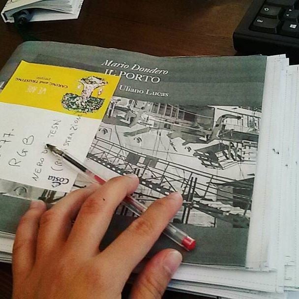
Blueline
I think this is one of the strangest terms for those new to graphics.
Why do we call proofs “bluelines”?
Because, until quite recently, when large-format plotters had yet to arrive, the negatives that will be used to make the plates are imaged onto a special paper using a machine called a contact copier. This paper is then developed using an ammonia solution. The result is called a “blueline” because the proof produced is light blue in colour. Corrections were made by pen.
Every so often, these simple machines would break down, which meant proofs had to be developed manually. This involved placing the printed sheets in tubes into which the developing liquid was poured. When opening the tube to remove the blue print, you would be hit in the face by ammonia fumes: it was one of the most psychedelic experiences you could have in printing.
-
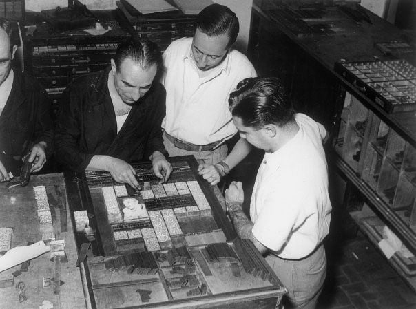
Retype
This is a term used to indicate that already printed plates will be run through the press again to print additional elements. It’s generally used when producing layouts, typically catalogues (whether artistic or commercial) in various languages: these are “retyped” over already printed plates that contain the images.
- Hickey
This refers to a certain type of print defect.
It’s generally a white spot with a halo that is particularly noticeable in large areas of colour. It was often caused by a hair or larger than usual piece of dust left on the film and, therefore, the plate. This problem has become increasingly rare with new printing technologies.
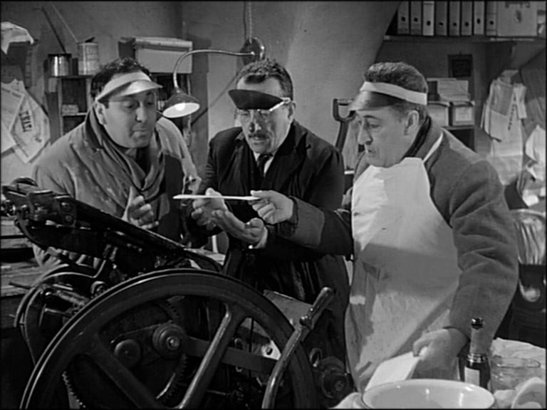
- Press Stopped
This last term sends shivers down the spine of every graphic designer working in production: it’s that moment when the machine operator, typically better built than the designer, appears at their desk, plate in hand, and requests a correction, there and then, because the press has stopped. The machine operator hates stopping the press and stands looking over the graphic designer’s shoulder, grumbling and groaning, dripping with sweat, grease and ink until the problem is resolved.
Remember this next time you send a last-minute correction to something that has already gone to press. You may be condemning the graphic designer to a horrible quarter of an hour!