
Founded by New Yorkers Audrey Gelman and Lauren Kassan in 2016, The Wing is a co-working space for women in North America. It owes its name to Virginia Woolf’s feminist essay ‘A Room of One’s Own’. Aiming to offer far more than just a room or part of a residence, The Wing provides its members not only with a workspace, but also with a network and a variety of events.
The founders opened their first co-working venue for women in the former Ladies’ Mile district near the Flatiron building in Manhattan. Around 100 years ago, this was the location of the first women’s club, which closed down when the civil rights of women were recognised and the interest in progressive clubs waned.

100 years on, Gelman and Kassan have revived the concept – and with great success. Indeed, the branch of The Wing situated in the former Ladies’ Mile district is not the only one of its kind; the club now has several locations around the USA and Canada. The first European branches are set to open their doors in London and Paris next year, with more in the pipeline.
The Wing club boasts more than a quarter of a million followers on Instagram. Since November 2015, the account has posted shots from events, photos of the club’s latest merchandise, and other pictures that match the colour scheme of the branding. The Wing therefore relies on design as well as on social media.

For this, the founders turned to the design agency Pentagram, with a team of graphic designers led by Emily Oberman developing the branding. The project encompassed the design of the logo, of interior graphics for the premises, and of merchandising, as well as the creation of a website and other online features.To ensure that the branding was authentic, the Pentagram team collaborated closely with Gelman and Kassan. The main challenge was creating a corporate identity that appealed to a wide variety of women without resorting to stereotypes – and that set itself apart from the typical, clinical co-working space. In this way, The Wing‘s design stands in stark contrast to that of the dingy clubs and open-plan offices commonly seen today.
In terms of typography, The Wing uses classic as well as contemporary fonts. Bianco Serif by AlfaType is its primary typeface. Pentagram set the logotype in Bianco, and the serifs added to the W are reminiscent of small wings.
Providing further testament to The Wing‘s aim of being more than a co-working space is its logo system, which combines endless variability with radical originality. Indeed, some 30 varieties of the letter W were designed, to represent the many different personalities of the members and to reflect the club’s light-hearted approach, in opposition to a straight-jacketed, stereotyped image of women. The individuality of the unusual logos gives the branding a great deal of flexibility. Ranging from the seemingly ordinary to the amusingly provocative, the logo system acts as a visual representation of the club’s objectives. The striking logos incorporate modern, sans-serif fonts, along with more unusual ones like Alpha-Wurst, Cottonwood, Mythos, and Retail Script, as well as the Wonder Woman symbol. At the logo system’s core is the iconic W used for the logo itself.

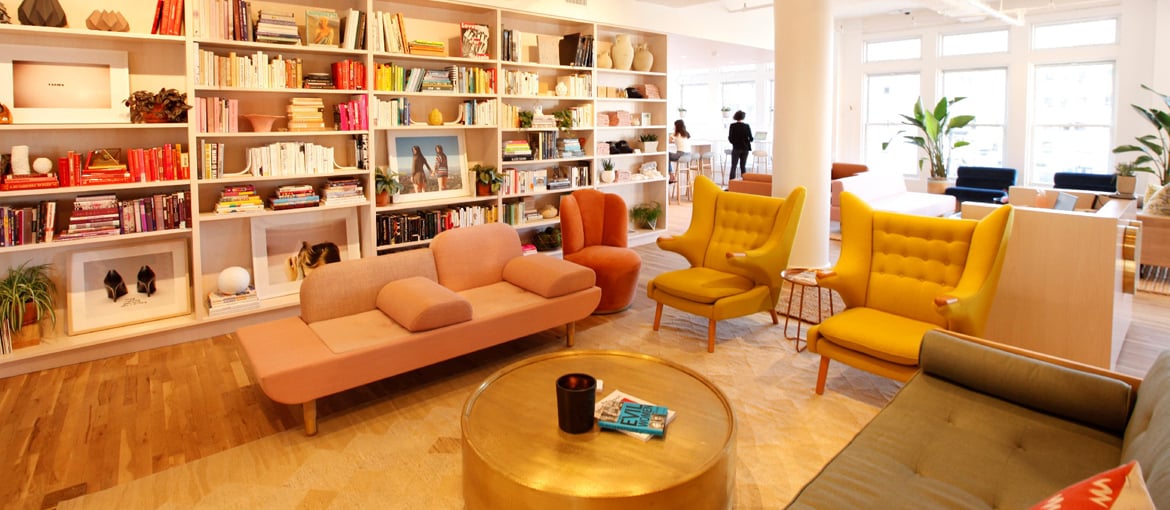
The premises were also the object of a branding effort. In designing the wallpapers, Joana Avillez worked closely with founder Audrey Gelman, but also, as she explains, ‘with Chiara de Rege, the interior designer, and Payton Turner from Flat Vernacular, who produced the paper’. Working with women from other disciplines fascinated her. She was particularly pleased to be involved in what she refers to as a ‘true collaboration’: ‘Sometimes, this kind of thing can quickly become frustrating – as the saying goes, “too many cooks spoil the broth” – but in this case everyone had their parts to play in ensuring the project succeeded.’ Her favourite aspect of the project was working with people she admires to ‘create something life-sized’. This, too, highlights the unique magic of the co-working space.
In designing The Wing, whose distinct style evokes a feeling of nostalgia despite its contemporary touches, the Pentagram team resorted to graphics from historical poster campaigns. Suffragette posters, designed last century as a call to action for women’s rights, have a serious, yet at the same time humorous, style. The Wing‘s iconic logo was also used as part of the interior design and can be seen, for example, at the reception desk or on posters on the walls.

The women’s clubs of the last century were a great source of inspiration for The Wing – in terms of both design and the choice of the venue itself, which has been described as being ‘very Manhattan’. Membership is as exclusive as Pentagram‘s design is: it costs a hefty $2,200 a year. As such, it is available only to a certain kind of woman – not unlike the clubs of 100 years ago.
The Wing is contradictory but successful. Gelman and Kassan have discovered a gap in the market in which they have been able to build a globally successful business thanks to brilliant branding.