
Table of Contents
According to the dictionary, a CV is the “list of titles, honours, positions, positions, jobs held, biographical details, etc., of a person’s career.” This definition makes no mention of the harsh reality, which is that it is estimated that recruiters take around six seconds to decide whether to throw the document in the trash, or to pay closer attention.
This means there are no second chances. When applying for a job, we should think of ourselves as a product to be marketed. Because, ultimately, what we are trying to do is sell our own brand. That’s why our academic background and work experience are just as important as knowing how to present this information in an attractive way to make a good first impression. And the choice of an appropriate font is one of the keys to standing out against the competition.
Fonts convey messages and trigger emotions
For some years now, there has been scientific evidence showing that fonts affect consumers’ perceptions of a product or company, as well as recruiters’ perceptions of job seekers. For example, a 2006 study by Wichita State University, in the US state of Kansas, revealed that fonts such as Times New Roman and Arial are associated with “stability” Courier New and Georgia convey “maturity”, while Agency FB symbolizes “rigidity”, and Kristen “emotion”.
What’s more, if the font is consistent with other aspects of marketing, such as the visual elements (in the case of a CV, the design, format, style, etc.), the recruiter is more likely to take away impressions like “this candidate has the relevant skills” or “inspires confidence.” The choice of a font has a huge impact on hireability, because we connect certain aesthetics and words with emotions, character traits and moods.
The most readable font families
Faced with the overwhelming variety of fonts, how do we know which one is best for our CV? Recruiters agree that, when choosing a font, there are two main factors to take into account: professionalism and readability. Professionalism refers to the style, the tone, which should reflect that the person can perform the job seriously and efficiently. In terms of readability, we must ensure that the CV is easy to read in different media: print, computers, tablets and mobile phones.
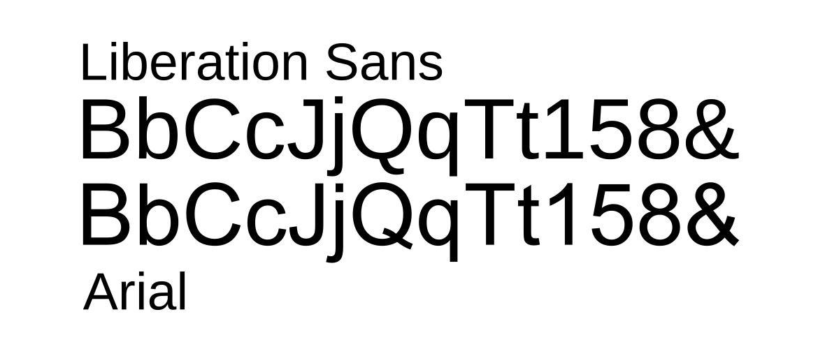
Fonts are grouped into “typographic families” that have a similar origin and only feature slight variations between them, although they can create a very different impression. For CVs, the most recommended families are Serifs and Sans Serifs due to their high degree of readability. The main difference between these families is that Serif typefaces have very characteristic tails or ends, while Sans Serif typefaces (Arial, Century Gothic, Helvetica, Geneva, MS Sans Serif, Tahoma, Trebuchet MS, Verdana…) lack this ornamental feature.

How to choose the most appropriate font for your CV
Although there are disagreements about which is the best font for a CV, most experts point to the following as the most effective:
- Arial. This classic font is a favourite when writing CVs. It is a good choice because it has clean lines and is easy to read. However, some point out that it has become common enough to seem boring. https://www.fonts.com/font/monotype/arial
- Calibri. This font appeared in the early 2000s as Microsoft Word’s replacement for the classic Times New Roman. It is considered a safe choice because it reads well on most screens, even when italicised, bolded or in headings. https://www.fonts.com/font/microsoft-corporation/calibri
- Cambria. Another popular font that has overtaken Times New Roman and with which recruiters are very familiar. It was designed to read well on screen and also when printed in small sizes, although it is not as formal as other fonts. https://www.fonts.com/font/microsoft-corporation/cambria
- Garamond. Named after the 16th century type designer Claude Garamond, hence its appearance inspired by the design of that era. It has a distinct personality and is ideal for academic or literary CVs and for those with many years of work experience. https://www.fonts.com/font/urw-type-foundry/garamond
- Helvetica. One of the best known and most widely used fonts in the world (especially by typographers and graphic designers for corporate brand logos), this font is a great choice for the CV because it is modern yet classic and easy to recognise. It gives a sense of symmetry. https://www.myfonts.com/fonts/linotype/helvetica/
- Didot. This font is particularly suitable for the creative industry, such as fashion or photography, because its tall strokes convey style and sophistication. It has a certain whimsy, but is still legible. In other types of CVs it can be used for headings. https://www.fonts.com/font/canada-type/didot
- Georgia. This is another of the best traditional-looking alternatives to Times New Roman. The font was created specifically for clarity on screen monitors, so it reads well on any digital document, even if the CV is sent as a PDF. https://www.fonts.com/font/microsoft-corporation/georgia
- Book Antiqua. This is a Roman typeface based on the illustrated letters of the Italian Renaissance. Recruiters recommend it when you want to give the CV a different feel to the more geometric designs of most texts, ideal for professionals in the arts or humanities. https://docs.microsoft.com/en-us/typography/font-list/book-antiqua
- Lato. Lato comes from the Polish word for “summer”, which gives a clue as to what it can convey. It is very natural with multiple styles and thicknesses, making it perfect for combining the texts and titles of each section of a CV. One advantage is that it is open source, so it can be downloaded for free. https://fonts.google.com/specimen/Lato
- Roboto. If this font looks familiar, it’s because it is the font used for Google Maps. It is less formal than other fonts, so it is not recommended for academic CVs or very formal work environments. It is similar to other web-optimised fonts, but has a thinner and more elegant typeface. https://fonts.google.com/specimen/Roboto
Other tips when submitting a CV
When it comes to choosing the right font for a CV or cover letter, there are other aspects we have to keep in mind, such as not combining different fonts in the same document. Similarly, you should use bold and italics in moderation, only to highlight key aspects or separate sections.
It can be very tempting to include all your background, whether academic or professional, in your CV. However, if you include too much content, you will need to reduce the font size, which makes it difficult to read. The optimum size would be around 11 points. Remember that one key objective is for the employer to be able to read the document easily, so the simpler to the eye, the better.