
Table of Contents
Whether you’re designing for a print or online publication, many rules are the same with the goal being legibility. If users can’t read it or don’t understand the hierarchy, you’re going to lose them. Trends in editorial design have run the gamut from over-the-top imagery and graphics, to sparsely inhabited pages of floating type in a sea of white space. And what works for one publication doesn’t work for another, so it’s completely subjective.
Designers Xavier Schoebel and Amélie Lecocq have plenty of experience working in publication design in France for cultural institutions like the Musée des Arts Décoratifs at the Louvre and Pompidou Center. Both teach graphic design—Xavier at LISAA, Institute of Applied Arts in Strasbourg, and Amelie at the Fine Arts of the University of Strasbourg. “Much of our work in editorial design revolves around cultural subjects, where we use illustrated charts and graphs to depict the information. For instance, what works for a children’s book, will not work in a fashion magazine,” Xavier explains.
Here, the duo, who also run their studio Collectif Ça va 2 Paire, share their predictions for five editorial design trends to watch for in 2018—many of which are tried and true.
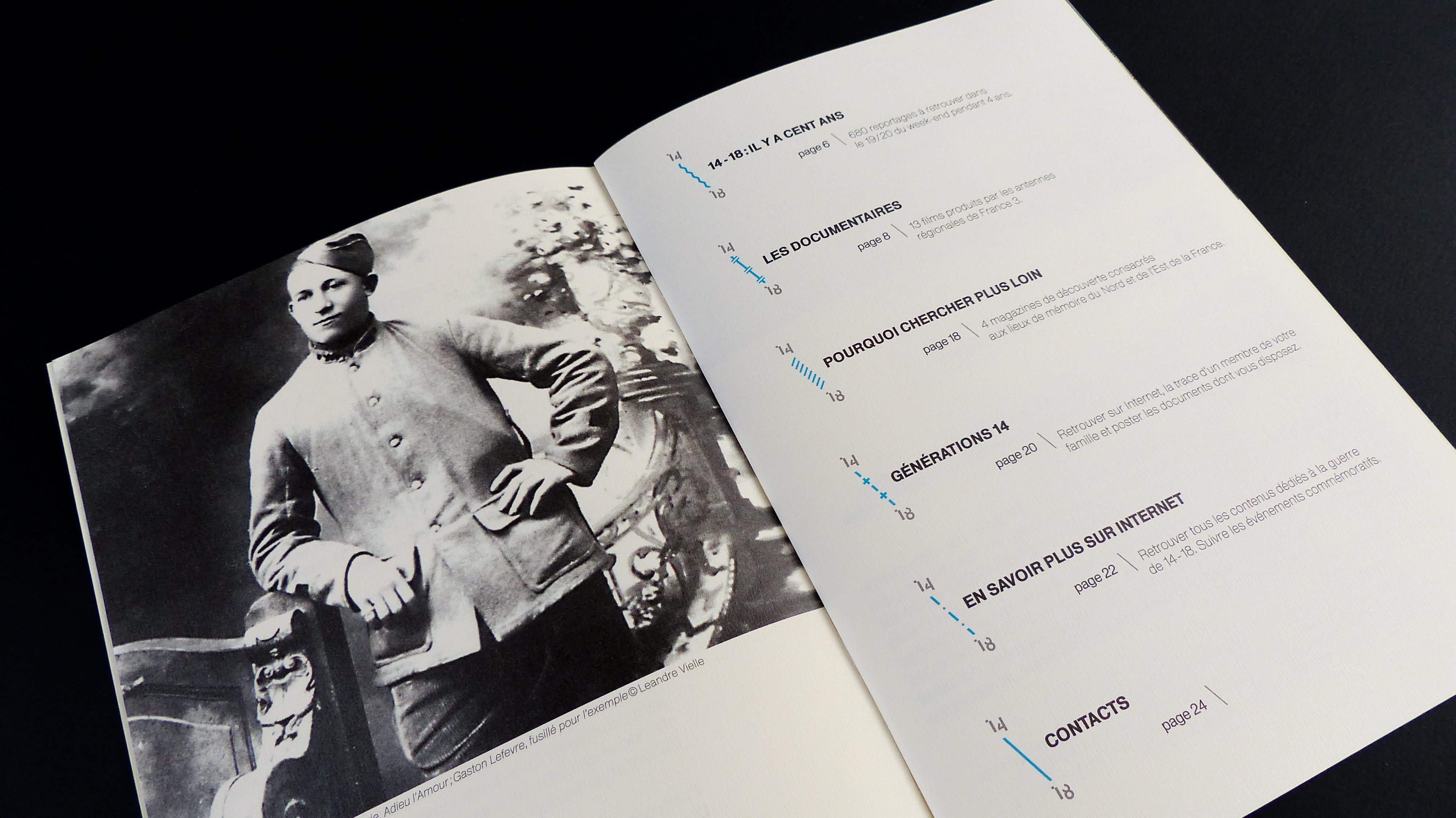
We like to use contemporary typographic creations. For example, in the book, The North and the East Into World War I we use different type styles to create drama on the page. We like the mix between old historical font and new ones, that are more flexible.
-
Typography: Mix it Up
The old type rules about using only two or three type styles in editorial design are no longer relevant. In fact, it’s fun to mix and fuse different fonts to create a particular mood. “We like the mix between old historic fonts and modern fonts, that are more flexible,” Amelie notes. “Creating contemporary typographic design sometimes means combining old and new to create a timeless vibe.”
-
Color: Bright is Right
Bright, high contrasting colors can make the difference between a hum-drum layout and something that speaks to the masses. Xavier says, “Pairing a bright color with a pastel or grey tone, is a simple way to create depth and intrigue, similar to how vintage album covers were portrayed in the ’70s. There was a tendency to have bright illustrations or letters over less chromatic or black and white photos.” Oftentimes, the contrast contributed to the album’s narrative and intrigue.
Infographics are a useful tool to illustrate measurements and facts. They also add impact and color to otherwise boring information.
-
Images: Original vs. Stock
Stock photos are fine if you’re in a hurry or on a very tight budget, but original art is always best, and that’s a trend that’s never going to change—which is great for artists and photographers. Illustrators can take a story to a whole new level with their interpretation of the narrative. “It’s also fun to add headlines or drawings on top of photos—just be sure to get the photographer’s permission to do this if you’re not buying exclusive rights,” Amelie notes. “These graphic additions, can really add drama and perspective.” Of course, if you buy stock images, you don’t need permission to do that.
Here, we turned the grid into a pictorial element for an exhibition on the history of the historical library of the University of Strasbourg. We put blue line references in for the block of text in the grid because it echoes the layout of old books that you can find in this type of library.
-
Composition: Balancing text and images
Grids are always a starting point for any publication designer. Setting up the page, determining the width of columns, and how headlines will look on the page. “Oftentimes, designers will deconstruct a grid to create dynamism in a composition,” Xavier says. “For example, there is a tendency to use more space in the margins to put different types of information like a small photo that serves as a reference to the larger image found later in a publication.”
-
Print vs. Online publications
We’ve been hearing it for years: “Print is dead.” Well, it’s not. Granted, the number of print publications has drastically dwindled in the last decade, but people—especially artists and designers—crave the tactile experience when it comes to flipping through a magazine or newspaper. “For us, digital editions can not replace print, but it’s a great compliment,” Amelie notes. For instance, if you’re doing a limited print run, try using heavier sheets or different printing techniques, and then explain the process in the digital edition. Make them co-exist and work together.
Some of these trends aren’t new, but editorial design can be very experimental depending on your audience. As Xavier says, “It’s about finding a balance between different levels of text, photographs, and illustrations to create new visual conversations.”