

Table of Contents
Anyone can take a nice photo, but not everyone can put together a photo shoot on a specific theme. And it’s a similar story when it comes to graphic design. Thanks to today’s technology, anyone can create a decent brochure, poster or presentation for, say, their social media account, but that doesn’t mean that everyone is now an expert in graphic design.
By graphic design, we mean the ability to create something that can be used as part of a broader strategy, on different media, and at different times. Graphic design is not just about creating form, but procedures too, in other words “establishing a set of operations whose characteristics are determined by a precise goal”[1].
This idea of design can be seen in practice most clearly in corporate visual identities.
A basic visual identity
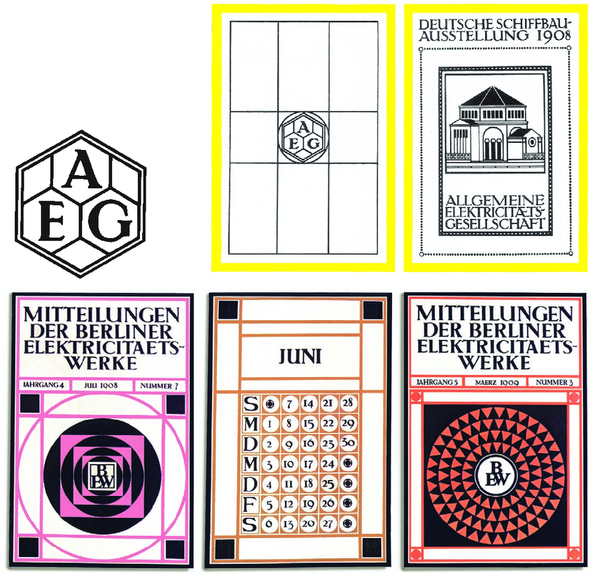
The work German architect Peter Behrens did for AEG in 1907 is considered by many as the first experiment (if we can call it that) in corporate visual identity. Behrens designed everything, from the logo and advertisements to catalogues, calendars and posters. But, crucially, he used the same typeface (Behrens-Antiqua), colours and series of grids to do so. Behrens was far ahead of his time: it would be years until his approach became widely adopted. Indeed, the concepts of corporate image and corporate identity only appeared in the 1940s.
This “basic” visual coordination will meet the communicative needs of most SMEs, especially where what’s required most is greater uniformity and consistency across graphic materials, whether these are printed or digital.
But when the size of the company grows and visual coordination is no longer enough, it’s time to create an identity.
Corporate (or brand) identity systems
The concept of a brand has been around for some time. Early examples can be seen in the middle ages with coats of arms, which came about when a need arose for custom graphics to identify families, lineages and trades. At a certain point, in the industrial revolution, brands began to spread and morphed into symbols for identifying factories. The next step was to go from a symbol representing a physical person to one representing a company, as businesses were recognised as separate legal entities from their owners [2].
So the company became an entity in search of a personality. Where previously trust in the quality of a product lay in the producer, understood as a person, now that trust needed to be placed in a company. At this point, a brand is no longer enough: what’s needed is a corporate identity.
This identity defines the company, the way it presents itself, behaves and speaks to its customers. The logo is just one of the elements of this visual identity, along with colours, typefaces, images, style and storytelling.
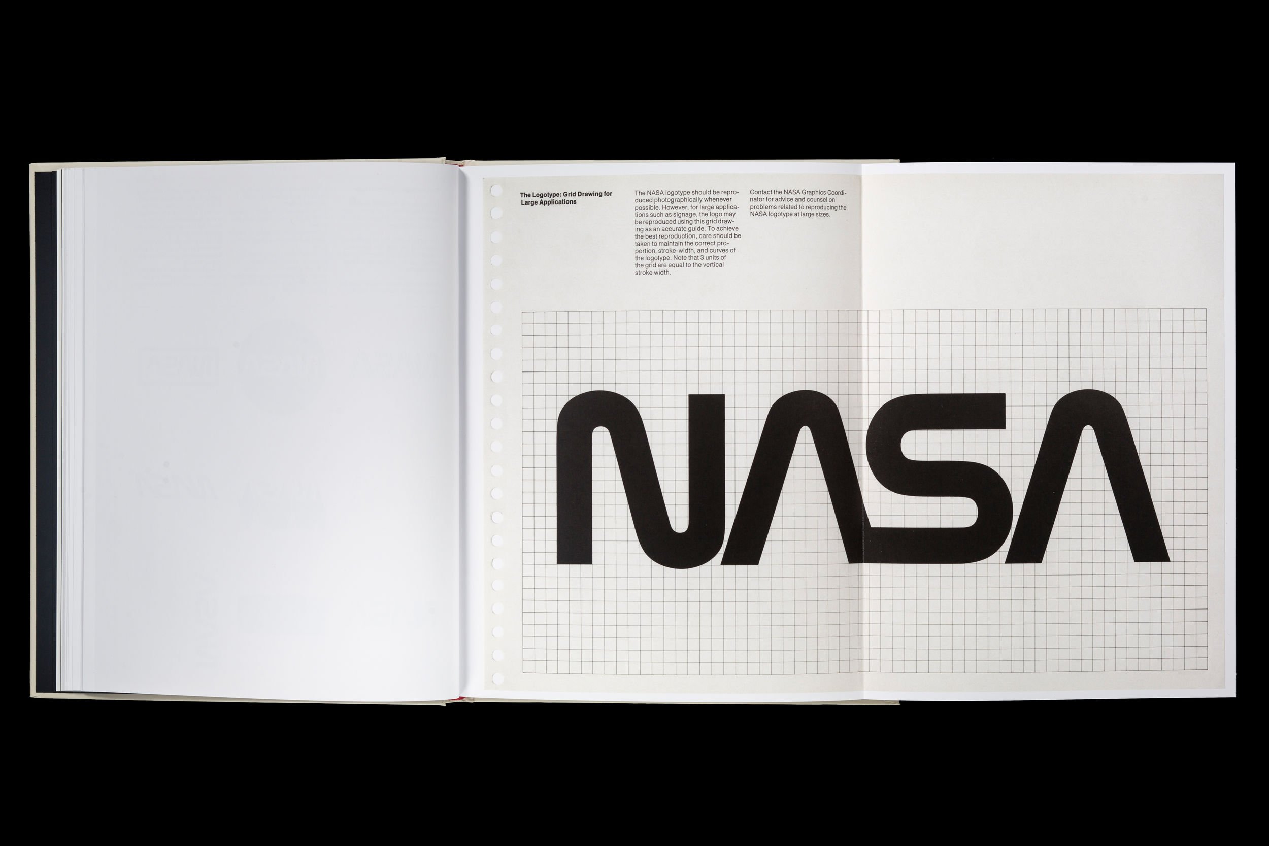
An essential tool for managing visual identity is the so-called “style manual”. A perfect example is NASA’s 1975 Graphics Standards Manual, designed by Richard Danne and Bruce Blackburn (who passed away at the age of 82 in February 2021)[3]. In 2015, NASA’s manual was reprinted by Standards Manual – a publishing house specialising in, well, standards manuals. The manual is also available in PDF format on the NASA website. Some 100 pages long, it provides guidance on everything, from which typefaces and colours to use, to how to apply the logo to headed paper or lay out a brochure or poster, even including suggestions on the type of grid to use.
Another Standards Manual publication is the 1970 New York City Transit Authority Graphics Standards Manual, designed by Massimo Vignelli and Bob Noorda’s Unimark agency in 1970.
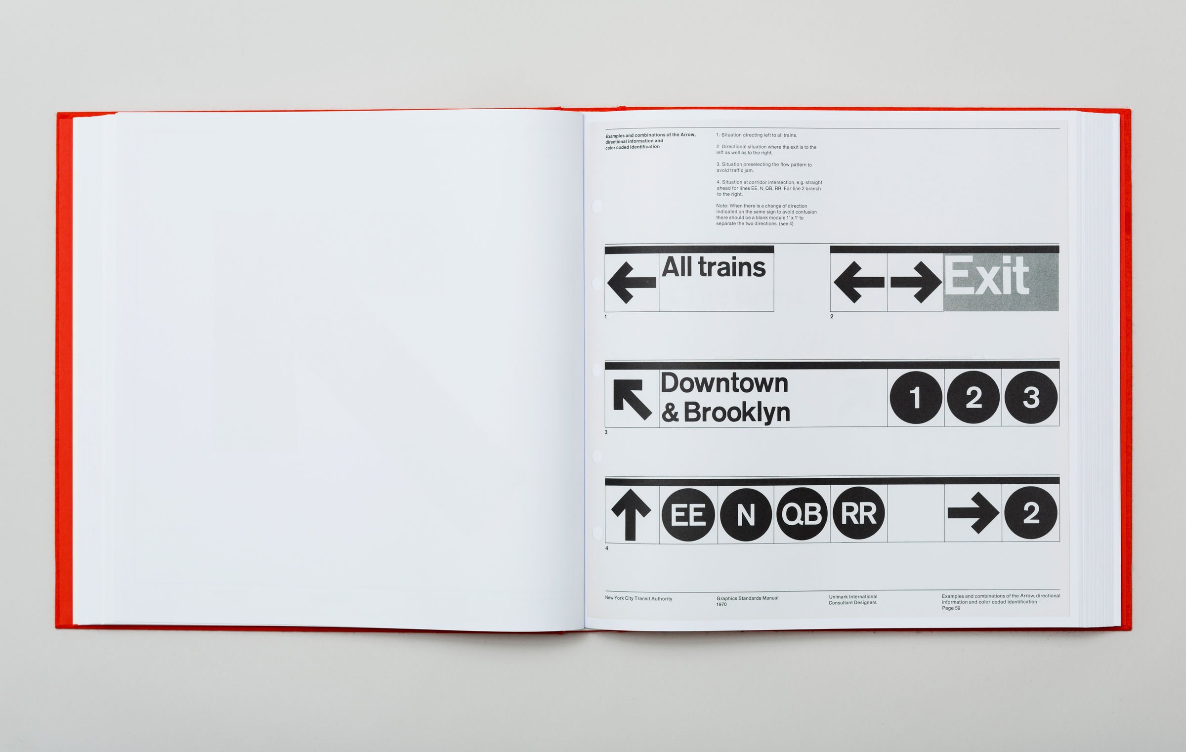
Style manuals set out the rules, processes and procedures that ensure an identity is coherent and recognisable, regardless of where and when it appears. They provide the guidelines for creating a new graphic artefact, whether it’s a brochure or poster (in NASA’s case), or signage for a new station (in the NYCTA’s case).
Designing a visual system that covers every aspect, and can be used to create an artefact in both theory and practice, guarantees consistent, effective and joined-up corporate communication.
When needs evolve further, even creating an identity and style manual may not be enough.
Design language and complex corporate visual identity systems
British branding consultant Wally Olins, one of the pioneers of the “total brand” and corporate branding, said that a company communicates what it is through everything it does[4]. When you have multiple touchpoints and communication channels, it’s time to evolve your visual identity into a design system.
Just one example, among many, is IBM. The firm produces graphic artefacts for print, web and advertising, as well as digital services, applications and software. So a style manual, like NASA’s, it not enough. It needs a language that can become a “system”. If you want to better understand IBM Design Language, it’s actually available to view online. And it leaves nothing to chance, addressing everything from their general design philosophy to specific technical and practical questions. As well as covering the basics like the logo, colours and typography, there are also sections that describe how to lay out a brochure, choose the right image or illustration, and correctly use animation and icons.
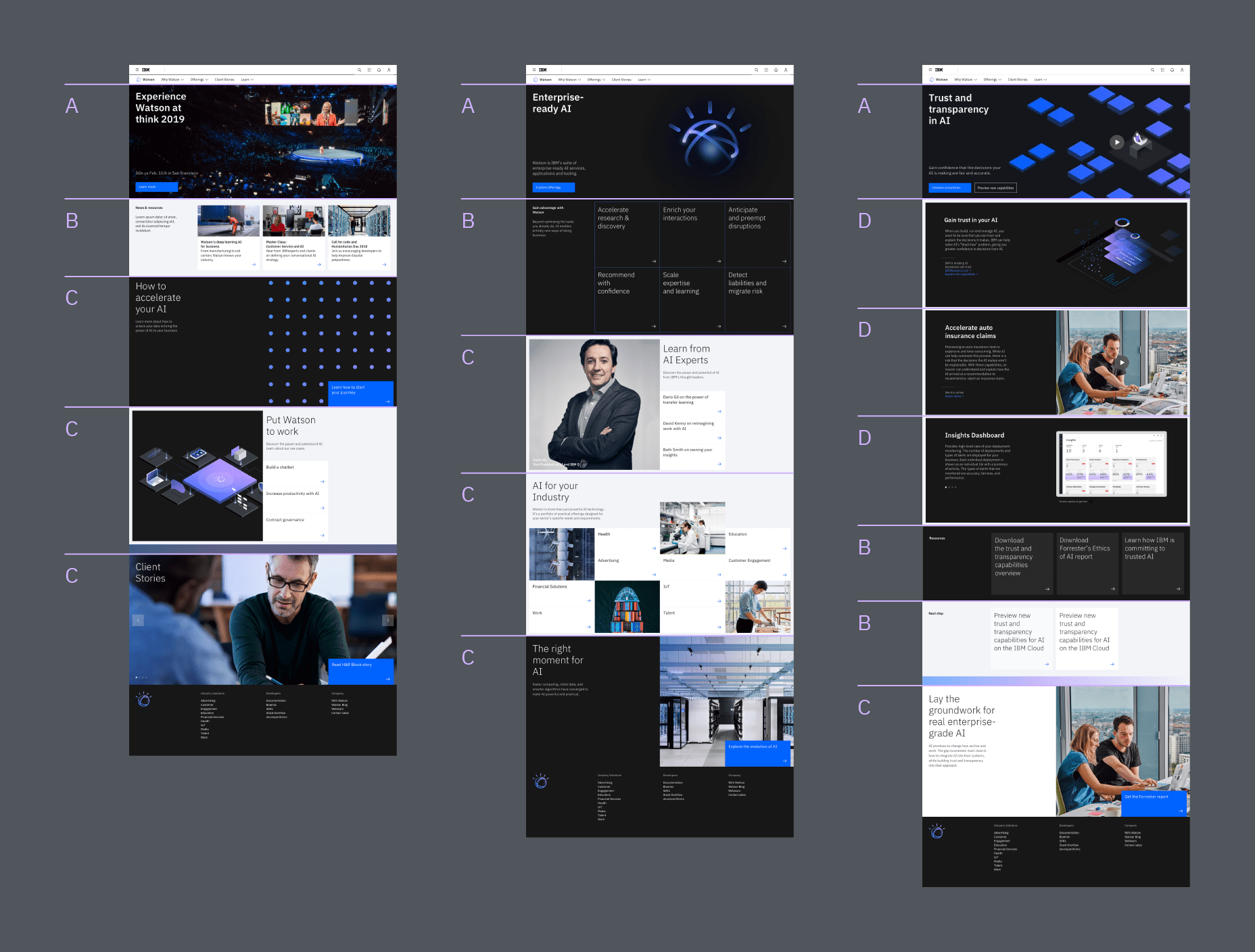

The language is also the foundation for the design system that IBM uses to create its applications and digital services, which it calls Carbon.
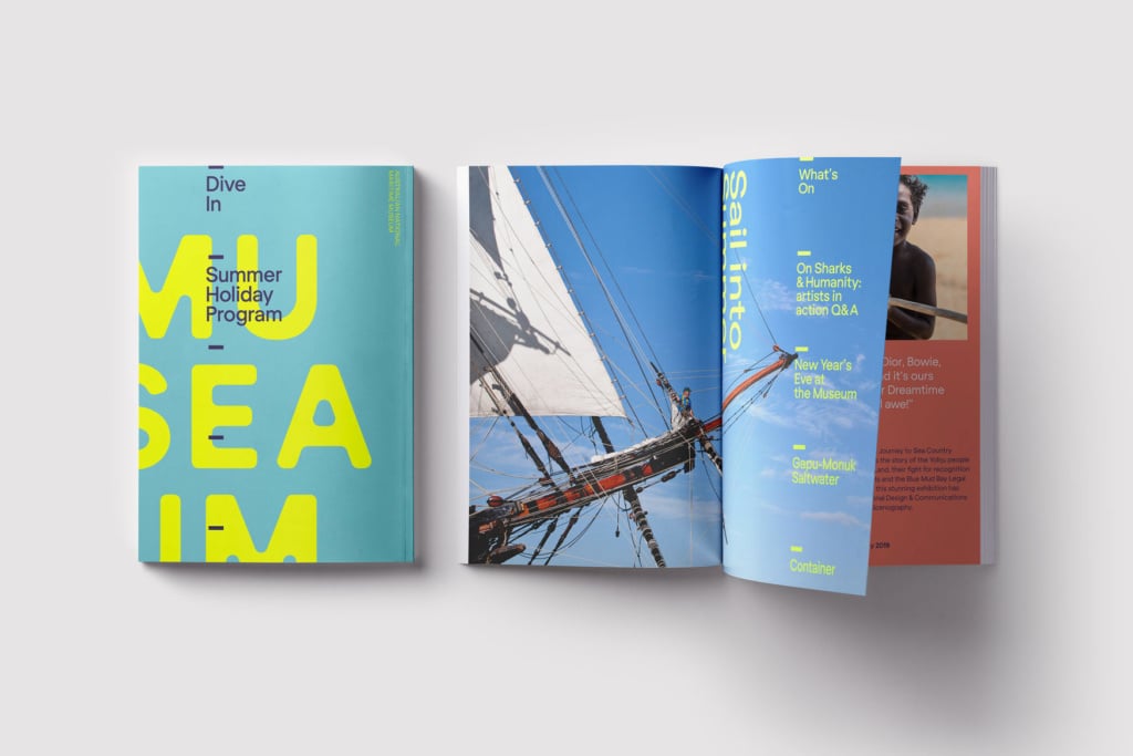
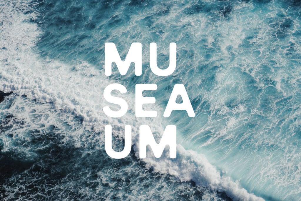
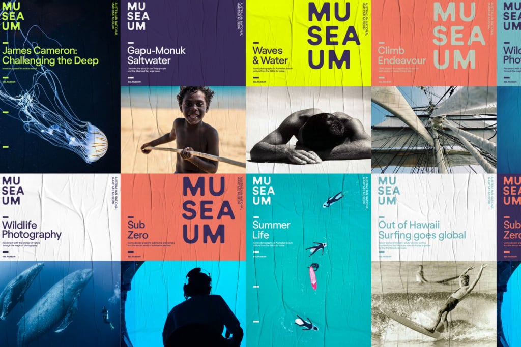
Let’s take another example: the visual identity for MUSEAUM, the Australian National Maritime Museum, designed by the Frost creative studio in 2018. If you follow the link, and look at the images below, you’ll see a series of graphic artefacts, from the logo to posters, from the museum guide to a series of publications. When you look at the designs, it’s clear that they all stem from the same idea, the same style manual, which could be part of a more complex design system. In the images presenting Frost’s work for the museum, a possible book collection is hinted at, which would require specially made guidelines derived from the main language, like the Carbon design system that IBM uses for its apps.

A design system is conceived, and works, on several levels. There are the basic principles, values, philosophy and approach. There’s the corporate image, logo, colours, font. There’s the practical dimension related to spacing, layout, typography, photos, icons, illustrations. There are the specific components that cover a particular and well-defined area. If that area is apps, it will talk about buttons, cards, menus; if that area is magazines, it will talk about the grid, how to handle headlines, summaries, quotations, captions, headings.
This idea of “systems” goes far beyond the need to provide a uniform structure and identity to corporate communication. Graphic design in particular, and design in general, is not just used to communicate, but to build identity too.
So a design system is a number of different things. It’s a shared visual language that ensures an organisation always presents a coherent and recognisable image. It’s a toolbox that enables you to coordinate the graphic artefacts that you produce, whatever their nature. And it’s an approach well-suited to the modern needs of a brand or business, because it lets them present their visual identity and communicate using a “mobile” system that can adapt to different media, at different times.
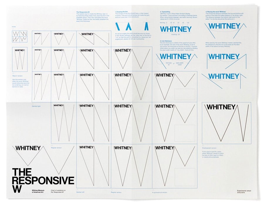
I’ve got one last example for you: the visual identity of the Whitney Museum, which uses a “responsive” W. Ever present, ever different, always recognisable.
[1] Riccardo Falcinelli, Critica portatile al visual design, Einaudi, Turin, 2014
[2] Gianni Sinni, Una, nessuna, centomila. L’identità pubblica da logo a piattaforma, Quodlibet, Rome, 2018
[3] Alex Vadukul, Bruce Blackburn, Designer of Ubiquitous NASA Logo, Dies at 82, New York Times, 18/02/2021
[4] Wally Olins, Brand New, Thames and Hudson Ltd, London, 2014