
Table of Contents
Long before the invention of paper, human beings were leaving signs in the surrounding environment to communicate information visually. These signs were essentially to facilitate orientation in space. Over the years, these symbols have taken on a common meaning and spawned the field of environmental graphic design (EGD).
This relatively modern discipline has only been formalised in the past 40 years. Previously, it was considered part of architecture and called architectural graphic design. Practitioners in this field understood that there are many differences between their profession and that of a traditional graphic designer, as EGD includes planning and communicating information on three-dimensional objects within a space. In 1973, the Society for Environmental Graphic Design (SEGD) was founded ( “environmental” was later changed to “experiential”).
Wayfinding design is a branch of EGD. This is usually divided into wayfinding design, which orients users of a space and helps them navigate it, interpretation, which brings together information about a space, and placemaking, which creates a distinctive identity for it.
Signage and wayfinding
Although they are often used interchangeably, signage essentially concerns signs, while wayfinding deals with the overall vision for orientation within a space.
More specifically, this discipline is about the signs and symbols in a space, or series of spaces, such as airports, hotels, parks, offices, hospitals, transport systems and even entire cities.
Utility and limits
In a practical sense, the role of wayfinding design is to create a map of a space inside the mind of a user who is trying to navigate it. The clearer the physical structure of the space, the clearer the mental map.
Yet it should be remembered that even the best signage can’t solve all of the navigation problems that arise in a very complex space. Wayfinding design can facilitate navigation of a place, but being based on its physical structure, it has limits.
A space’s identity
The importance of branding and brand strategy is ever more important to organisations, large and small, commercial and institutional. Brand strategy recognises that a user comes into contact with brands through a series of touchpoints whose quality and quantity must be carefully considered.
A good strategy includes wayfinding design among these touchpoints. Signage must connect seamlessly with other elements of an organisation’s identity.
There are two different approaches to signage. In the harmony approach, signage reflects and reinforces the spatial and architectural characteristics of a place. In the imposition approach, signage is designed to create a unique identity that is separate from the visual features of the physical place.
Good examples
Let’s now consider some examples of wayfinding design in different areas and on different scales. We’ll see that one of the key aspects of the discipline is the printing and production of components for signage.
Pompidou Centre, Paris
Ruedi Baur is a French designer famous for his signage projects during the nineties. For his work at the Pompidou Centre in Paris, Baur collaborated with architects Renzo Piano and Richard Rogers to create signage that was in harmony with the architecture. The design is in keeping with the centre’s international spirit: a series of colours were chosen (with yellow as the main colour) and pictograms created for navigating around the site.
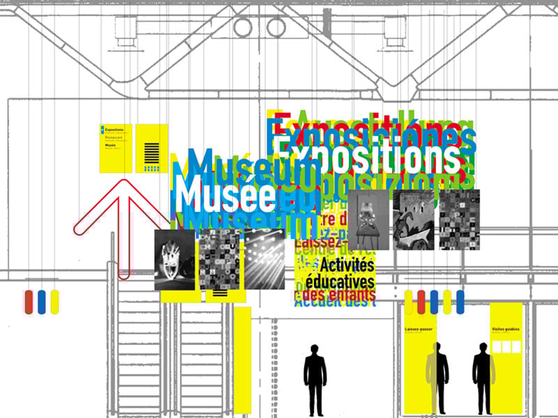
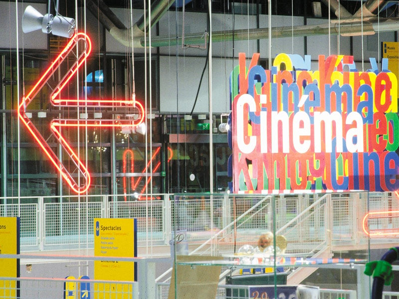
In technical terms, the project included the use of neon lights, plastic signs hung from the ceiling and large paper banners.
Tate Modern, London
The Tate Modern is the most visited contemporary art gallery in Europe. It was opened in 2000, and has undergone a series of extensions since then, with the latest finished in 2017. Wayfinding was designed by London-based Cartlidge Levene, specialists in signage and visual identity. The project focused on navigating through the gallery’s different rooms and buildings.
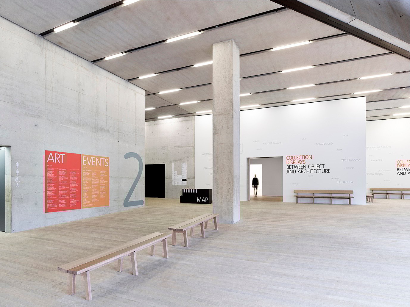

Signage at the Tate principally used pre-spaced vinyl stuck to the concrete walls. A series of products, including brochures and maps, were also produced to provide more information to visitors.
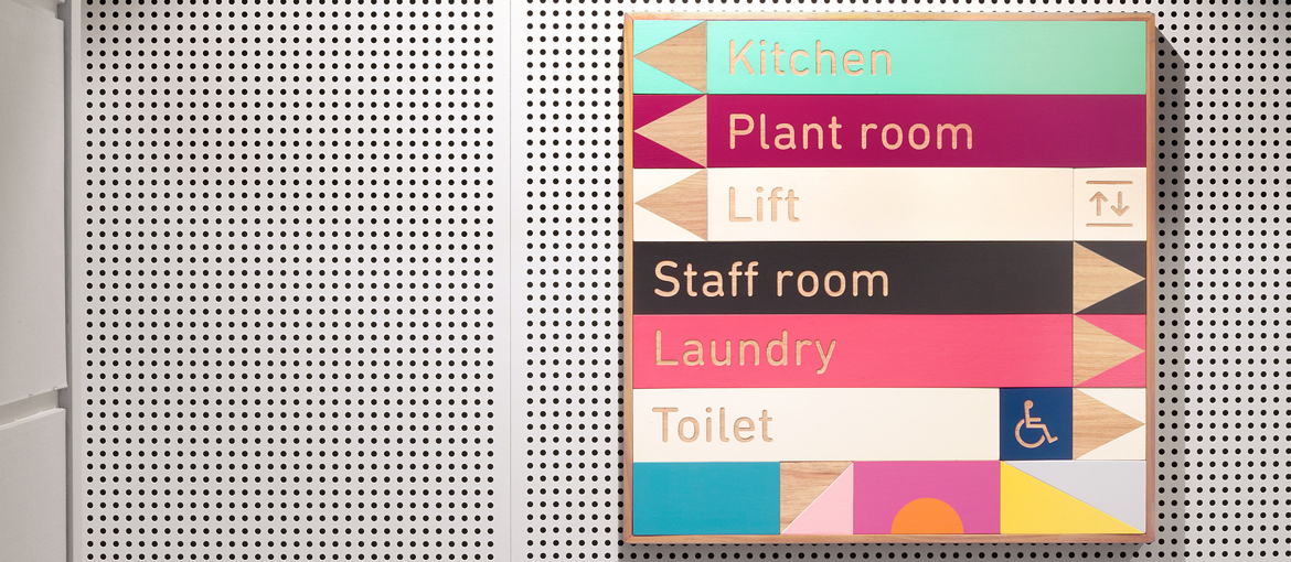
East Sydney Early Learning Centre
The Australian design agency Toko created the signage for the East Sydney Early Learning Centre. The direct inspiration for this project was the building blocks used by kids. The colour palette used is pastel yet varied, and the typeface rounded.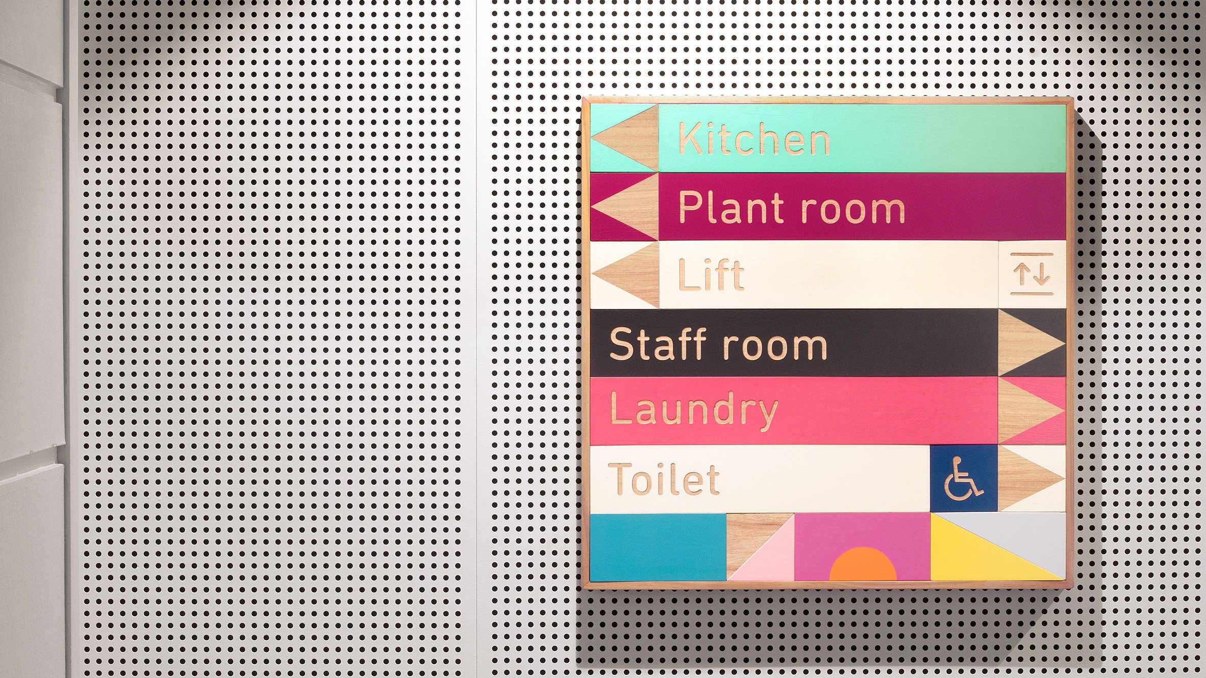
The signage blocks are mounted on a wooden frame and held together by magnets. This allows the blocks to be re-arranged as needed and in the event of architectural changes.
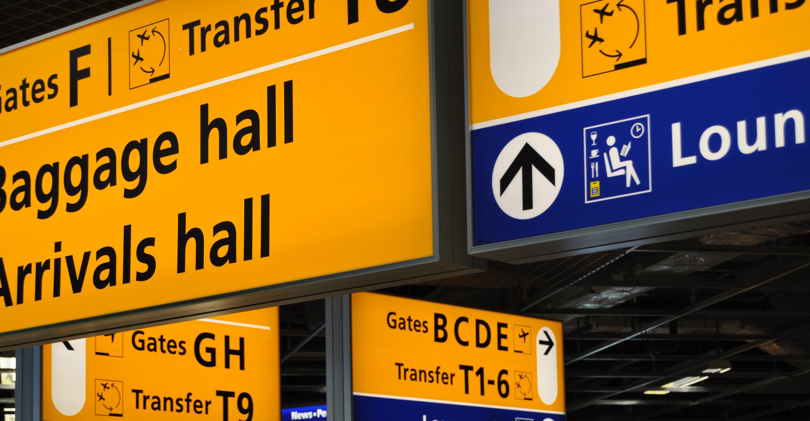
Amsterdam Schiphol Airport
Mijksenaar is a communications agency with offices in Amsterdam and New York. Since 1990, it has been responsible for wayfinding design at Amsterdam Schiphol airport. The design is based on liberal use of yellow, pictograms and clear and legible typography. The typeface used is Frutiger, created by Adrian Frutiger in the seventies specifically for airport signage (Paris Charles de Gaulle).
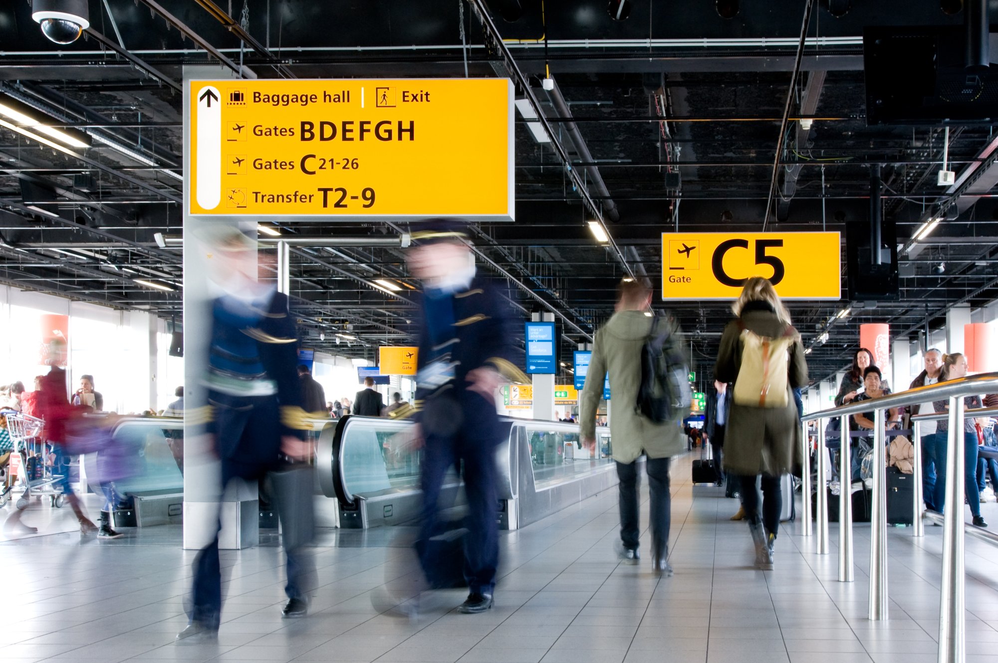
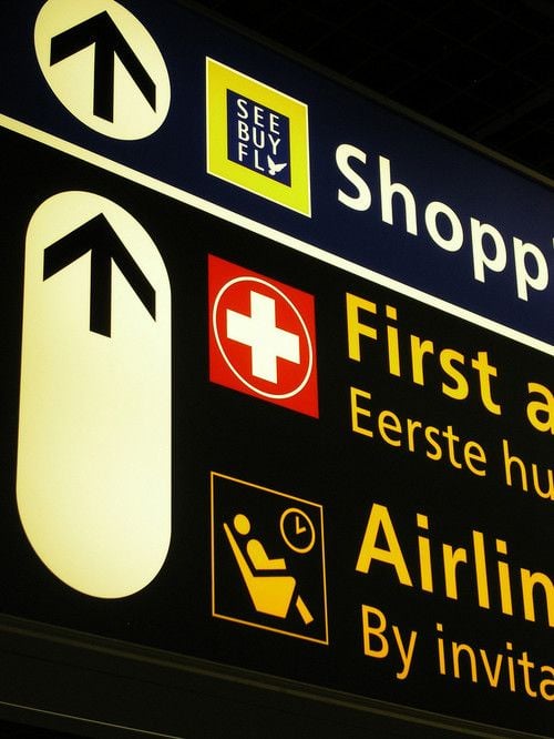
Almost all the signage in the airport uses large backlit signs. These are hung from the ceiling or positioned beside gates.
Wayfinding design is a discipline that has a significant impact on everyday life. Despite the growing intrusion of the digital world into our lives, signage remains largely physical and static. The examples that we’ve seen show that it’s possible to experiment with colours, typography and printing techniques to obtain effective yet very different results.