
Table of Contents
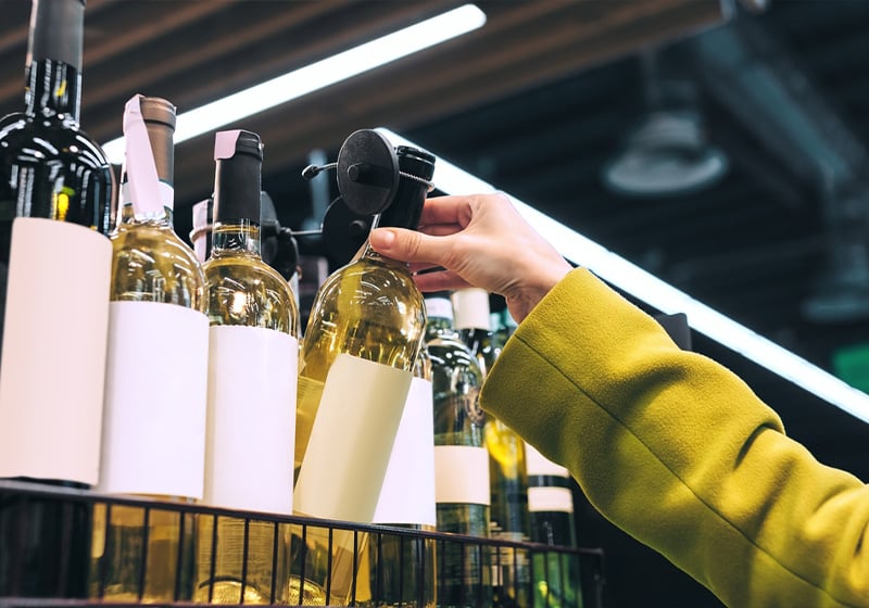
When it comes to wine, every detail matters.
From the grape variety to the terroir and the production method, every element contributes to defining the identity of the product. But there is one element more than any other that plays the key role in communicating this identity at a glance: the label.
Before it is even opened, a bottle is observed. And at that moment, the label becomes decisive: it tells a story, helps define its positioning and conveys value.
Among all design aspects, one of the most underestimated is precisely the size of the wine label. Yet this is a choice that directly affects readability, aesthetics and brand perception.
In this guide, we take a closer look not only at what the most common label sizes are, but above all how to choose the right ones strategically.
What are the standard dimensions for wine labels?
In the world of wine, there is no single mandatory size that applies to all cases. However, over time, certain formats have become widely used, especially for the most common bottle: the 75 cl format.
These dimensions have become a de facto standard because they work: they adapt well to bottle surfaces and ensure a good balance between available space and visual impact.
| Label type | Size (mm) | When to use it |
| Standard vertical | 90 × 120 mm | Most common and well-balanced format |
| Medium compact | 80 × 100 mm | Ideal for clean designs |
| Large format | 100 × 150 mm | Perfect for premium wines |
| Small | 60 × 80 mm | Half bottles or minimalist designs |
| Horizontal | 120 × 80 mm | Contemporary style |
This table is an excellent starting point, but it should not be interpreted as a rigid rule. In fact, one of the most common mistakes is choosing a “standard” size without considering the specific context of the product.
👉 A good label does not come from a standard size, but from a conscious choice aligned with the bottle and the brand it represents.
How to choose the right size based on the bottle
Every bottle has its own personality, defined by its shape, proportions and available surface. The label must work with these elements, not against them.
Let’s look at some examples of wine bottle types and recommended label approaches.
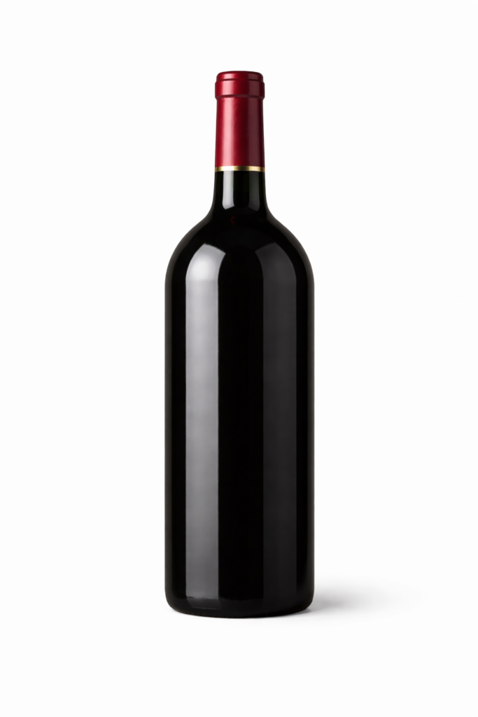
Bordeaux bottle
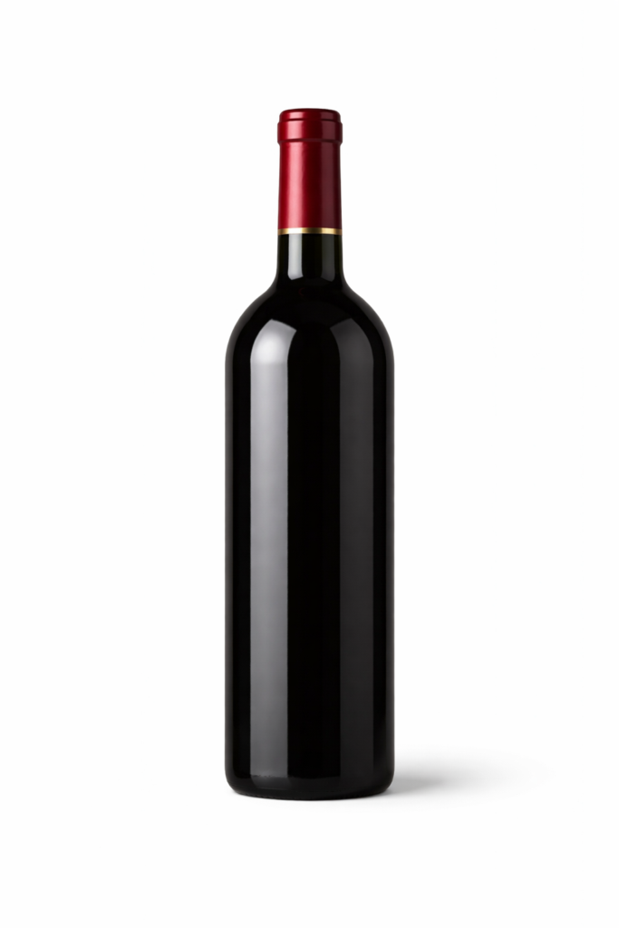
Let’s take the Bordeaux bottle, one of the most widely used: tall, with defined shoulders and a regular surface. Here, vertical labels work particularly well, as they follow the bottle’s lines and reinforce a sense of elegance.
Burgundy bottle
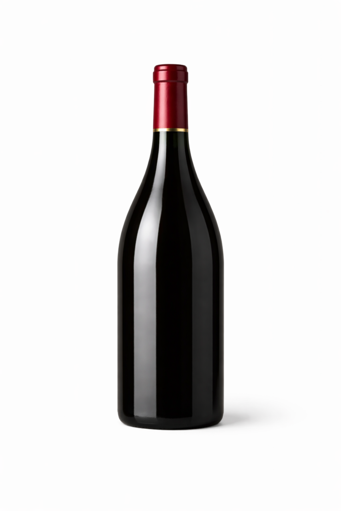
By contrast, a Burgundy bottle, softer and wider, offers more flexibility. In this case, wider formats or more creative designs can be used, making the most of the available surface without feeling forced.
Magnum bottle
When moving to Magnum or larger formats, things change. Here, proportion becomes key: a label that is too small risks getting visually lost, making the product appear less refined. It is therefore essential to increase the size while maintaining design coherence.
Sparkling wine / Champagne bottle
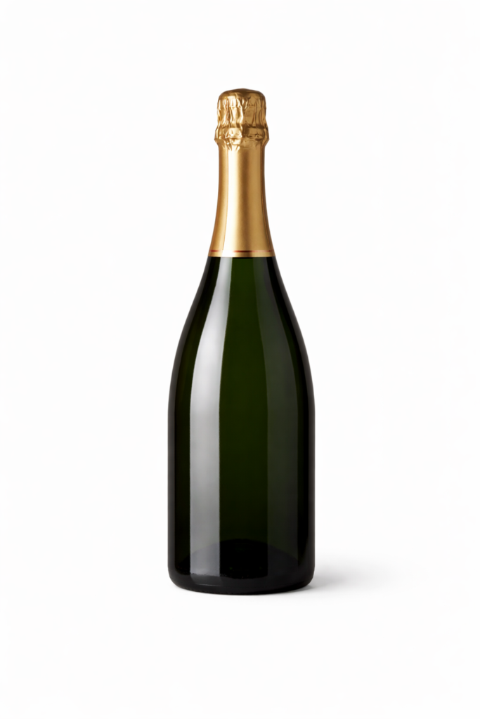
Sparkling wine and Champagne bottles introduce another variable: curvature. Rounded surfaces require more compact labels and more resistant materials, especially if the product is stored in humid environments.
👉 In short: the right size is always the one that works in harmony with the bottle.
How many labels does a wine bottle actually have?
When thinking about labels, it is easy to imagine a single element. In reality, communication on a wine bottle is often distributed across multiple layers.
Let’s take a closer look.
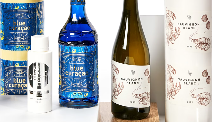
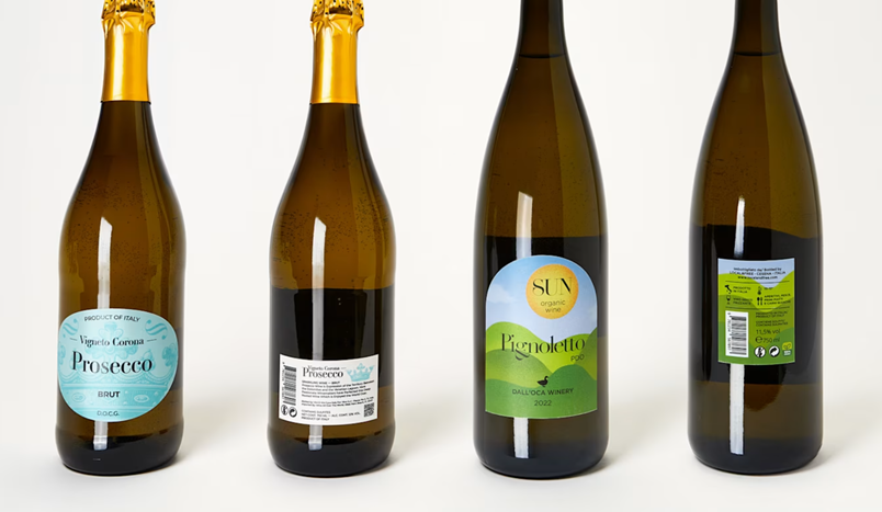
Front label
The front label is the one that captures attention: it is the face of the product, where visual identity is concentrated. This is where the wine name, brand and denomination are placed.
Back label
The back label plays a more informative role. This is where the consumer finds technical details, tasting notes and mandatory information. For this reason, it is often more discreet and less visually dominant.
Neck label
Finally, there is the neck label, an optional but highly effective marketing element. It can be used to highlight awards, special vintages or promotions.
👉 Choosing the right dimensions is not about a single element, but about the overall balance between all parts of the bottle: a system of labels that, as a whole, helps support and elevate the product.
What must a wine label include?
Beyond aesthetics, a label has a precise legal function. It must include a set of required elements that ensure transparency, traceability and consumer protection.
European regulations: mandatory elements
Within the European Union, wine labelling is governed by specific regulations. You can consult the official texts of Regulation (EU) No 1308/2013 and Regulation (EU) 2019/33 on the EUR-Lex portal:
https://eur-lex.europa.eu/legal-content/EN/TXT/?uri=CELEX:32013R1308
https://eur-lex.europa.eu/legal-content/EN/TXT/?uri=CELEX:32019R0033
Summarising the general guidelines, a label must include:
- Sales denomination of the wine (e.g. PDO, PGI or generic category)
- Nominal volume (e.g. 75 cl)
- Alcoholic strength (e.g. 13% vol)
- Details of the bottler or producer
- Country of origin
- Batch number
- Allergen information (e.g. contains sulphites)
- Ingredients and nutritional values (also via QR code, under current regulations)
Information hierarchy: what should stand out
Not all information carries the same visual weight. A well-designed label organises content clearly:
- Level 1 (identity) → wine name, brand, denomination
- Level 2 (description) → vintage, type, distinctive notes
- Level 3 (legal) → mandatory technical information
👉 This approach ensures compliance without compromising visual impact.
What about international markets?
If the wine is intended for export, it is essential to consider the regulations of destination markets.
For example:
- in the United States, specific wording such as the Government Warning is required
- in some Asian markets, translation into the local language is mandatory
- in many countries, additional sticker labels are required
👉 For this reason, it is advisable to take a broader approach when designing the label, anticipating possible adaptations for the countries where the wine will be sold.
These elements must be included clearly and legibly. This is precisely where size plays a fundamental role.
Dimensions and design: a strategic choice
The size of the label is not just a technical matter, but a key positioning tool.
Large labels: what they communicate
A large label conveys presence, visibility and a greater amount of information. It works well when there is a lot to communicate or when the brand has a more decorative style.
Small or minimalist labels: what they communicate
Conversely, a smaller, minimalist label suggests elegance, confidence and quality. It is typical of premium wines, where what is left unsaid becomes part of the message.
There is no universally better solution: everything depends on the message you want to convey.
👉 The right question is not “how big should it be?”, but “what perception do I want to create?”
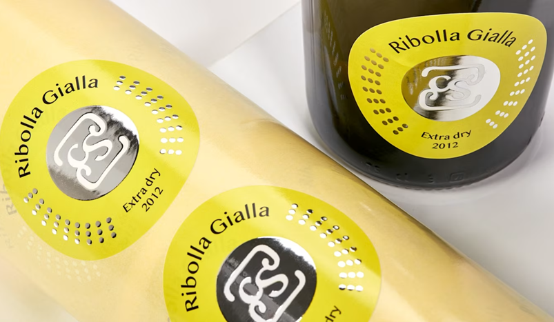
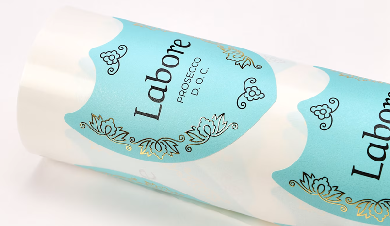
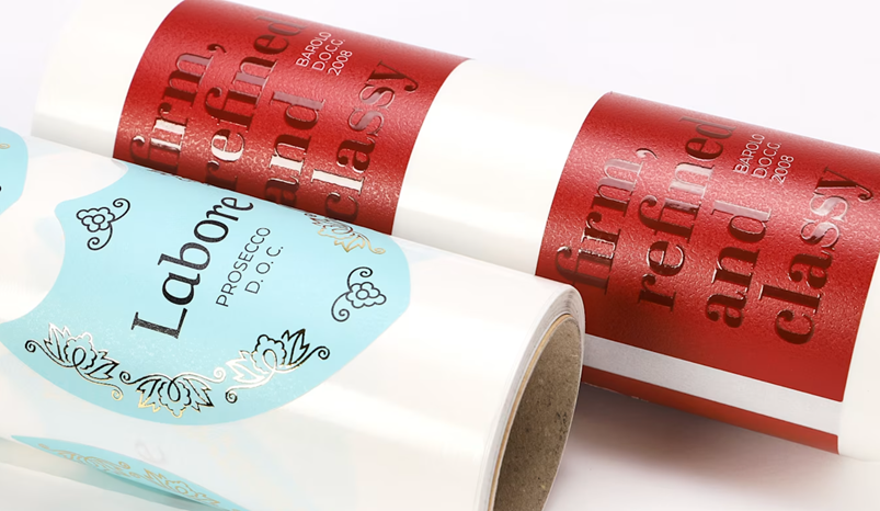
Materials and finishes: where the real difference is made
Once the size has been defined, another key factor comes into play: the material.
The most commonly used papers for wine labels
- Natural paper → slightly porous, perfect for artisanal or organic wines
- Embossed or textured paper → elegant and tactile
- Coated paper → smooth, ideal for vibrant colours
- Special papers (cotton, laid, etc.) → for premium or distinctive projects
- Synthetic materials (PP or PE) → resistant to moisture, ice and condensation
The most common finishing techniques
- Hot foil stamping (gold, silver, copper)
- Embossing or debossing
- Selective UV varnish
- Matt or soft-touch lamination
- Special effects and innovative materials
The same label can completely change perception depending on the material used. A natural paper, for example, conveys authenticity and craftsmanship. A smooth, glossy paper communicates modernity and precision.
Finishes add another level. Hot foil stamping in gold or silver highlights key elements and makes them instantly recognisable. Embossing adds depth and creates a tactile experience.
👉 This is often where the difference between a technically sound label and a truly memorable one is made.
If you want to explore all available options, you can discover adhesive roll labels on Pixartprinting, also ideal for the wine sector.
How much does it cost to print wine labels?
The cost of labels is often seen as a secondary variable, but it has a significant impact on the sustainability of the project, especially for small and medium productions.
Size directly affects the price: the larger the label, the greater the material consumption. But this is not the only factor.
Quantity also plays a key role: larger print runs reduce the unit cost, while smaller runs require more flexible solutions.
Finally, finishes can significantly influence the cost. A well-designed finishing can make a difference, but it must be evaluated in relation to the positioning of the wine.
👉 The goal is not to spend less, but to invest in the right way.
To get a concrete idea of costs and possible configurations, you can configure your custom roll labels online and check prices in real time.
Mistakes to avoid
Even with the best intentions, it is easy to make mistakes when choosing label dimensions.
One of the most common is choosing a label that is too large for the bottle, resulting in folds or application issues.
Similarly, a label that is too small may lack visibility and weaken communication.
Another frequent issue is poor readability: text that is too small or too dense makes information difficult to read.
👉 To avoid these problems, the simplest and most effective solution is always the same: test the design on a real bottle.
Where to print custom wine labels
A well-designed label deserves high-quality printing.
Relying on a specialised partner such as Pixartprinting allows you to manage every aspect of the process: from material selection to finishing, from initial samples to final production.
The ability to customise format, paper and finishing ensures labels that are not only technically correct, but fully aligned with the wine’s identity.
You can start designing your custom wine labels right away, choosing from a wide range of materials, formats and finishes.
Conclusion
Wine label dimensions are not a minor technical detail, but a strategic decision that affects perception, readability and positioning.
Every bottle requires its own ideal solution, tailored to its shape, content and communication goals.
With the right approach and the right tools, a label can become much more than a purely informational element: it can turn into a distinctive asset capable of making a real difference.