
Table of Contents
The origins of the project
Cédric Carcenac is a French winemaker from Montans, a village 25 miles north-east of Toulouse. For him, winemaking is more than a profession. It’s a passion, a tradition, a skill. It’s seven generations of family history. And at the end of 2017, after a very difficult year, Carcenac wanted to create a special vintage.
“We had a pretty tough 2017: the estate was the victim of a fire that destroyed almost everything, and I lost my father suddenly. And as winemakers, we express ourselves through our wines. Fortunately, our family, which has been here for generations, pulled together and rose to the challenge of rebuilding.”


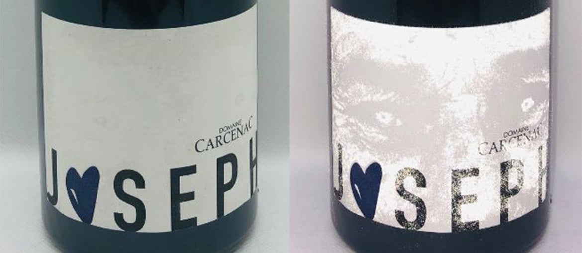
Carcenac wanted to produce a vintage named Joseph as a tribute to his late father. One that blended tradition and modernity. Which is why he asked graphic designer Célia Molinier and screen printer Lorenz Boegli to create a very special label. At first glance, the label appears minimalist, with just the name Joseph printed in black on a white background. But when photographed using a flash, it reveals an image of Joseph Carcenac.

“We wanted a high-end product with an interactive side, but without being too silly or quirky. Together with graphic designer Célia Molinier, we at first thought about doing something with virtual reality, but decided it was a bit too gimmicky,” explains Cédric Carcenac. Then Molinier remembered some posters she had seen by screen printer Lorenz Boegli in which his design was only visible when illuminated by a camera flash. She explains: “I discovered this technique a the Luxe Pack trade fair in Monaco and this project provided the perfect opportunity to use it for the first time in France on a wine bottle.”
Swiss screen printer Lorenz Boegli and his firm Atelier für Siebdruck are always on the look out for new printing techniques. For this label’s 3000-copy print run, Boegli used retroreflective ink made by Carcassonne-based Mistral Graphic.
“This ink contains glass microbeads that reflect light. When you take a photo with your phone using the flash, it creates a black and white image on the screen. It’s a surprising effect.”
Molinier refined this effect using premium methods and materials: thick, textured, off-white paper; embossing on the heart-shaped “O” in “Joseph”; and screen-printed typography.
Cédric Carcenac is very proud of everything about the wine, from its backstory and label to its flavour profile.
“This label is a great tribute to my father. We wanted to make a wine that he would have liked using a pure Syrah, his favourite grape, and I think that we succeeded. It’s a simple white label that hides its secret effect well.”
How does retroreflective ink work?
Retroreflective ink contains glass microbeads that redirect a large portion of the light hitting it back towards the source. Because of light deflection, the best effect is obtained when the observer is not perpendicular to the printed surface, but at an offset angle instead. Just how much of an angle depends on the size of the beads and where the ink is deposited.
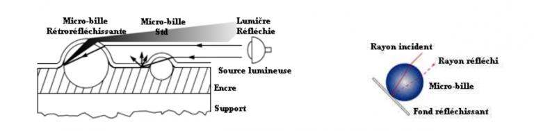
This ink intensifies the light rays hitting it, reflecting them at a different angle. Application is usually a two-stage process. A first coating of reflective ink is applied followed by a second layer of ink or varnish containing microbeads.
Mistral Graphic, the firm that provided the ink for the Joseph vintage label, has already developed a range of retroreflective colours, including white, yellow magenta, red, blue, and green, as well as a transparent base ink.
Different materials can be printed with this ink, including textiles and plastics. It can also be used for transfer printing in certain instances.
A similar example for Converse
In 2016, Paris-based advertising firm Waf Agency wanted to produce a cover for urban culture magazine Shoes UP that had the same reflective effect created by a pair of Converse trainers:
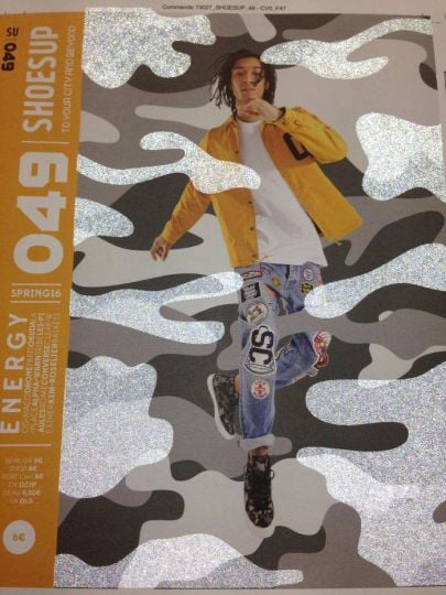
Camouflage-print Chuck Taylor All Star II. Waf Agency needed a printer who could pull off this technical challenge. So they turned to Japell Hanser SAG.
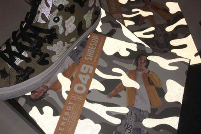
Christophe Pujol from Japell Hanser SAG explains the approach they took:
“A number of trials were needed to perfect this special ink and its application, because it’s not a product that’s easy to use. We deposited microbeads in a very particular way, because the agency wanted them to be visible without a flash. So we mixed them with silver aluminium particles.”