
Table of Contents
In our article “Creating an autumn colour palette for your graphic design project”, we talked about colour analysis, which involves looking at a person’s skin, eye and hair colour to work out which colour combinations suit them best for clothes and make-up. Colour analysis divides people into four groups, which are named after the seasons (autumn, winter, spring and summer).
The origins of this theory can be traced back to Johannes Itten, the Swiss painter who taught at the Bauhaus art school and devised the colour wheel. To illustrate the different relationships and interactions between colours, Itten came up with the idea of dividing them up into primary, secondary and tertiary colours, as well as introducing two other distinct criteria: temperature (warm or cool) and value (light or dark). Then, inspired by the colours seen in the natural world in each season, he associated these with four different types of people.

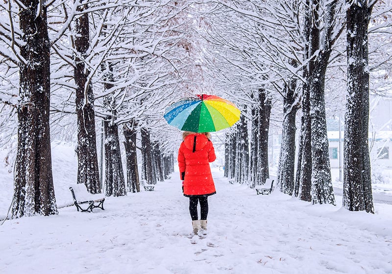
In this article, we’ll be taking a closer look at the many facets of winter with the ultimate goal of choosing the most suitable palette for this season.
The colours of Winter
The main traits of people in this category are a cool undertone, a low value (in other words dark) and medium-high contrast. In colour analysis, Winter can have characteristics in common with Autumn, but differs in two respects: undertone, which is warm in Autumn types and cool in Winter types, and overtone (or skin tone), which is brown, olive or yellowish in Autumn types and pinkish or olive in Winter types. Let’s take a deeper dive into the traits of people in this group.
Skin
People who belong to this season have a light or olive complexion with a cool undertone.
Eyes
Eyes can be light or dark, brown, blue, green or grey.
Hair
Hair colour is devoid of warm hues and can have tones that range from dark brown to jet black. Sometimes it may include lighter tones like ash blond.

The three subcategories of Winter in colour analysis
In colour analysis, Winter people are divided into three further subgroups, each characterised by a dominant feature. Let’s take a closer look each of the Winter subcategories and the palettes recommended for each.
Deep Winter
People who fall into the Deep Winter subgroup have dark eyes and hair, and medium-dark skin that tans easily. The ideal colours for this group are deep and predominantly cool tones: black, midnight blue, forest or petroleum green, charcoal grey, dark purple, burgundy red or ice white.
Cool Winter
This subgroup has skin, hair and eyes that are lighter. The colour of their complexion varies from very fair to medium, the colour of their eyes can be brown, grey or green, and their hair is usually light-medium brown. The palette that best suits Cool Winter includes every shade of blue, smoke grey, dark purple, pale pink and petroleum green.
Bright Winter
Bright Winter is characterised by high contrast and brightness: blue or green eyes and porcelain skin set off dark hair. People who belong to the Bright Winter group look best in bold and bright colours like fuchsia, meadow green, electric blue and lemon yellow.
True Winter
When the features we previously described – namely a cool undertone, dark shades, and high levels of intensity and contrast – combine in an individual’s color palette in a totally balanced manner, it is referred to as “Absolute Winter” (also simply called Winter or Pure Winter, or in English, True Winter, Winter). Here’s the profile of “true winter” subjects: cool skin (with an almost lunar appearance), hair of a medium-intense brown (but also dark), and eyes with a deep and dark iris.
As well as being a valuable tool for fashion and beauty professionals, colour analysis can also be used in other areas where choosing the right colour combinations is key (graphic and web design, illustration, interior design and home staging).

How to choose a winter colour palette
As their names suggest, winter shades are predominantly cool, deep and bright: black, dark blue, lead grey, dark green, purple, light pink, and dark red. As well as the online resources that we recommended in our article on autumn colour palettes (inserire link), it’s also worth checking out the websites and apps below.
Color Palettes
Divided into different sections (warm, cool, pastel and contrasting), this site enables you to create colour combinations from just one or two tones. What’s more, some photos can be downloaded and used for your own projects – simply send a request to site admin. In the “All tags” section, under “winter palette” (and similar) you can view sets of colours inspired by winter.

Color Collective
Created by colour designer Lauren Wager, this site lets you browse palettes created by graphic designers, artists and photographers from all over the world. One category worth a look is fabric and paper, which contains lots of great ideas for graphic design and fashion.
Adobe Capture
This application allows you to turn photos taken with your phone into colour palettes, patterns, shapes and fonts to use in Photoshop, Illustrator and other graphic design programs. It’s a really useful feature if you want the magic of winter landscapes to be the inspiration for your colour palette!
Behance
On this popular platform for creatives, you can find thousands of graphic designs, photos and illustrations inspired by winter by simply typing the keywords that interest you into the search bar.

Undertone, value and brightness: how to use them to create your palette
Colour analysis classifies colours according to three criteria: undertone, value and brightness. These are useful for identifying different colour variations and creating a harmonious and balanced colour palette. Let’s take a more detailed look.
Undertone
Undertone describes the temperature of a shade and divides tones into warm and cool. Every colour can have a warm undertone if yellow is added to it, or a cool undertone if blue is added.

Value
The value (or depth) indicates the brightness of colours and divides them into light and dark. The closer a shade is to white, the lighter it is considered to be; and the closer a shade is to black, the darker it is considered to be.
Intensity
The intensity of a colour depends on its level of saturation, in other words, the amount of grey present. More saturated shades are brighter and fuller, whereas less intense shades are fainter and paler.

Knowing how to adjust your palette using these three values can help you to create colour combinations that are balanced and perfectly in line with the colour analysis seasons.
Would you like to help us add to or improve the content of this article? Check our guidelines and send us your request via email at: seo@pixartprinting.com.