Table of Contents
Childhood memories have a unique flavour.
Someone who knew this well was Marcel Proust: the author explored the phenomenon in his famous episode of the Madeleine.
Advertising creative Yohan knows this too: he fuels his fervent imagination with his boyhood memories. Everyone has their own youthful passion: a band, TV show, series of books, superhero, football team or videogame.
Youth is marked by innocence and inexperience, but also the genuine passion and enthusiasm of being able to paint a blank canvas of experience: there’s great pleasure to be found in filling it with colours, images and figures, emotions, sensations and stimulations.
Yohan was looking for inspiration to produce limited-edition posters that would fully encapsulate his lifelong passions: cartoons, videogames and comics. As his mind wandered, he stumbled through a door in his head that took him back to the memories of his youth.
And there they were: fresh, vivid, thrilling, as if they happened yesterday.
That’s what’s so great about memories: they condense our experiences, capturing impressions and feelings, letting us go back and relive them whenever the right key is pressed, door opened or cake eaten.
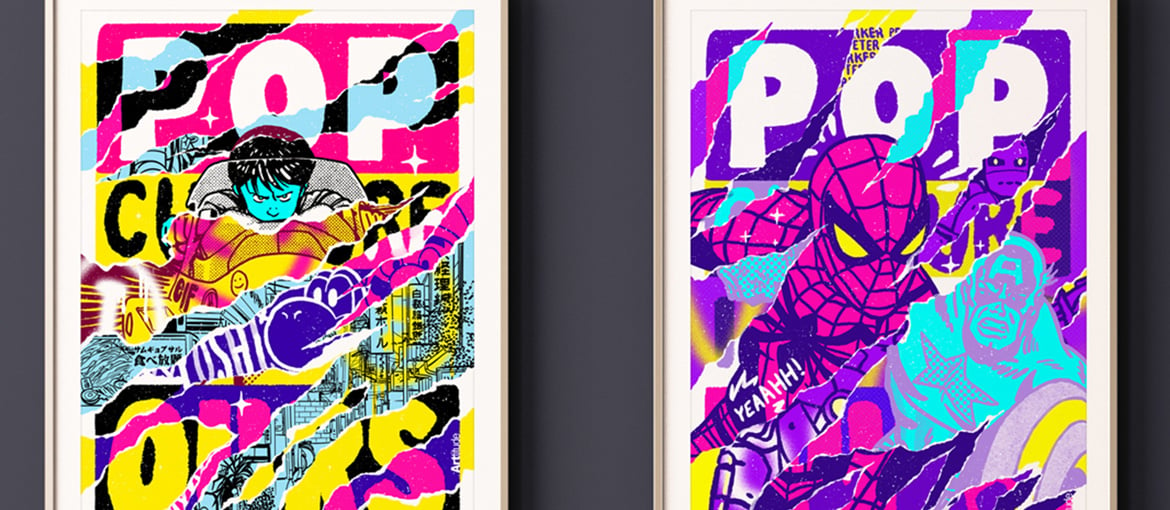
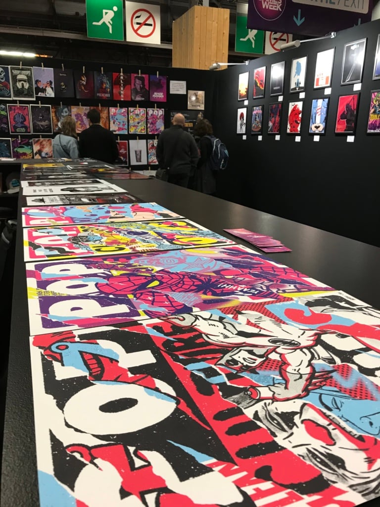
Returning to his childhood heroes, Yohan printed a series of four limited-edition posters which he exhibited at the Paris Games Weeks gallery to great success. The pleasure Yohan felt in seeing photos of his posters framed and hung by their lucky purchasers was immense.
It’s time to find out some more about Yohan and how he created these incredible posters. In the process, we hope to give you food for creative thought.
Happy reading!
Who are you? Tell us about yourself, what you get up to in life, and your dreams, aspirations and talents. A short but faithful portrait!
Hey I’m Yohan Quintar aka Lighton, a french artist from Paris. For the little story, I started to work in advertising at 16 as an apprentice graphic designer and since this moment I keep working on my style to express myself, now I share my time between art direction, illustration and painting in freelance. My inspirations come a lot from Pop art and HipHop culture. In my adolescence I fell in love with Warhol and Lichtenstein’s works and on the other side I discovered artists like 123Klan, Grems, Meka… I mixed all those references and try to find my own way !
Before telling us how your idea was born, can you explain to our readers what you produced using our printing services?
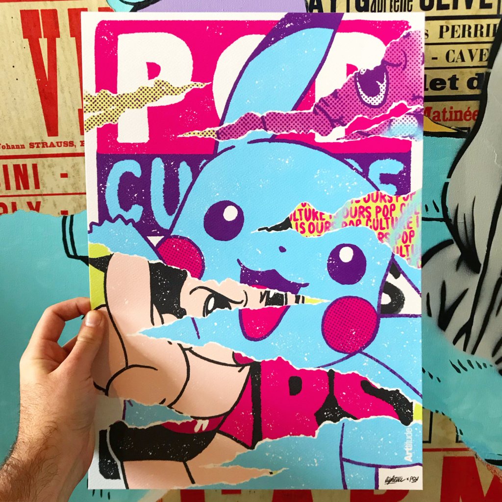
In November 2019, ArYtude invited me to be part of the Paris Games Week Art Gallery (Paris Games Week is the biggest video games event in France) of course I was honored and I accepted. For the occasion I had to bring some exclusive artworks to show and sell, so I decided to create limited edition prints with your printing services.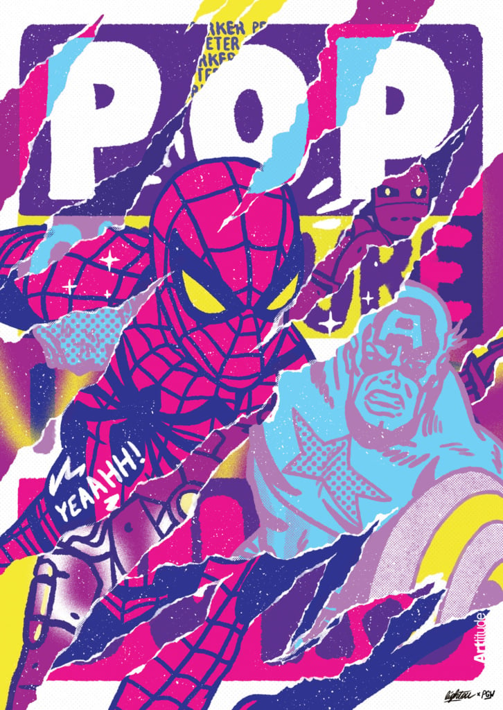
Let’s go back to the moment it all began. When did you come up with the idea for this design? Did you stumble across it by chance? Tell us a bit about how you devised the concept.
Paris Games week is a big and important event for players and passionate, and my objective was to offer them something exclusive, hand signed on a quality paper. So I imagined a little collection of 4 limited edition prints. I started to think about the link between video games and me, and it remains me a lot of childhood references. But I couldn’t think about only video games: my childhood is a big mix between a bunch of stuff linked together (games, cartoons, toys…) who are my definition of pop culture. So I felt like I had to work on something larger than exclusively video games theme and I started to work on a series named “Pop culture is ours“.
Once you had found the right idea, you had to set an objective. What did you want to achieve with your idea?
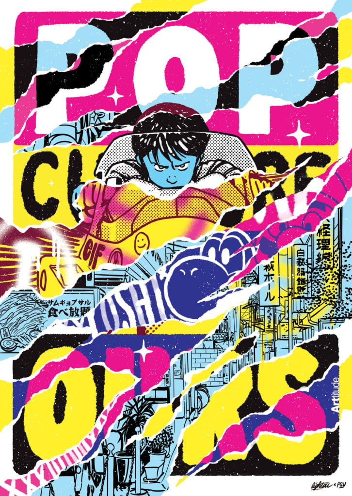
First, I selected my four biggest child references. It cames pretty fast : Pokemon, Akira, Spiderman and Batman. With those iconic characters I wanted to create the perfect collection to link everybody with their childhood memories.
With the idea for the design and the aim you wanted to achieve sorted, all you had to do was create it! How did you do it? What were the design phases and how many were there? Tell us about the process that brought your idea to life and made it ready for printing.
For this collection I worked mostly on Adobe Photoshop, because there is a lot of brushes and texture effect. Since few months I like to work my designs like the old advertising’s posters you can see in the subway with multiple layers of torn paper, it’s a good way to add a lot of little messages or references and create something who looks out of time. About the process I worked on my Wacom screen tablet (Cintiq), I start by working on the principal visual (for exemple the big pikachu) and ager I had some slices of torn paper and try to find the good balance of proportions and colors.
It’s time to print! How did you use print-on-demand to produce your design? Which materials did you choose? And why did you choose these materials and this printing technique?
I love to work in RVB at first, so I translated my colors in CMYK, prepared my print files and choose an orange skin paper for the print. I love the texture of it!
Now it’s time to make the most of the products you created. In your case, the aim was to produce a creative and powerful limited edition poster. How did it feel to see the printed copies in your hands?
I was so excited to unbox the prints ! The result was exactly what I wanted, and people loved it at the event, the Pikachu one was sold out in two days ! I received a lot of photos from people who framed it and put it in their home, that’s the sensation I want to know all my life haha.
This is only the start! What other projects do you have planned for the future? Can you share them with us?
This year will be a major year for me, I work on a lot of canvas and sculptures and I hope to make soon an exhibition in Miami at the annual art fair for the second time. That would mean a lot for me.

