
Table of Contents
Fun, colourful, over the top. Socially aware and introspective. A star of world cinema. Pedro Almodóvar and his iconic films have, in one way or another, left their mark on Spanish and European cinema over the past 40 years. What sticks in our mind is the sensuality of his characters and the force that animates them: desire.
Today, we’re looking at the films of Pedro Almodóvar from a different angle: his lettering and typographical choices. In doing so, we learn that even fonts can tell us a lot about the Spanish director: the cartoonish, imprecise but original lettering of the first Almodóvar release gradually makes way for more elegant and balanced typefaces. And there’s a bit of everything in between, including a long-standing, recurring collaboration with Argentine designer Juan Gatti – one that has many parallels with the famous partnership between Alfred Hitchcock and Saul Bass [link to “The fonts of Alfred Hitchcock” article].
Before we discover the fonts and lettering that feature in Almodóvar’s most famous pictures – from Women on the Verge of a Nervous Breakdown to Tie Me Up! Tie Me Down!, to his latest release, Pain and Glory – we’ve put together, as we often do, an initial selection of some of his best title credits.
What Have I Done To Deserve This?
A dark and highly idiosyncratic comedy – one of the best examples of early Almodóvar – What Have I Done To Deserve This? came out in 1984 and is transgressive and bitingly satirical. Not wanting to give too much away, all we can say is this: over the course of the story, a murder is committed using a most peculiar weapon.
The lettering of the opening credits reveals one of Almodóvar’s earliest passions: comics. Before becoming a famous director, while working for Spain’s national phone company – his main job for 12 years – young Pedro published comic strips in underground magazines, as well as dabbling in avant-garde theatre, writing and, of course, cinema.
Perhaps that’s why the opening credits of What Have I Done To Deserve This? use decidedly cartoonish lettering in their shape, colours and mishmash of different styles juxtaposed next to one another, before ending on the enormous main title, black on red, which is revealed by a fast tracking shot.
The credits were designed by Spanish artist and director Iván Zulueta, who said he was inspired by the lettering found on detergent boxes.
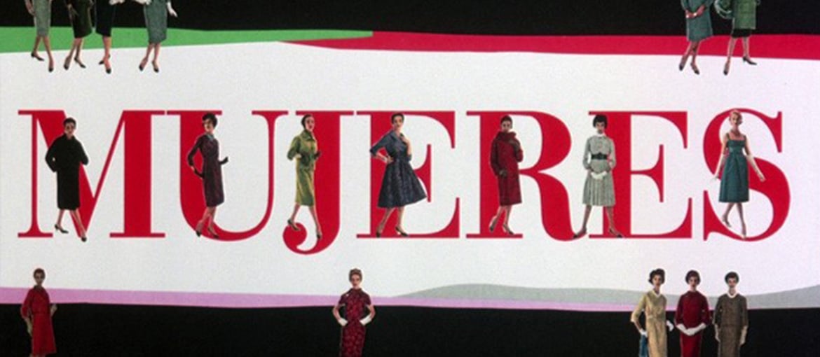
Women on the Verge of a Nervous Breakdown
Released in 1988, Women on the Verge of a Nervous Breakdown is an irreverent comedy that weaves together multiple stories. As is very often the case in the director’s films, the main characters are women.
Taking us into this feminine world are the stunning opening credits, which marked the beginning of the long-standing collaboration between Almodóvar and Argentine designer Juan Gatti.
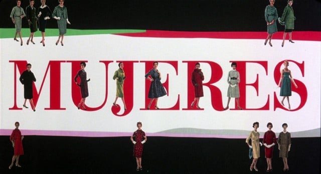
In stark contrast to the psychological depth of the film’s characters, the opening credits are an ironic distillation of the most ostentatious and naïve feminine tropes. Gatti creates a masterful collage cuttings and details from sixties fashion magazines: elegant silhouettes, a flower, lipstick, a high-heeled shoe.
The font too is typical of glossy magazines of the era: Bauer Bodoni. It is inspired by the characters created by Giambattista Bodoni, which had a profound impact on typography at the end of the 18th century (indeed, we listed Bodoni among the five inventors who revolutionised printing.
Bauer Bodoni was designed in 1926 by Heinrich Jost, the artistic director at the storied Bauer type foundry in Frankfurt. Considered one of the most thoughtful interpretations of the Bodoni typeface, its use is widespread, especially in glossy magazines.
Fun fact: to create these incredible opening credits, Pedro Almodóvar and Juan Gatti used the truca, a special printer for cinematic film that was fashionable at the time for creating special effects.
https://www.youtube.com/watch?v=AaU8jkCSDY8&ab_channel=RaquelMoreno
Tie Me Up! Tie Me Down!
Released in 1990, Tie Me Up! Tie Me Down! is a romantic comedy in which Almodóvar explores some of his favourite themes from his early films: desire, love and obsession. The movie tells the story of the relationship between an actress and her kidnapper.
In this film too, Almodóvar collaborated with Juan Gatti on the design of the credits. Born in Argentina and trained in New York, Gatti was one of the most exciting designers around at the time. Their relationship was very much like that formed between Alfred Hitchcock and New York designer Saul Bass [link to “The fonts of Alfred Hitchcock” article]. Both were long-standing collaborations – Gatti would work on the credits and posters for some 11 Almodóvar films – between extremely creative personalities who were geniuses in their own ways. “Sometimes we have disagreements,” Gatti told the Guardian in 2011. “We can both be obsessive and stubborn – but these differences eventually enrich the final product.”
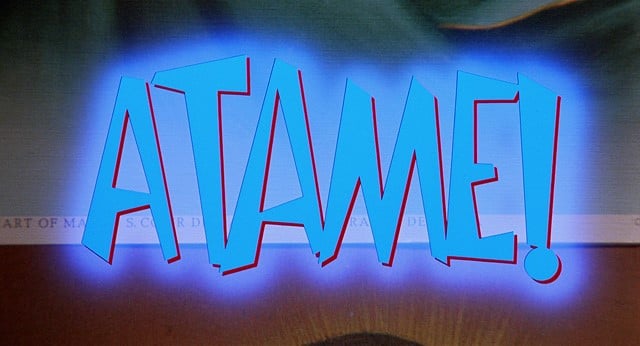
Ironically, in the opening credits for Tie Me Up! Tie Me Down!, as well as the poster for the film, Gatti openly pays homage to the work of Saul Bass. The uneven sans serif font of the lettering, in an almost cartoonish bright blue, explicitly borrows from some of the American artist’s most famous work: the title sequences for Alfred Hitchcock’s Anatomy of a Murder and Otto Preminger’s The Man with the Golden Arm.
It’s also interesting to note that the lettering created by Juan Gatti appears above a series of replica images of the Hearts of Jesus and Mary, almost as if it were an Andy Warhol piece. This choice was a last-minute improvisation by Almodóvar.
Julieta
Released in 2016, Julieta is one of Almodóvar’s most mature and famous pictures. Through a series of flashbacks, the film recounts the trials and tribulations of a mother and daughter over the course of three decades. Its irreverence leaves enough room melancholy, silence, abandonment and absence. From a typographical perspective, the flashy lettering gives way to more balanced fonts.
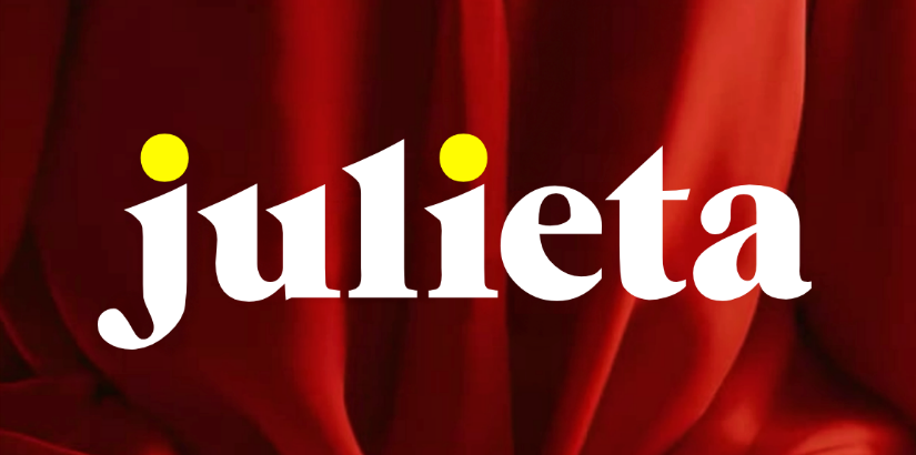
In the film, the fates of mother and daughter, adolescent girl and fully grown woman, seem to combine. And it was from this idea that the poster was born, created by Madrid-based graphic design studio Barfutura: connecting the photographs of the two women is a powerful main title. “We were after an elegant, strong typeface that was somehow different. We needed this type of font because the title, comprised of a single word, would place strong emphasis on the font,” as the poster’s creators explained in an interview.
They opted for ITC Grouch, a font that was also used in the title sequence for the film.
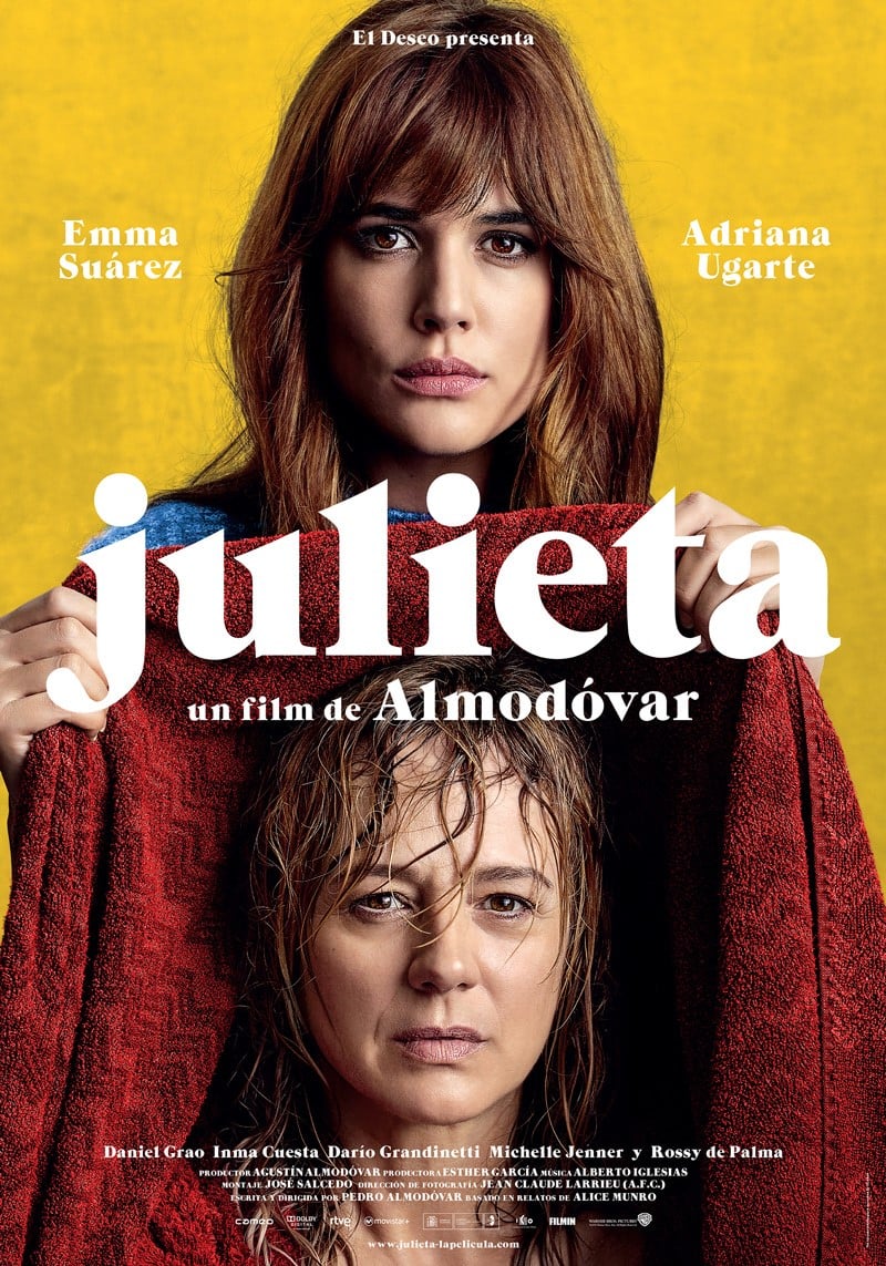
ITC Grouch is a high-contrast serifed font – in other words, there’s a big difference between the thick lines and thin lines of each glyph – designed in 1970 by Tom Carnase and Ronne Bonder. You may recall that we’re already met Tom Carnase in our series of articles on fonts and directors. The American typographer, teacher and graphic designer created ITC Busorama used by Quentin Tarantino for the credits of Pulp Fiction.
Pain And Glory
Pain And Glory came out in 2019 and is Almodóvar’s latest release. It’s a film about the act of creation and tells the story of an ageing director who must come to terms with his declining health, with his inability to shoot any more films and with past passions that still burn strong.
For Almodóvar, Pain And Glory represents somewhat of a step back in time: there’s a return to actors from his previous films, like Antonio Banderas and Penélope Cruz, as well as a new collaboration with Juan Gatti for the opening credits (the last time the pair worked together was in 2011 on The Skin I Live In).
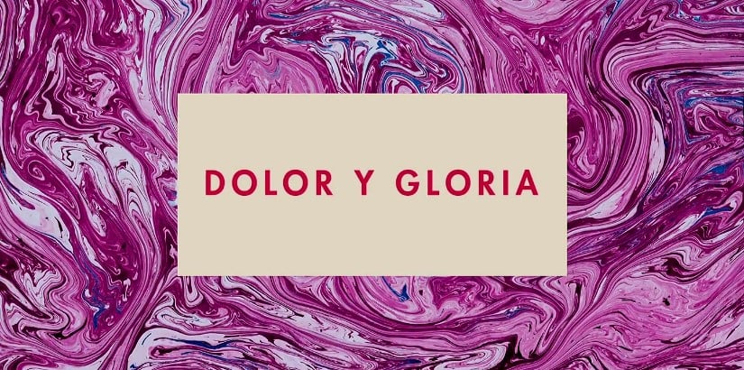
The title sequence immediately plunges us into a world of art and creativity. The background patterns – blue, pink, green, red – are almost hypnotic and bring to mind marbling, a paper-decorating technique that imitates the swirls of colour on a marble surface. Fun fact: this technique originated in Asia, spread through the Islamic world and arrived in Venice in the 17th century, where bookbinders used it to line books and other objects.
It is against this iridescent background that the opening credits appear in a grey-white rectangle. Once again, the typeface chosen is the balanced and widely used: Futura.
Futura is one of the best-loved and most-used fonts in the world. It’s modern and geometric, inspired by the visual elements of Bauhaus. Designed by German Paul Renner in 1927, it was initially intended to be used in Neues Frankfurt (New Frankfurt in English), a modernist architectural project started by the city at the end of the twenties. And did you know that it’s also a favourite font of another director?
We’ve seen how the design of credits used in the cinematography of Pedro Almodóvar is more than a minor detail. That’s why in his graphic and typographic choices he has always collaborated with outstanding artists like Juan Gatti. What’s more, the title sequences play an important role: they open a parenthesis in our everyday worlds and prepare us to dive into the magical universe of Almodóvar’s films.